Flight School Marketing Professional Website Template
Cleared is a split-screen landing page template built for flight schools running Facebook ad campaigns. It leads with bold proof stats, a dramatic cockpit header, and a persistent amber call-to-action that drives clicks to an enrollment page. The Arctic White and charcoal palette projects regulatory confidence, while the Stats-First layout dismantles common objections one section at a time.
by Rocket studio
Quick summary
Cleared is a single-page, split-screen landing page template designed for flight school Facebook ad campaigns. It pairs full-bleed cockpit imagery with oversized proof statistics to build trust fast. Every scroll section alternates stat and visual across a clean 50/50 layout. The caution-amber call-to-action button drives traffic directly to an enrollment page, with no form required on the page itself.
Who this template is for
This template is built for flight schools that need a high-converting Facebook ad landing page without starting from scratch. It suits marketers and school operators who want a polished, evidence-led page ready to deploy quickly.
- Flight school owners and marketing managers running paid social campaigns
- Aviation program coordinators targeting career-changers, college students, and discovery-flight enthusiasts
- Anyone who needs a click-through landing page that builds trust before asking for action
What problem this template solves
Most flight school landing pages either look generic or bury the proof too deep. Prospective students arrive from a Facebook ad already skeptical about cost, timeline, and job prospects. This template meets that skepticism head-on.
- It leads with a compelling pass-rate statistic before a visitor can scroll away
- It stacks objective proof across every section to address cost, employability, and timeline objections
- It removes friction by keeping forms off the page and directing motivated visitors straight to enrollment
What you get with this template
You get a fully structured, single-page layout with every section pre-built and ready to customize with your school's real data. The design system is cohesive and purposeful from the header to the micro-footer.
- A dark full-bleed cockpit header with a glowing oversized stat and an amber call-to-action beneath it
- A repeating split-screen stat-and-image structure that builds an evidence wall across multiple scroll sections
- A three-element micro-footer on every section featuring an FAA Part 141 badge, a Google review score, and a financing disclosure line
Feature list
This section covers the core built-in capabilities of the Cleared template as described in the source brief.
Dark Full-Bleed Cockpit Header
The header uses a deep charcoal-to-black cockpit interior image shot from the left seat at dusk. Instrument panel glow in soft blue and amber frames a single oversized stat in arctic white type. The effect is immediate, atmospheric, and authoritative.
Stats-First Split-Screen Layout
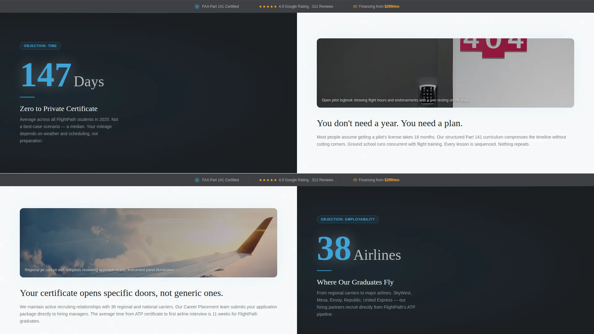
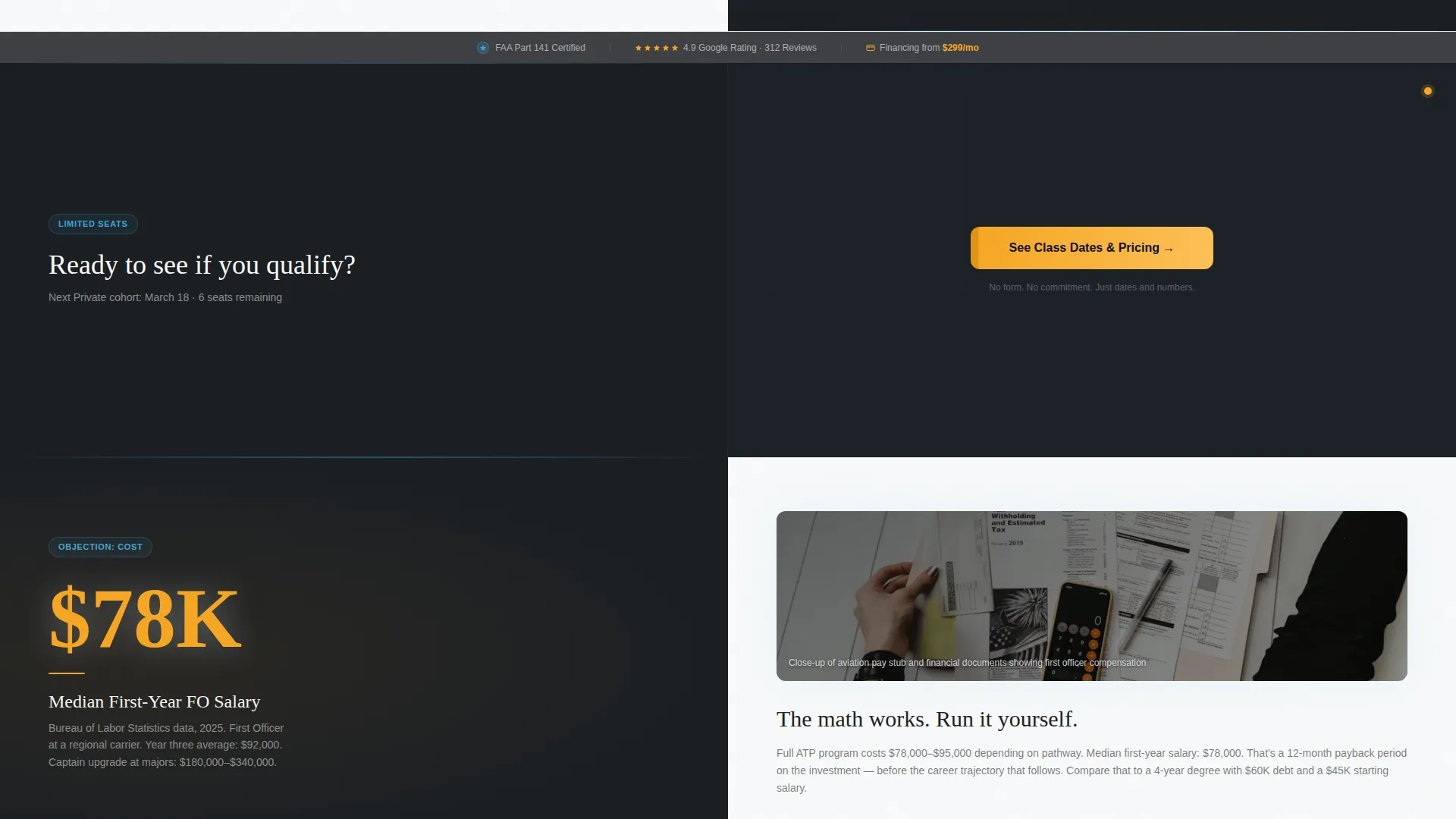
Every scroll section opens with a bold, oversized number on one half of the screen. The paired half displays a corresponding image, such as a student logbook, a regional jet cockpit, or a pay stub mockup. This structure turns the page into a prosecutorial evidence wall rather than a standard pitch.
Persistent Amber Call-to-Action Bar
The "See Class Dates and Pricing" button appears in caution-amber beneath the header stat and repeats as a full split-screen bar after every second section. The repetition keeps the next step visible without feeling aggressive.
Section-Level Trust Micro-Footer
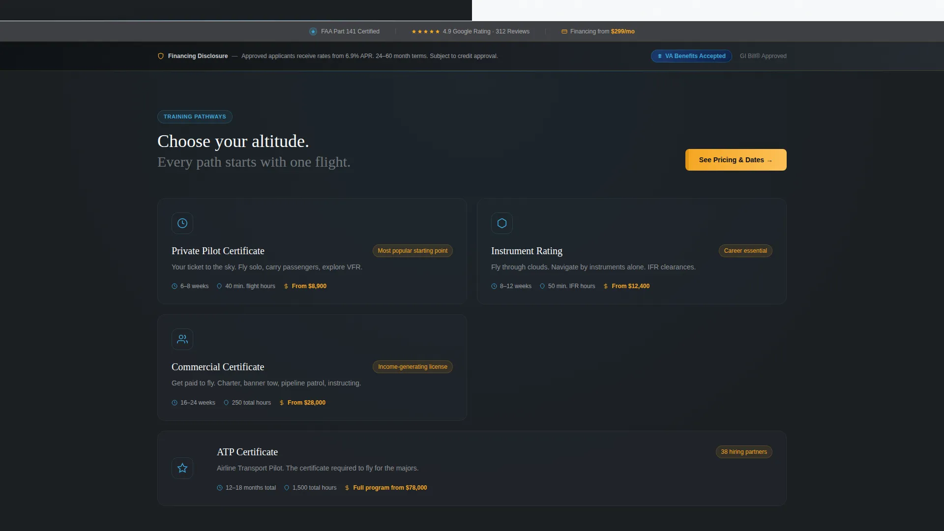
Every content section includes a three-element trust strip at the base. It displays an FAA Part 141 certification badge, a live-pull Google review score, and a financing disclosure line. These elements provide regulatory and social proof at every decision point on the page.
Legal Shield Theme Elements
The template incorporates FAA approval badge placements, Veterans Affairs benefit callouts, and a financing-disclosure bar styled to feel protective rather than bureaucratic. This cluster of trust signals addresses the compliance concerns that often stall enrollment decisions.
Arctic White Color System
The palette uses clinical frost white for backgrounds, instrument-panel charcoal for typography, altitude-indicator blue for section dividers and data lines, and caution-amber exclusively for calls-to-action and compliance badges. The system is consistent and purposeful across every section.
Page sections overview
| Section | Purpose |
|---|---|
| Cockpit Header | Opens with immersive stat and amber call to action |
| First Stat Block | Addresses timeline objection with days-to-certificate figure |
| call to action Repeat Bar | Reinforces click action after first two sections |
| Airline Reach Block | Shows graduate employment breadth across carriers |
| Salary Proof Block | Counters cost concern with first-year income data |
| call to action Repeat Bar | Second persistent call to action placement mid-scroll |
| Safety and Approval Block | Surfaces FAA certification and VA benefit callouts |
| Financing Disclosure Bar | Presents monthly payment context transparently |
| Section Micro-Footer | Repeats trust trio on every content section |
Design & branding system
The Cleared template uses a four-color Arctic White system that feels like a freshly calibrated glass cockpit. Every color has a fixed role, so the palette never competes with itself.
- Arctic white (#F8FAFB) dominates all backgrounds to project transparency and clinical precision
- Instrument-panel charcoal (#1B1F23) anchors all body and headline typography for maximum contrast
- Altitude-indicator blue (#3DA5D9) traces section dividers and data lines, referencing a synthetic vision horizon display
- Caution-amber (#F5A623) is reserved exclusively for call-to-action buttons and compliance badges, so the eye always finds the next action instantly
Mobile & speed optimization
The split-screen layout is structured to adapt gracefully when a visitor lands from a mobile Facebook ad click. The 50/50 columns stack cleanly on smaller screens so the stat always reads before the supporting image.
- Oversized stat typography scales for small screens without losing visual impact
- The persistent amber call to action button remains prominent at every scroll depth on mobile
- The micro-footer trust elements stay compact and readable across device sizes
How this template helps you convert
The entire page is engineered around a single action: the click to the enrollment page. Every design and content decision serves that goal.
- The header stat creates immediate credibility before the visitor can form a reason to leave, reducing early bounce behavior
- The repeating call to action bar after every second section means the action step is never more than one visible section away at any scroll depth
- The section-level micro-footer eliminates the last common objections, namely certification legitimacy, peer validation, and affordability, right at the moment a visitor considers clicking
Other information about this template
This template is purpose-built for the flight school Facebook ads niche and is designed to function as a standalone click-through page. It does not include a contact form or on-page scheduling tool.
- The template is categorized under Professional Services and Flight School Marketing
- It is intended for use alongside a separate enrollment or scheduling page where payment and class selection occur
- The financing disclosure bar and VA benefit callout sections can be updated to reflect your school's actual program terms
- The Google review score element in the micro-footer is designed to display a live-pulled rating, so accurate source data should be connected before publishing
- The template style is a 50/50 Split Screen, and the header concept follows the Dark Full-Bleed with Glow creative direction

Theme
Legal Shield
Creative direction
Stats-First Impact
Color system
Arctic White
Style
Split Screen (50/50)
Direction
Click-Through
Page Sections
Dark Full-bleed Cockpit Header
Stats-first Split-screen Layout
Persistent Amber Call-to-action Bar
Section-level Trust Micro-footer
Legal Shield Trust Elements
Arctic White Color System
Related questions
Does this template include an on-page form or booking tool?
Can I update the statistics to match my school's real data?
How many times does the call-to-action button appear on the page?
What does the micro-footer trust strip include on each section?
Who is the target audience this landing page is designed to reach?



