Senior Support Professional Website Template
Click is a warm, trust-first donation and fundraising landing page for a senior computer literacy classroom. Built with a zigzag alternating layout, it guides family members, neighbors, and supporters from emotional connection to confident giving. Tiered donation cards, volunteer sign-up paths, and earned trust badges make every section easy to act on.
by Rocket studio
Quick summary
Click is a single-page fundraising template built for a nonprofit senior computer class. It opens with an award-badge trust wall and a headline that instantly reassures visitors. The zigzag alternating sections move between graduate stories and classroom realities, carrying donors from feeling moved to clicking "Fund a Seat" with confidence.
Who this template is for
This template is designed for nonprofit organizers, community advocates, and senior-services coordinators who need to raise funds online. It works equally well for adult children looking to share the program with family members, and for local libraries or senior centers promoting digital literacy in their communities.
- Nonprofit staff running a senior computer literacy program
- Fundraising coordinators seeking a clear, donor-ready page
- Volunteer coordinators recruiting patient instructors from the community
What problem this template solves
Most donation pages feel cold or cluttered. For an audience that includes elderly first-time students and their concerned adult children, that friction is especially costly. Visitors leave before they donate because they do not understand where their money goes or why it matters.
- Donors cannot picture the impact of a small gift without tangible, specific giving tiers
- Family members feel unsure whether the program is credible without visible trust signals
- Potential volunteers have no clear path to sign up alongside the donation flow
What you get with this template
You get a fully structured, single-page layout that takes visitors from trust-building to action in one smooth scroll. Every section is purpose-built, from the hero trust wall to the tiered giving selector at the bottom.
- A hero section with award badges, a nonprofit shield, and a milestone counter
- Two alternating vision sections showing real graduate outcomes paired with classroom realities
- A donation section with three giving tiers and a separate volunteer sign-up path
Feature list
This template delivers a focused set of components that work together to lower hesitation and raise giving confidence.
Award Badges Trust Wall
The header arranges trust seals in a horizontal row across a cream field. Included marks cover nonprofit status, a county aging-services partnership crest, a "500+ Graduates" milestone badge, and an accessibility compliance mark. Together they function like framed diplomas on a waiting-room wall.
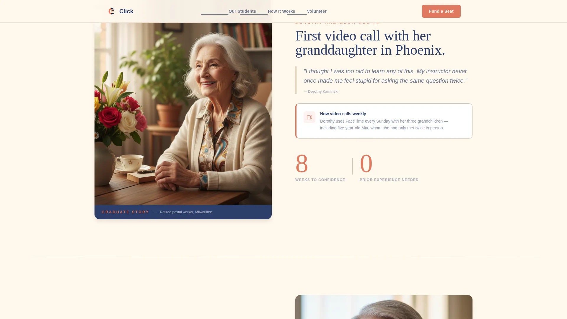
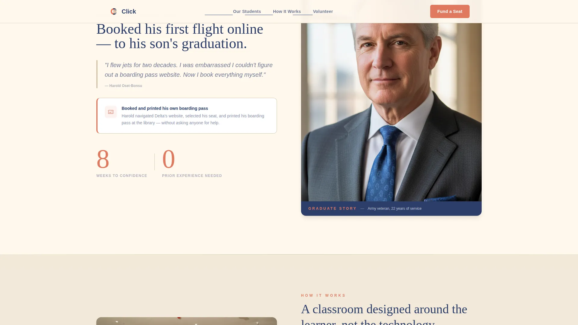
Zigzag Alternating Story Sections
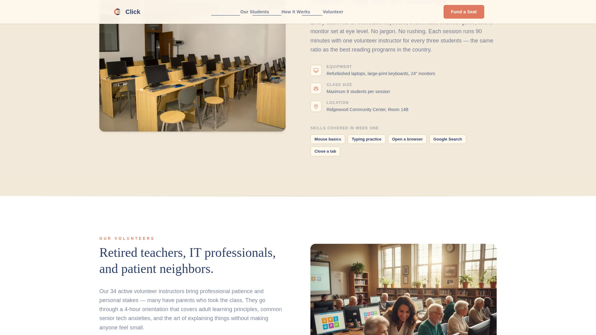
Odd sections present graduate outcomes: a photo alongside a real result such as a first video-call screenshot or a self-booked boarding pass. Even sections show how the program works: the physical classroom, volunteer instructors, and donated equipment with oversized keyboards. The alternation builds emotional weight and operational credibility in tandem.
Tiered Donation Selector
Three radio-style giving cards let donors choose a specific, tangible contribution. The $35 tier covers a printed student workbook. The $75 tier funds a full eight-week course. The $150 tier sponsors a refurbished laptop for a student to keep. Each amount is small, concrete, and easy to picture on a real desk.
Volunteer Sign-Up Path
A secondary call-to-action reads "Volunteer to Teach" for visitors who prefer to give time rather than money. It sits visually distinct from the donation flow so neither path competes with or confuses the other.
Large-Type Readability Design
Body copy renders at a minimum of 18 pixels using Plus Jakarta Sans. Headings use DM Serif Display at generous sizes. Coral accent color appears only on buttons and progress indicators, keeping the eye guided rather than overwhelmed.
Scroll-Triggered Animation
GSAP ScrollTrigger powers image reveals and staggered fade-ins as visitors scroll. A subtle scroll-linked parallax effect adds depth without distraction, keeping the experience lively for desktop visitors while remaining accessible on tablet devices.
Page sections overview
| Section | Purpose |
|---|---|
| Hero Trust Wall | Display award badges and headline to establish credibility immediately |
| Graduate Outcome Story | Show a real student result alongside a personal photo |
| Classroom Reality View | Reveal volunteers, donated laptops, and oversized keyboards in use |
| Second Graduate Story | Present a second outcome: a booked boarding pass or flagged scam email |
| Fund a Seat | Offer three giving tiers and a volunteer sign-up path |
| Footer | Close with a linear pattern footer and organizational links |
Design & branding system
The Warm Stone color system pairs clinical confidence with genuine warmth. Every color choice is deliberate and serves a clear role in the reading experience.
- Cream (#FFF8ED) dominates all backgrounds for maximum text contrast and ease of reading
- Navy (#2C3E6B) anchors all headings and body text; sandstone (#D4C5A9) acts as a gentle section divider
- Coral (#E07A5F) appears only on buttons and progress indicators to draw the eye exactly where action is needed
Mobile & speed optimization
The template is built desktop-first with careful adaptation for tablet screens, which is where much of the senior audience browses. Touch targets and type sizes are scaled up throughout.
- Body text starts at 18 pixels minimum, with heading sizes set generously for low-vision readers
- Touch targets on donation tier cards and call-to-action buttons are sized for fingers, not cursors
- Static sections use Server Components while the interactive donation selector runs as a Client Component to keep the page load light
How this template helps you convert
Every design and copy decision in this template points toward one outcome: a visitor who gives with confidence and remembers why they gave.
- The award badges at the top remove doubt before the visitor reads a single sentence of body copy, making them more receptive to the story that follows.
- The zigzag alternation between graduate outcomes and classroom realities means donors understand both the human result and the practical mechanism before they reach the giving section.
- The tiered donation cards replace vague giving with specific, visualizable objects, which research in nonprofit fundraising consistently shows increases average gift size and completion rates.
Other information about this template
This template is part of a broader set of nonprofit and social-impact page templates. A few additional details are worth knowing before you customize it.
- The footer follows a Pattern 1 Linear layout, providing a clean close with room for organizational contact details and links
- Named graduate testimonials can slot into the alternating sections as pull-quotes, reinforcing social proof beyond the badge wall
- The page is localized for United States audiences with English copy, USD currency amounts, and MM/DD/YYYY date formatting throughout
- The coral call-to-action color is deliberately reserved and used nowhere else in the layout, so the giving buttons always stand out without competing for attention
- This template fits naturally within the Senior Support Services category and supports digital literacy outreach initiatives tied to community aging programs

Theme
Medical Clarity
Creative direction
Vision & Mission
Color system
Warm Stone
Style
Zigzag/Alternating
Direction
Donation/Fundraising
Page Sections
Award Badges Trust Wall
Zigzag Alternating Story Layout
Tiered Donation Selector
Volunteer Sign-up Path
Senior-optimized Typography
Scroll-triggered Animations
Related questions
Who is the primary donor this page is designed to convert?
What are the three donation tiers included in the template?
Can potential volunteers use this page too?
Is the page readable for older visitors browsing on a tablet?
How many sections does this landing page include?


