Healthcare PPC Agency Landing Page Template
ClinicConvert is a horizontal scroll landing page template built for healthcare pay-per-click agencies. It uses an Ink and Paper aesthetic fused with an iridescent color system to guide visitors through a gallery of real-world campaign results. The layout builds trust step by step and moves qualified prospects toward two clear conversion paths: a benchmark report download and a free campaign audit.
by Rocket studio
Quick summary
ClinicConvert is a single-page, horizontal scroll template designed for healthcare pay-per-click agencies. It frames campaign results as gallery exhibits, builds authority through typeset data, and closes with two conversion paths. The visual identity blends manuscript warmth with prismatic user interface accents, giving the page the calm credibility of a medical journal and the energy of live performance data.
Who this template is for
This template is built for performance marketing agencies that serve medical and dental practices. It speaks directly to the professionals managing paid search for clinics that need more patient appointments, not just more clicks.
- Healthcare pay-per-click agency owners and account managers presenting results to medical clients
- Freelance paid search specialists pitching orthopedic, dermatology, dental, or plastic surgery practices
- Multi-location medical group marketers who need a polished, results-led agency page to attract new partners
What problem this template solves
Medical practices often hire pay-per-click agencies without a clear way to evaluate performance. Agencies, in turn, struggle to communicate complex campaign data in a way that builds immediate trust. This template solves both sides of that gap.
- Practices cannot easily see whether their ad spend is being wasted on irrelevant queries or outbid by non-medical competitors
- Agencies lack a compelling, visual format to present cost-per-lead reductions, impression share gains, and conversion rate improvements
- Generic marketing templates fail to reflect the authority and specificity that healthcare buyers expect before committing
What you get with this template
You get a fully designed, horizontal scroll landing page that presents agency performance through a gallery of framed case exhibits. Every section has been purpose-built for the healthcare pay-per-click niche.
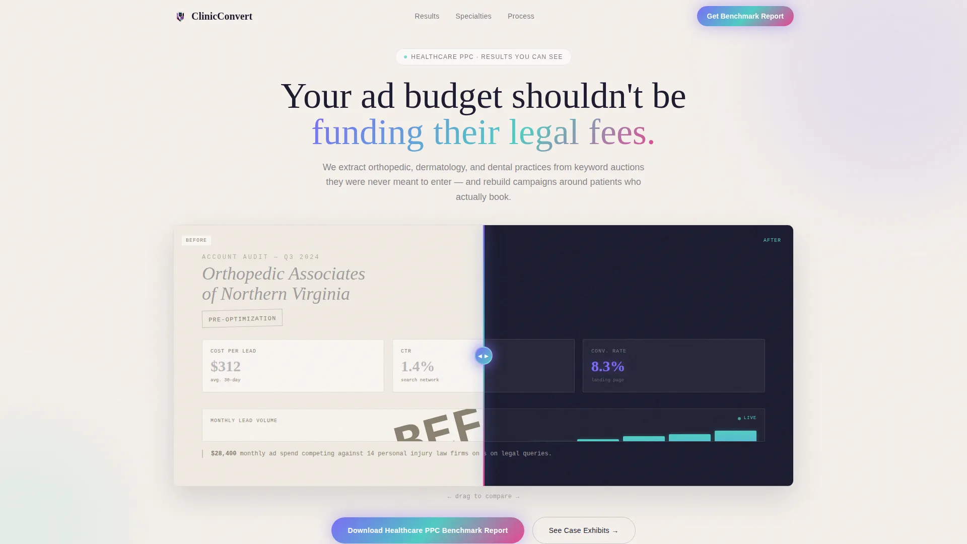
- A Before and After Slider header showing a Google Ads dashboard transformation from a $312 cost-per-lead down to $41, with iridescent user interface on the improved side
- A horizontally scrolling gallery of three framed case exhibits covering cardiology, pediatric dental, and plastic surgery campaigns, each typeset with captions, footnotes, and result callouts
- A dual-conversion closing panel with a benchmark report download form and a persistent sticky audit button for higher-intent visitors
Feature list
This template delivers a focused set of interactive and visual components, each grounded in the brief and built for the healthcare agency context.
Before and After Slider Header
The header splits two Google Ads dashboard views side by side. The left panel is grayed and typewriter-styled, showing a hemorrhaging campaign at $312 cost-per-lead. The right panel glows with iridescent animation at $41 cost-per-lead with tripled click-through rates. A draggable glowing vertical line lets visitors reveal the transformation at their own pace.
Horizontal Gallery Scroll
The page advances laterally through framed case exhibits, giving visitors the deliberate, evidence-reviewing feel of walking through a mounted print gallery. Each panel is a distinct campaign story. Movement is unhurried and accumulates conviction with each exhibit passed.
Typeset Case Exhibit Panels
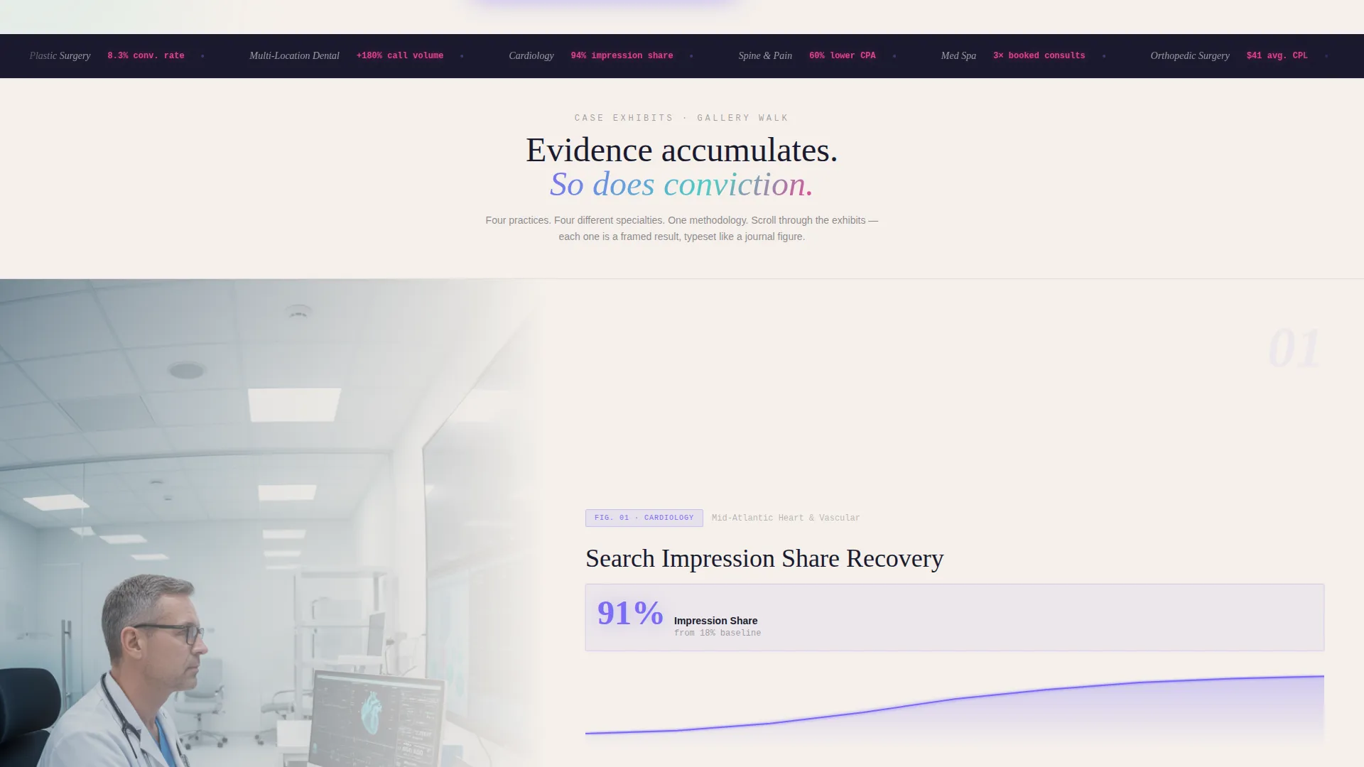
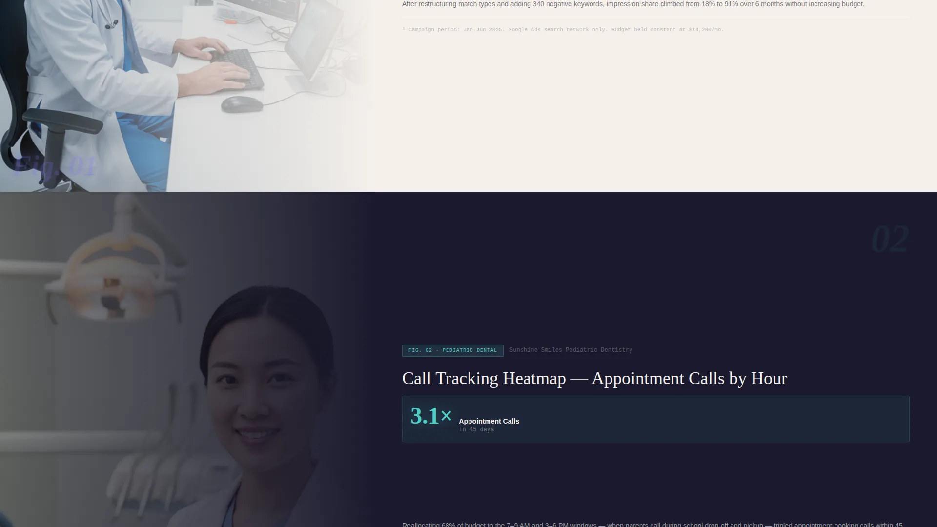
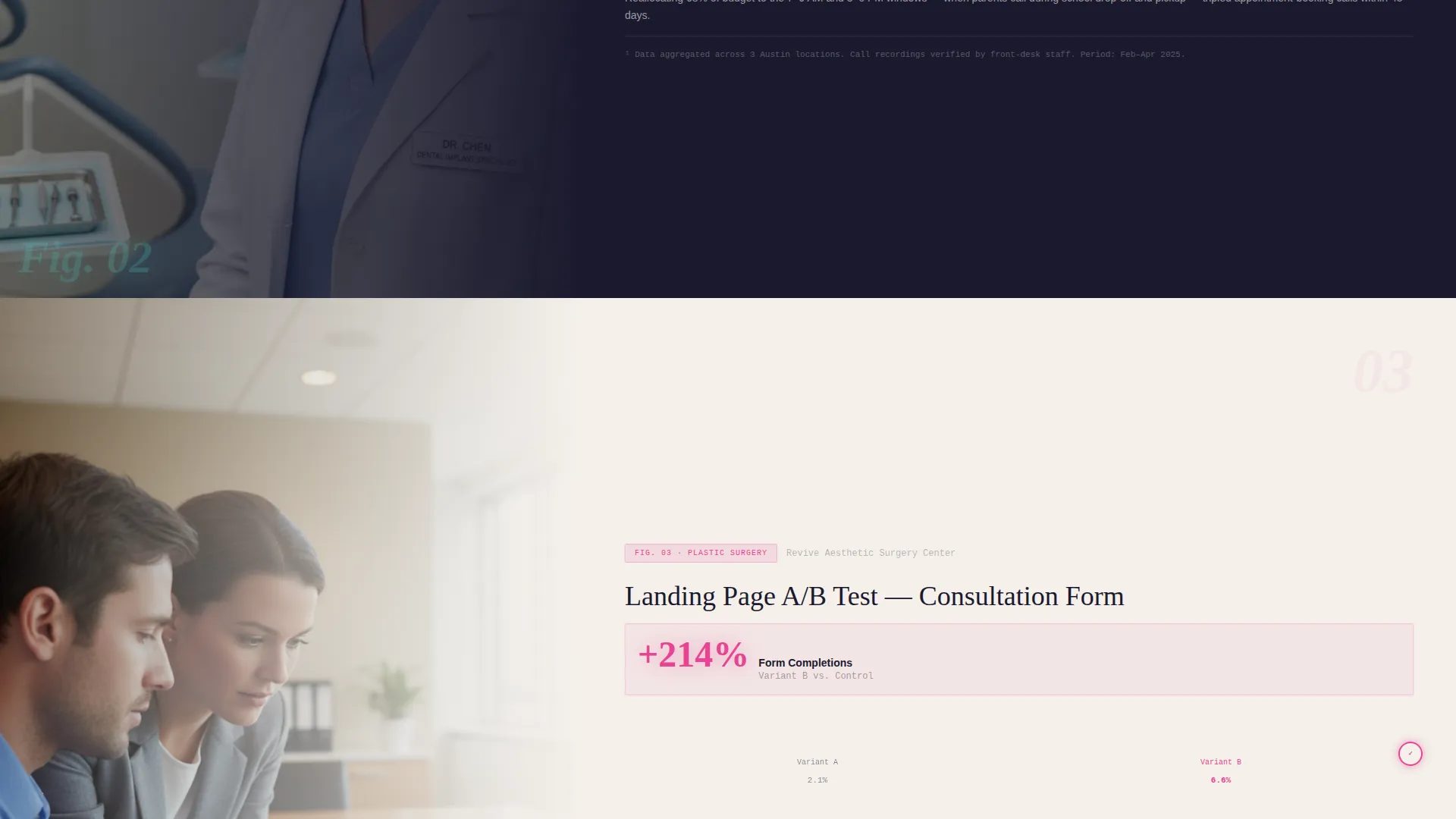
Three gallery panels present real campaign scenarios as journal figures. Panel one shows a cardiology practice's search impression share climbing month over month. Panel two displays a pediatric dental group's call tracking heatmap. Panel three presents a plastic surgery clinic's landing page A/B test result, with the winning variant circled in diagnostic rose.
Dual Conversion Path Layout
The final gallery panel functions as an exhibit exit with two conversion options. A form captures practice specialty, monthly ad spend range, and work email for the benchmark report download. A persistent sticky button in iridescent violet offers a free campaign audit for visitors ready to act immediately.
Ink and Paper Iridescent Design System
The visual identity uses deep manuscript black, warm cotton stock, iridescent violet, holographic teal on hover states, and diagnostic rose for metric accents. Backgrounds alternate between cotton stock and manuscript black. Interactive elements are connected by an iridescent gradient that pulses gently, like a luminous thread stitching the page.
Journal-Style Data Presentation
Every case exhibit is formatted like a figure from a medical journal, complete with caption, footnote, and result callout. The iridescent accents pulse subtly on metric highlights, reminding visitors that this is living data rather than static print.
Page sections overview
| Section | Purpose |
|---|---|
| Before/After Header | Visualize campaign cost-per-lead transformation with a draggable slider |
| Cardiology Exhibit Panel | Show month-over-month search impression share growth for a cardiology practice |
| Pediatric Dental Panel | Present a call tracking heatmap for a pediatric dental group campaign |
| Plastic Surgery Panel | Display an A/B test result with the winning variant highlighted in diagnostic rose |
| Benchmark Report Form | Capture specialty, ad spend range, and email for a content download |
| Sticky Audit Button | Persistent higher-intent conversion path for campaign audit requests |
Design & branding system
The design system pairs the textured warmth of an Ink and Paper theme with a prismatic iridescent color layer. The result feels like a handwritten prescription note caught under a UV light: analog authority meeting algorithmic shimmer.
- Color palette: deep manuscript black (#1A1A2E), warm cotton stock (#F5F0EB), iridescent violet (#7B6CF6), holographic teal (#4ECDC4) for hover states, and diagnostic rose (#E84393) reserved for performance metrics and alert accents
- Typography: typewriter serif used for the grayed "before" dashboard panel, contrasted with clean iridescent user interface type on the improved side, and journal-figure captioning throughout the gallery
- Backgrounds alternate between cotton stock and manuscript black, with text rendered in the opposing tone for high contrast and readability
Mobile & speed optimization
The horizontal scroll template is designed with controlled, deliberate motion. Each panel transition is smooth and purposeful, keeping the experience focused regardless of device.
- Horizontal scroll behavior is designed for pointer and touch input, keeping the gallery walkthrough usable on both desktop and mobile viewports
- The sticky audit button persists throughout the scroll journey, ensuring the secondary conversion path stays accessible without interrupting the exhibit flow
- Lightweight prismatic animation on iridescent accents is applied subtly, so visual interest does not come at the cost of page responsiveness
How this template helps you convert
The conversion architecture of this template is built around evidence accumulation. Visitors do not see a pitch; they walk through proof.
- The Before and After Slider opens the page with an immediate, visceral demonstration of the agency's impact, replacing abstract claims with a draggable cost-per-lead comparison that prospects can control themselves.
- The gallery of three case exhibits builds credibility across three distinct medical specialties, allowing orthopedic, dental, dermatology, and plastic surgery prospects to each find a familiar scenario before reaching the closing form.
- The dual-path exit panel meets visitors at two intent levels: those who want to learn first can download the benchmark report, while those ready to act can tap the persistent sticky button for a free audit, reducing drop-off at the moment of decision.
Other information about this template
This template is categorized under Portfolio and Agency and sits within the Healthcare Marketing and Agency subcategory. It is purpose-built for the healthcare pay-per-click niche, where trust signals and data specificity matter more than volume-based marketing copy.
- The template style is horizontal scroll, which is well suited to sequential evidence presentation and gallery-format storytelling
- The creative direction follows a Gallery Walk model, where each panel is a self-contained exhibit rather than a scrolling section
- The header concept is a Before and After Slider, a format that communicates campaign improvement faster than any written headline
- The landing page direction is Content and Resource, meaning the primary call to action is a benchmark report download rather than a direct sales request
- The color system is AI Iridescent, layered over an Ink and Paper theme to create a visual identity that feels both medically authoritative and technologically modern
- This template suits agencies working with clients such as orthopedic surgeons competing against personal injury lawyers in paid search, dermatology clinics competing against med spas, and multi-location dental groups managing complex campaign structures
Theme
Ink & Paper
Creative direction
Gallery Walk
Color system
AI Iridescent
Style
Horizontal Scroll
Direction
Content/Resource
Page Sections
Draggable Before and After Slider
Horizontal Gallery Scroll Layout
Three Typeset Case Exhibit Panels
Dual-path Conversion Exit Panel
Ink and Paper Iridescent Visual System
Journal-style Data Callouts
Related questions
Who is this landing page template designed for?
What are the two conversion paths included in this template?
Can I replace the case exhibit panels with my own client results?
Why does this template use a horizontal scroll format instead of vertical?
Does this template include the Before and After Slider in the header?



