Hair Accessories Subscription Box Landing Page Template
Clip is a scroll-reveal landing page template built for hair accessories subscription boxes. It showcases three curated subscription tiers through a progressive comparison journey, a pinned upgrade call-to-action, and a warm sunset gradient visual system. Designed for subscription retail brands, it guides visitors from casual browsing to confident tier upgrades using beautiful product reveals and desire-building scroll interactions.
by Rocket studio
Quick summary
Clip is a single-page scroll-reveal template made for hair accessories subscription box brands. It presents three subscription tiers side by side, progressively revealing each tier's contents as the visitor scrolls. A pinned "Upgrade My Box" call-to-action stays visible throughout, nudging visitors toward higher tiers. The warm sunset gradient palette and styled flat-lay header create an unboxing atmosphere that feels personal and curated.
Who this template is for
This template is built for subscription box brands selling curated hair accessories. It works especially well for small-to-mid-sized brands that offer tiered membership plans and want a focused upgrade experience for both new visitors and existing subscribers.
- Subscription box founders launching or refreshing their storefront landing page
- Gift-market brands targeting buyers who want a personal, curated feel without guesswork
- Existing subscription brands running email re-engagement campaigns to prompt tier upgrades
What problem this template solves
Most subscription landing pages treat every tier equally, which makes it hard for visitors to feel the difference between plans. The result is hesitation, not conversion. Clip solves this by making the scroll itself tell the story, each section revealing more product, more desire, and more reason to upgrade.
- Visitors lose interest when tier differences are not shown visually and progressively
- Existing subscribers land on a generic page with no clear path to upgrade their plan
- Gift-buyers feel overwhelmed by options and leave without making a decision
What you get with this template
You get a fully structured, scroll-reveal landing page designed around a three-tier subscription upgrade journey. Every section is purposefully ordered to build desire as the visitor moves down the page.
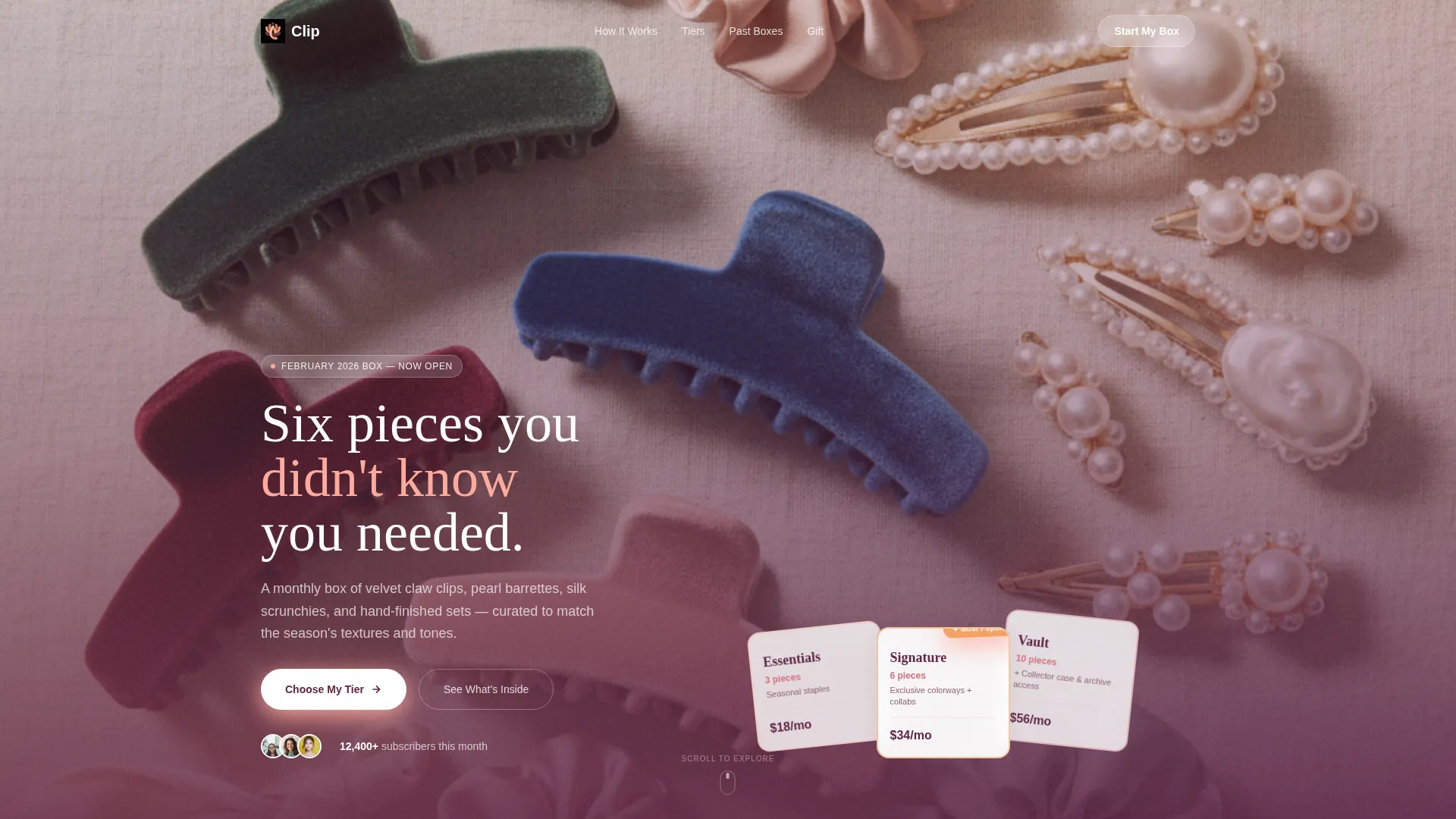
- A styled flat-lay header displaying all three subscription tiers with animated shimmer on the featured tier
- A progressive scroll comparison grid that expands columns from left to right as visitors scroll deeper
- A pinned viewport call-to-action button that updates dynamically to reflect the tier currently in view
Feature list
This template's features are drawn directly from the brief and structured to support a subscription upgrade flow.
Progressive Scroll Reveal Grid
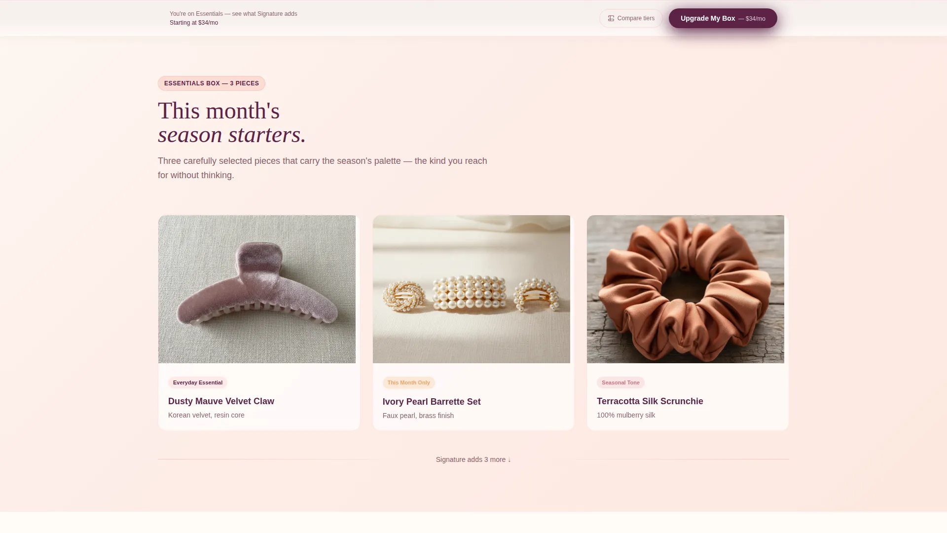
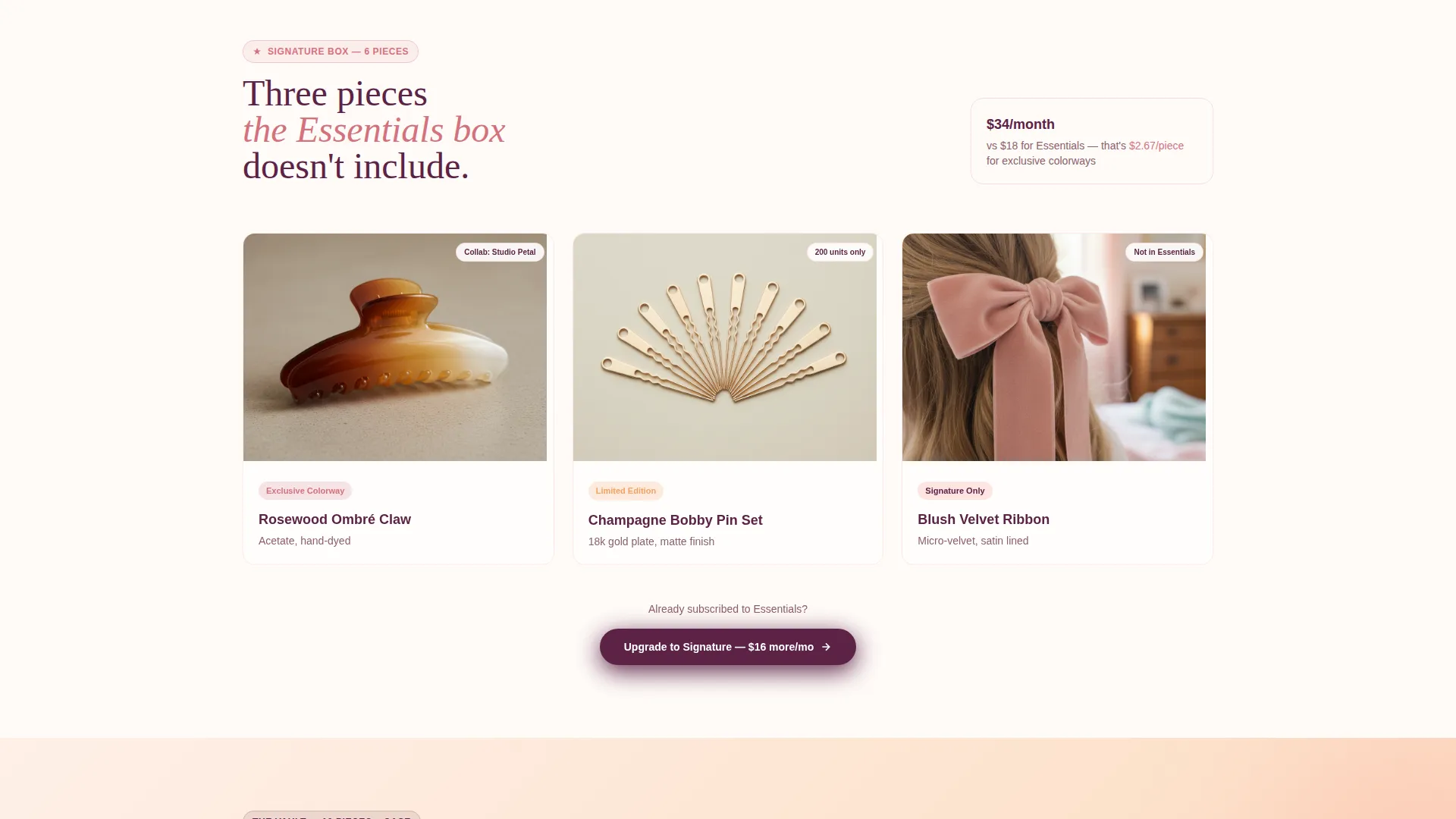
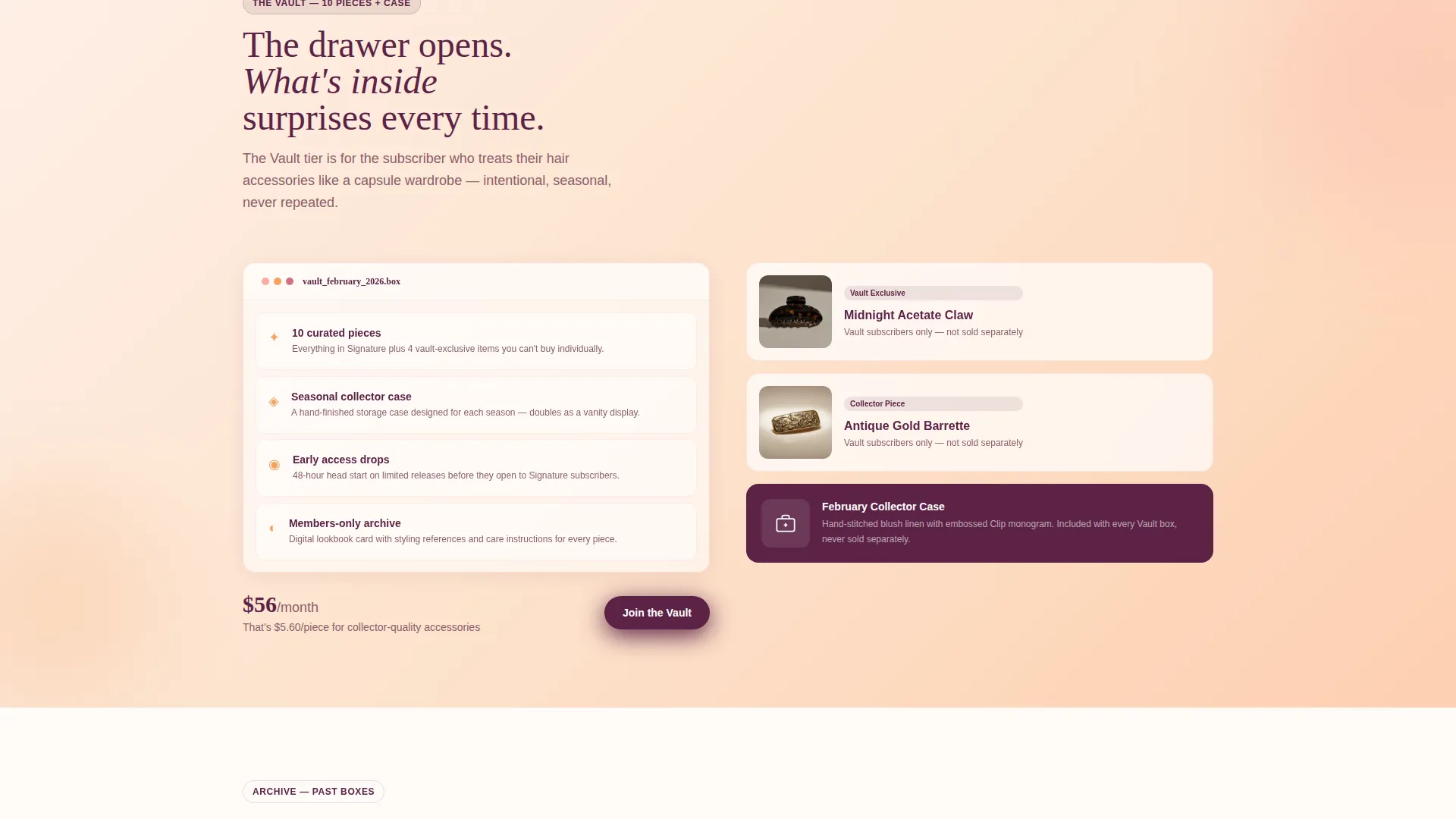
The core of the page is a Comparison Journey grid. It starts narrow with the Essentials tier and expands rightward as the visitor scrolls. New columns slide in to show Signature additions and then Vault exclusives, making each previous tier feel visually incomplete without feeling pushy.
Pinned Upgrade Call-to-Action
A "Upgrade My Box" button sits pinned to the bottom of the viewport throughout the entire scroll. It updates dynamically to reflect whichever tier the visitor is currently viewing. This keeps the upgrade action always one tap away without interrupting the browsing experience.
Tier Pre-Selection for Returning Subscribers
Existing subscribers who arrive from an email link land with their current tier already pre-selected and visually grayed out. This framing means every interaction on the page naturally nudges the visitor one tier upward rather than toward a plan they already hold.
Side-by-Side Tier Comparison Overlay
A secondary toggle opens a sliding overlay that places all three tiers side by side for a direct comparison. Visitors who prefer to evaluate plans analytically before upgrading can use this view instead of relying on the scroll reveal alone.
Past-Box Gallery with Missed-Item Labels
A past-box gallery near the bottom of the page shows sold-out Vault exclusives. Each unavailable piece carries a small "You missed this" label in dusty rose. This creates genuine urgency rooted in real scarcity, not manufactured countdown timers.
Three-Tier Bundle Header Display
The header opens with an overhead flat-lay photograph showing the Essentials, Signature, and Vault boxes fanned open across a linen surface. Tiny price tags sit beside each box, and a thin animated shimmer traces the edge of the Signature box to mark it as the most popular tier.
Page sections overview
| Section | Purpose |
|---|---|
| Header Bundle Display | Introduces all three tiers with flat-lay photography and animated shimmer on the featured box |
| Essentials Tier Grid | Displays this month's Essentials pieces with material callouts |
| Signature Expansion Columns | Slides in new grid columns to reveal exclusive colorways and collaborations |
| Vault Unlock Reveal | Reveals Vault extras including archive pieces, early access, and a styling lookbook card |
| Tier Comparison Overlay | Sliding side-by-side panel for analytical tier evaluation |
| Past-Box Gallery | Shows sold-out Vault exclusives with "You missed this" dusty rose labels |
| Pinned Upgrade call to action | Persistent bottom-viewport button that updates to reflect the active tier |
Design & branding system
The visual identity follows a Sunset Gradient color system built around four warm tones. The palette evokes the last twenty minutes of golden hour hitting a vanity mirror, soft, warm, and flattering without feeling loud.
- Warm peach (#FDAB9E) and golden apricot (#F4A261) wash across section backgrounds as gradient fills
- Deep plum (#5C2346) grounds all primary typography and call-to-action buttons for strong contrast
- Dusty rose (#D4727E) marks interactive hover states, toggle switches, and the "You missed this" label on past-box items
Mobile & speed optimization
The template is structured for a clean scroll experience across screen sizes. The progressive reveal grid and pinned call-to-action are both designed to work within the constraints of a mobile viewport.
- The tier grid reflows vertically on smaller screens so column expansion remains readable without horizontal scrolling
- The pinned "Upgrade My Box" button remains anchored to the bottom of the viewport on both desktop and mobile layouts
- The flat-lay header photograph and overlay panel are sized to load within a single viewport height on standard devices
How this template helps you convert
The page is built around a single, clear business outcome: moving subscribers and new visitors one tier higher. Every design decision supports that goal without relying on aggressive tactics.
- The progressive scroll reveal builds desire organically. Visitors see exactly which pieces they are missing at each tier, making the upgrade feel like a natural next step rather than a sales push.
- The pinned call-to-action removes friction at the moment of decision. When a visitor is ready to upgrade, the button is already visible, so they never need to scroll back up to find the action.
- The past-box gallery closes the loop with real scarcity. Seeing sold-out Vault exclusives labeled "You missed this" gives visitors a concrete, product-level reason to upgrade before the next box ships.
Other information about this template
This template is categorized under Retail and E-Commerce, specifically within the Hair Accessories and Clips Store subcategory. It is suited for the hair accessories and clips dropshipping store niche, where product discovery and tier differentiation are central to the purchase journey.
- The template follows a Marketplace Grid theme with a Card Grid modular structure, making individual product pieces easy to swap or update each month
- The creative direction is a Comparison Journey, a scroll-based format that progressively reveals value rather than presenting all tiers at once on a static pricing table
- The header concept is a styled flat-lay lifestyle shot, consistent with the Marketplace and Multi landing-page direction identified in the matched intersection context
Theme
Marketplace Grid
Creative direction
Comparison Journey
Color system
Cloud Canvas
Style
Card Grid (Modular)
Direction
Marketplace/Multi
Page Sections
Progressive Scroll Reveal Grid
Pinned Upgrade Call-to-action
Returning Subscriber Pre-selection
Side-by-side Comparison Overlay
Past-box Scarcity Gallery
Animated Flat-lay Header Display
Related questions
Who is this landing page template designed for?
Can returning subscribers use this page directly from an email link?
What are the three subscription tiers shown in this template?
Does this page work for gift-buyers, not just subscribers?
What makes this different from a standard subscription pricing page?



