Manufacturing Payroll | Free Website Template | Rocket
Clockin is a manufacturing payroll landing page built for mid-market plant operations. The split-screen layout pairs a shift-change photo with a deep indigo panel, scroll-driven network map, and role-specific social proof. Designed for operations directors, HR managers, and CFOs managing 200 to 2,000 hourly workers across multiple facilities.
by Rocket studio
Quick summary
Clockin is a single-page landing page template built for a manufacturing payroll provider. It uses a cinematic 50/50 split-screen layout, a scroll-driven facility network map, and an amber-accented click-through conversion flow. The page speaks directly to operations directors, HR managers, and CFOs who manage complex hourly payroll across multiple plant locations.
Who this template is for
This template is built for B2B SaaS companies selling payroll or workforce management tools to mid-market manufacturers. It speaks the language of the plant floor without needing a translator.
- Operations directors overseeing 200 to 2,000 hourly workers across multiple facilities
- HR managers handling garnishment orders, multi-state tax filings, and union remittance
- CFOs who need prevailing wage accuracy and audit-ready pay stubs
What problem this template solves
Generic payroll landing pages do not reflect the real complexity of manufacturing operations. Shift differentials, union dues split across multiple locals, and Defense Contract Audit Agency (DCAA) compliance requirements are invisible to most providers. This template makes that complexity visible, so the right buyers immediately recognize the fit.
- Communicates shift differential stacking, multi-state filings, and union remittance in a single scroll
- Replaces form-first conversion with a recognition-driven click-through flow
- Mirrors the visitor's operational scale section by section, building trust before the ask
What you get with this template
The template delivers a complete, desktop-first landing page with high interactivity and a clear narrative arc. Every section is purpose-built for the manufacturing payroll buyer journey.
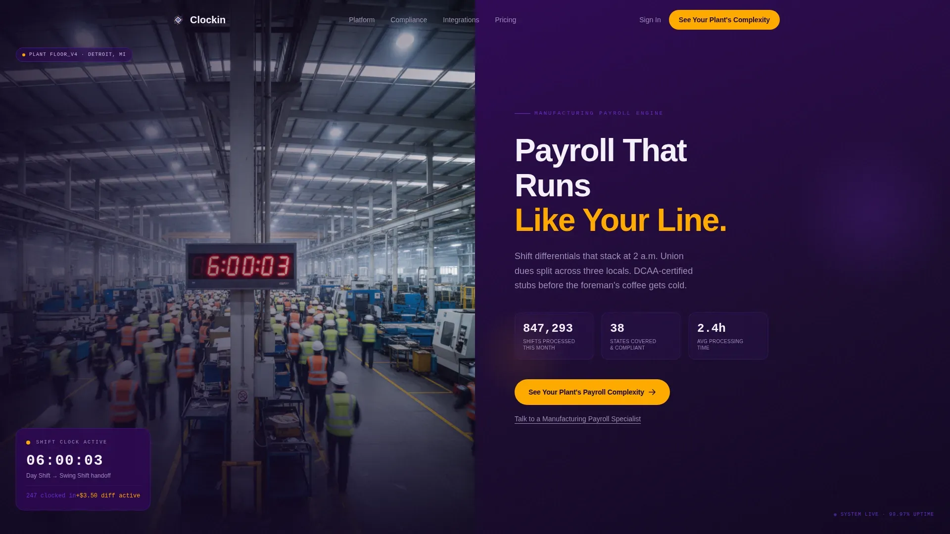
- A cinematic hero section with a 50/50 split, live counters, and a primary amber call to action
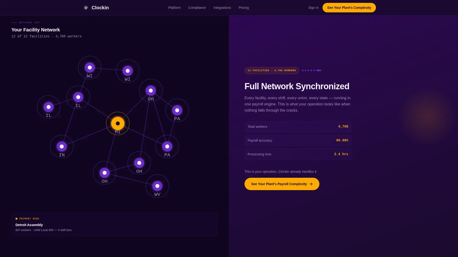
- A scroll-linked network map that accumulates facility nodes and reveals complexity layers as the visitor scrolls
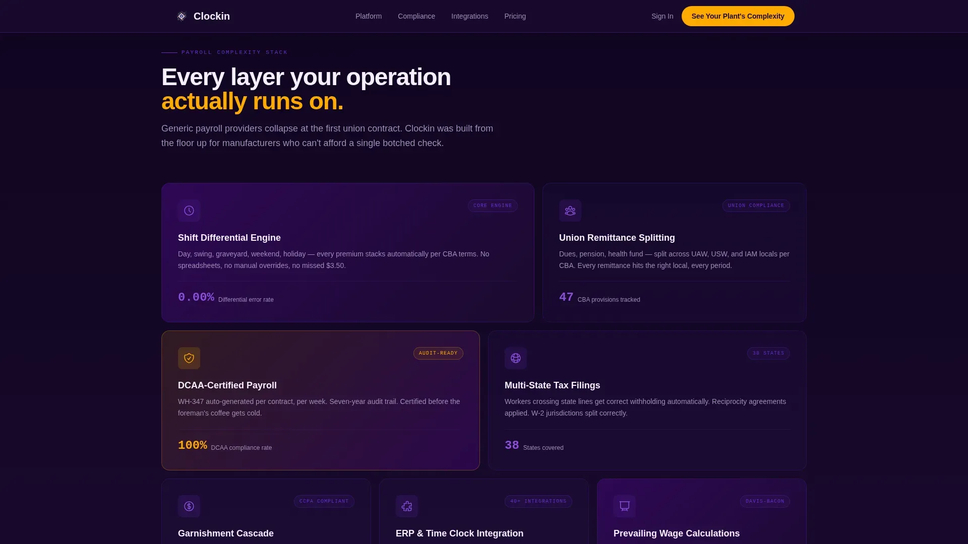
- An asymmetric complexity grid covering shift differentials, union remittance, DCAA compliance, and multi-state tax
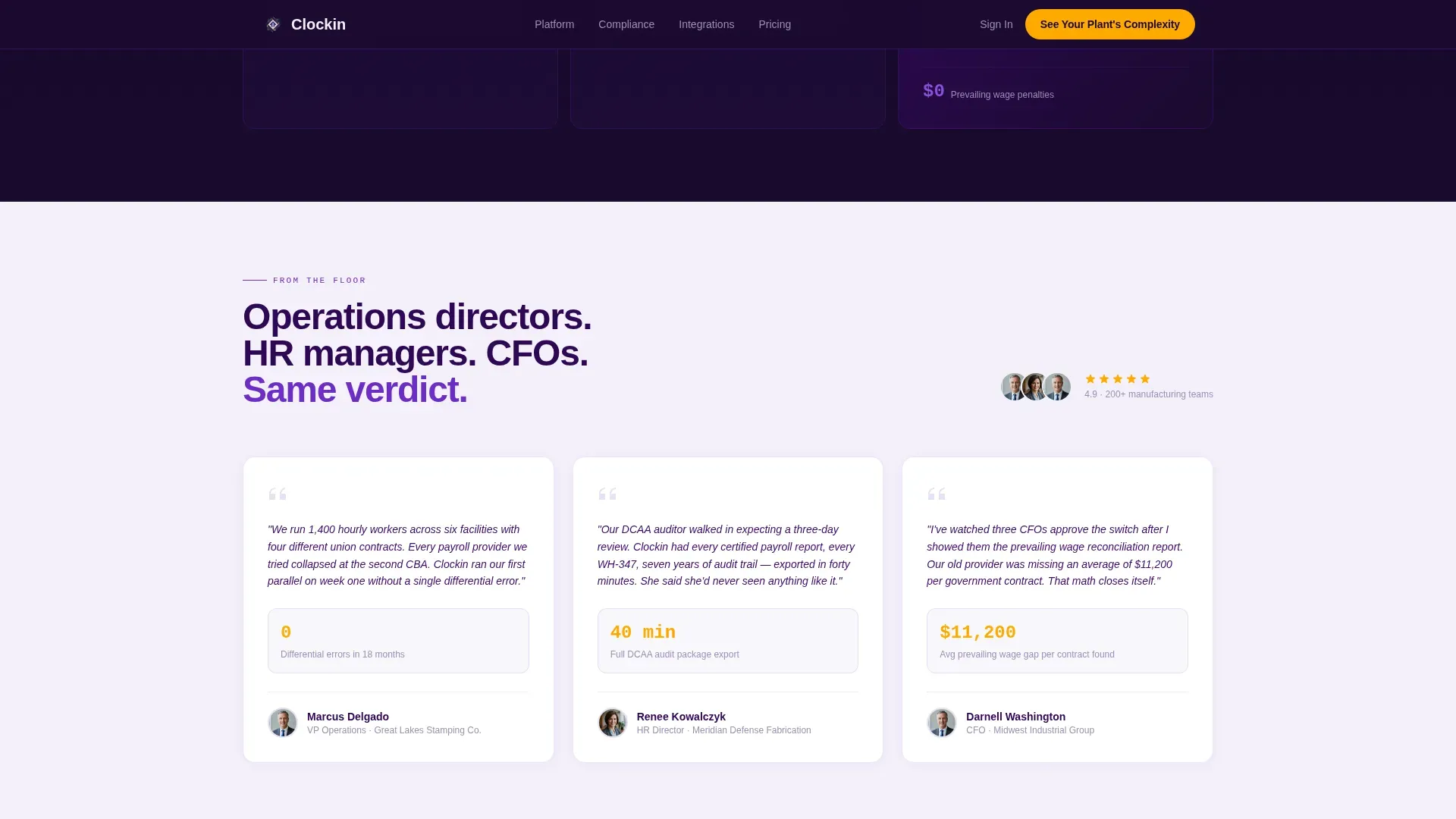
- Role-specific social proof testimonials with concrete operational metrics
- A full-width final conversion panel and a linear single-row footer
Feature list
This template combines visual storytelling, data-forward design, and precision layout to serve a highly specific industrial audience.
Cinematic 50/50 Hero Split
The hero section divides the viewport evenly. The left side holds a high-contrast facility photograph shot at shift change, with motion blur on workers and a tack-sharp clock display reading "06:00:03." The right side is deep indigo with a white headline, three live count-up counters, and a safety-stripe amber call-to-action button.
Scroll-Driven Network Map
As the visitor scrolls, an animated facility network map populates in real time. Each node lights up in voltage purple, and the right panel reveals a new layer of payroll complexity with each addition. The accumulation narrative mirrors the visitor's own multi-facility reality without a word of explanation.
Asymmetric Complexity Bento Grid
An asymmetric grid layout organizes four payroll complexity themes: shift differentials, union remittance splitting, DCAA audit compliance, and multi-state reciprocity. Each cell communicates a distinct operational challenge and positions the product as the direct solution.
Role-Specific Social Proof Panel
Testimonials are segmented by buyer role, including operations directors, HR managers, and CFOs. Each testimonial includes hard numbers such as processing time, error rate reductions, and facilities covered, making the proof concrete and credible.
Click-Through Conversion Flow
There is no form on the landing page. The primary call to action routes to a dedicated assessment page. A secondary text link offers direct access to a specialist. The conversion logic is recognition-first: visitors click because the page has already reflected their reality back to them.
Page sections overview
| Section | Purpose |
|---|---|
| Hero Split Panel | Introduce brand with shift-change photo, live counters, and primary call to action |
| Facility Network Map | Build scale recognition through scroll-driven node accumulation |
| Complexity Bento Grid | Illustrate four core payroll complexity themes in an asymmetric layout |
| Social Proof Testimonials | Deliver role-specific credibility with measurable outcomes |
| Final Conversion Panel | Drive the primary click with a full-width amber-anchored call to action |
| Linear Footer | Close the page with a clean single-row footer pattern |
Design & branding system
The visual identity follows a Directory and Discovery theme powered by an Electric Indigo color system. The palette is precise and intentional, with every color carrying a functional role across the layout.
- Deep shop-floor indigo (#2E0854) anchors headers and navigation; arc-flash white (#F4F0FB) fills content panels
- Voltage purple (#6C2DC7) activates on hover states and interactive elements like network map nodes
- Safety-stripe amber (#FFAA00) is reserved exclusively for calls to action and critical data callouts
Typography pairs DM Sans for body and interface text with JetBrains Mono for numerical data displays. The overall style reads as industrial precision: controlled darkness interrupted only by elements that demand attention.
Mobile & speed optimization
The template is built desktop-first, reflecting the actual usage context of operations directors reviewing payroll on workstations during shift review. The layout still adapts for smaller viewports.
- Server Components handle all static sections, keeping the base page lightweight
- Client Components manage scroll-linked animations, count-up counters, and node pulse effects
- The split-screen layout and network map are designed for full-width desktop viewing first, then scaled down for tablet and mobile
How this template helps you convert
The conversion strategy is built around earned recognition rather than immediate lead capture. Visitors do not encounter a form on the landing page itself.
- The scroll narrative accumulates complexity layer by layer, so each visitor sees their own operational profile mirrored back to them before any ask is made.
- The primary amber call to action, "See Your Plant's Payroll Complexity," appears at the hero and again after the network map reaches full density, giving two natural moments to click without pressure.
- A secondary text link, "Talk to a Manufacturing Payroll Specialist," sits beneath the primary call to action for buyers who are already ready to engage directly.
Other information about this template
This template is designed specifically for the manufacturing HR and industrial payroll niche. It sits at the intersection of operational credibility and B2B sales conversion for mid-market manufacturers in the United States.
- Localization is set for the USA, with USD currency and 12-hour time format throughout
- Animation intensity is high, with scroll-linked network map progression, count-up counters, and node pulse animations all driven by client-side interactivity
- The FAQ accordion is included as an interactive component within the page
- The template style is classified as Split Screen (50/50) under the Directory and Discovery theme
- This template suits manufacturers running operations across multiple states who need a payroll provider that visibly understands their compliance requirements
Theme
Directory & Discovery
Creative direction
Network Effect
Color system
Electric Indigo
Style
Split Screen (50/50)
Direction
Click-Through
Page Sections
Cinematic 50/50 Hero Split
Scroll-driven Facility Network Map
Asymmetric Complexity Bento Grid
Role-specific Social Proof
Click-through Conversion Panel
Related questions
Who is the primary audience for this landing page template?
Does this template include a lead capture form?
What makes the scroll experience different from a standard landing page?
What level of animation does this template use?
Can this template be adapted for payroll providers outside manufacturing?


