Project-Based Time Tracking Landing Page Template
Clockwork is a single-column landing page template built for a lightweight, project-based time tracking tool aimed at freelancers and small studios. It follows a Problem→Solution Arc, opens with a bold photo-split header, and drives freemium sign-ups through a minimal two-field form. The design uses an Electric Indigo palette to create a focused, late-night work atmosphere.
by Rocket studio
Quick summary
Clockwork is a focused landing page template for a project-based time tracking tool. It is built as a single-column scroll with a clear narrative arc. The design feels like a glowing monitor at 11pm, calm, energized, and purposeful. It guides freelancers and small studio owners from recognizing a problem to signing up for a free trial.
Who this template is for
This template speaks directly to the people who lose billable time because tracking it feels like extra work. It is built for small, independent operators who need a fast, honest record of where their hours actually went.
- Solo designers managing multiple client retainers at once
- Two-person development shops who often start the timer late or forget entirely
- Creative directors who need to justify revision hours to clients with hard data
What problem this template solves
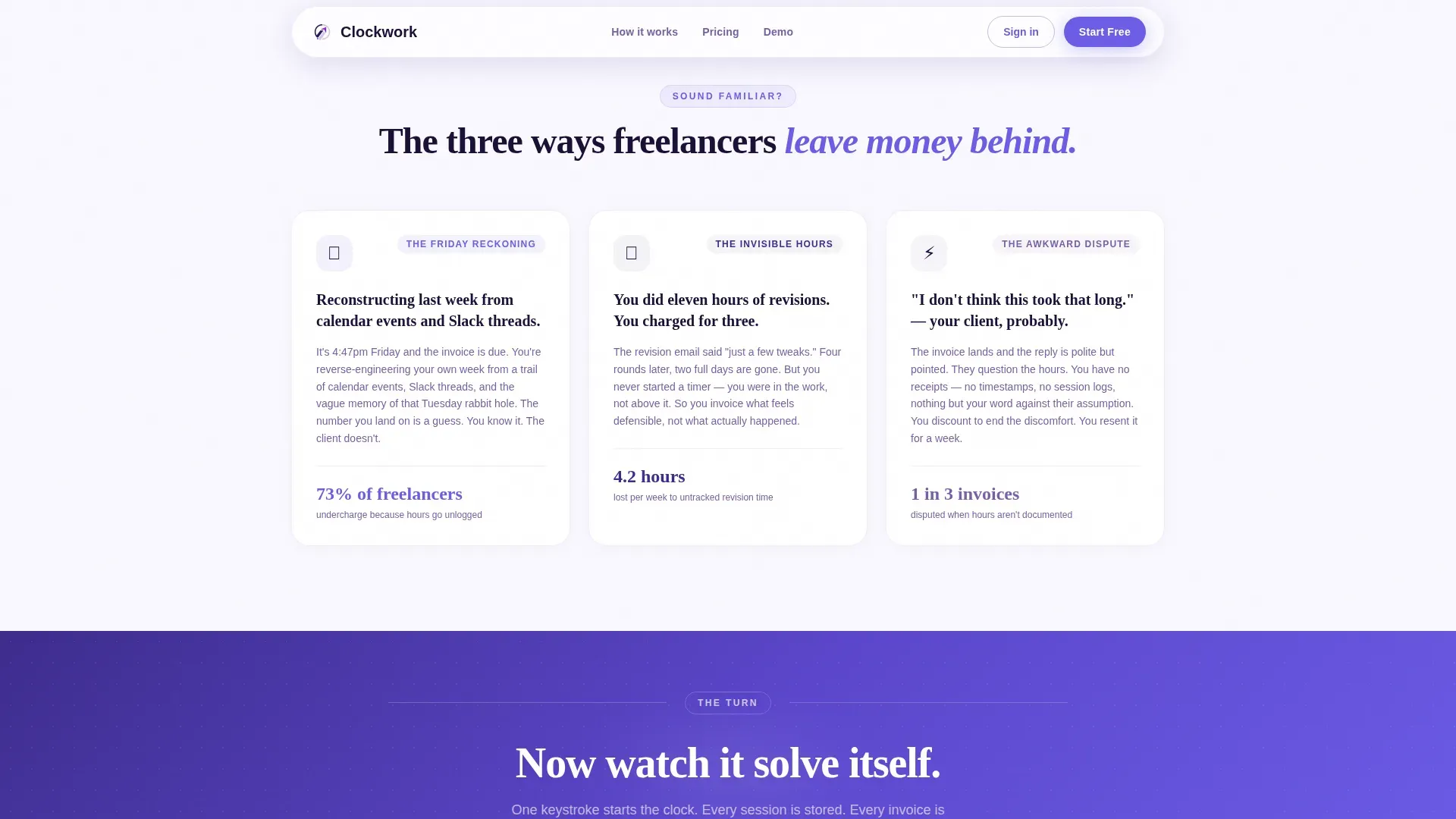
Freelancers and small studio owners regularly undercharge because hours go unlogged. Reconstructing a timesheet from memory on a Friday afternoon is stressful and inaccurate. This template presents a product that solves that specific frustration head-on, in plain language.
- Hours disappear between sessions, leaving invoices that feel like guesses
- Client disputes over billable time become awkward without a clear record
- Generating a professional invoice from scattered notes takes time nobody has
What you get with this template
This template delivers a complete, conversion-ready single-column landing page. Every section is arranged to move a visitor from pain to confidence to sign-up without friction.
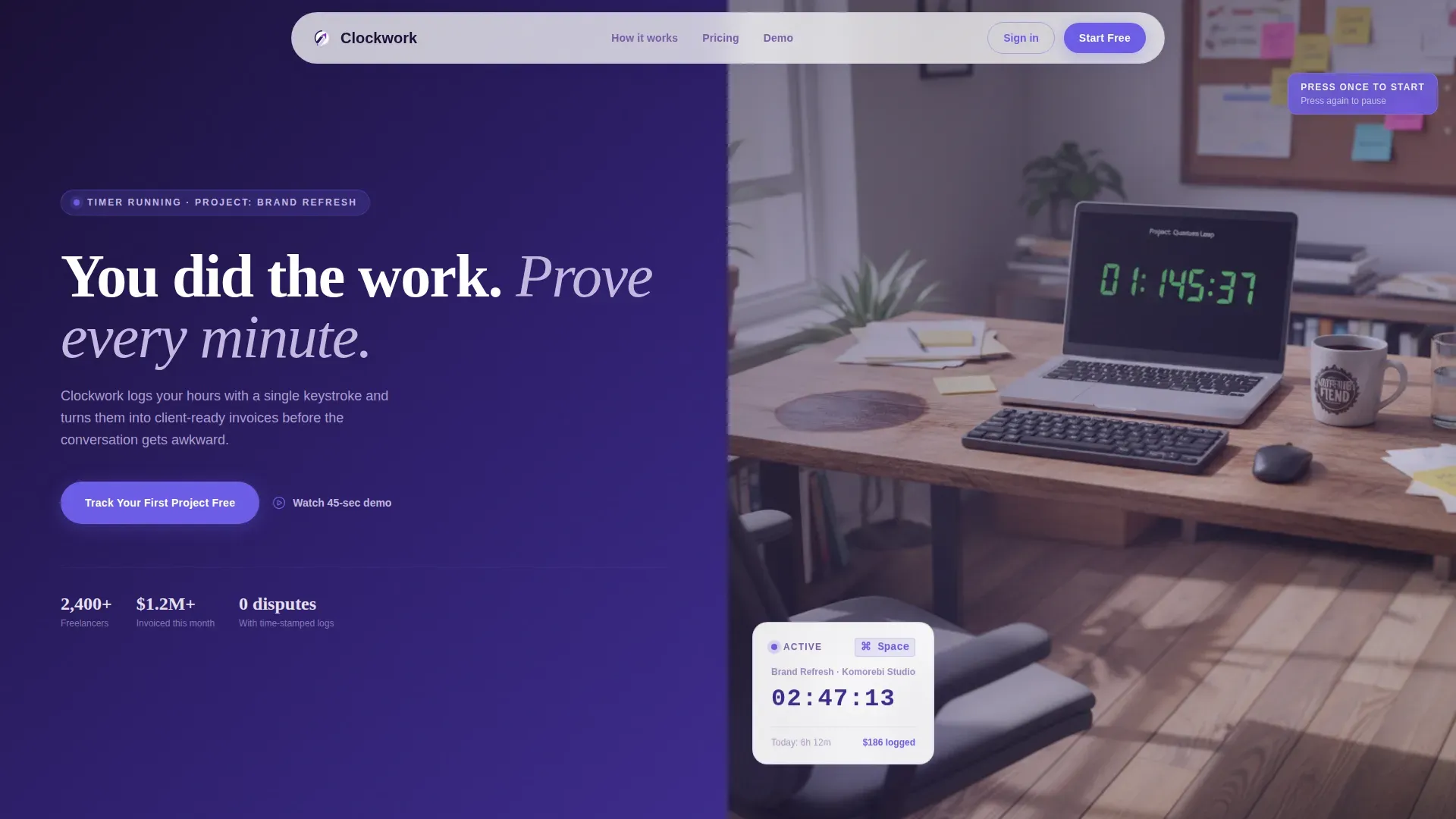
- A cinematic photo-split hero section with a bold indigo headline and primary call to action
- A three-part pain point section with punchy copy and small illustrations, followed by a sequential solution arc
- A social proof section with freelancer testimonials, a 45-second demo video thumbnail, and a minimal two-field sign-up form
Feature list
This template packages every piece a visitor needs to trust the product and commit to trying it. Each feature below reflects a deliberate design or structural choice from the source brief.
Problem-First Narrative Arc
The scroll opens in the visitor's frustration. Three short, illustrated pain-point sections name real problems: reconstructed timesheets, undercharged projects, and unwinnable client disputes. A clear visual dividing line then pivots the page to solutions, creating a rhythm of tension followed by release on every scroll.
Single-Keystroke Timer Demo Section
The solution arc walks through the product step by step. Each section reveals one feature as a direct answer to the problem named above it. A mid-page 45-second demo video thumbnail gives visitors a chance to see the timer in motion before committing to a sign-up.
Client-Ready Invoice Preview
A dedicated section shows the actual invoice output that clients receive. This grounds the product's value in a concrete, visible deliverable rather than an abstract promise.
Freemium Sign-Up Form
The primary call to action asks for only two fields: an email address and a project name. The form appears after the header and repeats after every solution section. Keeping the entry barrier this low means the visitor is mentally inside the product before they click.
Electric Indigo Visual System
The color palette uses deep workspace indigo, bright signal violet, soft interface lavender, and a sharp electric accent for buttons and active highlights. Typography pairs Plus Jakarta Sans for body text with Fraunces display serif for headlines, reinforcing the focused, late-night work atmosphere.
GSAP ScrollTrigger Animations
The template is built with high-animation intent. Stagger reveals, scroll-linked transitions, and magnetic call-to-action buttons create a dynamic but controlled reading experience that rewards continued scrolling.
Page sections overview
| Section | Purpose |
|---|---|
| Hero photo split | Introduce the product with a bold headline and primary call to action |
| Pain point trio | Name three specific frustrations with punchy copy and illustrations |
| Solution pivot line | Mark the narrative turn from problem to product walkthrough |
| Sequential feature reveals | Show each product feature as a direct answer to the pain above it |
| Invoice output display | Present the client-ready invoice the product generates |
| Demo video thumbnail | Offer a 45-second preview for visitors who need to see it move |
| Social proof section | Share freelancer testimonials with specific, outcome-based results |
| Final sign-up form | Close with the two-field email form and a repeated call to action |
| Linear footer row | Provide a clean, single-row footer with essential links |
Design & branding system
The visual identity follows an Educational Guide theme. The palette is built around the feeling of a focused monitor late at night: energized, calm, and deeply concentrated.
- Colors: deep workspace indigo (#3D2C8D) as the primary base, bright signal violet (#7B5EA7) for secondary elements, soft interface lavender (#E8E0F0) for light surfaces, and sharp electric accent (#6C5CE7) reserved for buttons, active timers, and inline highlights
- Typography: Plus Jakarta Sans handles all body and interface text for clarity; Fraunces display serif carries the oversized headlines for warmth and authority
- Layout: single-column flow with high-contrast section breaks, scroll-linked stagger reveals via GSAP ScrollTrigger, and magnetic call-to-action buttons
Mobile & speed optimization
The template is built desktop-first, reflecting the primary use case of freelancers billing clients from a workstation. The layout adapts for smaller screens without losing the narrative structure.
- Desktop-first column flow keeps the photo-split header and sequential reveal sections readable at larger breakpoints first
- Server Components handle all static content sections, while Client Components are reserved for animations and the interactive timer demo
- The single-column structure ensures a clean reading path on any screen size without horizontal scrolling or layout collapse
How this template helps you convert
Every structural decision in this template is aimed at reducing hesitation and increasing sign-ups. The page earns trust before asking for anything.
- The two-field sign-up form (email plus project name) removes commitment anxiety. A visitor types their first project name and feels like they have already started using the product before clicking submit.
- The Problem→Solution Arc mirrors how the target visitor already thinks. Seeing their exact frustration named on screen builds immediate credibility, making the solution sections feel earned rather than promotional.
- Repeating the primary call to action after every solution section means a visitor who is ready to act never has to scroll back up to find the form.
Other information about this template
This template was designed around a specific intersection of the productivity tools and freelance services space. A few additional details are worth noting for anyone evaluating it.
- The localization is set for English, United States dollar (USD) formatting, and MM/DD/YYYY date display
- Social proof blocks are designed to carry specific, outcome-based testimonials such as hours recovered or client disputes resolved rather than generic praise
- The footer follows a linear single-row pattern, keeping the bottom of the page clean and uncluttered
- The template sits within the HR and Hiring category under the Time and Attendance subcategory, making it relevant for tools positioned in the project-based time tracking niche


Theme
Educational Guide
Creative direction
Problem→Solution Arc
Color system
Electric Indigo
Style
Single Column Flow
Direction
Freemium/Trial
Page Sections
Problem-first Narrative Arc
Sequential Solution Reveal Sections
Client-ready Invoice Preview
Minimal Two-field Sign-up Form
Second Demo Video Thumbnail
GSAP Scrolltrigger Animation System
Related questions
Who is this landing page template designed for?
What does the sign-up form collect?
Can I customize the color palette and typography?
Does the template include the demo video or testimonials?
Is this template suitable for a desktop-first audience?


