St. Patrick's Day Business Professional Website Template
Clover is a masonry-style landing page template built for a letterpress-and-foil St. Patrick's Day stationery shop. It guides visitors through a curated card discovery experience using relationship-based categories, a three-question quiz flow, and a price-anchored hero. The warm parchment and deep clover green palette gives every section the quiet elegance of a well-kept stationery drawer.
by Rocket studio
Quick summary
Clover is a single-page stationery landing page template designed for St. Patrick's Day card shops. It combines a masonry discovery grid, a guided card-finder quiz, and a price-anchored hero to move visitors from browsing to buying. The visual tone is ink-soft and deliberate, built for shoppers who value a handwritten note over a last-minute text.
Who this template is for
This template suits independent stationery makers and seasonal card shops selling St. Patrick's Day greeting cards online. It works especially well for businesses offering tiered price points, premium foil or letterpress finishes, and curated gift-ready packaging.
- Stationery shops selling single cards, curated boxes, and premium foil collections
- Small retailers targeting both personal buyers and bulk office orders
- Irish or Irish-American brands shipping cards domestically and internationally
What problem this template solves
Stationery shoppers often feel overwhelmed by large product grids. They want help choosing the right card quickly, not scrolling through hundreds of options. This template replaces that frustration with a structured discovery path built around relationships and tone.
- Visitors can find the right card by recipient rather than hunting by price or product code
- The quiz flow removes decision fatigue in three simple questions
- Relationship-based categories make the shop feel personal, not transactional
What you get with this template
The template delivers a fully composed single-page layout designed to match the look and feel of a curated stationery shop. Every section works together to guide a visitor from first glance to basket without friction.
- A price-anchored hero section with three visible price points and a clear subheadline
- A masonry card grid organized by recipient relationship with hover-flip tile interactions
- A three-question quiz flow that returns five matched card recommendations with "Add to Basket" buttons
Feature list
This template includes a set of purposefully designed layout components. Each one serves a specific role in the discovery and purchase journey.
Price-Anchored Hero Section
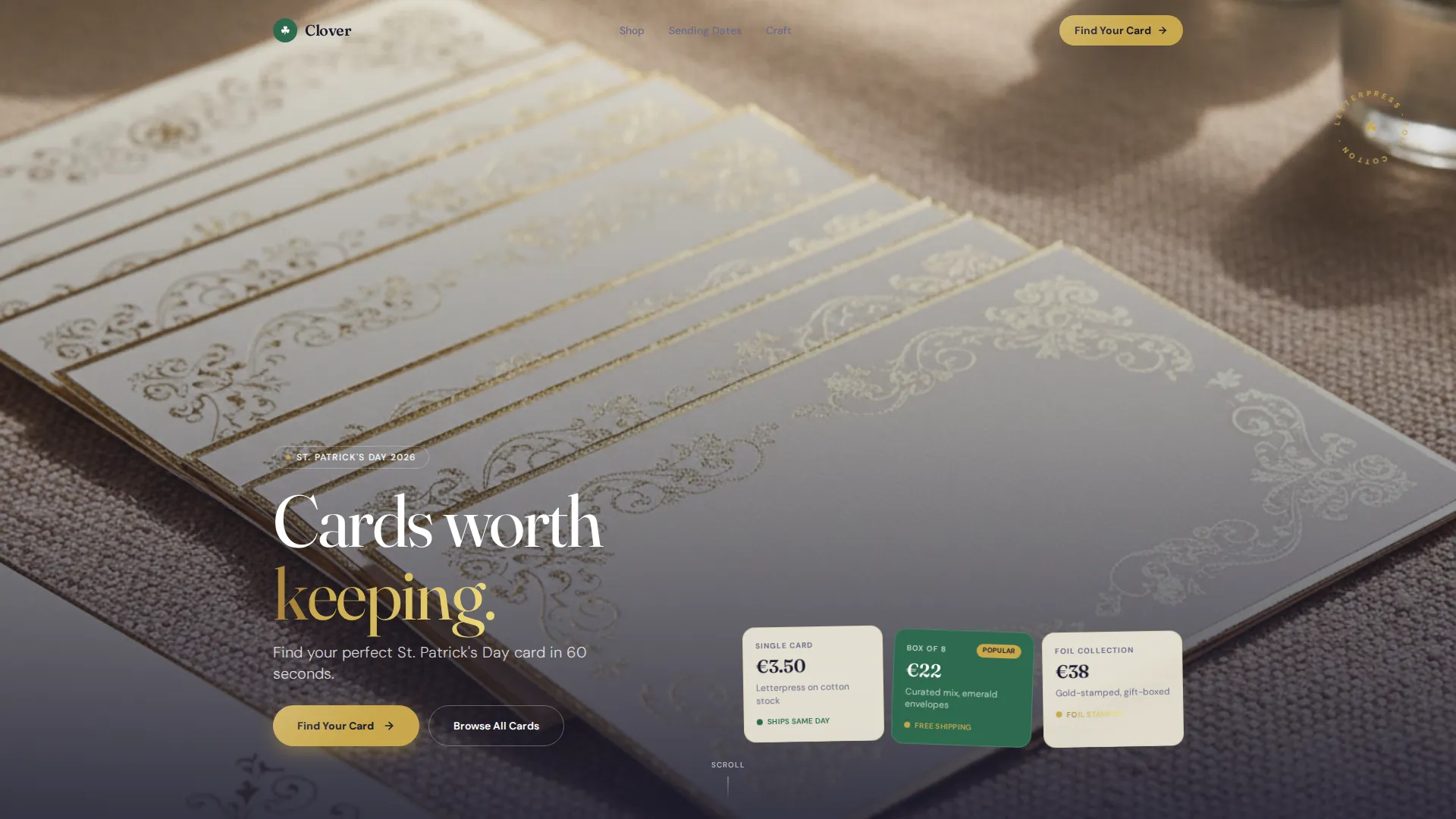
The hero displays three cards fanned on a linen surface at €3.50, €22, and €38. Prices are typeset in the same serif used on the physical cards. A subheadline reads "Find your perfect St. Patrick's Day card in 60 seconds," setting a clear expectation from the first scroll.
Relationship-Based Masonry Grid
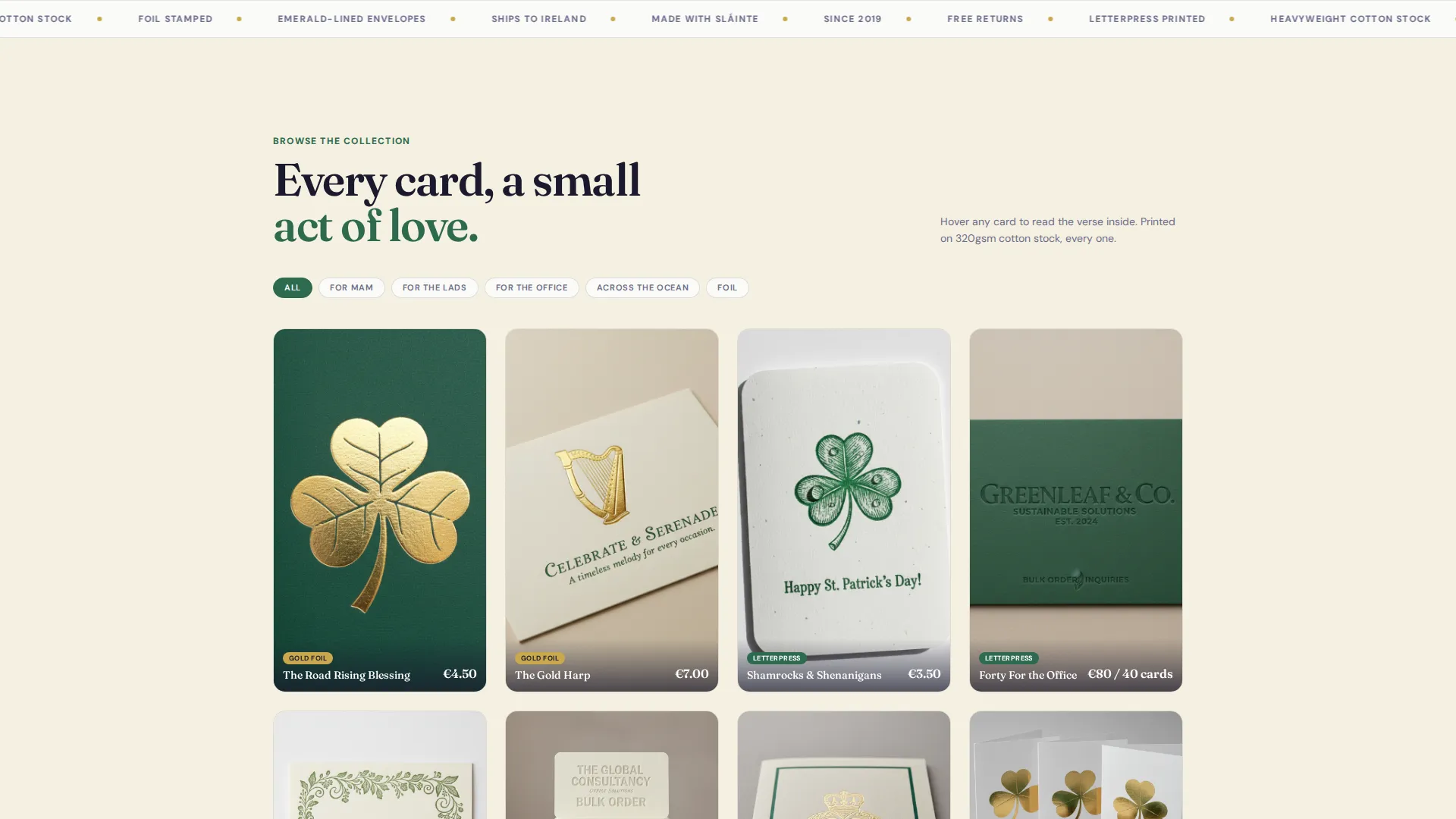
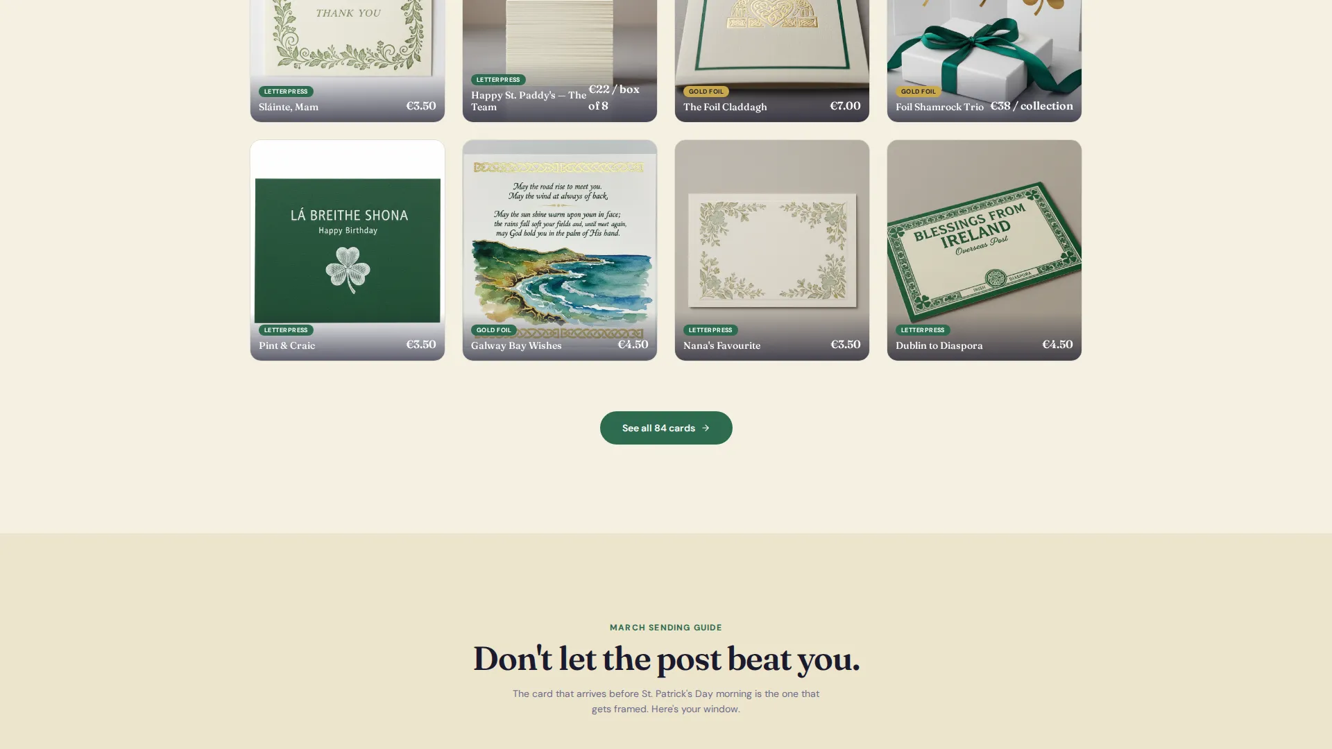
Cards are grouped by recipient rather than price: For Mam, For the Lads, For the Office, and For Across the Ocean. Each masonry tile flips on hover to reveal the interior verse. This turns browsing into a personal discovery moment rather than a product catalogue scan.
Three-Question Card-Finder Quiz
The primary call to action launches a guided quiz. Visitors answer who the card is for, what tone they want (heartfelt, funny, traditional, or cheeky), and whether they prefer foil or letterpress. The quiz returns a curated grid of five matched cards, each with an "Add to Basket" button.
Seasonal Scroll Narrative
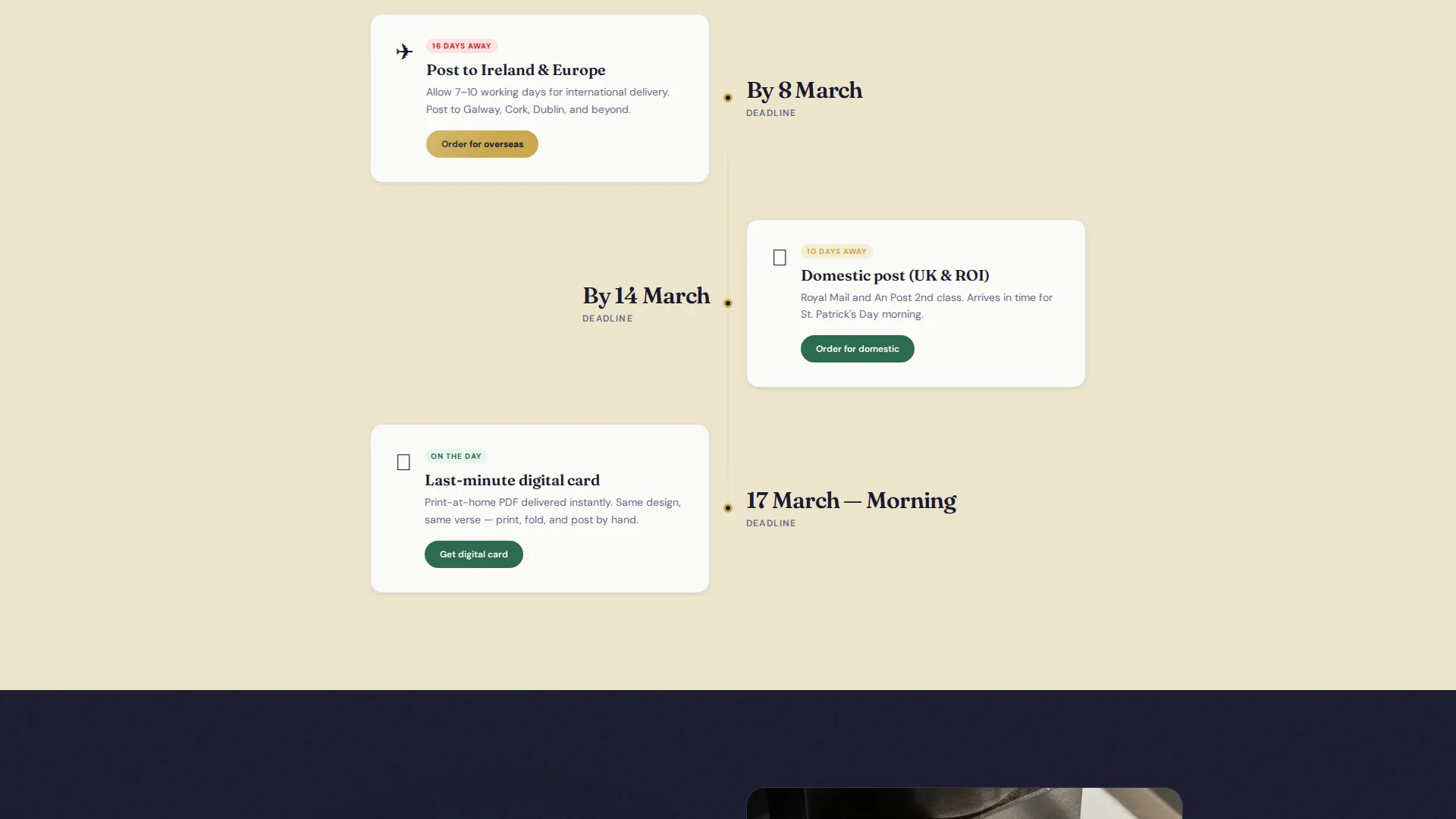
The page walks visitors through the calendar of sending. Early March content highlights overseas post timelines. Mid-March content covers domestic delivery. St. Patrick's Day morning features the last-minute digital option. This structure keeps the page feeling timely and urgent without a countdown clock.
Tag-Based Grid Filter Path
Visitors who prefer to skip the quiz can browse the masonry grid directly using category tags. Tags are styled in deep clover green on hover, letting self-directed shoppers filter quickly without losing the curated feel of the page.
Foil-Stamp Accent System
Metallic gold (#C9A84C) is reserved for foil-stamp visual accents and the primary call-to-action button. This deliberate restraint gives the gold detail real visual weight every time it appears, echoing the premium foil finish on the physical cards themselves.
Page sections overview
| Section | Purpose |
|---|---|
| Hero Price Frame | Anchors value with three visible price points and a clear subheadline |
| Card-Finder Quiz | Guides visitors through three questions to five matched card results |
| For Mam Grid | Curates cards suited for a mother or grandmother recipient |
| For the Lads | Groups cards with a funny or cheeky tone for friends |
| For the Office | Displays bulk-friendly identical card options for workplace orders |
| For Across Ocean | Highlights early-post options for international shipping timelines |
| Seasonal Send Guide | Walks visitors through March posting windows by destination |
| Tag Filter Bar | Lets browsers skip the quiz and filter the full masonry grid |
Design & branding system
The visual identity follows a Directory and Discovery theme built on an Ink and Paper color palette. Every design choice feels like it belongs on a stationer's workbench: paper-soft backgrounds, precise ink-dark text, and one precious metallic detail that earns its place.
- Warm parchment (#F5F0E1) as the page background, fountain-pen black (#1A1A2E) for body text and card borders
- Deep clover green (#2D6A4F) on hover states and category tags, metallic gold (#C9A84C) for foil accents and the call-to-action button
- Serif typography used consistently across card prices, headings, and interior verse reveals to unify the physical and digital experience
Mobile & speed optimization
The masonry grid and quiz flow are designed to reflow cleanly on smaller screens. Tile interactions and category filters remain usable on touch devices without requiring a redesign of the layout.
- Masonry columns adjust for mobile viewports so card tiles stay readable and tappable
- The three-question quiz presents one question at a time, keeping the flow clear on narrow screens
- Price points and the call-to-action button stay prominent above the fold on both desktop and mobile layouts
How this template helps you convert
The template is built around reducing hesitation and shortening the path from interest to purchase. Every structural choice serves that goal.
- The price-anchored hero sets three clear entry points before a visitor scrolls, removing price uncertainty early and letting shoppers self-select the right tier.
- The card-finder quiz replaces an overwhelming grid with a personal curation experience, returning only five matched results so the decision feels manageable rather than exhausting.
Other information about this template
This template is part of a broader Retail and E-Commerce template family designed for seasonal businesses. It is particularly well-suited to St. Patrick's Day product pages that need to balance gift-browse discovery with time-sensitive purchase urgency.
- The Overlap and Layered template style allows card tiles and quiz panels to feel visually stacked, echoing the physical act of leafing through a box of cards
- The Directory and Discovery theme means the page rewards slow browsing as much as it rewards the visitor in a hurry
- The Seasonal and Moment creative direction makes the page feel timely in early March and urgent by the seventeenth, without requiring a live countdown element
Theme
Directory & Discovery
Creative direction
Seasonal/Moment
Color system
Sunset Gradient
Style
Overlap/Layered
Direction
Direct Sales
Page Sections
Price-anchored Hero with Three Tiers
Relationship-based Masonry Card Grid
Three-question Card-finder Quiz
Seasonal Scroll Send Timeline
Tag-based Grid Filter Path
Foil-accent Gold Call-to-action System
Related questions
Can I use this template for products beyond St. Patrick's Day cards?
How does the card-finder quiz work on the page?
Can the template handle both single-card and bulk order buyers?
What does the hover-flip interaction show on each card tile?
Is the masonry grid suitable for a large product range?



