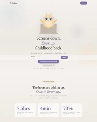
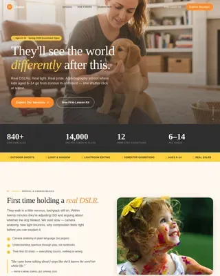
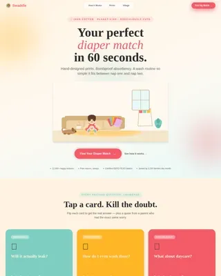
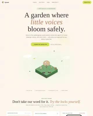
School Age (5-10) Products & Reviews Website Template
Clubhouse is a warm, hand-crafted landing page template for a school-age social community serving kids aged five to ten. Built on a masonry layout with a Pinterest-style corkboard feel, it guides cautious parents from curiosity to a free trial click through illustrated vignettes, parent testimonials, and a trust-building scroll narrative rooted in safety and joy.
by Rocket studio
Quick summary
Clubhouse is a single-page landing page template for a children's social community targeting kids aged five to ten. It uses a Gallery Walk masonry layout, a Lottie village animation header, and a warm artisan visual style to earn parent trust before directing them to a free trial signup flow.
Who this template is for
This template is built for founders, product teams, and indie developers launching a children's social platform or community app. It speaks directly to parent-first acquisition, where trust comes before the click.
- Parents of school-age children who need to feel safe before signing up, including homeschool families and military families rebuilding social circles
- Creators of screen-time-conscious products for kids aged five to ten who want a warm, story-led presentation
- Educators and child development advocates promoting peer-connection tools in a non-alarming, visually inviting format
What problem this template solves
Most digital product landing pages lead with features. Parents of young children lead with worry. This template flips that order, building emotional trust before asking for any commitment.
- Generic app landing pages feel cold and corporate, which is exactly what cautious parents distrust
- Safety messaging often arrives too late in the scroll, after a parent has already left
- There is no obvious path for skeptical visitors to learn more before they commit, which kills conversions from high-intent but cautious audiences
What you get with this template
You get a fully structured, single-page landing page that walks parents through community life, safety assurances, and social proof before surfacing any signup prompt.
- A Lottie or vector header animation showing a hand-drawn village assembling plank by plank, complete with a paper airplane loop and crayon-style illustrated children
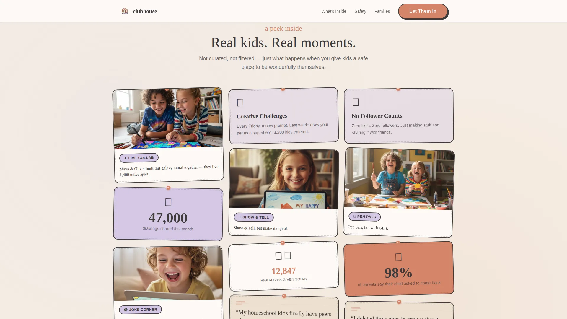
- A masonry Gallery Walk section built like a corkboard, with tilted community vignette cards that shift from "what it looks like" to "what it feels like" to "how we keep them safe"
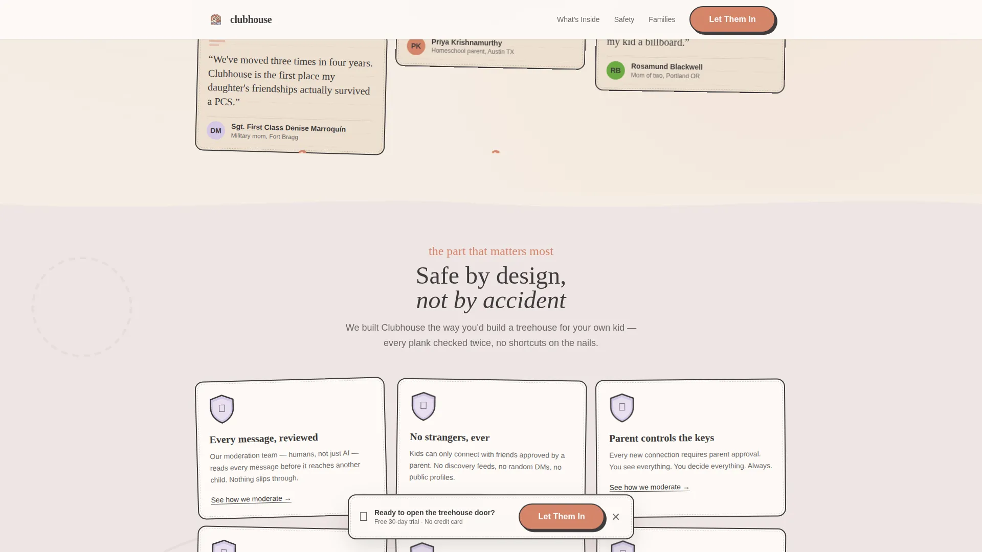
- Two conversion paths: a primary terracotta "Let Them In" call-to-action button and a secondary "See How We Moderate" charcoal text link routing cautious parents to a dedicated trust page
Feature list
This template includes a set of purpose-built components designed specifically for a parent-facing children's community landing page.
Lottie Village Header Animation
A hand-drawn village scene assembles itself as the page loads. A wobbly treehouse rises plank by plank, a paper airplane loops across the sky trailing a dotted line, and three crayon-style children wave from windows that light up one by one. The line work is intentionally imperfect, giving the header a warm sketchbook quality.
Masonry Corkboard Gallery
Cards of varying heights and widths are tilted one or two degrees, as though pinned to a real corkboard. The layout uses GSAP scroll triggers to reveal vignettes in sequence, shifting the narrative from community life to emotional warmth to safety features as the visitor scrolls deeper.
Dual Call-to-Action Architecture
The primary "Let Them In" button appears in terracotta beneath the hero animation, then resurfaces pinned to a floating illustrated banner after the third row of cards. A secondary text link, "See How We Moderate," lives inside the safety vignette cards for visitors who need more reassurance before committing.
Illustrated Safety Vignette Cards
Safety features are explained inside illustrated shield-shaped card graphics rather than bullet-point disclaimers. This keeps the visual tone consistent and positions safety as a design value rather than a legal footnote.
Handwritten Testimonial Cards
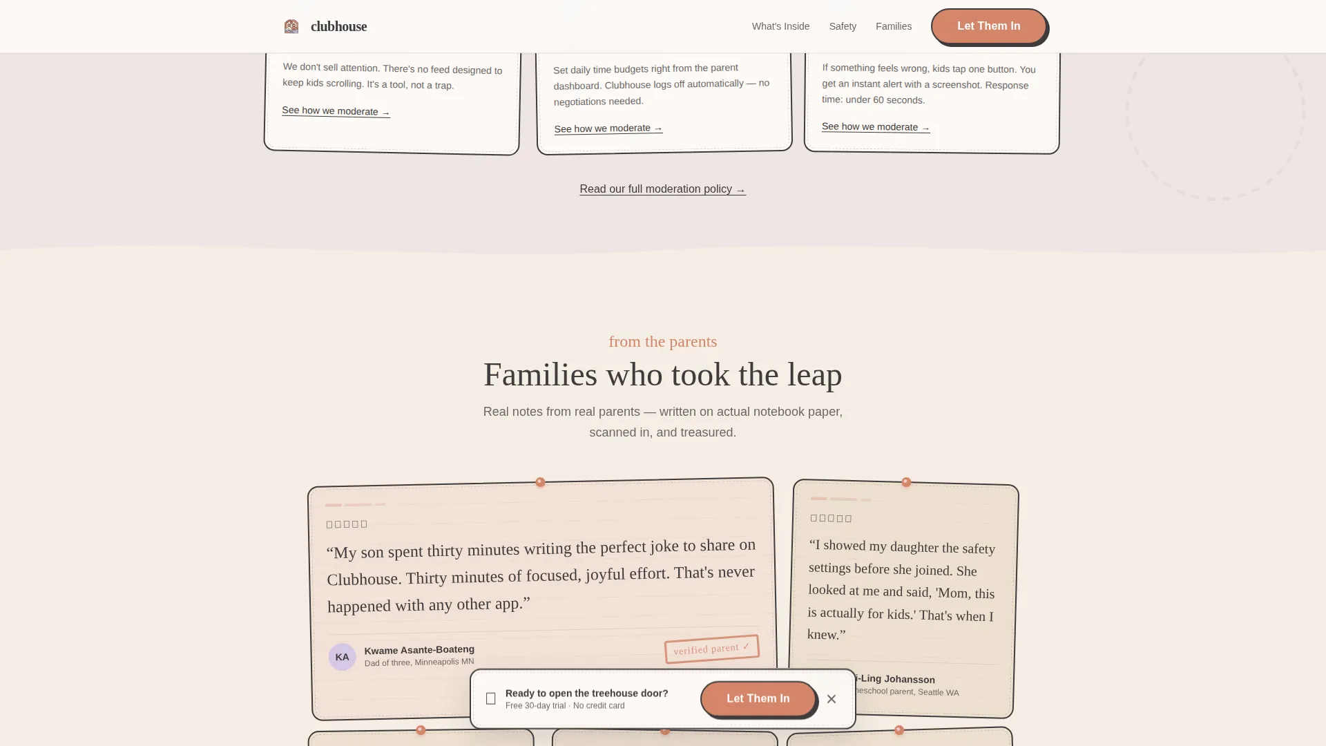
Parent testimonials appear on torn notebook graphics with a handwritten-style visual treatment. This matches the construction-paper aesthetic and gives social proof a tactile, human quality rather than the feel of a polished review widget.
Floating Illustrated call to action Banner
A persistent illustrated banner pins to the viewport after the third masonry row, keeping the primary call to action visible without interrupting the scroll narrative. The banner uses the terracotta accent color to stay visually prominent against the cream background.
Page sections overview
| Section | Purpose |
|---|---|
| Hero Animation Header | Assembles hand-drawn village scene on load with headline and primary call-to-action button |
| Gallery Walk Masonry | Corkboard vignette cards shift narrative from community life to emotional warmth to safety |
| Safety Vignette Cards | Illustrated shield cards explain moderation features with secondary trust-page link |
| Parent Testimonials | Torn notebook testimonial graphics build social proof in an on-brand tactile style |
| Floating call to action Banner | Persistent illustrated banner resurfaces primary call-to-action after third card row |
| Minimal Footer | Horizontal footer pattern keeps the page clean without distracting from conversion |
Design & branding system
The template follows a Warm Artisan theme using the Soft Mist color system. Every visual choice references handmade materials: watercolor washes, construction paper tears, pencil-sketch borders, and hand-stamped ink textures.
- Color palette: oat milk cream (#F5EDE3) dominates backgrounds, morning fog lilac (#D5C8E6) washes over cards and dividers, pencil-sketch charcoal (#3E3B3C) handles all body text and thin illustrated borders, and hand-stamped terracotta (#D4856A) is reserved strictly for buttons, badges, and hover states
- Typography pairing: Fraunces handles headings with a rounded, slightly bouncy character; DM Sans provides clean, readable body text; a handwritten accent font adds artisan warmth to labels and callouts
- Visual style: no stock photography anywhere; every element feels drawn, stamped, or torn from colored paper, keeping the aesthetic consistent from hero to footer
Mobile & speed optimization
The template is built mobile-first, recognizing that most parents will encounter this page while browsing on a phone in the evening. Layout, animation, and interaction decisions all prioritize the small-screen experience.
- CSS-first animations reduce JavaScript dependency, keeping scroll-triggered reveals smooth on lower-powered mobile devices
- Lazy image loading defers offscreen card assets until needed, reducing initial load weight across the masonry grid
- Server Components handle static sections of the page, minimizing client-side rendering overhead for content that does not change per user
How this template helps you convert
Every structural decision in this template is built to move a cautious parent from curiosity to a confident click, without pressure or noise.
- The scroll narrative is sequenced deliberately: community life first, emotional resonance second, safety third, so trust compounds naturally before the call to action reappears
- The floating illustrated banner keeps the primary conversion button visible at the right moment, after the visitor has already seen enough to feel ready, without forcing the prompt too early
- The secondary "See How We Moderate" link gives high-skepticism visitors an exit ramp that keeps them in your funnel rather than losing them entirely
Other information about this template
This template is part of a broader family of landing page templates built for the Kids and Family category, with a specific focus on the school-age social community niche covering children aged five to ten.
- The template style is Masonry or Pinterest layout, with a Gallery Walk creative direction and a Click-Through landing page direction leading to an external parent-only registration flow
- The header concept uses a Lottie or vector animation approach, making it compatible with standard Lottie player libraries for animation delivery
- Localization defaults are set for English, United States dollar pricing, and United States date format
- Interaction complexity is high, including masonry hover states, magnetic call-to-action button behavior, and scroll-linked card reveals driven by GSAP

Theme
Warm Artisan
Creative direction
Gallery Walk
Color system
Soft Mist
Style
Masonry/Pinterest
Direction
Click-Through
Page Sections
Lottie Village Header Animation
Masonry Corkboard Gallery
Dual Call-to-action Architecture
Illustrated Safety Vignette Cards
Handwritten Testimonial Cards
Floating Illustrated Call to Action Banner
Related questions
Is this template suitable for a children's app or community product?
Does this template include a signup form?
Can I customize the color palette and typography?
How does the masonry layout work on mobile screens?
What is the purpose of the secondary 'See How We Moderate' link?