Specialty Farming Professional Website Template
Clutch is a single-page zigzag landing page template built for an artisan ostrich egg farm. It leads with cinematic pastoral imagery and scroll-triggered stat reveals to hook specialty chefs, craft artists, and homesteaders. The design follows a Japanese Zen color system, and every section drives visitors toward a free handbook download or a seasonal inventory browse.
by Rocket studio
Quick summary
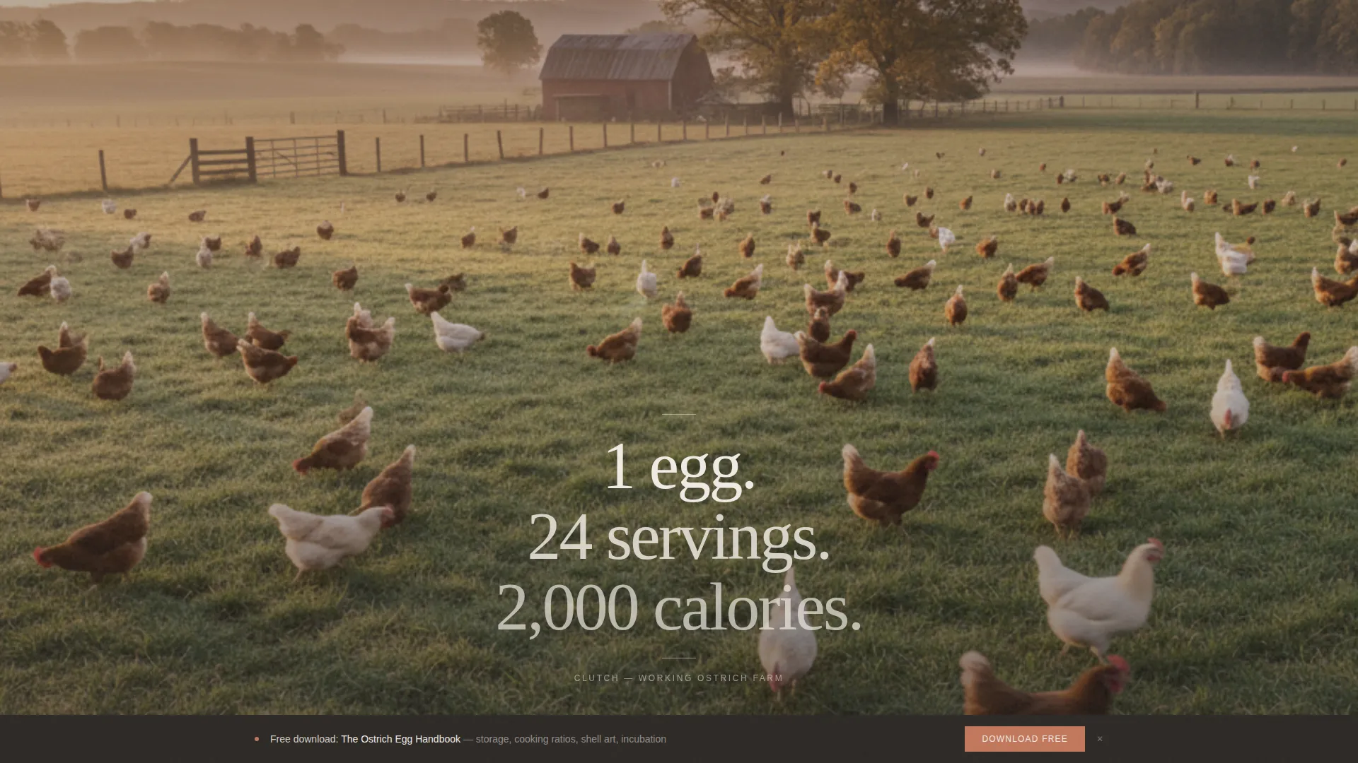
Clutch is a documentary-style landing page template for a specialty ostrich egg farm. It opens with a full-bleed misty pasture photograph and a single fading stat. Four zigzag sections then walk visitors through cooking ratios, shell weight, shelf life, and sourcing value. Every number earns its paragraph, and the page closes with a handbook download form and an inventory calendar link.
Who this template is for
This template is built for niche agricultural producers who sell directly to discerning buyers. It suits farms, artisan food suppliers, and specialty craft suppliers who need to educate visitors before asking for a conversion.
- Specialty chefs sourcing statement proteins and needing reliable cooking ratio data
- Craft artists and sculptors looking for large, carvable egg shells as a raw material
- Homesteaders researching whether a single ostrich egg can replace a full carton in a weekend bake
What problem this template solves
Most farm websites explain what they sell before proving why it matters. Clutch reverses that sequence. It leads with hard numbers that teach visitors something surprising, building trust before any form or call to action appears.
- Visitors arrive with skepticism and need proof before they will download anything or browse inventory
- A single product with multiple buyer types requires separate use-case storytelling within one focused page
- Artisan and specialty farm pages often look generic, failing to match the quality of the product they represent
What you get with this template
You get a fully structured, single-page layout with five distinct visual sections, two conversion paths, and a cohesive Japanese Zen design system. Every section is ready to customize with your own photography and copy.
- A cinematic hero section with a full-bleed pastoral photograph and scroll-triggered stat fade-in
- Four alternating zigzag content sections, each pairing a bold stat with a supporting photograph, chart, or use-case story
- A dual conversion system: a sticky bottom bar form that appears after the third section, plus a full-width form block before the footer
Feature list
The template's capabilities are drawn directly from the brief and built into the page structure.
Stat-First Zigzag Layout
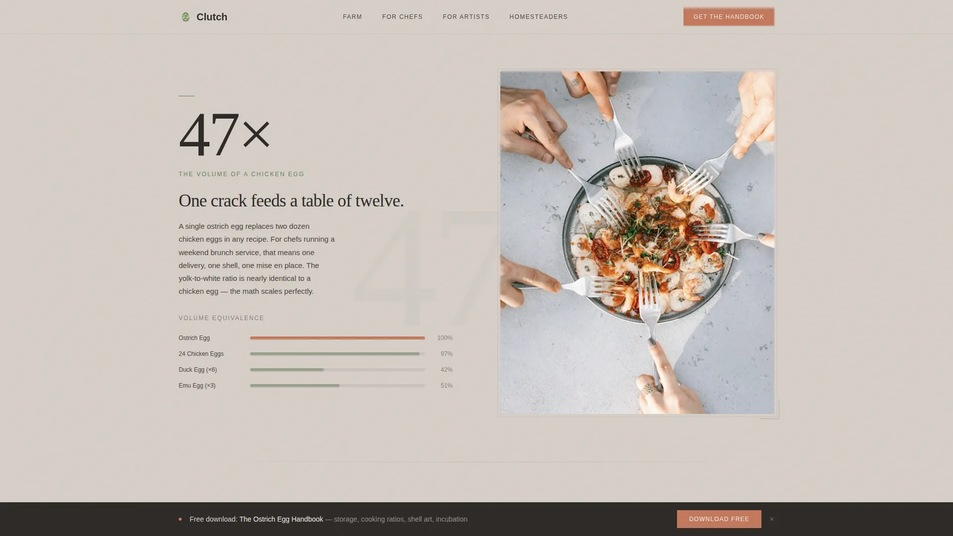
Each of the four content sections leads with a large typographic stat before any explanatory text appears. The stat sits on one side of the viewport while the supporting image or chart occupies the other, alternating left and right on every section. This pattern creates a field-journal reading rhythm that keeps visitors scrolling.
Cinematic Hero with Stat Fade-In
The hero opens with a slow-pan pastoral photograph: ostriches in soft focus, three large eggs on rough linen, dried lavender, and warm golden-hour light. A single stat fades in over the image in white type. No other interface elements are visible until the visitor scrolls, preserving the documentary atmosphere.
Dual-Path Conversion System
The primary conversion path prompts visitors to download a free ostrich egg handbook via a two-field form (first name and email). A sticky bottom bar triggers after the third section, then reappears as a full-width block near the footer. A secondary call to action links to a live seasonal availability calendar.
Scroll-Triggered Stat Counters
Stat values animate into view as each section enters the viewport using Intersection Observer reveals. Staggered entry timing makes the numbers feel discovered rather than presented, reinforcing the field-journal aesthetic throughout the page.
Japanese Zen Color and Typography System
The palette uses washed sand for backgrounds, ink stone for body text, moss for accents, and muted terracotta reserved for calls to action and download buttons. Fraunces serif handles display stats and headlines, while DM Sans handles body and utility text, creating a sparse and unhurried visual hierarchy.
Desktop-First Responsive Adaptation
The layout is designed desktop-first with careful mobile adaptation so the zigzag sections restack cleanly on smaller screens without losing the stat-first reading order or the visual weight of the hero photograph.
Page sections overview
| Section | Purpose |
|---|---|
| Hero full-bleed | Opens with pastoral photograph and single fading stat; no interface visible until scroll |
| Zigzag section one | "47x the volume" stat paired with chef use-case photograph on alternating left-right layout |
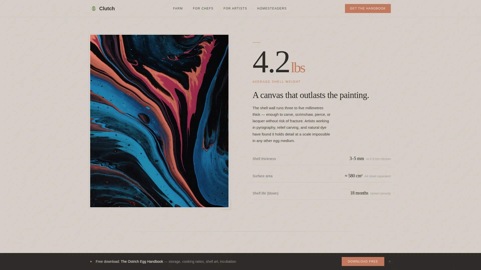
| Zigzag section two | "4.2 lbs average shell weight" stat paired with artist use-case photograph on reversed side |
| Zigzag section three | "18 months shelf life when blown" stat paired with homesteader comparison chart |
| Zigzag section four | "1 egg. 12 people. 1 pan." stat paired with cooking ratio visual |
| Sticky conversion bar | Handbook download form triggered after third section scrolls into view |
| Full-width form block | Handbook download repeated as a full-width section before the footer |
| Arc split footer | Logo and tagline on the left, navigation links on the right |
Design & branding system
The visual identity follows a Service Utility theme expressed through a Japanese Zen color palette. Every design decision prioritizes negative space and lets each element earn its position on the page, much like a single bold stone in a raked gravel garden.
- Four-color palette: washed sand (#D6CFC7) for backgrounds, ink stone (#2D2926) for text, moss after rain (#6B7F5E) for accents, and muted terracotta (#C2785C) exclusively for call-to-action elements and download buttons
- Typography pairing: Fraunces serif display for stats and headlines, DM Sans for body copy and utility labels, creating contrast between monumental numbers and readable prose
- Slow parallax scrolling and staggered stat reveals reinforce the unhurried, documentary atmosphere described in the brief
Mobile & speed optimization
The template is designed desktop-first but includes careful mobile adaptation so the experience remains coherent on smaller screens.
- Zigzag sections restack vertically on mobile, preserving the stat-first reading order so the number always appears before its supporting content
- Server Components handle static sections, and JavaScript is kept minimal to support smooth parallax and Intersection Observer animations without heavy overhead
- The sticky bottom bar adapts to mobile viewport height so it does not obscure the primary content during scroll
How this template helps you convert
The page is built around a content-first conversion strategy. Visitors learn before they are asked to act, which makes the download feel like a natural next step rather than a cold ask.
- The stat-first zigzag structure teaches visitors something surprising in every section, so by the time the handbook form appears, the content has already demonstrated the value of the full forty-page resource.
- The sticky bottom bar introduces the download offer at the moment visitors are most engaged (after three sections of surprising data), then the full-width form block near the footer gives a second opportunity to convert without feeling repetitive.
- The secondary "Browse Seasonal Availability" path serves visitors who are ready to purchase but not ready to commit to a form, keeping them on a meaningful journey toward the inventory calendar.
Other information about this template
This template is part of the Clutch template line. It is categorized under Agriculture and Environment, with a focus on the Specialty Farming niche and an Ostrich Egg Farm use case. The intersection match score for this niche and category pairing is 13, reflecting a highly specific audience alignment.
- The template style is Zigzag or Alternating, with the creative direction labeled Stats-First Impact
- The header concept is Seasonal Imagery, and the landing page direction is Content or Resource conversion
- The color system is Japanese Zen, and the theme is Service Utility, matching the sparse and purposeful visual language throughout
Theme
Service Utility
Creative direction
Stats-First Impact
Color system
Japanese Zen
Style
Zigzag/Alternating
Direction
Content/Resource
Page Sections
Stat-first Zigzag Layout
Cinematic Hero Section
Dual-path Conversion System
Scroll-triggered Stat Counters
Japanese Zen Color and Typography
Desktop-first Responsive Adaptation
Related questions
Who is the primary audience for this landing page template?
What are the two conversion paths included in the template?
Can I customize the stats and photographs in each zigzag section?
What typography is used in this template?
Does the sticky bottom bar work on mobile screens?