Social Media & Influencer Agency Portfolio Website Template
Collab is a single-page landing page template built for creator partnership agencies. It uses a masonry grid of case study cards, a bold editorial headline, and a structured brand inquiry form to turn browsing into briefing. The Ink and Paper visual identity makes every section feel considered, tactile, and confidently different from typical influencer marketing pages.
by Rocket studio
Quick summary
Collab is a creator partnership agency landing page template with a masonry case study layout, a centered editorial headline, and a dual-path conversion flow. It is designed for agencies that connect brands with creators, serving both brand-side clients and talent-side managers. The Cloud Canvas color system and Ink and Paper theme make the page feel like a well-produced pitch deck.
Who this template is for
This template is built for agencies and studios that sit at the intersection of brand strategy and creator talent. It speaks to the people doing the matching, not just the brands or creators themselves.
- Creator partnership agencies pitching marketing directors at direct-to-consumer brands
- Talent management firms that want a professional intake path for inbound brand inquiries
- Startup-focused consultancies helping founders build a creator strategy from scratch
What problem this template solves
Most influencer agency pages look like every other one: a logo wall, a tagline, and a contact form. They fail to build trust before asking for the budget conversation. This template replaces that pattern with accumulated proof.
- Brand clients need to see real campaign results before they hand over a six-figure budget
- Talent managers need a credible page that positions their roster above commodity rate-card requests
- Founders need a clear starting point that signals the agency understands their specific problem
What you get with this template
You get a fully designed, single-page layout that guides each visitor type toward the right next step. Every section has a defined job, from first impression to form submission.
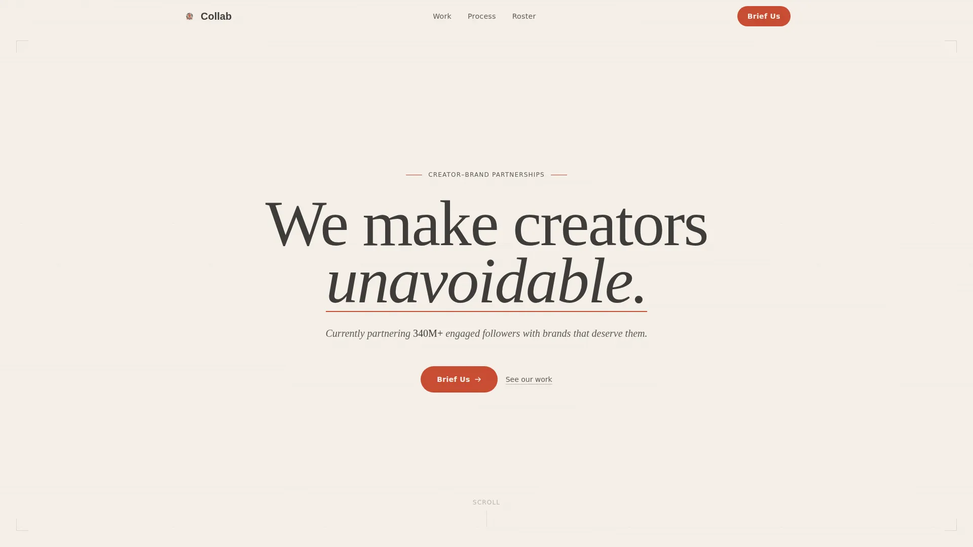
- A giant editorial headline section with a live roster reach figure and a scroll-triggered vermillion underline
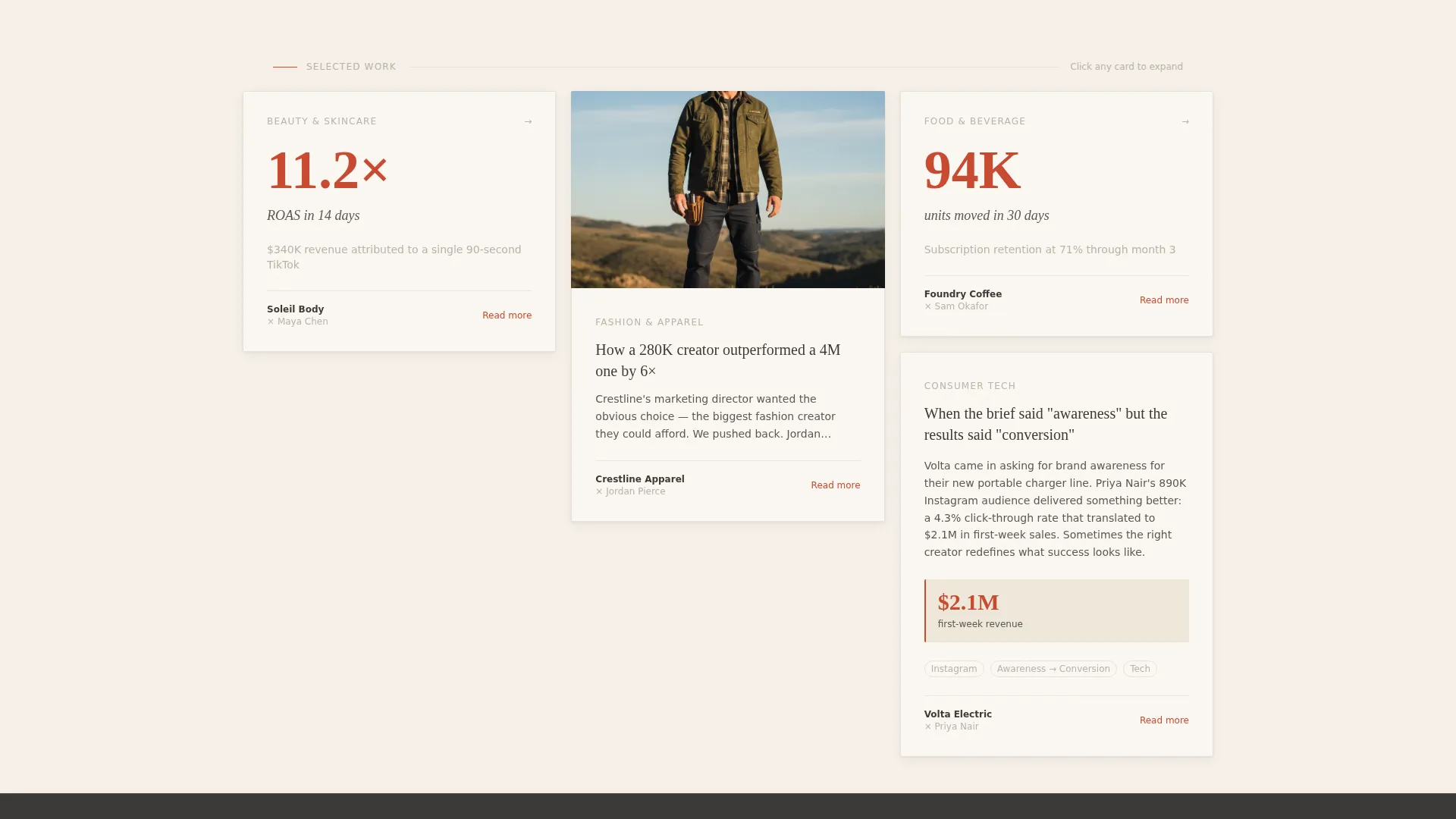
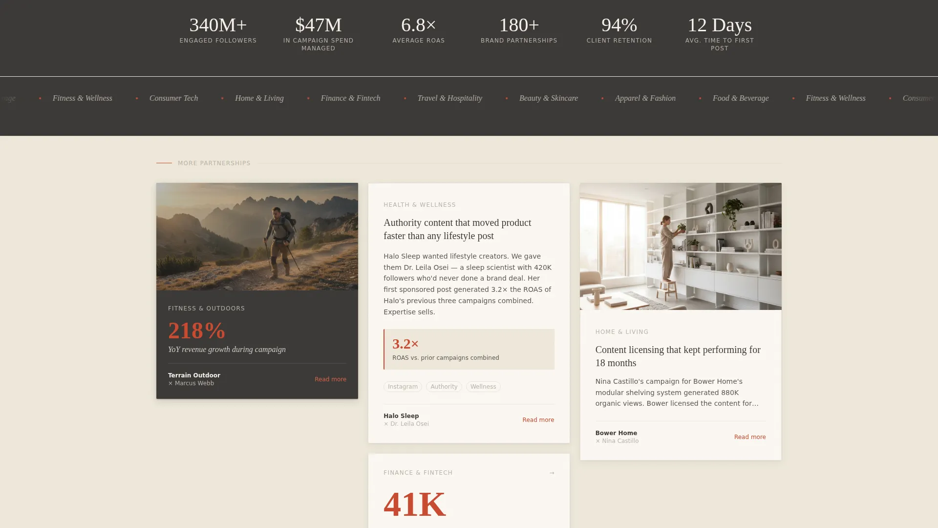
- A staggered masonry grid where each card tells a partnership story, showing creator faces, campaign KPIs, and two-paragraph narratives
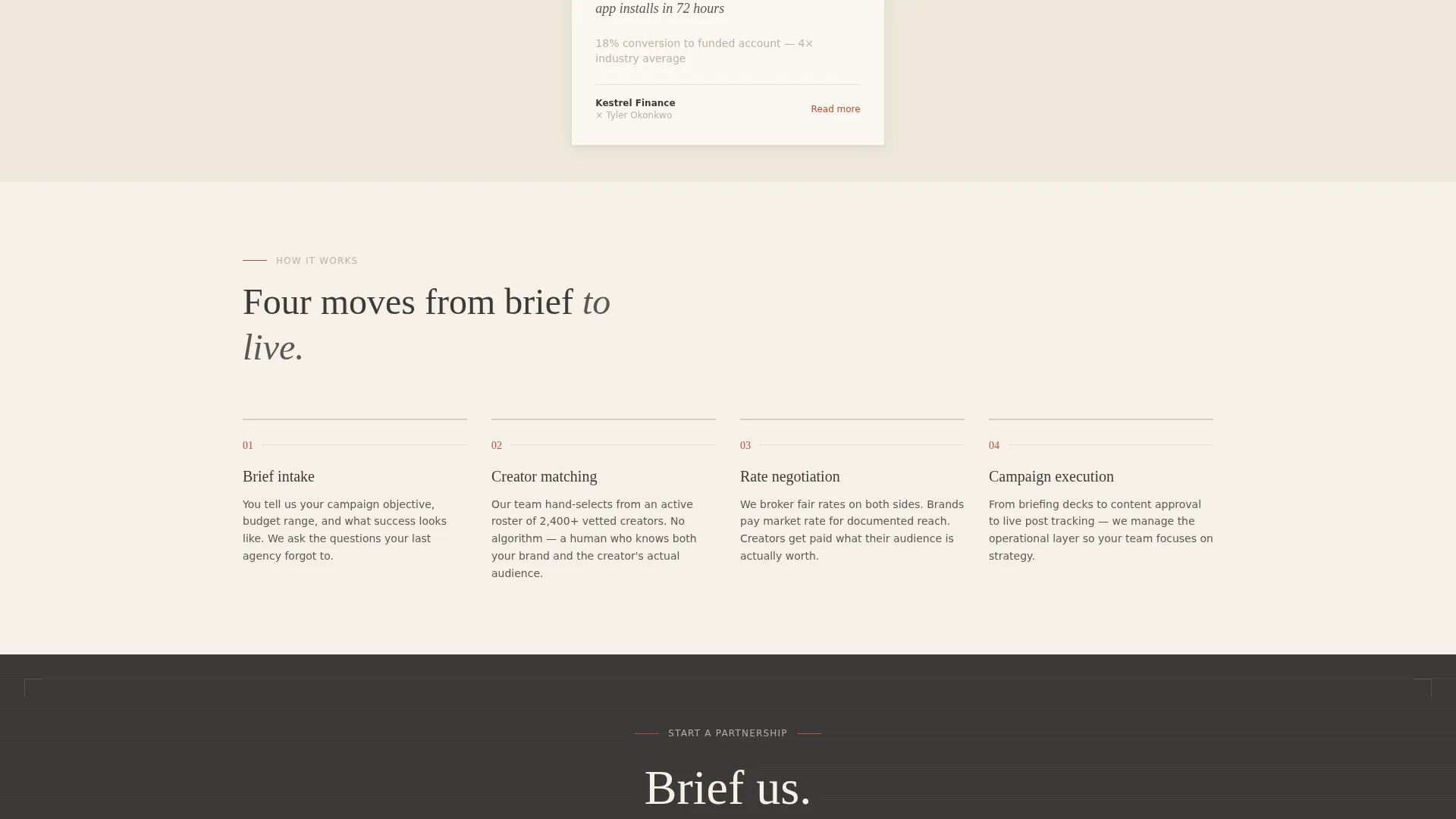
- Two distinct conversion paths: a "Brief Us" brand inquiry form and a "Submit Your Roster" talent intake flow in the footer
Feature list
This template packs a focused set of purpose-built components into a single, scrollable page. Each one is drawn directly from the brief and serves a specific role in moving the visitor forward.
Editorial Headline Section
The header centers an oversized serif headline on a wide parchment field. A thin vermillion underline draws itself on scroll, creating a moment of visual drama without competing imagery. A single italic line below carries the agency's combined roster reach figure.
Staggered Masonry Case Study Grid
Cards vary in height across the grid. Some show a creator mid-shoot beside the brand product. Others display a single KPI in oversized type, such as an 11.2x return on ad spend figure. Others expand into a full narrative with campaign imagery on click, all without leaving the page.
Fixed "Brief Us" Navigation Pill
A vermillion pill button sits anchored in the top navigation throughout the scroll. It stays visible at all times, so the primary call to action is never more than one click away regardless of where the visitor is on the page.
Brand Inquiry Form
After the sixth masonry row, a full-width section presents the brand-side intake form. Fields include company name, monthly creator budget range via dropdown, campaign type selection, and a free-text field asking what success looks like for the client.
Talent Roster Submission Footer
The footer contains a secondary conversion path built for talent managers. It flips the intake fields to creator-side inputs, allowing managers to submit their roster for agency consideration without interrupting the brand-focused page flow above.
Alternating Background Sections
Page backgrounds alternate between warm parchment white and soft graphite. This rhythm gives each section its own visual weight and prevents the long scroll from feeling monotonous.
Page sections overview
| Section | Purpose |
|---|---|
| Editorial Headline | Opens with agency positioning and live roster reach |
| Masonry Grid Rows | Builds trust through accumulated case study evidence |
| Mid-Page call to action | Captures brand inquiries after proof has accumulated |
| Brief Us Form | Collects company name, budget, campaign type, and goals |
| Footer Roster Path | Offers talent managers a separate creator-side intake |
Design & branding system
The Cloud Canvas color system is built around a deliberately analog palette. It positions the agency against the neon gradients and gradient meshes common in influencer marketing, signaling that this team operates with a different standard.
- Core palette: warm parchment white (#F5F0E8), soft graphite (#3D3A38), pencil-sketch gray (#B8B2A8), and muted vermillion (#C84B31) reserved for calls to action and pull quotes
- Typography lives in a refined editorial serif throughout, giving every headline and body block the feel of a carefully typeset pitch deck
- Masonry cards feature visible paper-textured edges, as if each case study has been pinned to a studio wall
Mobile & speed optimization
The masonry layout adapts to narrower screens without sacrificing the editorial tone. Card stacking and text sizing are structured to keep the case study narrative readable on any device.
- Cards reflow into a single-column stack on mobile, preserving the scroll-based storytelling rhythm
- The fixed "Brief Us" pill remains accessible in the navigation across all screen sizes, keeping the primary conversion action within reach
How this template helps you convert
The page is engineered around a simple idea: let results do the convincing before the form asks for anything. By the time a visitor reaches the inquiry section, the page has already answered most of their questions.
- The masonry grid builds a compounding argument row by row, so each scroll deepens the visitor's confidence in the agency's track record before any commitment is requested.
- The dual-path conversion design means brand clients and talent managers each find a relevant intake flow, reducing friction and keeping both audiences engaged through to submission.
Other information about this template
This template is categorized under Portfolio and Agency, with a subcategory focus on social media and influencer agency work. It is specifically matched to the creator partnership agency niche.
- Template style is Masonry and Pinterest layout, well suited to editorial and case study content
- The Ink and Paper theme and Cloud Canvas color system are the defining visual identities for this template
- The creative direction is Case Study Narrative, meaning the page argues through evidence rather than assertion
- The header concept is Giant Headline Centered, designed to command attention on a wide parchment field
- The landing page direction is Partnership and Business-to-Business, optimized for high-consideration budget conversations
Theme
Ink & Paper
Creative direction
Case Study Narrative
Color system
Cloud Canvas
Style
Masonry/Pinterest
Direction
Partnership/B2B
Page Sections
Editorial Headline with Scroll Animation
Staggered Masonry Case Study Grid
Fixed Brand Inquiry Call to Action Pill
Structured Brand Intake Form
Talent Roster Submission Footer
Alternating Parchment and Graphite Sections
Related questions
Can I edit the case study cards with my own campaign data?
Is the Brief Us form customizable for my agency's intake needs?
Does this template work for agencies that represent both brands and creators?
What makes this template different from a standard agency portfolio page?
Can the roster reach figure in the headline be updated to reflect my agency's numbers?


