E-Commerce Marketing & Agency Booking Website Template
Collab is a dark, immersive influencer marketing agency landing page built for e-commerce brands that need real revenue results from creator partnerships. The masonry layout showcases campaign case studies as scrollable proof, a Before/After slider opens with instant visual impact, and a neon mint call to action guides qualified brand partners toward booking their first campaign.
by Rocket studio
Quick summary
Collab is a single-page influencer marketing agency template designed for direct-to-consumer brands that need to turn creator campaigns into measurable revenue. The dark studio aesthetic, masonry campaign grid, interactive Before/After slider, and a two-step partnership qualifier make this landing page feel like a high-converting pitch deck that never stops scrolling.
Who this template is for
This template is built for influencer marketing agencies that serve e-commerce clients with serious revenue goals. If your agency positions itself on return on ad spend (ROAS) rather than follower counts, this layout speaks that language from the first pixel.
- E-commerce marketing agencies pitching direct-to-consumer (DTC) beauty, apparel, or consumer product brands
- Agency founders and marketing directors who need a landing page that leads with proof before the pitch
- Teams targeting scaling brands whose founders have already burned budget on vanity metrics and now want contribution margin
What problem this template solves
Most agency websites sell services. This template sells outcomes. The core problem it addresses is the trust gap between a brand and an agency they have never worked with before. Visitors arrive skeptical and leave converted because the page leads with case study math, not promises.
- E-commerce founders cannot quickly judge whether an agency will move product or just impressions
- Agencies struggle to communicate the link between creator content and actual revenue without a structured, visual proof system
- Generic portfolio layouts fail to create the visceral "stop-scrolling" moment that earns a qualified inquiry from a time-poor CMO
What you get with this template
You get a fully designed, single-page layout built around three conversion pillars: visual proof, progressive credibility, and a low-friction qualifier form. Every section is purpose-built to advance a skeptical brand decision-maker toward booking a discovery call.
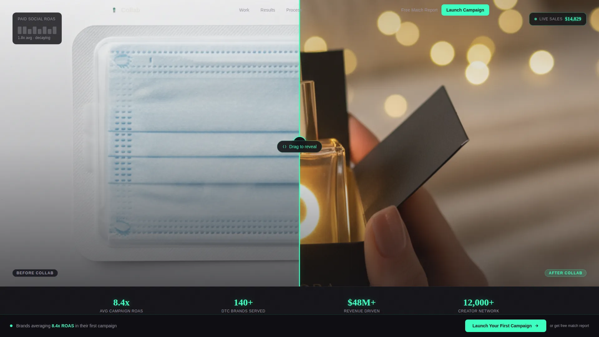
- An interactive Before/After slider header with a self-typing headline that reveals after interaction
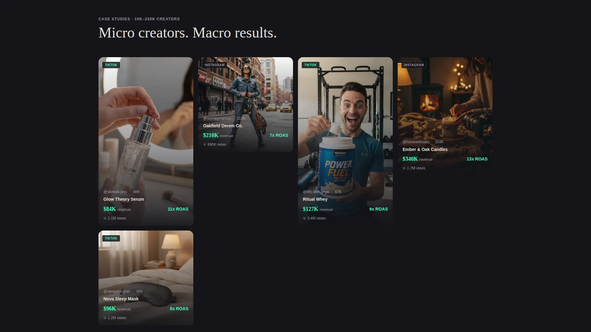
- A masonry campaign grid where each card carries engagement metrics and revenue figures that count up as they enter the viewport
- A two-step partnership qualifier form and a secondary "Creator-Brand Match Report" lead magnet path
Feature list
This template is built around specific interactive and visual components that work together to earn trust and drive qualified inquiries.
Interactive Before/After Slider Header
The header splits a single product view: the left side shows a static flatlay with a stagnant revenue graph in vapor gray, and the right side reveals the same product mid-unboxing in a creator's hands with a live sales ticker climbing in neon mint. A pulsing slider handle invites interaction, and only after the visitor drags does the headline type itself: "Same product. Different story. 11x ROAS."
Masonry Campaign Case Study Grid
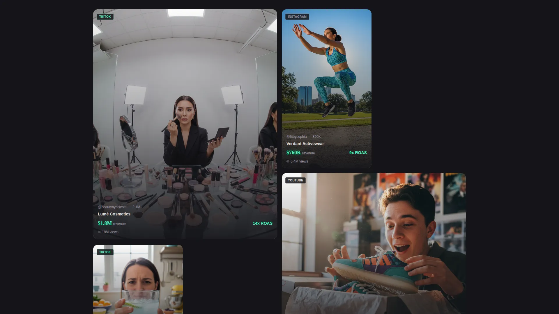
The masonry grid displays campaign case studies as content thumbnails with play buttons, engagement metrics, and viewport-triggered revenue counters. Cards are arranged so small creators appear first, then scale toward mega-partnerships as the visitor scrolls deeper. The rhythm mirrors a feed algorithm, making visitors feel like they are discovering proof rather than being sold to.
Cinematic Full-Width Section Breaks
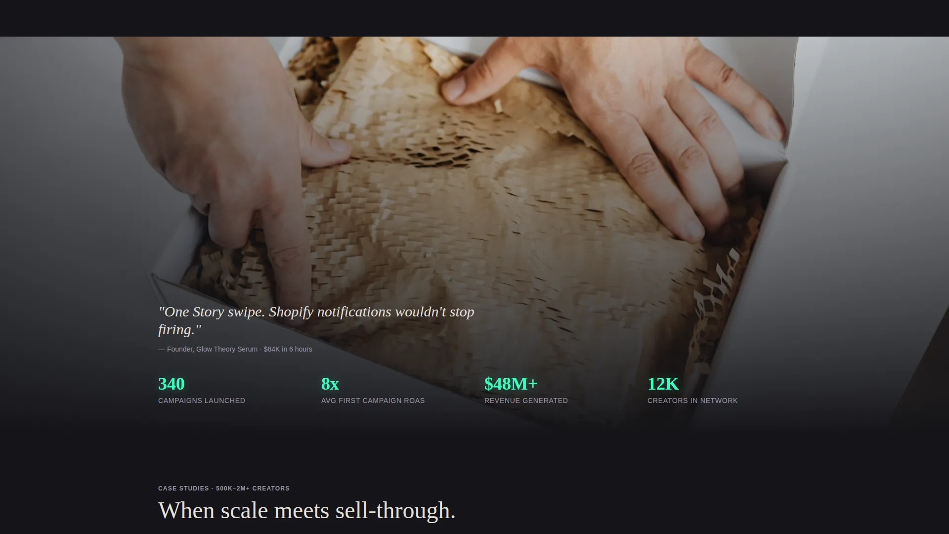
Between masonry clusters, full-width cinematic breaks display slow-motion footage of unboxings, studio shoots, and warehouse fulfillment sequences. These breaks reinforce that real product moved, adding backend credibility to the front-end creator content on display.
Persistent Neon Mint call to action Bar
After the third masonry cluster, the primary call-to-action "Launch Your First Campaign" appears in neon mint and pins to the bottom of the viewport. It stays visible through the remainder of the page scroll, so the qualified visitor always has a clear next step without hunting for a button.
Two-Step Partnership Qualifier Form
Clicking the primary call to action opens a two-step intake form. Step one collects the brand URL, monthly revenue range via dropdown ($50K to $100K, $100K to $500K, $500K and above), and primary product category. Step two asks which platforms matter most (TikTok, Instagram, YouTube) and the preferred campaign timeline. This structure filters leads before the first conversation.
Secondary Lead Magnet Path
A parallel conversion path offers a free "Creator-Brand Match Report." Visitors drop their brand URL and receive a PDF listing ten creators already aligned with their audience. This path captures prospects who are not yet ready to commit to a full campaign brief.
Page sections overview
| Section | Purpose |
|---|---|
| Before/After Slider Header | Opens with interactive product contrast and a self-typing revenue headline |
| First Masonry Cluster | Introduces small-creator case studies with live revenue counters |
| Cinematic Break One | Full-width footage reinforcing real product movement |
| Mid Masonry Cluster | Scales to larger partnerships with growing revenue figures |
| Cinematic Break Two | Studio and fulfillment footage adding backend credibility |
| Final Masonry Cluster | Mega-partnership case studies at peak production quality |
| Persistent call to action Bar | Pins "Launch Your First Campaign" to viewport after third cluster |
| Partnership Qualifier Form | Two-step intake capturing brand fit and campaign goals |
| Creator-Brand Match Report | Secondary lead magnet for early-stage brand visitors |
Design & branding system
The visual identity follows a Dark Immersive theme built on the Cloud Canvas color system. The palette is designed to make content glow against a deep, receding background. Every color decision serves a behavioral purpose: backgrounds recede, typography floats, and the accent color signals action.
- Deep charcoal void (#141418) for all backgrounds, soft vapor gray (#E2DFD8) for body typography, and muted cloud lilac (#9B95A6) for secondary user interface elements
- Signal neon mint (#3DFFC0) reserved exclusively for calls-to-action, hover states, and live metric displays so every interactive element is unmistakable
- The overall feel references a darkened studio where ring lights carve faces out of shadow, letting campaign content and revenue numbers do the visual heavy lifting
Mobile & speed optimization
The masonry grid and cinematic breaks are structured to work across screen sizes. The layout prioritizes vertical scroll behavior, which maps naturally to how mobile users consume feed-style content.
- Masonry card sizing and spacing are designed to remain readable and tappable on smaller screens without breaking the grid rhythm
- The persistent call to action bar sits above the mobile navigation thumb zone, keeping the primary action reachable throughout the scroll
- Viewport-triggered counter animations activate as each card enters view, so the effect works correctly whether the visitor is on a desktop or a phone
How this template helps you convert
The entire page is structured as a progressive proof sequence. By the time a visitor reaches the call to action, they have already seen the revenue math across multiple case study cards and have done their own return-on-investment calculation.
- The Before/After slider creates an immediate emotional contrast between "before agency" and "after agency," making the value proposition visceral before a single word is read.
- The masonry grid builds cumulative proof by escalating campaign scale and revenue figures across the scroll, so trust compounds naturally rather than being claimed upfront.
- The two-step qualifier and lead magnet offer two distinct entry points, capturing both high-intent buyers ready to brief a campaign and early-stage prospects who need one more nudge.
Other information about this template
This template is categorized under Portfolio and Agency, specifically within the E-Commerce Marketing and Agency subcategory. It is purpose-built for the influencer marketing agency niche and carries an intersection match score of 13, reflecting tight alignment between the template style, theme, and niche intent.
- The template style is Masonry/Pinterest, the theme is Dark Immersive, the creative direction is Cinematic Sequence, and the header concept is Before/After Slider
- The landing page direction is Partnership and B2B conversion, making it suited for agencies that sell retainer or project-based services to brand clients
- The color system is Cloud Canvas, a four-tone palette where neon mint acts as the sole action color, keeping the visual hierarchy clean and the user's attention directed
Theme
Dark Immersive
Creative direction
Cinematic Sequence
Color system
Cloud Canvas
Style
Masonry/Pinterest
Direction
Partnership/B2B
Page Sections
Interactive Before/after Slider Header
Masonry Campaign Case Study Grid
Cinematic Full-width Section Breaks
Persistent Neon Mint Call to Action Bar
Two-step Partnership Qualifier Form
Secondary Creator-brand Match Report Lead Magnet
Related questions
Who is this landing page template designed for?
What conversion paths does this template include?
Can I customize the case study cards and revenue figures?
What does the two-step qualifier form collect?
Does the Before/After slider headline appear immediately on load?



