Credible Pawn Broker Landing Page Template
Pledge is a zigzag reviews and testimonials landing page built for pawnbrokers who want to lead with trust. It pairs staff portraits with real customer stories, alternating left and right down the page. A bold manifesto header, specialty appraiser sections, and a lead-generation form surrounded by live social proof make every visitor feel like they are joining a long line of people who were treated fairly.
by Rocket studio
Quick summary
Pledge is a single-page testimonials and reviews landing page for pawnbrokers. It opens with a bold manifesto, then cycles through staff-and-customer zigzag pairings, specialty category reviews, and a lead-generation form wrapped in live social proof. The design uses an Ink and Paper palette that feels like a notarized receipt, plain, direct, and built to earn trust fast.
Who this template is for
This template is for pawnbrokers who depend on reputation to win new customers. It works especially well for established shops that have collected real reviews and want those reviews to do the convincing.
- Independent pawnbrokers building an online presence for the first time
- Established pawn shops looking to convert web visitors into quote requests
- Multi-appraiser shops that want each specialist to own their own social proof section
What problem this template solves
Most pawn shop websites hide behind generic stock photography and vague promises. Potential customers, shift workers short before payday, contractors needing quick equipment cash, and families clearing estates, arrive skeptical and leave without acting.
- Skeptical visitors have no reason to trust an anonymous shop page
- Generic layouts fail to show the real people behind the counter
- No clear path from "I'm curious" to "I want a quote"
What you get with this template
You get a fully structured, single-page layout that leads with authority and ends with action. Every section is purpose-built to reduce hesitation and move visitors toward a quote request or a phone call.
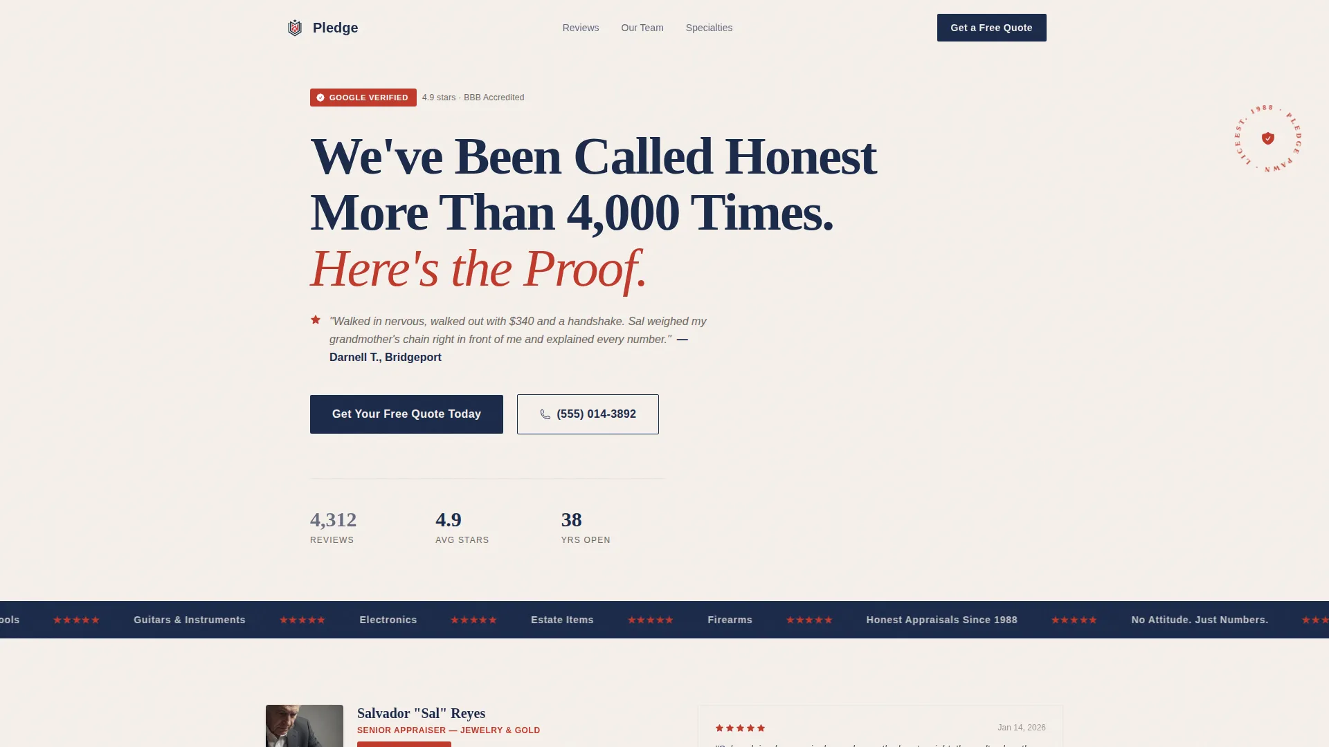
- A manifesto-style header with a verified review count and a featured customer quote
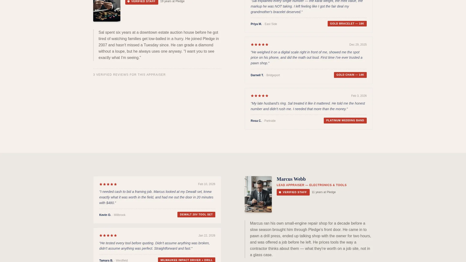
- A zigzag alternating layout pairing staff portraits with customer story blocks
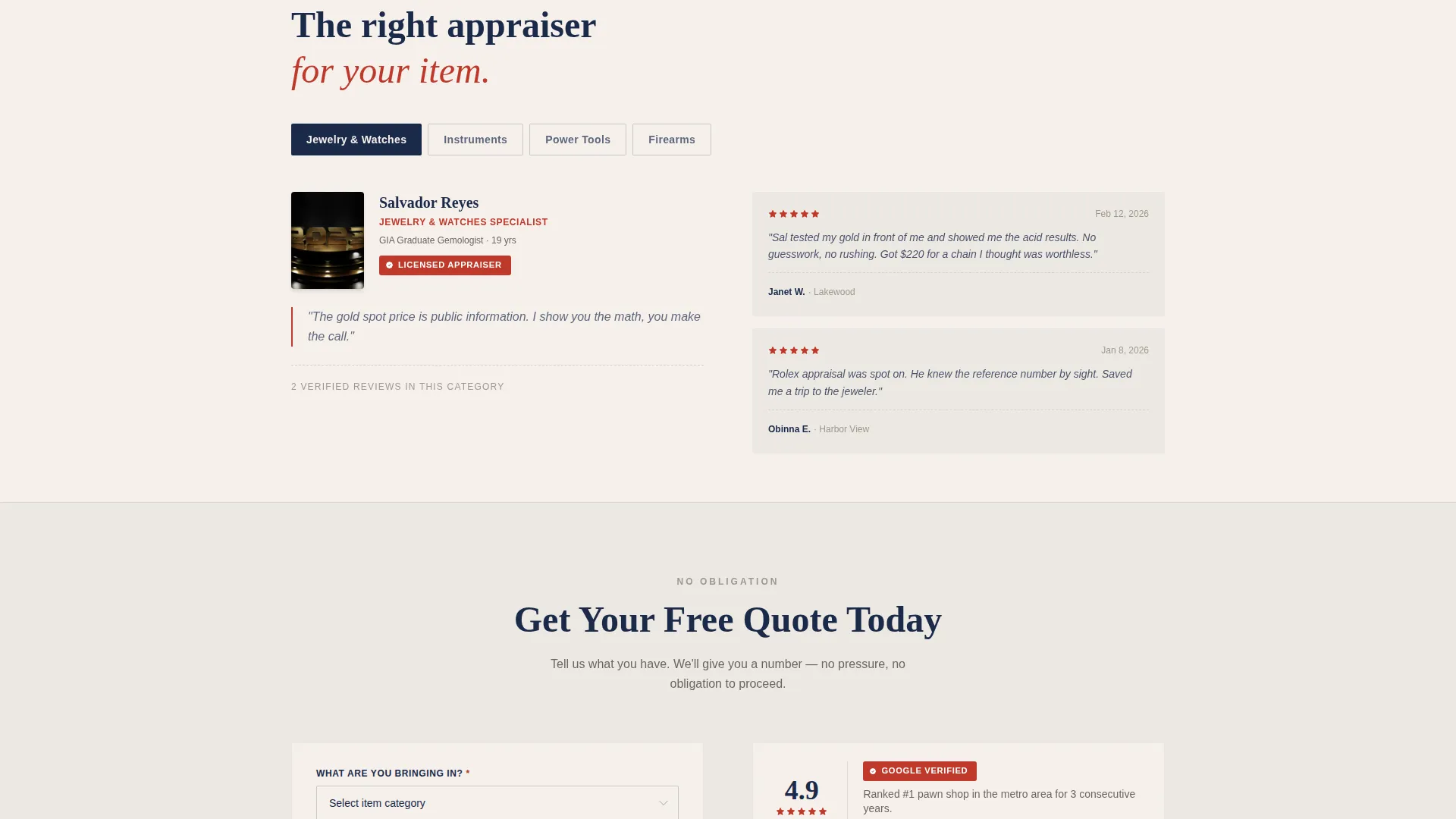
- Specialty review sections organized by category, each introduced by the relevant appraiser
- A lead-generation form with item category dropdown, photo upload, name, and phone fields
- A secondary click-to-call button for visitors who prefer a direct conversation
Feature list
A paragraph overview of the features section: every component in this template is chosen because it earns credibility and reduces friction. The features below reflect exactly what is built into the page layout.
Manifesto Header with Verified Badge
The header opens with bold navy serif type on clean off-white. A stamped-red verified badge sits beside the headline, and a live counter displays the total review count. A real five-star review fragment with a first name and neighborhood runs beneath the main line in lighter weight.
Zigzag Staff and Customer Pairings
The page scrolls through alternating blocks. A customer story sits left, a staff portrait right, then the pattern flips. Each pairing connects a real face to a real transaction, making it clear that business happens between specific people, not behind an anonymous counter.
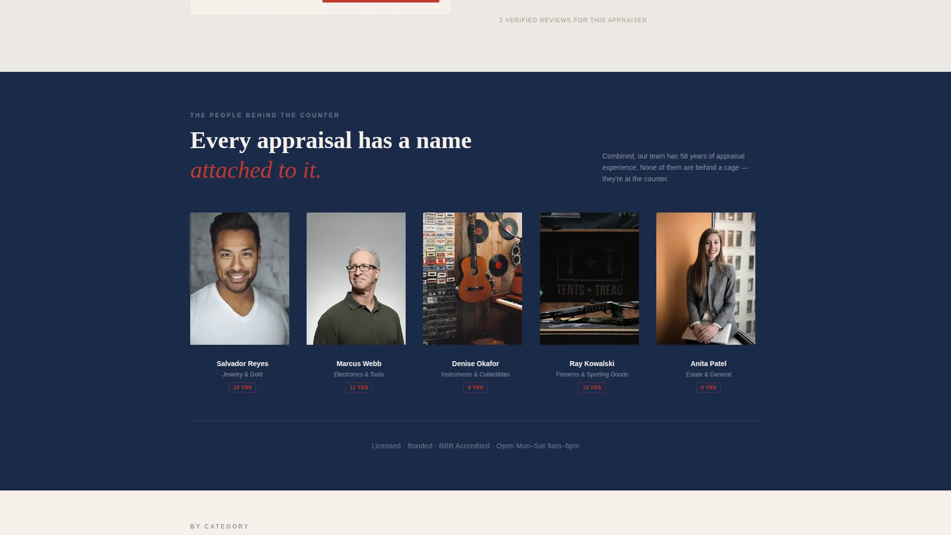
Full-Width Team Strip
Midway through the page, the zigzag pattern breaks for a single full-width band showing the whole team standing together outside the shop. Names appear beneath each person. This section resets the reader's attention and reinforces team credibility before specialty sections begin.
Specialty Category Review Blocks
Jewelry, electronics, firearms, and instruments each get a dedicated section. The relevant appraiser is introduced with visible credentials, and customer quotes for that category stack beside them. Visitors who come in with a specific item type see proof from people in their exact situation.
Lead Generation Form with Social Proof Surround
The quote request form asks for item category first, then a photo upload, then name and phone number. It is surrounded by a live review count, an average star rating display, and the three most recent reviews with timestamps. The form feels like a natural next step, not an interruption.
Click-to-Call Secondary Path
A prominent click-to-call button sits alongside the form. Visitors who prefer to speak rather than type have a direct route. This secondary path ensures the page captures leads from both digital-native visitors and those who trust a voice more than a form.
Page sections overview
| Section | Purpose |
|---|---|
| Manifesto Header | Opens with bold trust statement and live review counter |
| Featured Customer Quote | Anchors credibility with a real first name and neighborhood |
| Zigzag Story Blocks | Pairs staff portraits with individual customer testimonials |
| Full-Width Team Strip | Shows whole team together with names, builds collective trust |
| Specialty Appraiser Sections | Organizes reviews by item category with appraiser credentials |
| Quote Request Form | Captures leads via category dropdown, photo upload, and contact fields |
| Click-to-Call Button | Provides a direct phone path for visitors who prefer voice contact |
| Live Review Feed | Displays three most recent reviews with star ratings and timestamps |
Design & branding system
The visual identity follows a Service Utility theme built around an Ink and Paper color system. Every color choice reinforces the feeling of a notarized document sitting on a laminate counter. There is no flash, no apology, just legible authority.
- Newsprint off-white (#F5F0EB) and receipt-tape gray (#D6D2CC) alternate as section backgrounds, keeping the scroll comfortable and organized
- Ballpoint ink navy (#1B2A4A) carries all body text and headings, providing strong contrast without feeling aggressive
- Stamped red (#C0392B) appears only on trust elements: verified review icons, years-in-business seals, and star rating displays
Mobile & speed optimization
The layout is built to read cleanly on any screen size. Zigzag columns stack vertically on smaller screens so portrait and quote pairings stay readable without horizontal scrolling.
- The form fields stack in a logical order on mobile, item category first, photo upload second, contact details last
- The click-to-call button is sized and placed for easy thumb reach on small screens
- Background color alternation is preserved on mobile so the scroll rhythm remains clear
How this template helps you convert
The page is structured as a progressive trust-building argument. Every section adds one more reason to reach out before the visitor reaches the form.
- The header opens with a specific, verifiable claim and a real customer voice, giving skeptical visitors an immediate reason to keep reading rather than leaving.
- The zigzag staff-and-customer pairings gradually shift the visitor's mental model from "anonymous pawn shop" to "real professionals I can talk to", lowering the barrier to submitting a quote request.
- The form surrounds itself with live review data and recent timestamps, so the act of filling it out feels like joining a long, well-documented line of satisfied customers rather than taking a risk.
Other information about this template
This template is designed as a standalone reviews and testimonials landing page for pawnbroker online presence. It sits within the Professional Services category and is matched to the pawnbroker booking and online presence niche.
- The Ink and Paper color system is paired with a Service Utility theme to signal reliability without visual noise
- The Stats-First Impact creative direction means every section leads with numbers or verified proof before narrative
- The template style follows a Sidebar Companion and Content and Resource direction, meaning information is structured to educate and reassure before asking for action
- No stock photography is used in the design direction; language and real portraits carry the visual weight
- The page is built as a single-page layout optimized for lead generation through both form submission and direct phone contact
Theme
Service Utility
Creative direction
Stats-First Impact
Color system
Ink & Paper
Style
Sidebar Companion
Direction
Content/Resource
Page Sections
Manifesto Header with Verified Badge
Zigzag Staff and Customer Layout
Full-width Team Strip
Specialty Category Review Blocks
Lead Generation Form with Social Proof Surround
Click-to-call Secondary Path
Related questions
Can I use this template if I only have a few reviews so far?
Do I need multiple staff members to use the zigzag sections?
What item categories does the specialty review section cover?
What information does the lead generation form collect?
Is this template suitable for a pawnbroker who handles estate buyouts?



