Joint & Family Finance FAQ & Common Questions Website Template
The Pooled shared savings jar comparison landing page template is built for fintech and joint finance products. It uses a typographic hero, frequently asked question-driven scroll, and four-column comparison tables to dissolve buyer anxiety one question at a time. The freemium signup form captures name, email, and saving context, with no credit card required at entry.
by Rocket studio
Quick summary
This is a single-page comparison landing page template designed for a shared digital savings product. The page uses oversized frequently asked question questions as scroll anchors, each paired with a four-column comparison table that puts competitors side by side. A sticky mobile call to action bar, horizontal testimonial scroll, and a minimal pill-selector signup form work together to guide prospects from curiosity to conversion.
Who this template is for
This template fits fintech founders, product teams, and indie developers building joint or family finance tools. It is equally useful for anyone creating competitor comparison pages for a freemium savings product that needs to earn trust before asking for signup.
- Teams building shared savings, pooled goal, or joint finance landing pages that need to compare features honestly against spreadsheets, payment apps, and traditional bank accounts.
- Marketers or developers who want high converting landing pages with a clean frequently asked question-driven structure that dissolves objections before the call to action appears.
- Creators launching a freemium finance product who want a user friendly, mobile-first comparison landing that converts potential customers without requiring a credit card at entry.
What problem this template solves
Comparison landing pages for financial products often fail at the moment they matter most: when a cautious visitor asks a hard question. Generic templates bury answers in small print or hide pricing behind a sales call. This template takes a different approach. Every real objection a visitor carries becomes a section heading, and every answer is backed by a structured comparison table.
- Visitors arrive already comparing options. Without clear, honest side by side comparison content, they leave. This template keeps them on the page by answering the exact questions they are already asking.
- Shared finance products face higher trust barriers than most. The frequently asked question-driven scroll structure means prospects see transparent, factual differences between options before they are ever asked to sign up.
- The signup form is intentionally minimal. Simplified forms with minimal fields reduce user drop-off, and this template reflects that principle by asking only for a first name, email, and one contextual question.
What you get with this template
The template delivers a complete, section-led comparison landing page ready for a shared savings or joint finance product. Each section is purposeful and sequenced to move potential buyers from skepticism to confidence. The page is built around the insight that a well-crafted comparison page can drive up to 50 percent more conversions from your content.
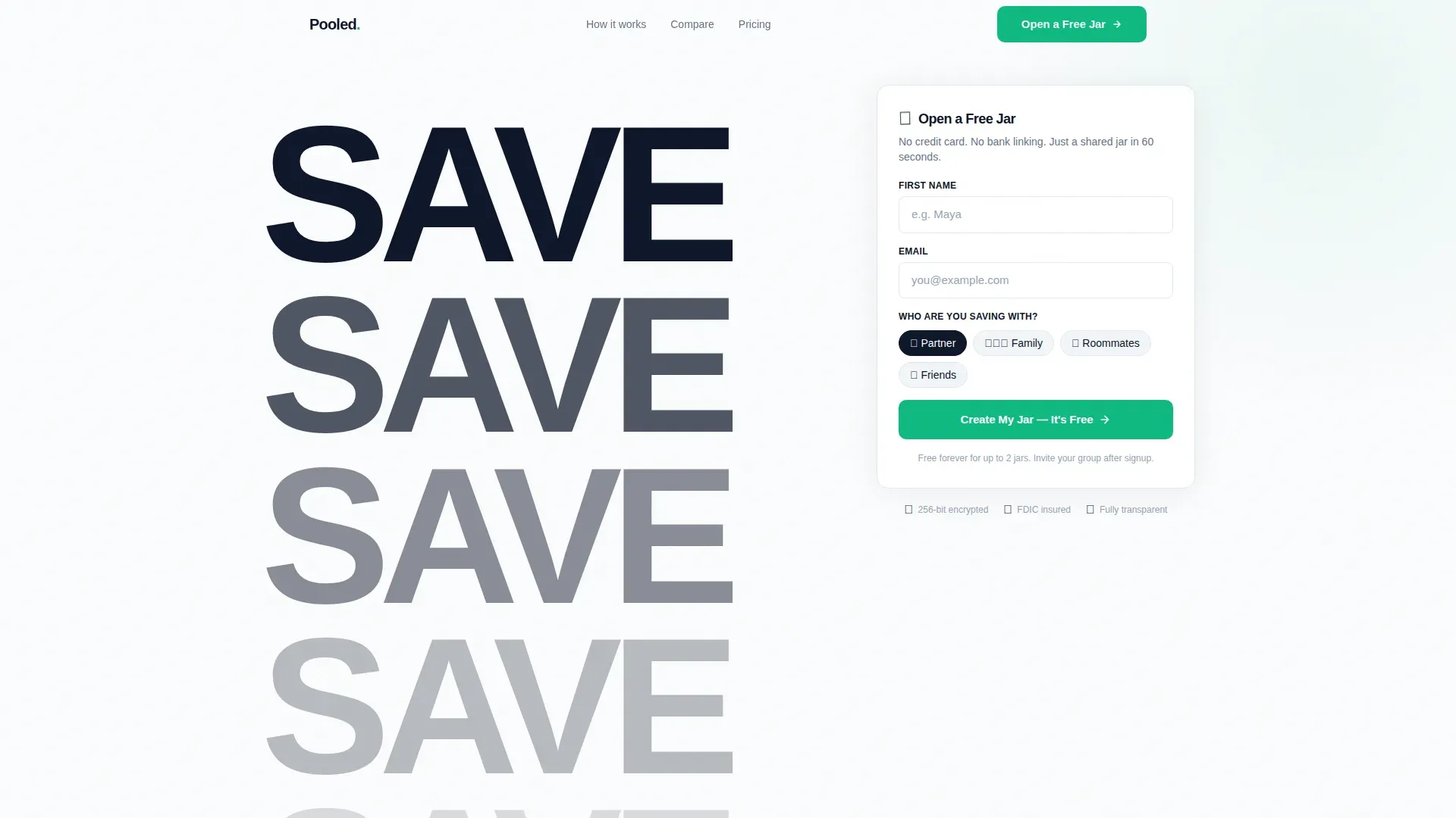
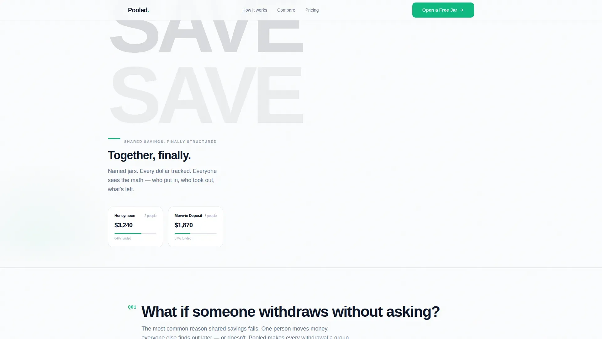
- A typographic hero section with a stacked "SAVE" tower, a precise "Together, finally" headline, and a pill-selector signup form asking who the user is saving with.
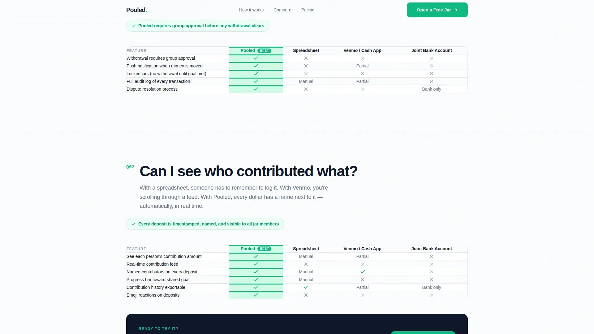
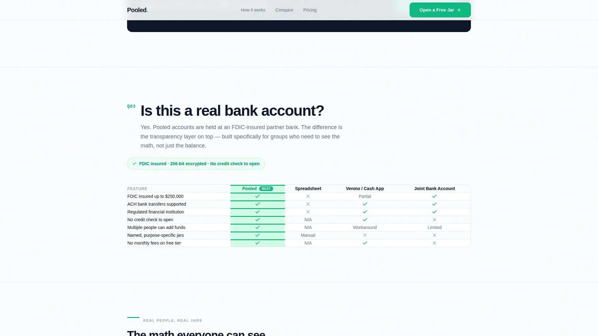
- Three frequently asked question sections each anchored by an oversized objection question, each answered by a four-column comparison table pitting the product against a shared spreadsheet, Venmo requests, and a traditional joint bank account.
- A horizontal-scroll testimonial section with specific use cases and dollar amounts, plus a sticky bottom call to action bar on mobile, and a single-row footer.
Feature list
This template packs purposeful design features and structural components built specifically for comparison landing pages in the joint finance niche. Each element earns its place by helping visitors compare features quickly and make informed decisions with confidence.
frequently asked question-Driven Comparison Scroll
The page scroll is structured as a series of real objections visitors already carry. Each question is rendered in oversized type and answered immediately with a four-column comparison table. This format lets users quickly grasp the key differences between options without hunting for answers. Creating competitor comparison pages this way is a strategic tactic: it guides visitors toward a decision by answering the exact question they are asking.
Four-Column Comparison Table Layout
Each frequently asked question section includes a structured comparison table that places the product alongside three alternatives in a clear side by side comparison. The feature comparison chart format means potential customers can compare features across rows in seconds. A well-structured comparison table helps visitors see how your product stacks up against others at a glance, and this template uses that format consistently across all three frequently asked question sections.
Typographic Hero with Pill Signup Form
The hero section uses a Stacked Type Tower of the word "SAVE" repeated vertically, each instance fading in opacity until it dissolves into the background. A concise headline sits at the base. Directly below, a minimal signup form captures first name, email, and a pill-selector question asking who the visitor is saving with. No credit card and no bank linking are required at this stage, which reduces friction and keeps conversion rates healthy.
Horizontal Scroll Testimonial Section
Customer testimonials appear in a horizontal-scroll card format. Each card references a specific saving scenario and a real dollar amount, making the social proof feel grounded rather than generic. Adding customer testimonials, review snippets, or case study highlights can increase credibility and reinforce claims, and this template is built to highlights customer testimonials in a format that feels personal and specific.
Sticky Mobile Call to Action Bar
On mobile devices, a sticky bottom bar keeps the primary call to action visible throughout the scroll. This ensures that after any comparison table or frequently asked question section, the path to signup is always one tap away. The hero section of this landing page communicates value immediately with a bold headline and a persistent call to action, which is essential given that approximately 57 percent of internet traffic is mobile.
Progress Bar and Visual Tracker Elements
The template includes electric mint progress bars that can represent collective savings goals. Data visualization tools such as progress bars and milestone trackers help users understand collective goals at a glance. These elements also serve a motivational role: gamification elements like visual trackers indicate progress in shared goals and encourage group members to stay committed.
Page sections overview
| Section | Purpose |
|---|---|
| Hero Typographic Tower | Introduces brand, pill signup form, and primary call to action |
| frequently asked question One: Withdrawals | Answers the unauthorized withdrawal objection with a comparison table |
| frequently asked question Two: Contributions | Shows who contributed what using a side by side comparison table |
| frequently asked question Three: Bank Status | Clarifies account legitimacy with a trust-signal comparison table |
| Testimonial Scroll | Horizontal customer testimonial cards with specific saving scenarios |
| Sticky Mobile call to action | Keeps the primary call to action accessible throughout mobile scroll |
| Footer Single Row | Minimal single-row footer with links and compliance signals |
Design & branding system
The visual layout follows a Startup Velocity theme built entirely on an Arctic White color system. Every design decision reinforces clarity. The palette uses snow-field white (#FAFBFC) for all backgrounds, hairline divider gray (#E2E8F0) for structural separation, ink-black (#0F172A) for all type, and a single electric mint accent (#10B981) for every interactive element, toggle, and progress bar. The result feels like a freshly unboxed device: minimal, precise, and instantly trustworthy.
- Typography is set in Plus Jakarta Sans throughout. The hero uses tightly tracked, oversized type. frequently asked question question headings use large display sizing. Body text and comparison table cells stay compact and readable.
- The electric mint accent color carries all interactive weight: pill selectors, call to action buttons, progress bars, and comparison table highlights all use this single color. Nothing else competes for attention.
Mobile & speed optimization
This template is built mobile-first. Approximately 57 percent of internet traffic is mobile, and the template reflects that priority in every structural decision. The sticky bottom call to action bar ensures the signup path is never more than one tap away, regardless of how far a visitor has scrolled through the comparison tables. Fast loading is equally important: a one-second delay in page load can reduce conversions by 7 percent, so the template uses Server Components for static sections and Client Components only where interactive elements like the pill form require them.
- Staggered fade-in animations and scroll reveals via IntersectionObserver are applied at medium intensity, so the page feels dynamic without adding unnecessary load weight.
- The four-column comparison tables reflow cleanly on smaller screens, preserving the side by side comparison structure without horizontal overflow or cramped cells.
How this template helps you convert
A competitor comparison landing page is a web page designed to directly compare your product with those of your competitors. Done well, comparison pages build trust, showcase transparency, and drive conversions by helping prospects see the unique value a brand provides. This template is purpose-built to do exactly that for a shared savings product, with every design and content decision pointing toward one outcome: a confident, friction-free signup.
- The frequently asked question-driven structure dissolves anxiety before the call to action appears. Each comparison table answers a real objection, so by the time visitors reach the "Open a Free Jar" button after the third frequently asked question, every major concern has already been addressed. This approach can help shorten the sales cycle by simplifying the decision making process for your audience.
- The pill-selector signup form is the final step in a buying process designed to earn trust first. Placing the primary call to action only after three rounds of honest, transparent comparison content means visitors who click are genuinely informed and ready. Placing compliance signals near the call to action can lift conversions by 10 to 20 percent, and this template is structured to support that placement.
Other information about this template
This template sits at the intersection of several disciplines: SaaS comparison pages design, fintech product marketing, and group savings user experience. Understanding how all three work together helps explain why this template is structured the way it is.
Competitor comparison pages are essential tools for improving SEO and guiding potential buyers during their purchasing journey. Potential buyers often conduct extensive online research before making a decision. Incorporating relevant keywords and long tail keywords into comparison landing page copy, along with optimized meta tags, helps increase page visibility and drives more targeted traffic. Using user stories and real examples in comparison content makes the page more relatable and credible.
SaaS comparison pages and saas comparison content more broadly follow established patterns: a concise headline, a comparison table, social proof, and a strong call to action. This template follows those patterns while layering in the specific needs of a joint finance product, where trust is the most critical factor.
Honesty and transparency are fundamental in building trust on comparison pages. This template is built on that principle. Rather than cherry-picking data points, each four-column comparison table presents the differences across all four options with equal clarity, whether those differences favor the product or explain trade-offs honestly.
The template also supports dual-audience messaging, which is valuable when a product targets different user groups, such as newlyweds and roommates, with the same page. The pill-selector form captures which group the visitor belongs to, creating useful segmentation data from the very first interaction.
Additional social proof, such as third party ratings and compliance badge placement near the call to action, can further add credibility for financial products. Templates should prominently feature visible compliance badges such as SOC 2, PCI DSS, or FDIC insurance logos, and this template reserves space for those signals near the primary call to action. Testimonials and social proof are essential for building credibility in financial templates, and the horizontal testimonial scroll section is designed to deliver exactly that.
Regular updates are essential to ensure comparison information remains current. Because each comparison table is structured as a clean markdown-style grid, updating a row when a competitor changes its pricing or features requires minimal effort. The pricing table format used across the frequently asked question sections is intentionally simple for that reason.
This pooled shared savings jar comparison landing page template is a good fit for saas companies, fintech startups, and small businesses in the joint finance niche who want to compete effectively by being the most transparent option on the page. The competitive advantage of this template is not just visual polish. It is the structural honesty built into every comparison section.
- The platforms stack of options compared across the four columns (product, spreadsheet, payment app, and traditional bank) covers the realistic set of alternatives that potential customers actually consider.
- The template is designed to engage visitors with an interactive demo-style pill form and progress bar visuals, giving the page an interactive demo feel without requiring a full product walkthrough.
- Other comparison pages in the finance niche often rely on static screenshots or vague benefit lists. This template replaces those with structured, scannable comparison tables that let visitors compare features and differences in seconds.
- Creating competitor comparison pages with this template means inheriting a visual layout and scroll logic that have been designed specifically for the decision making process of a cautious, research-driven finance audience.
- The freemium model means cost is not a barrier at signup. The page explains the product's benefits clearly so that users who click "Open a Free Jar" already understand the value they are getting.
- User friendly design is non-negotiable in finance products. The template achieves this through tight visual hierarchy, minimal color, and a scroll rhythm that never overwhelms visitors with too much information at once.
- Competitive comparison pages in adjacent categories such as budgeting tools or expense trackers can adapt this template structure. The four-column comparison table and frequently asked question layout are flexible enough to serve a range of joint finance use cases.
- The template invites users to self-identify their saving context at the very first interaction, which makes the page feel personally relevant from the start.
- Interactive calculators can help users visualize the benefits of pooling funds before signing up, and this template's progress bar and pill-form components lay the groundwork for that kind of interactive demo extension.
Theme
Startup Velocity
Creative direction
FAQ-Driven
Color system
Arctic White
Style
Comparison Table
Direction
Freemium/Trial
Page Sections
Faq-driven Comparison Scroll
Four-column Comparison Table Layout
Typographic Hero with Pill Signup Form
Horizontal Scroll Testimonial Section
Sticky Mobile Call to Action Bar
Progress Bar and Visual Tracker Elements
Related questions
Can I customize the comparison table columns for different competitors?
Does the template include the sticky mobile call to action bar out of the box?
Is the pill-selector signup form editable?
How does the frequently asked question section structure help with conversions?
Can this template be adapted for other joint finance products?



