Regulatory & Licensing Professional Website Template
A split-screen landing page built for a real estate regulatory commission. It pairs a stark manifesto quote with live license and recovery counters, then walks visitors through complaint procedures, licensing fee allocation, and Consumer Recovery Fund outcomes. The primary call to action, "Protect a Homeowner," leads into a three-step donation form designed to earn trust before asking for a contribution.
by Rocket studio
Quick summary
This is a single-page, split-screen landing page template purpose-built for a government real estate commission. It combines institutional authority with radical transparency, guiding licensed brokers, fraud victims, and policy analysts through complaint processes, licensing data, and recovery fund outcomes. Every scroll reveals another layer of auditable information, and the page culminates in a focused "Protect a Homeowner" donation call to action backed by a three-step progressive form.
Who this template is for
This landing page template serves a specific but essential set of visitors. It is designed for institutions that need to project authority and openness at the same time, not just one or the other.
- Licensed brokers and agents who need fast access to continuing education deadlines, license renewal details, and fee allocation breakdowns.
- Consumers and fraud victims who are filing complaints, tracking case outcomes, or considering a contribution to the Consumer Recovery Fund.
- Legislators and policy analysts who review enforcement data and fund disbursement records before drafting housing policy.
What problem this template solves
Government regulatory pages often feel impenetrable. Dense navigation, opaque processes, and buried data erode public trust before a visitor even reads the first paragraph. This landing page template solves that problem directly.
- Bureaucratic opacity is replaced by numbered procedural steps, public data panels, and timeline diagrams that make every process legible.
- Donor skepticism is addressed by showing real case recovery amounts and a live fund-allocation dashboard link before any donation ask appears.
- Fragmented user journeys are resolved through a logical, section-led layout that routes each visitor type, broker, consumer, or legislator, toward the information they actually need.
What you get with this template
This template delivers a fully structured, single-page layout ready to represent a real estate commission with precision and clarity. The layout is grounded in a Corporate Precision design theme and a Monochrome Steel color system. No imagery is used in the hero; authority comes from language and live data standing side by side.
- Five distinct content sections covering the hero manifesto, complaint journey, licensing and fees, recovery fund outcomes, and a three-step donation form, plus a minimal single-row footer.
- A split-screen (50/50) layout throughout, pairing procedural steps on the left with corresponding data, timelines, or document previews on the right.
- A three-step progressive donation form that begins with preset amounts ($25, $50, $100, or custom), then collects name and email, then moves to payment, reducing friction and building confidence at every step.
Feature list
This landing page template is built around a focused set of interactive and structural features drawn directly from the project brief. Each feature serves a specific audience need and a specific moment in the page's narrative flow.
Live Accountability Counters
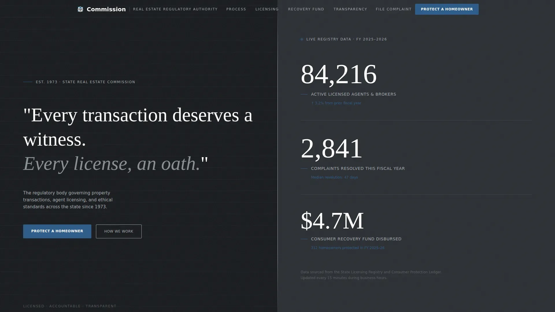
The right panel of the hero section displays three real-time counters: active licenses, complaints resolved this fiscal year, and total consumer recoveries in dollars. Numbers are large enough to read from a distance and update with a subtle tick animation. This feature sets the tone for the entire page: data is not hidden, it is the headline.
Split-Screen Procedural Layout
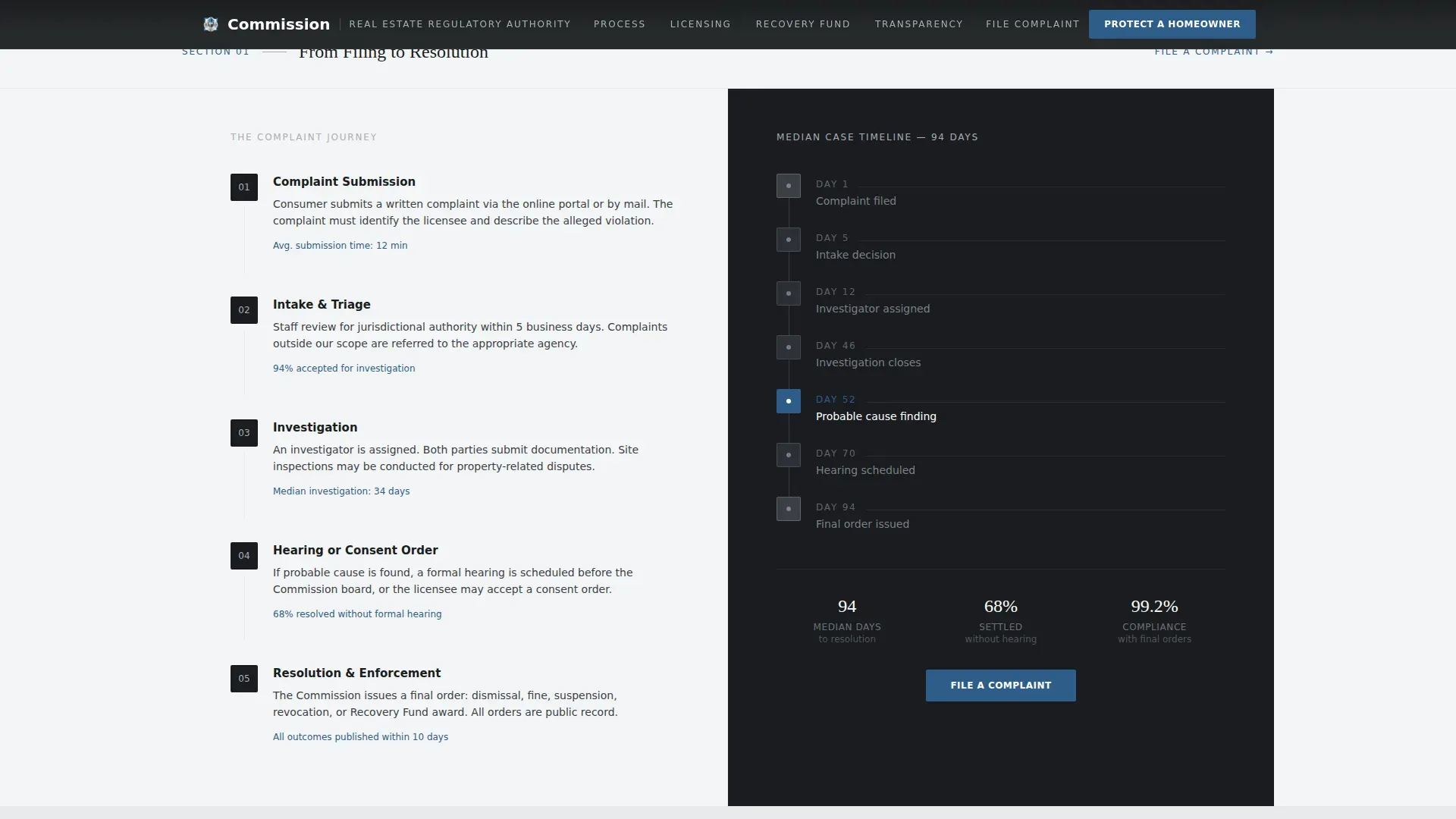
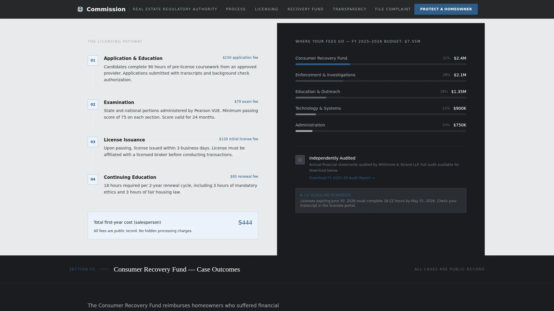
Every content section uses a 50/50 split. The left panel holds a numbered procedural step, whether that is how a complaint moves from filing to resolution, how licensing fees are allocated, or how recovery funds are disbursed. The right panel shows the corresponding public data, timeline diagram, or document preview. The layout creates a consistent rhythm that makes complex regulatory processes easy to follow.
Complaint Journey Timeline
A dedicated section walks visitors step by step through the complaint process. Each numbered stage on the left is paired with a visual timeline on the right. Consumers can see exactly where their case stands. Legislators can audit the process at a glance. The design removes ambiguity from what is often the most anxiety-inducing part of any regulatory interaction.
Recovery Fund Outcome Cards
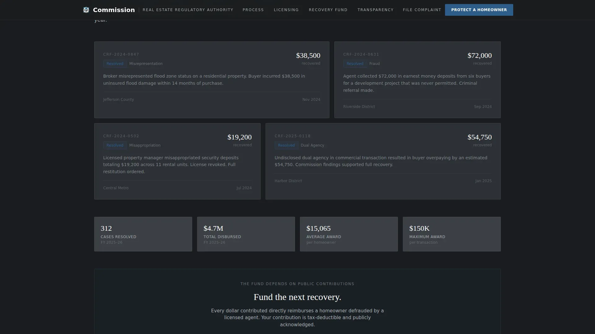
Before the donation ask, the page presents case outcome cards showing real recovery amounts. These cards carry the emotional weight that earns the primary call to action. Visitors see whose mortgage was saved, and in what dollar amount, before they are ever asked to fund the next one. This sequencing is intentional and directly tied to conversion.
Three-Step Progressive Donation Form
The donation form uses progressive disclosure across three steps: preset amount selection, name and email entry, and payment. A secondary path, "See Where Funds Go," links to a live allocation dashboard. This path reduces skepticism by giving visitors a transparent view of fund use before committing. The form layout is clean, focused, and built to minimize drop-off at each stage.
Manifesto Hero with Quote Display
The hero section uses oversized Fraunces serif type on a gunmetal split-screen background. No images are used. The left panel holds the manifesto quote. The right panel holds the live counters. The result is an opening that feels institutional and modern at once, cold precision meeting genuine public accountability.
Page sections overview
| Section | Purpose |
|---|---|
| Hero Split Screen | Manifesto quote left, live accountability counters right |
| Complaint Journey | Numbered procedural steps left, resolution timeline right |
| Licensing and Fees | Fee allocation process left, public allocation chart right |
| Recovery Fund Outcomes | Case outcome cards plus primary "Protect a Homeowner" call to action |
| Donation Form | Three-step progressive disclosure with secondary dashboard link |
| Minimal Footer | Single-row footer with essential navigation links |
Design & branding system
The design language for this template is Corporate Precision. It is built to feel like a modernized government office: cold, ordered, and completely legible. The Monochrome Steel color system carries no warmth and makes no apology. Every color choice has a function, and every typographic decision reinforces institutional clarity.
- Color palette: Gunmetal charcoal (#3B3F45) anchors all primary backgrounds. Brushed aluminum (#A8ADB3) handles secondary panels and divider lines. Institutional white (#F4F5F6) fills content wells. Regulatory blue (#2E5C8A) appears exclusively on links, buttons, and status indicators.
- Typography: Fraunces serif is used for the manifesto quote and display headings. DM Sans handles all interface text, data labels, and body copy. The pairing creates contrast between authority and usability.
- Layout principles: The 50/50 split screen is consistent across all sections. Generous white space separates each data point and procedural element so nothing competes for attention. The layout creates a logical flow that directs visitors naturally through each layer of information.
Mobile & speed optimization
This template is designed desktop-first, reflecting its primary audience of brokers and legislators working on workstations. Full mobile support is included, ensuring the layout remains accessible and readable on smaller screens.
- Responsive split-screen columns stack vertically on mobile devices, preserving the left-panel narrative and right-panel data relationship without losing context.
- Performance architecture: Static server components handle non-interactive sections. Client components power the live counters and the multi-step donation form. Scroll reveals and split-screen parallax run at medium animation intensity to balance visual polish with responsiveness.
How this template helps you convert
A polished, professional landing page can improve conversion rates meaningfully, and this template is built with that outcome at its core. The page is not trying to sell a product. It is trying to earn trust, and then direct that trust toward a specific and meaningful action: funding the Consumer Recovery Fund.
- Trust is built before the ask. The complaint journey timeline, the licensing fee allocation chart, and the recovery fund outcome cards all appear before the donation form. By the time a visitor reaches the "Protect a Homeowner" button, they have already seen exactly how the institution operates and how every dollar is tracked.
- The form reduces friction progressively. The three-step donation form moves visitors through amount selection, contact details, and payment in a sequence that feels manageable rather than demanding. The "See Where Funds Go" secondary path gives hesitant visitors a transparent exit that still keeps them engaged with the page.
Other information about this template
This template is relevant beyond its specific regulatory niche. The structural principles it applies, radical transparency, progressive disclosure, and split-screen data pairing, translate to any government or public-sector landing page project where trust must be earned before action is requested.
- Surfer context: This template shares structural DNA with library discover free community programs landing page template patterns, where clear layout, user friendly navigation, and community-oriented content drive visitor engagement. Public libraries and regulatory commissions both serve a local community through free access to information, and both benefit from website templates that make various resources easy to find.
- Template adaptability: The layout is designed so that institutions can swap in their own data, update counter figures, and replace outcome card details without restructuring the page. The design system supports easy customization to match the branding needs of any public agency.
- Content parallels for public institutions: Just as library website design prioritizes making educational resources and community programs discoverable, this regulatory landing page is structured to make enforcement data, complaint procedures, and fund outcomes equally easy to surface. Whether visitors are students researching housing law, patrons of public services, or licensed professionals, the layout ensures they can easily find the necessary information they came for.
- Builder and code flexibility: The template is built with clean HTML and a component-based structure. Teams with coding knowledge can extend functionality directly. Teams without it can use drag and drop builder tools compatible with the template's layout to customize sections, update links, and adjust the event calendar or forms without writing a line of code.
- Promoting public programs online: Just as promoting community programs online drives awareness and participation for public libraries, this template promotes the Consumer Recovery Fund and the commission's services to a wider audience. The page is designed to highlight key programs, make free resources accessible, and create community connections between the institution and the people it serves.
- Design inspiration value: The look and feel of this template serves as a source of inspiration for any public-sector web project. The hero section approach, stark type on a dark background with live data alongside, can be adapted for annual reports, enforcement dashboards, or policy summary pages. Most brands in government contexts avoid this level of visual confidence; this template leans into it deliberately.
- Reaching a wider audience: The page is built to reach not just direct users but also legislators, journalists, and advocacy groups who share or cite institutional data. Clear layout, readable data panels, and a logical page structure all support shareability and repeat visits.
Theme
Corporate Precision
Creative direction
Transparent Process
Color system
Monochrome Steel
Style
Split Screen (50/50)
Direction
Donation/Fundraising
Page Sections
Live Accountability Counter Display
Split-screen Procedural Narrative
Recovery Fund Outcome Cards
Three-step Progressive Donation Form
Complaint Journey Timeline Section
Manifesto Hero with Serif Quote
Related questions
Can this template be used by other government or public-sector agencies?
Does the donation form support custom contribution amounts?
How does the 'See Where Funds Go' secondary path work?
Is this landing page designed to work on mobile devices?
Can the live counters be updated without rebuilding the full page?