YouTubers Community Specialist Professional Website Template
Commune is a nature-inspired landing page template for a donation-funded YouTubers mastermind group. It uses a zigzag alternating layout to introduce three real member stories, a tiered donation selector, and dual calls to action. The design draws on a Forest Trust color system to create a warm, lodge-like atmosphere that earns trust before it asks for anything.
by Rocket studio
Quick summary
Commune is a single-page landing page template built for a free, community-funded mastermind for YouTubers in the 5K to 100K subscriber range. It leads with a cinematic photo-and-text hero, then walks visitors through three alternating member story blocks before presenting a tiered donation call to action. Every design decision is made to feel warm, grounded, and earned.
Who this template is for
This template is built for community organizers, creator-economy advocates, and nonprofit-adjacent groups who want a landing page that leads with human stories instead of feature lists. It speaks directly to two audiences at once: mid-tier YouTubers looking for a peer room, and established creators or supporters who want to fund one.
- Organizers running a free or donation-funded creator community
- YouTubers in the 5K to 100K subscriber range who feel isolated and want to apply
- Larger creators or aligned donors who want to support the next generation of builders
What problem this template solves
Most community landing pages look like software product pages. They list features, promise outcomes, and ask for a decision before the visitor feels anything. That approach fails completely when your offer is a small, human group built on trust.
- Visitors leave before they understand who is already in the room
- A generic layout undermines the warmth and seriousness of a peer-led community
- Donation pages without emotional context rarely convert first-time visitors
What you get with this template
You get a complete, single-page layout that moves visitors through a carefully sequenced emotional arc. The page starts with a bold identity statement, introduces three real member stories in alternating blocks, and closes with a donation tier selector and a dual-path call to action.
- A half-page photo-and-text hero section with a tall serif headline
- Three zigzag member story blocks with alternating left-right photo and text layout
- A donation tier selector with three suggested giving levels and a secondary application path
Feature list
This section covers the core built-in capabilities of the Commune landing page template.
Zigzag Alternating Story Layout
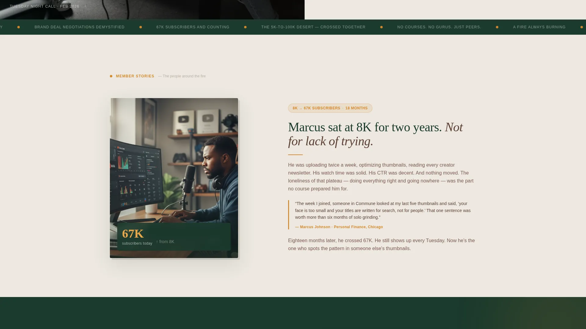
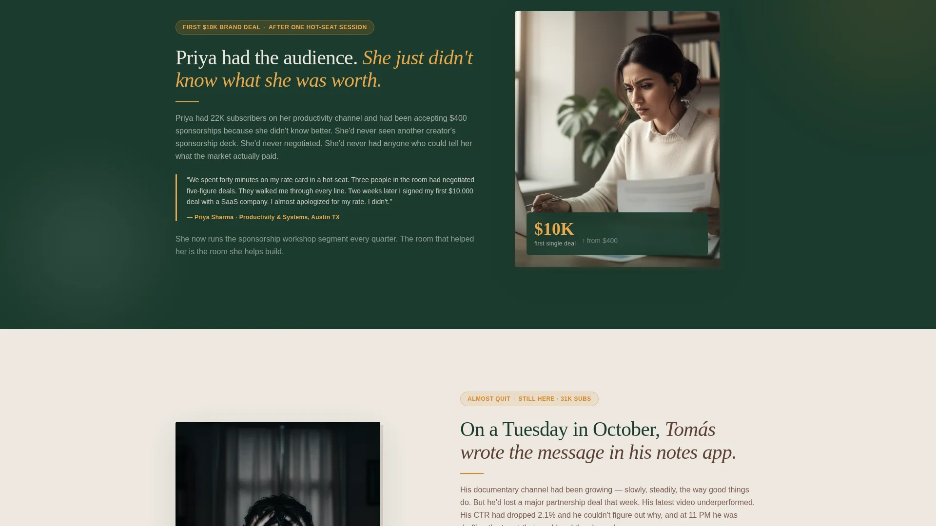
Each member story section flips its photo and text columns as you scroll down. The first block places the photo on the left and the story on the right. The second reverses that. The third mirrors the first. This scroll-driven alternation creates a rhythm that feels like meeting people one by one around a fire, not browsing a roster.
Half-Page Photo and Text Hero
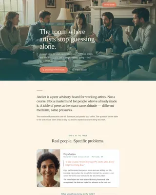
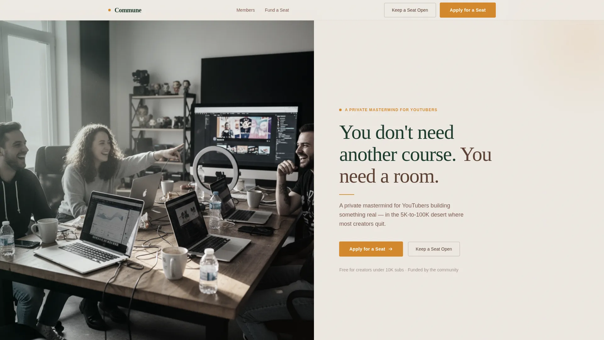
The header splits the viewport into two equal halves. The left side holds a candid, slightly desaturated photo of four creators at a table covered in laptops and coffee mugs. The right side carries the headline in a tall serif typeface, followed by a single supporting line. No hero carousel, no animated background, just a direct and confident opening.
Tiered Donation Selector
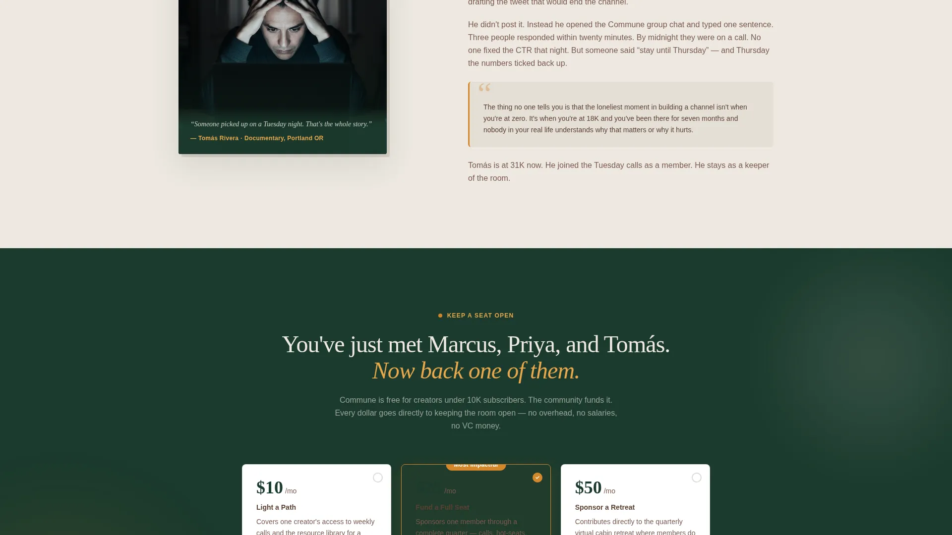
The donation call-to-action section presents three giving tiers with plain-language descriptions. Ten dollars per month lights one creator's path. Twenty-five dollars per month funds a full seat. Fifty dollars per month sponsors a quarterly retreat. The selector uses campfire amber for all interactive elements so the action stands out clearly against the surrounding layout.
Dual-Path Conversion Design
The page keeps two distinct visitor journeys open at all times. A donor path leads to "Keep a Seat Open." A creator path leads to "Apply for a Seat." Both calls to action appear in context after the third member story, so the visitor arrives at the decision point already familiar with the people they are supporting or hoping to join.
IntersectionObserver Scroll Reveals
Each section uses staggered animation-in reveals triggered as the visitor scrolls into view. The effect is medium intensity, meaning sections fade and slide in naturally without feeling like a product demo. The technical approach uses IntersectionObserver for scroll-linked alternation and minimal JavaScript to keep the experience smooth.
Forest Trust Color System
The entire palette is built around four colors: deep canopy green, weathered bark brown, morning fog off-white, and campfire amber. Backgrounds alternate between fog white and canopy green as sections change. Amber appears only on calls to action and highlighted testimonial pulls. The result feels like a wool flannel hung on a hook inside a national park lodge.
Page sections overview
| Section | Purpose |
|---|---|
| Hero Split Header | Introduces Commune with a photo-and-text split and the core headline |
| Member Story: Marcus | Zigzag block covering an 8K to 67K subscriber growth arc |
| Member Story: Priya | Zigzag block covering a first $10K brand deal after a group hot-seat session |
| Member Story: Tomás | Zigzag block covering a member who almost quit and was talked back by the group |
| Donation Tier Selector | Three giving levels with amber calls to action and a secondary apply path |
| Page Footer | Logo and tagline on the left, navigation links on the right |
Design & branding system
The visual identity follows a Nature-Inspired theme rooted in the Forest Trust color system. Every color choice has a specific role, and no color is used decoratively outside its assigned function. Typography pairs a tall serif display face for headlines with a clean sans-serif for body text, creating contrast without formality.
- Deep canopy green (#1B3A2D) and morning fog off-white (#EDE8E1) alternate as section backgrounds
- Weathered bark brown (#5C4033) carries body text on light sections; fog white carries text on dark sections
- Campfire amber (#D4882C) is reserved exclusively for calls to action and highlighted testimonial pulls
Mobile & speed optimization
The template is designed desktop-first with strong mobile adaptation built in. The zigzag layout stacks vertically on smaller screens, keeping each member story readable and visually coherent without breaking the emotional sequence. Server Components handle static content, and JavaScript is kept minimal to avoid unnecessary load.
- Zigzag columns stack cleanly into single-column blocks on mobile viewports
- Animation reveals are lightweight and use IntersectionObserver rather than scroll-event listeners
- Static sections are handled with Server Components to reduce client-side rendering overhead
How this template helps you convert
This landing page is built around a specific insight: people fund and join things they feel emotionally connected to, not things they intellectually agree with. Every structural decision serves that principle.
- The three member stories are sequenced so that by the time the donation selector appears, the visitor has already met a real person whose path they understand. The ask feels personal, not transactional.
- The dual-path design means neither donors nor applicants feel like an afterthought. Each visitor finds a clear next step that matches their own relationship to the community.
Other information about this template
This template is built for the specific intersection of community organizing and the creator economy. It suits nonprofit-adjacent projects, free peer programs, and donation-funded creator groups that rely on storytelling over specifications. A few additional details worth knowing before you build with it:
- The footer follows an arc layout pattern with the logo and tagline anchored on the left and navigation links on the right
- Localization defaults are set for English (United States), currency in USD, and date format MM/DD/YYYY
- The template is categorized under Community and Nonprofit, with a subcategory of YouTubers Community
- Typography uses Fraunces for display headlines and DM Sans for body text throughout the page
- The amber color (#D4882C) is a deliberate scarcity signal: it appears only where the page asks something of the visitor, keeping its visual weight meaningful
Theme
Nature-Inspired
Creative direction
Team & People
Color system
Forest Trust
Style
Zigzag/Alternating
Direction
Donation/Fundraising
Page Sections
Zigzag Alternating Member Story Layout
Half-page Photo and Text Hero
Tiered Donation Selector
Dual-path Conversion Design
Scroll-triggered Section Reveals
Forest Trust Color System
Related questions
Can I use this template for a community that is not focused on YouTube creators?
Is the donation tier selector interactive out of the box?
How many member story sections does the template include?
Does the page support both donors and applicants at the same time?
What typography does this template use?