Fitness Professionals Community Landing Page Template
Commune is a donation and membership landing page built for fitness professionals who need a private space to recover, connect, and be honest. The staggered masonry testimonial grid, split-hero header, three-tier giving panel, and full-width stat sections work together to move visitors from emotional recognition to committed action.
by Rocket studio
Quick summary
Commune is a single-page landing page template designed for a paid fitness professionals community. It uses a staggered masonry testimonial grid, a split half-page hero, and a structured three-tier donation panel to convert both supporters and working fitness professionals into members or recurring donors.
Who this template is for
This template is built for community organizers, wellness advocates, and fitness industry insiders who want to create a private membership and fundraising page. It speaks directly to the people running those communities and the audiences they are trying to reach.
- Personal trainers, group fitness instructors, and rehab-focused coaches looking to join or fund a peer support community
- Community founders who need a compelling donation and membership page for a fitness professionals network
- Supporters and advocates who want to sponsor access for fitness professionals who cannot afford membership
What problem this template solves
Fitness professionals carry enormous physical and emotional weight for their clients. Most industry landing pages are built to sell performance and achievement. This template solves the opposite problem: it creates a space that feels safe before a visitor ever reads a call to action.
- Generic community templates fail to build trust with burned-out professionals who are skeptical of polished marketing
- There is no standard template that combines a testimonial mosaic, evidence-based stat sections, and a tiered donation flow in one cohesive layout
- Fitness professionals need to feel seen and heard before they will donate, join, or share a page with a colleague
What you get with this template
You get a complete single-page layout structured around emotional storytelling and clear giving pathways. Every section has a defined purpose, and nothing is decorative without reason.
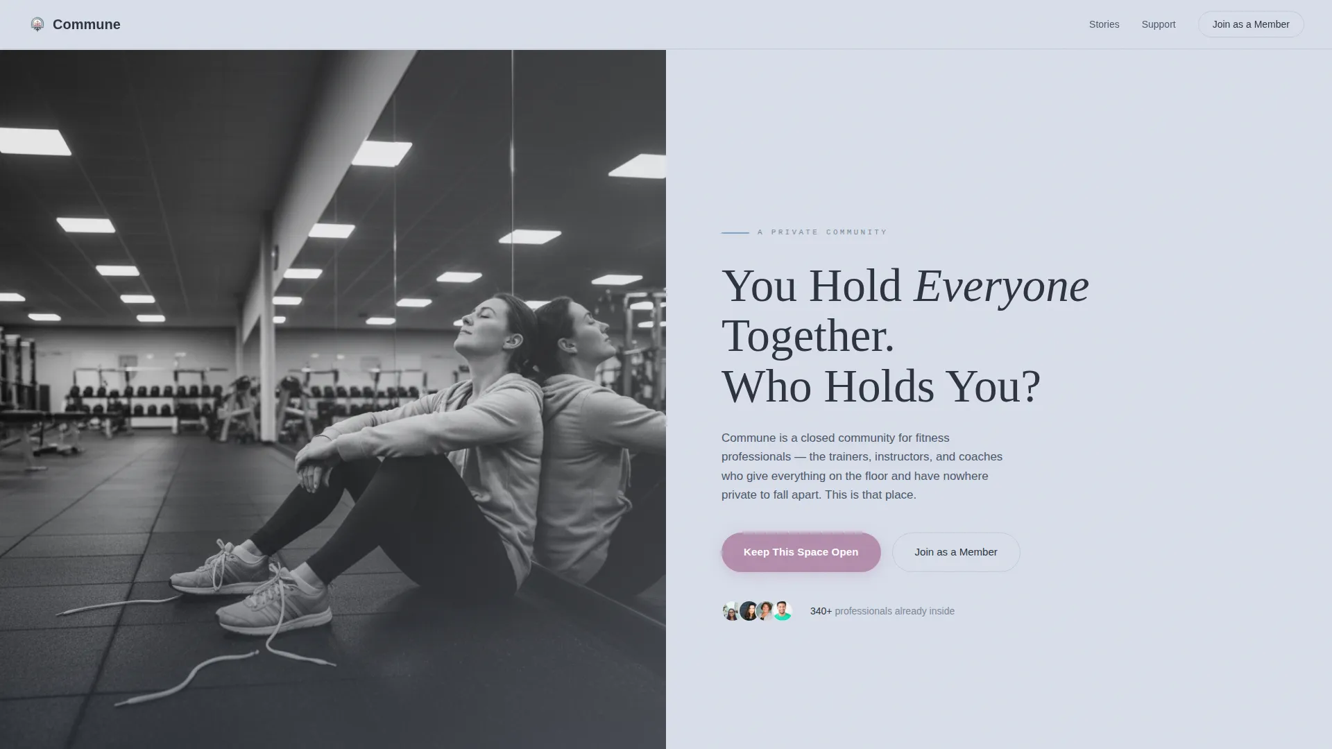
- A split half-page hero with a black-and-white photo composition and a large serif headline on the right side
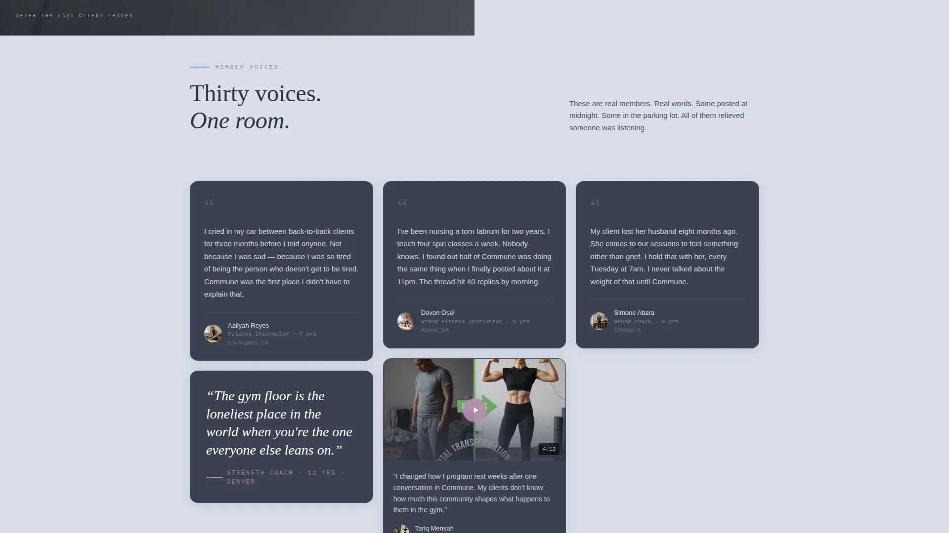
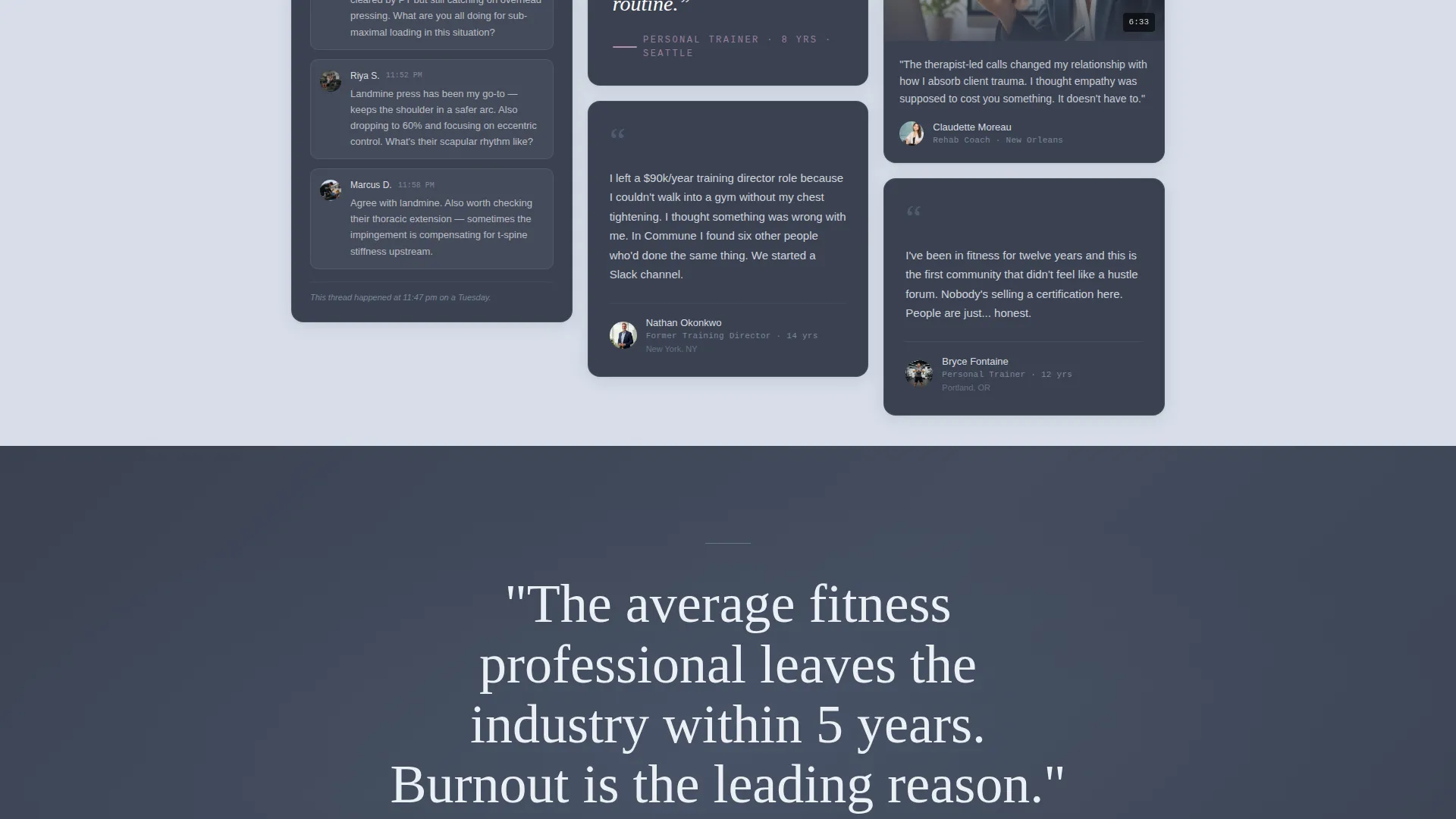
- Three staggered masonry testimonial clusters featuring mixed card formats: written confessions, pulled quotes, video thumbnails, and group thread screenshots
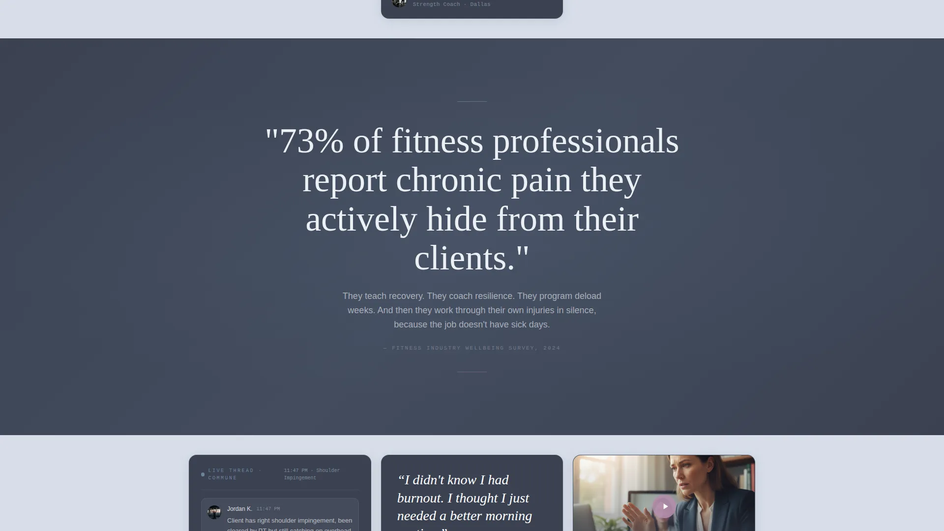
- Two full-width stat breath-pause sections carrying industry statistics between mosaic clusters
- A three-tier donation panel with member faces, impact sentences, and a primary call-to-action button
- A persistent top-navigation membership link with a form modal capturing name, training specialty, and years in the industry
- A minimal warm footer using a split layout pattern
Feature list
This template is built around a small set of deliberate, high-impact features. Each one is designed to earn trust and guide action without pressure.
Staggered Masonry Testimonial Grid
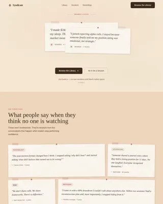
Three distinct mosaic clusters display member stories in varied card sizes and formats. Cards include written confessions, pulled quotes over blurred gym photos, short video thumbnails, and group thread screenshots. The progressive reveal feel creates the sense of walking deeper into a living room where voices keep joining.
Split Half-Page Hero Section
The hero divides the screen into two halves. The left holds a black-and-white photograph of a fitness professional resting alone on a gym floor. The right carries a large serif headline, a single explanatory subline, and a soft-cornered donation button.
Full-Width Stat Breath-Pause Sections
Two full-width sections interrupt the mosaic flow with grounded industry statistics. The first reads "73% of fitness professionals report chronic pain they hide from clients." The second addresses industry attrition and burnout. These sections slow the scroll and anchor emotion in evidence.
Three-Tier Donation Panel
The giving panel presents three clear monthly tiers: $15, $40, and $100. Each tier shows exactly one member face and one sentence explaining what access changed for that person. Tier selection is interactive, and the primary call to action reads "Keep This Space Open."
Membership Form Modal
A persistent but understated top-navigation link labeled "Join as a Member" opens a modal form. The form captures name, training specialty, and years in the industry. It provides a direct membership path without competing with the donation flow.
Scroll-Triggered Card Reveals
Cards load with staggered scroll-triggered animations using Intersection Observer. The parallax stat sections add depth between clusters. The effect builds gradually so the page feels alive and responsive as visitors move through it.
Page sections overview
| Section | Purpose |
|---|---|
| Split Hero | Introduces the community's emotional core and primary call to action |
| Mosaic Cluster 1 | Opens testimonial flow with confessions, quotes, and thread cards |
| Stat Breath Pause 1 | Grounds emotion with the chronic pain statistic |
| Mosaic Cluster 2 | Deepens story with video thumbnails and pulled quotes |
| Stat Breath Pause 2 | Reinforces urgency with industry attrition and burnout data |
| Mosaic Cluster 3 | Closes the mosaic with midnight troubleshooting group thread cards |
| Three-Tier Donation Panel | Converts visitors to recurring donors across three giving levels |
| Minimal Warm Footer | Closes the page with a quiet, split-layout footer |
Design & branding system
The visual identity follows a Healing Space theme. Every color choice is deliberate, pulling from a palette that feels like early morning on a mountain trail rather than a commercial gym.
- Canvas background in soft overcast gray (#D8DEE9), card backgrounds in grounding charcoal slate (#3B4252), and accent links in open-sky blue (#81A1C1) on hover states
- Active buttons and donation tier highlights use quiet dawn lilac (#B48EAD), keeping the page warm without urgency
- Typography uses Fraunces as the serif headline face, DM Sans for body text, and JetBrains Mono for statistics and labels
Mobile & speed optimization
The template is designed desktop-first with a graceful mobile-responsive collapse. The masonry grid adapts cleanly across screen sizes without losing the layered storytelling effect.
- The masonry grid collapses gracefully on smaller screens so card variety is preserved at every viewport
- Images use lazy loading and CSS scroll behavior to reduce initial load weight
- Intersection Observer drives the scroll-triggered card reveal animations without heavy JavaScript dependencies
How this template helps you convert
The page earns every click through accumulated emotional weight rather than aggressive marketing. By the time a visitor reaches the donation panel, the mosaic has done most of the work.
- The hero headline creates immediate emotional recognition for fitness professionals and supporters, reducing the friction of a cold scroll through an unfamiliar page
- Three mosaic clusters with thirty distinct member voices build trust progressively, so the "Keep This Space Open" call to action feels like a natural response rather than a sales ask
- The three-tier giving panel removes decision paralysis by presenting clear impact per dollar, with a member face and a single outcome sentence anchoring each tier
Other information about this template
This template sits at the intersection of community fundraising and fitness industry advocacy. It works equally well for organizers launching a new private community and for established groups that need a more emotionally resonant public-facing page.
- The footer follows a split Arc Browser-style layout pattern, keeping the close of the page warm and minimal
- The donation panel is built in USD and uses US-centric fitness industry context for statistics and member language
- The template supports both donor and member conversion paths simultaneously without either path undermining the other
- Scroll-triggered animations use medium intensity, so the page feels alive without overwhelming visitors on slower connections
Theme
Healing Space
Creative direction
Testimonial Mosaic
Color system
Slate & Sky
Style
Masonry/Pinterest
Direction
Donation/Fundraising
Page Sections
Staggered Masonry Testimonial Grid
Split Half-page Hero Section
Full-width Stat Breath-pause Sections
Three-tier Donation Panel
Persistent Membership Form Modal
Scroll-triggered Card Reveal Animations
Related questions
Can this template support both donors and new members at the same time?
Does the masonry grid work on mobile devices?
Can I change the donation tier amounts and impact statements?
Is the stat content editable if my community uses different data?
Who is the secondary audience this template is designed to reach?