Marketing Community Landing Page Template
Commune is an editorial-style landing page template built for paid marketing professional communities. It pairs a warm, magazine-inspired layout with a Community Mosaic header, real member story sections, pull-quote breaks, and an event registration form. The design feels intentional and human, guiding visitors toward saving a seat at the next monthly open session.
by Rocket studio
Quick summary
Commune is a single-page template for marketing professionals' paid communities and memberships. It blends editorial magazine design with a healing-space aesthetic to make every visitor feel recognized before they register. The layout moves from a member portrait mosaic to real member stories, pull-quotes, and a focused event registration form.
Who this template is for
This template is built for community founders and operators who serve mid-to-senior marketing professionals. It works especially well when your offer centers on peer trust, small-group accountability, and gated access rather than a course catalog or feature list.
- Marketing community founders running paid memberships or monthly open sessions
- Brand strategists or consultants launching a gated peer group for senior marketers
- Agency leaders or independent operators building a quiet, high-trust space for marketing professionals
What problem this template solves
Most community landing pages lead with feature lists, pricing tables, and bullet-point benefits. That approach does not work for a community where the real value is belonging. Visitors leave before they feel anything. Commune solves this by building trust through people, not product specs.
- Senior marketers scan generic community pages and feel nothing they recognize
- Founders struggle to convey warmth and peer quality without sounding like every other membership offer
- Event registration pages often feel transactional, losing visitors who are curious but not yet ready to commit
What you get with this template
You get a complete, ready-to-adapt editorial landing page designed around human recognition and peer-driven trust. Every section is intentional and sequenced to move a skeptical, experienced marketer from quiet curiosity to genuine readiness to join.
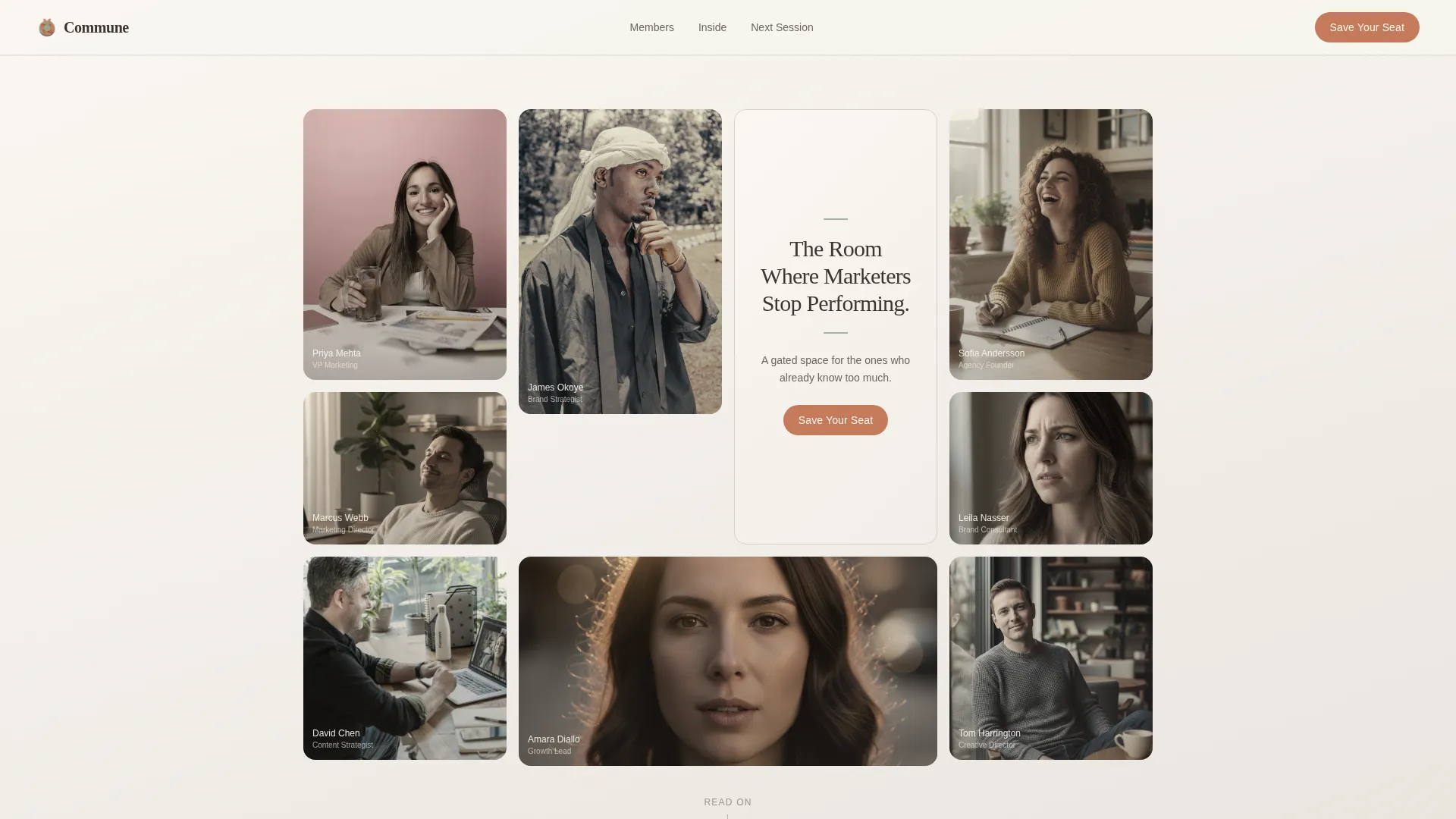
- A Community Mosaic hero section with an organic masonry portrait grid and a serif headline center tile
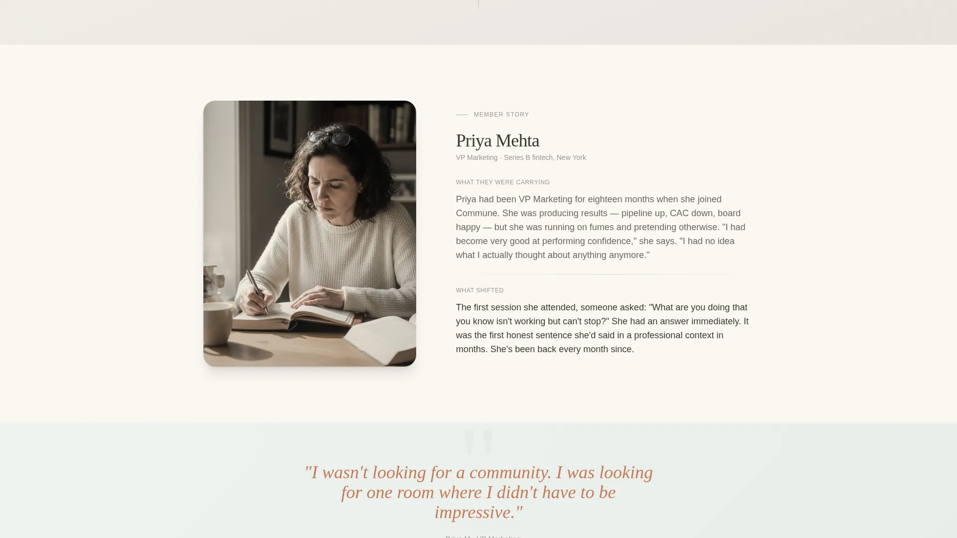
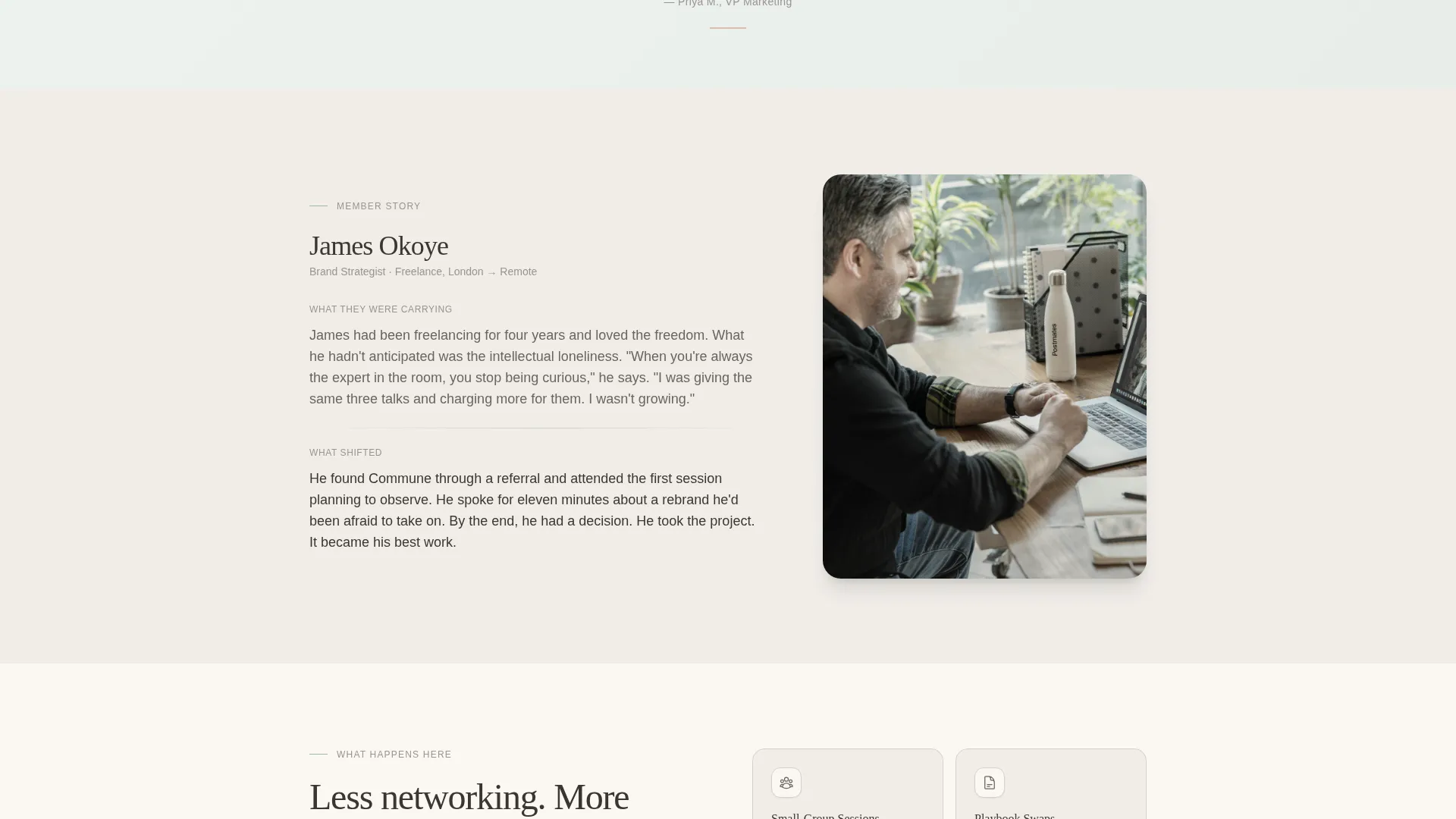
- Alternating member story sections with environmental photography placeholders and editorial pull-quote breaks
- A two-path event registration section: a primary "Save Your Seat at the Next Table" form and a secondary free archived session recording option
Feature list
This section covers the core built-in design and layout features that make Commune work as a high-trust community landing page.
Community Mosaic Hero Header
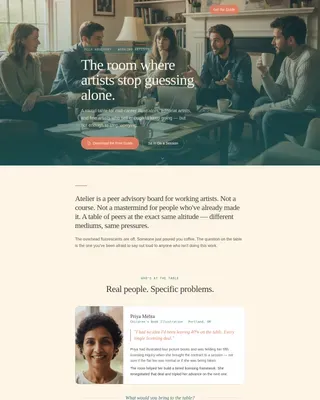
The hero section uses a masonry grid of member portrait tiles. One center tile is slightly larger and holds the headline in hand-set serif type. Tiles shift softly on hover, creating a living, human first impression without a single logo or badge in sight.
Editorial Member Story Sections
Below the mosaic, the page introduces real members in alternating editorial profiles. Each profile includes a name, a role title, and a single honest paragraph about what shifted after joining. Photography is environmental rather than posed, reinforcing authenticity at every scroll step.
Terracotta Pull-Quote Breaks
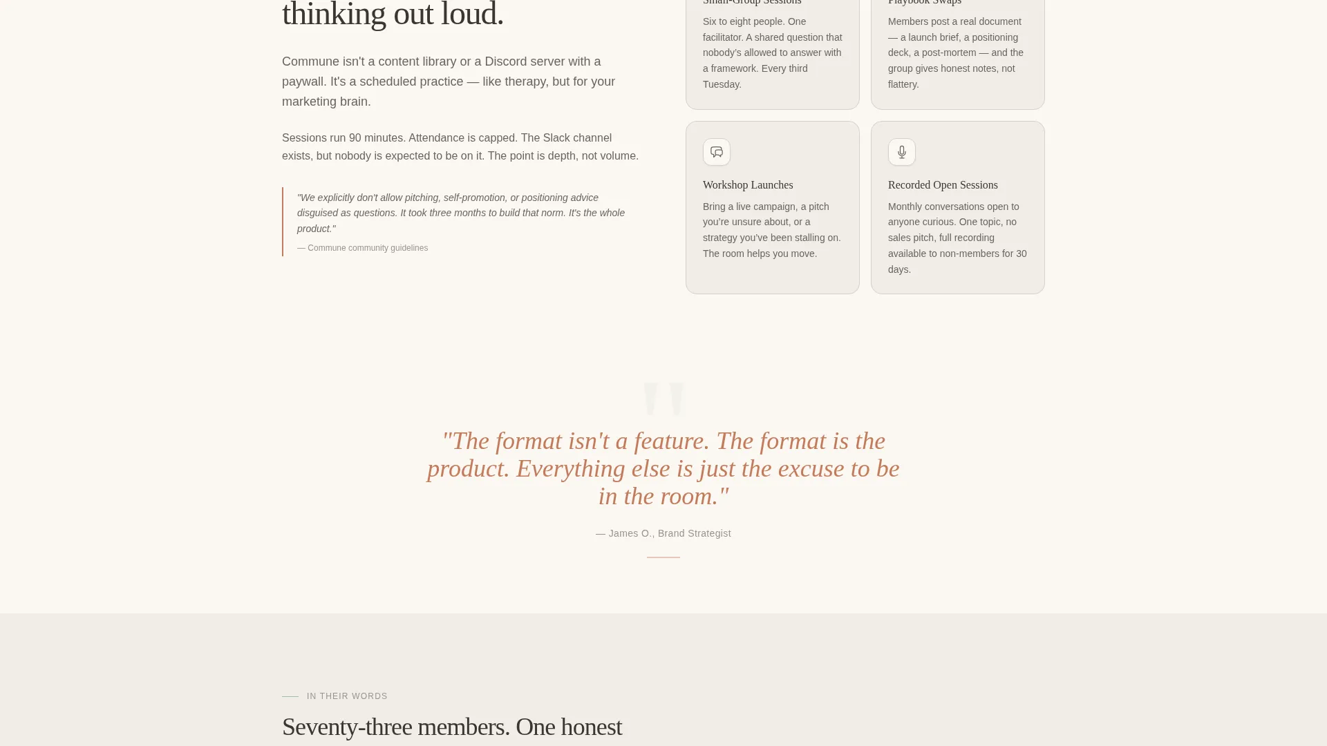
Between member stories, editorial pull-quotes appear in the terracotta clay accent color. These breaks set a reading rhythm and surface the community's voice in a way that feels closer to a magazine feature than a sales page.
Two-Path Event Registration Form
The primary call to action is a short registration form asking for first name, current role, and one open-text field: "What's the marketing question you can't ask out loud?" A secondary path offers a free archived session recording for visitors who are not yet ready to attend live.
Scroll-Linked Animation and Stagger Reveals
Sections animate in with staggered reveal transitions as the visitor scrolls. Pull-quotes use scroll-linked parallax. The mosaic responds to hover. These interactions add depth without distracting from the editorial content.
Minimal Footer Pattern
The footer follows a clean, minimal pattern with social links and a copyright line. Nothing competes with the primary registration call to action above it.
Page sections overview
| Section | Purpose |
|---|---|
| Community Mosaic Hero | Opens with member portraits and the serif headline to establish human presence immediately |
| Member Stories | Alternating editorial profiles build peer recognition and emotional trust through real voices |
| Pull-Quote Editorial Break | Terracotta pull-quotes set reading rhythm and surface community tone between story blocks |
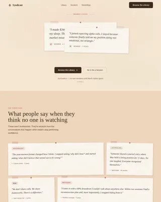
| Social Proof Mosaic | Additional member voices and environmental photography reinforce community quality and breadth |
| Event Registration | Primary form and secondary free recording path convert curious visitors into registered attendees |
| Minimal Footer | Clean social links and copyright close the page without competing with the registration section |
Design & branding system
The visual identity follows a Healing Space theme built on the Cloud Canvas color system. Every color choice is deliberate: nothing competes, nothing shouts, and every element is given room to breathe. Typography pairs Fraunces, a warm serif display face, with DM Sans for body text and interface elements.
- Warm white (#FAF7F2) and morning fog gray (#D6D1CA) alternate as section backgrounds, keeping the eye comfortable across a long scroll
- Quiet sage (#A3B5A6) appears only in dividers and subtle background washes; terracotta clay (#C47B5A) grounds call-to-action buttons and pull-quotes with a single confident accent
- Deep charcoal (#3B3632) carries all body text, softer than pure black and easier to read in long editorial passages
Mobile & speed optimization
This template is designed desktop-first, reflecting the professional audience most likely to read on a laptop during a deliberate moment. Full mobile support is included so the experience holds on any device without breaking the editorial flow.
- The Community Mosaic adapts from its masonry desktop grid to a clean stacked layout on smaller screens
- Static sections use server-side rendering; interactive elements like the mosaic hover and registration form run as client components to keep the page light where it matters
- Stagger reveal animations and scroll-linked parallax are calibrated to feel smooth without slowing the overall page experience
How this template helps you convert
Commune is built around emotional recognition rather than feature persuasion. By the time a visitor reaches the registration form, joining should feel less like a purchase decision and more like an overdue homecoming.
- The mosaic hero leads with real faces and one honest sentence, earning attention before asking for anything in return.
- Member story sections make visitors see themselves in the people already inside, lowering the psychological barrier to registering.
- The two-path form removes the all-or-nothing pressure: visitors can save a seat at a live session or access a free archived recording first, meeting them wherever they are in their decision.
Other information about this template
Commune is specifically matched to the marketing professionals paid community and membership niche within the broader Community and Nonprofit category. It is particularly well suited to operators who have outgrown generic community tools and need a dedicated front door that reflects the quality of what is inside.
- Template style is Editorial and Magazine, making it distinct from dashboard-style or feature-grid community pages
- The creative direction is Team and People, meaning every design decision prioritizes human faces and real voices over product imagery or iconography
- The landing page direction is Event Registration, so the entire scroll sequence is engineered around a single clear next step: saving a seat at the next monthly open session
- The accordion component in the FAQ section supports additional questions without adding visual clutter to the main scroll flow
Theme
Healing Space
Creative direction
Team & People
Color system
Cloud Canvas
Style
Editorial/Magazine
Direction
Event Registration
Page Sections
Community Mosaic Hero Header
Editorial Member Story Sections
Terracotta Pull-quote Breaks
Two-path Event Registration Form
Stagger Reveal Scroll Animations
Minimal Social Footer
Related questions
Who is this template designed for?
Can I adapt the member story sections to fit my own community?
What does the event registration form collect?
Does this template work with a small or early-stage member base?
Can this template be adapted for a free community or open event?