Retiree Insurance Professional Website Template
Companion is a dashboard-style landing page template built for retiree pet insurance providers. It leads with three animated headline metrics, flows through a cost-comparison table and interactive coverage grid, and routes visitors directly to a quote engine. The Cloud Canvas color system and data-first layout make the financial case before the call to action ever appears.
by Rocket studio
Quick summary
Companion is a single-page, data-dashboard landing page template for retiree pet insurance. It opens with animated financial metrics, guides visitors through an insured-versus-uninsured cost comparison, and ends at a low-friction quote button. The layout feels like a financial planning tool, not a brochure, which is exactly right for a fixed-income audience weighing real numbers.
Who this template is for
This template is built for pet insurance providers targeting the retiree market. It suits brands whose value proposition centers on affordability, senior-pet coverage, and transparent pricing rather than emotional storytelling.
- Pet insurance companies serving adults aged 60 and older with senior pets
- Retiree-focused financial product teams launching a direct-response landing page
- Insurance marketers who need a desktop-first, data-led page that routes to an existing quote engine
What problem this template solves
Retirees researching pet coverage are skeptical. They have seen vague benefit language before and they need numbers, not narratives. Standard insurance landing pages rely on lifestyle photography and generic copy that fails to answer the one question this audience always asks: "Is this worth the monthly cost on a fixed income?"
- Existing templates do not show cost-comparison data or senior-pet-specific pricing upfront
- Generic layouts create friction by burying key figures behind contact forms
- Emotional or photography-heavy designs feel mismatched for a data-driven financial decision
What you get with this template
You get a fully structured, single-page layout that argues the financial case before asking for anything in return. Every section is a panel or card. The page reads like a dashboard, not a sales pitch.
- Animated metric cards, an accordion cost table, a toggled coverage grid, and a sticky call-to-action bar
- A Logo Bar header with space for carrier and veterinary partner logos in monochrome graphite
- A full-width coral call-to-action panel, a claims-paid ticker section, and a linear single-row footer
Feature list
This template includes the following built-in capabilities drawn directly from its design and interaction brief.
Animated Headline Metrics Panel
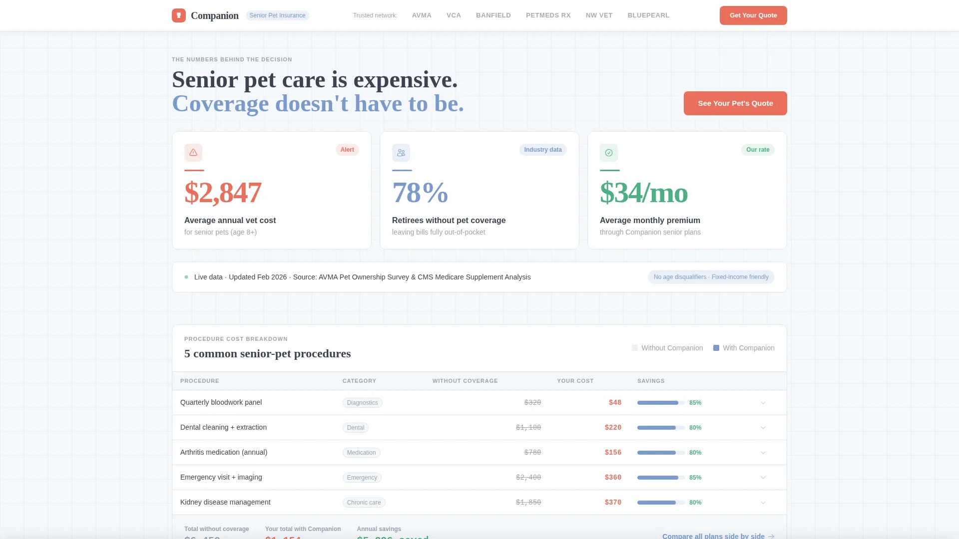
Three key figures animate upward on scroll inside a bento-grid layout: average annual vet cost for senior pets ($2,847), the share of retirees without pet coverage (78%), and the average monthly premium ($34). The counter animation mimics a live dashboard loading real data, which establishes credibility immediately.
Insured versus. Uninsured Cost Table
An accordion-style table compares insured and uninsured costs across five common senior-pet procedures. Visitors can expand and collapse rows, making it easy to scan the numbers most relevant to their pet's situation without scrolling past a wall of data.
Interactive Coverage Grid with Toggles
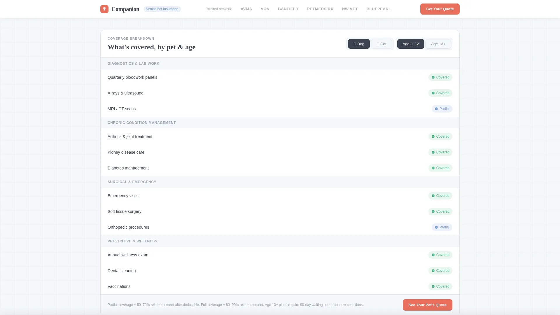
A coverage breakdown grid lets visitors filter by species (dog or cat) and age bracket. The toggles update the visible plan information so each visitor sees the coverage that matches their specific pet. No page reload is needed.
Sticky Call-to-Action Bar
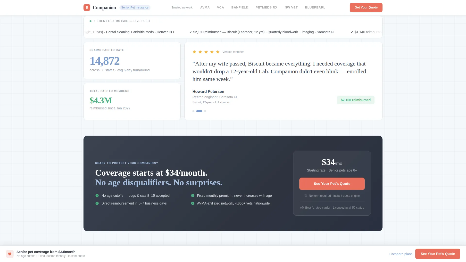
After the second scroll depth, a sticky bottom bar appears with the primary "See Your Pet's Quote" button. The bar stays visible as visitors explore the page, reducing the effort needed to take action at any point in the scroll journey.
Trust and Social Proof Panel
A claims-paid ticker, partner logo strip, and retiree testimonials with specific dollar figures appear together in a dedicated trust section. This panel answers credibility questions without interrupting the data flow of the earlier sections.
Partner Logo Bar Header
The header is a slim horizontal bar showing the brand wordmark left-aligned alongside carrier and veterinary partner logos rendered in monochrome graphite on a cloud-white background. It signals institutional credibility in the first visual moment, before any copy is read.
Page sections overview
| Section | Purpose |
|---|---|
| Logo Bar Header | Displays brand wordmark and partner logos for immediate credibility |
| Animated Metrics Panel | Shows three headline financial figures with scroll-triggered counters |
| Cost Comparison Table | Compares insured versus. uninsured costs across five senior-pet procedures |
| Coverage Breakdown Grid | Dog/cat and age-bracket toggles reveal relevant plan details |
| Trust and Social Proof | Claims ticker, partner logos, and retiree testimonials with real numbers |
| Final Call-to-Action Panel | Full-width coral panel with the primary quote button |
| Linear Footer | Single-row footer with essential links |
Design & branding system
The visual identity follows a Startup Velocity theme applied through the Cloud Canvas color system. The palette is intentionally calm and legible, designed for a desktop-first retiree audience that values clarity over visual excitement.
- Soft cumulus white (#F4F7FA) for panel backgrounds, calm graphite (#3B4351) for text and data labels, and sky-washed periwinkle (#7B9ACC) for chart fills and progress indicators
- Confident coral (#E86F5C) used exclusively for calls to action and alert-state numbers, ensuring the eye is guided without visual noise
- DM Sans for body text and data labels, paired with Fraunces for display headlines, creating a data-dashboard-meets-warm-financial-planner aesthetic
Mobile & speed optimization
The template is designed desktop-first, which reflects the real browsing habits of the retiree demographic. It still adapts for tablet and mobile use so no visitor is turned away.
- Interactive elements such as toggles, the accordion table, and the sticky call-to-action bar are built as client-side components for smooth responsiveness
- Static sections use server-rendered components to keep initial load fast without sacrificing the animated and interactive panels
- Counter animations and scroll reveals are set to a medium intensity, keeping the experience lively without feeling overwhelming on any screen size
How this template helps you convert
This template is structured around a single principle: prove the financial case before the call to action appears. Every panel is ordered to answer the next logical question a skeptical retiree would ask.
- The animated metrics panel surfaces the most persuasive numbers first, so the value proposition is clear within the first viewport, and the primary "See Your Pet's Quote" button appears right alongside those figures.
- The cost-comparison table and coverage grid provide the second and third layers of evidence, with a secondary text link ("Compare All Plans Side by Side") available beneath the table for visitors who need more detail before clicking.
- By the time the coral call-to-action button appears for the third time in the full-width final panel, the numbers have already made the argument, and the sticky bottom bar ensures the quote path is always one tap away.
Other information about this template
This section covers additional practical details about the Companion template that do not fit neatly into the feature or design sections above.
- The page routes visitors to an external carrier quote engine with pre-filled parameters; there is no embedded form on the page, keeping friction near zero
- Localization is set for a United States audience using USD currency and MM/DD/YYYY date formatting throughout
- The template is categorized under Finance and Insurance, specifically within the Retiree Insurance subcategory and the Retiree Pet Insurance niche, making it purpose-built rather than adapted from a general insurance layout
- Animation intensity is set to medium: counter animations, scroll reveals, and toggle filters provide interactivity without overwhelming visitors who prefer a quieter browsing pace

Theme
Startup Velocity
Creative direction
Stats-First Impact
Color system
Cloud Canvas
Style
Dashboard/Data Grid
Direction
Click-Through
Page Sections
Animated Headline Metrics Panel
Insured Versus. Uninsured Cost Table
Interactive Coverage Grid with Toggles
Sticky Call-to-action Bar
Trust and Social Proof Panel
Partner Logo Bar Header
Related questions
Does this template include a quote form?
Can I adjust the dog/cat and age-bracket toggles to match my own plan tiers?
Is this template suitable for a tablet audience?
What makes this template different from a standard insurance landing page?
How many times does the primary call-to-action appear on the page?



