A comparison table landing page built for manufacturing benefits consultants. It opens with a live enrollment odometer, delivers hard retention statistics before any explanation, and walks HR directors, plant managers, and CFOs through a side-by-side plan comparison. Two clear calls to action drive audit requests and benchmark report downloads from the same page.
by Rocket studio
Loading preview…
Quick summary
This landing page template is purpose-built for a manufacturing benefits consultancy. It leads with a mechanical odometer ticker showing live enrollment numbers, then drops hard statistics before a row-by-row comparison table. Every scroll escalates the data gap between a generic broker plan and a manufacturing-optimized plan, ending with a dual call-to-action section that captures both serious audit leads and early-stage prospects.
Who this template is for
This template is made for consultancies that specialize in benefits packages for industrial and manufacturing employers. It speaks directly to the decision-makers who feel the pain of skilled-trades turnover every quarter.
Human Resources directors at mid-size manufacturers running two or three shifts
Plant managers who have lost experienced machinists or computer numerical control operators over a dental plan
Chief Financial Officers trying to balance rising premiums against tight per-unit margins
What problem this template solves
Manufacturers lose skilled tradespeople to competitors not because of wages alone, but because their benefits packages are generic, confusing, and not designed around shift work. A standard broker template does nothing to show the gap. This page makes that gap visible and undeniable.
No clear side-by-side proof that a manufacturing-optimized plan outperforms a generic broker plan
No compelling, data-first narrative that speaks to the cost of turnover, not just the cost of premiums
No structured path that converts both a ready-to-act HR director and a still-researching CFO on the same page
What you get with this template
You get a complete, single-page layout that carries a visitor from proof to action without a single weak handoff. Every section is designed around industrial credibility and hard numbers.
A mechanical odometer hero section with a bold yellow headline and a floating call-to-action bar that pins after the second scroll
A statistics impact grid and a full comparison table showing a generic broker plan versus a manufacturing-optimized plan, row by row
Theme
Educational Guide
Creative direction
Stats-First Impact
Color system
Dopamine Pop
Style
Comparison Table
Direction
Recruitment/Hiring
Page Sections
Live Mechanical Odometer Header
Stats-first Impact Grid
Row-by-row Comparison Table
Floating Audit Call-to-action Bar
Dual Conversion Call-to-action Section
Scroll-triggered Section Animations
Related questions
Who is the primary audience for this landing page template?
What does the comparison table actually compare?
How does the dual call-to-action section work?
Does the floating call-to-action bar stay visible the whole time?
Can this template work for a consultancy focused on a specific region or industry segment?
A dual call-to-action section combining an audit request form and a gated benchmark report download
Feature list
This template includes the following built-in components and layout features as described in the source brief.
Live Enrollment Odometer Header
A large, mechanical-counter-style odometer sits at the top of the page and rolls upward, showing the number of manufacturing employees currently enrolled in plans designed by the consultancy. The digits click and tumble like a production counter on the plant floor. A single bold line in safety yellow sits beneath it as the page's opening dare.
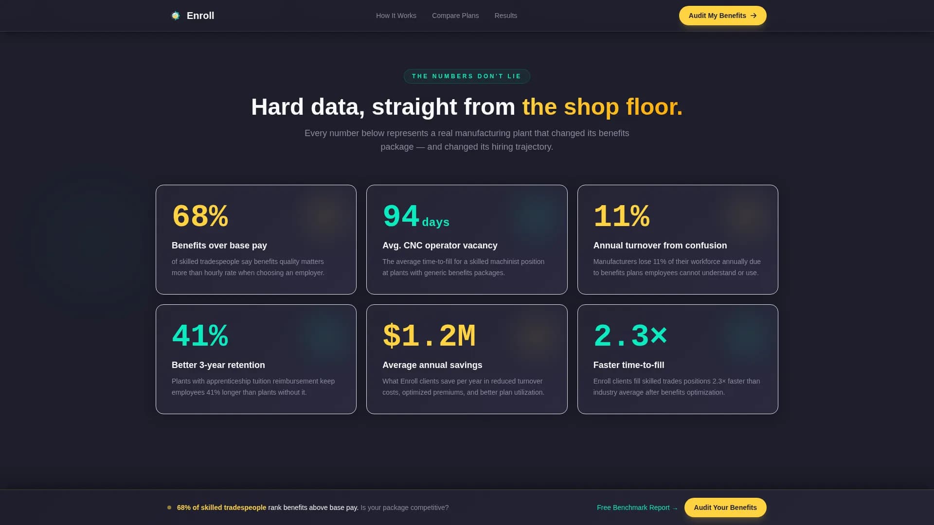
Stats-First Impact Grid
Before any explanation appears, the page delivers hard numbers. The stat "68% of skilled tradespeople rank benefits above base pay" lands first, followed by a grid of supporting figures covering retention rates, time-to-fill metrics, and annual premium savings.
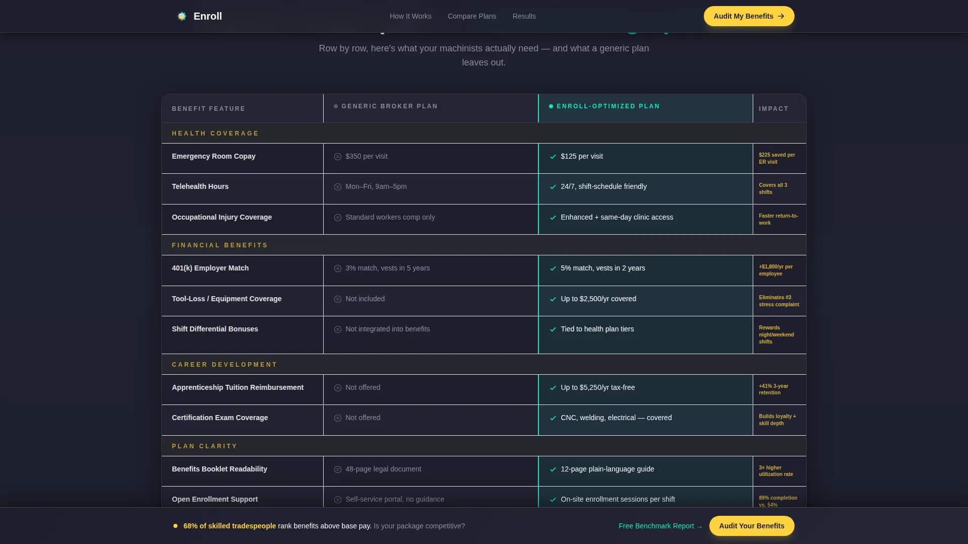
Side-by-Side Comparison Table
The core of the page is a row-by-row comparison table. It places a generic broker plan next to a manufacturing-optimized plan and highlights the winner in each row using electric teal. Rows cover emergency room copay, tool-loss coverage, shift-schedule-friendly telehealth hours, and apprenticeship tuition reimbursement.
Floating Call-to-Action Bar
After the second scroll, a persistent floating bar pins to the viewport and keeps the primary call to action visible. It prompts visitors to request a benefits package audit without interrupting their reading flow.
Dual Conversion Section
The page closes with two parallel paths. The audit request form asks for company name, number of employees, current benefits provider, and biggest hiring pain point. The secondary path offers a downloadable Manufacturing Benefits Benchmark Report gated behind an email address only.
Scroll-Triggered Data Reveals
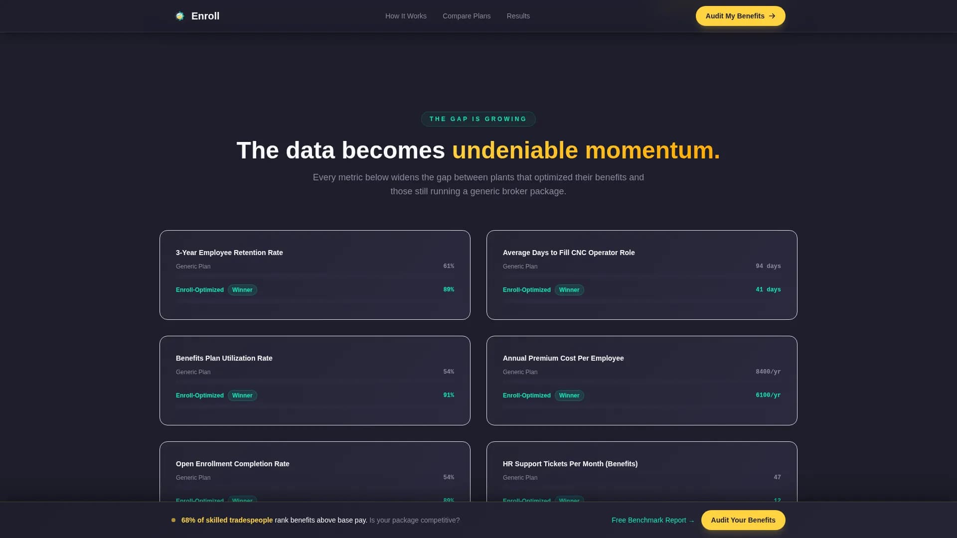
Each section animates into view as the user scrolls. Stat callouts and table row highlights activate on scroll, building momentum as the data gap between plan types becomes increasingly clear.
Page sections overview
Section
Purpose
Hero Odometer
Live enrollment proof and opening dare headline
Stats Impact Grid
Hard numbers before any explanation
Comparison Table
Row-by-row plan gap visualization
Retention Metrics
Escalating gap data on turnover and savings
Audit Form
Qualified lead capture via benefits audit request
Benchmark Download
Early-stage lead capture via gated report
Footer
Single-row linear brand and navigation close
Design & branding system
The visual identity follows an Educational Guide theme built on a Dopamine Pop color system. The palette is engineered for industrial clarity, not corporate softness. It feels like a safety vest catching fluorescent light on a factory floor.
Midnight shop-floor charcoal (#1E1E2C) anchors every background; safety yellow (#FFD23F) fires on primary buttons and stat callouts; electric teal (#0AEBC0) traces comparison table winners and progress bars; PPE white (#F9FAFB) opens breathing room inside dense card and table layouts
Typography uses DM Sans for body copy and user interface elements, and JetBrains Mono for all numbers, statistics, and odometer digits
Mobile & speed optimization
The template is built desktop-first to match how HR directors and CFOs typically work, at a workstation with a full-screen browser. A solid mobile fallback ensures the page remains usable for plant managers who may access it from a tablet or phone on the floor.
Static sections use server components for faster initial load; the odometer and form interactions run as client components to keep animation smooth without blocking the page
The floating call-to-action bar, comparison table highlights, and scroll-triggered stat reveals are all handled with targeted client-side interactivity, keeping the rest of the layout lightweight
How this template helps you convert
Every design and layout decision on this page is aimed at removing doubt and shortening the path from first impression to a submitted form or downloaded report.
The odometer opens with proof before a single word of copy, giving skeptical CFOs and HR directors a number to anchor their trust before reading further.
The comparison table makes the cost of inaction concrete and visual, so a plant manager who just lost a machinist sees exactly what the gap looks like in writing.
The dual call-to-action structure meets visitors at two different levels of readiness, converting both the qualified buyer who wants an audit and the researcher who just wants the benchmark data.
Other information about this template
This template is localized for the United States market. All currency references use USD, measurements follow imperial standards, and date formatting follows the MM/DD/YYYY convention common in American manufacturing operations.
The page is designed for a business-to-business consultancy context, targeting mid-size manufacturers with between 200 and 2,000 employees across multiple shifts
Animation intensity is set to high, covering the mechanical odometer counter, scroll-triggered stat reveals, comparison table row highlights, and the floating call-to-action bar
The footer follows a linear single-row pattern, keeping the close clean and uncluttered after a data-heavy page