Complete Retiree Insurance Comparison Website Template
Shield is a retiree auto insurance comparison table landing page template built for insurance businesses that want to convert retired drivers into audit leads. It combines stark data presentation, amber-highlighted comparison tables, and a streamlined three-field form into one focused page that answers the question most retirees never thought to ask: am I still overpaying for coverage I no longer need?
by Rocket studio
Quick summary
Shield is a single-page insurance landing page template designed for retiree auto insurance services. It pairs an authoritative Legal Shield visual style with structured comparison tables that expose exactly where retired drivers overpay. The page moves visitors through national overpayment data, a five-row coverage breakdown, and a free policy audit form, all without a single unnecessary distraction.
Who this template is for
This template is the perfect solution for insurance businesses and independent agents who serve retired drivers. If your company needs a focused insurance landing page that speaks plainly to people who have outgrown their old policies, this template fits that goal precisely.
- Insurance companies and agencies targeting drivers aged 65 and older
- Independent agents offering low-mileage, snowbird, or single-vehicle plan reviews
- Insurance marketing teams that want to create professional audit-style landing pages quickly
What problem this template solves
Retired drivers rarely re-shop their car insurance. They carry commuter-era full coverage on vehicles that now sit in a garage six months of the year. A standard insurance landing page does not surface that problem clearly enough to prompt action. This template treats the overpayment gap as the central story, and makes the case with data, not sales language.
- Retirees see they are paying for coverage levels that do not match how they actually drive
- Potential customers can self-qualify before requesting an audit, reducing friction for both sides
- The page avoids industry jargon, making every coverage line easy to understand without prior insurance knowledge
What you get with this template
You get a complete, ready-to-customize insurance landing page template built around a single conversion goal: getting retired drivers to request a free policy audit. Every section earns its place. Nothing is decorative without purpose.
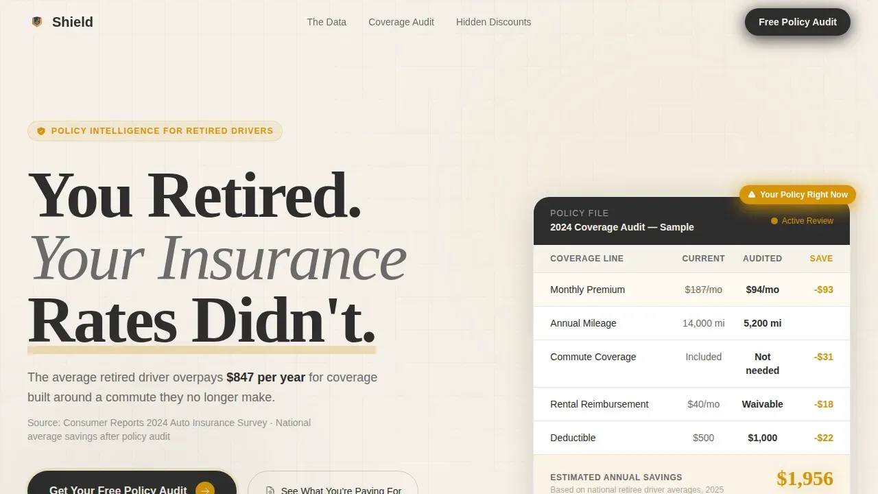
- A hero section with a bold headline and a side-by-side policy comparison snapshot
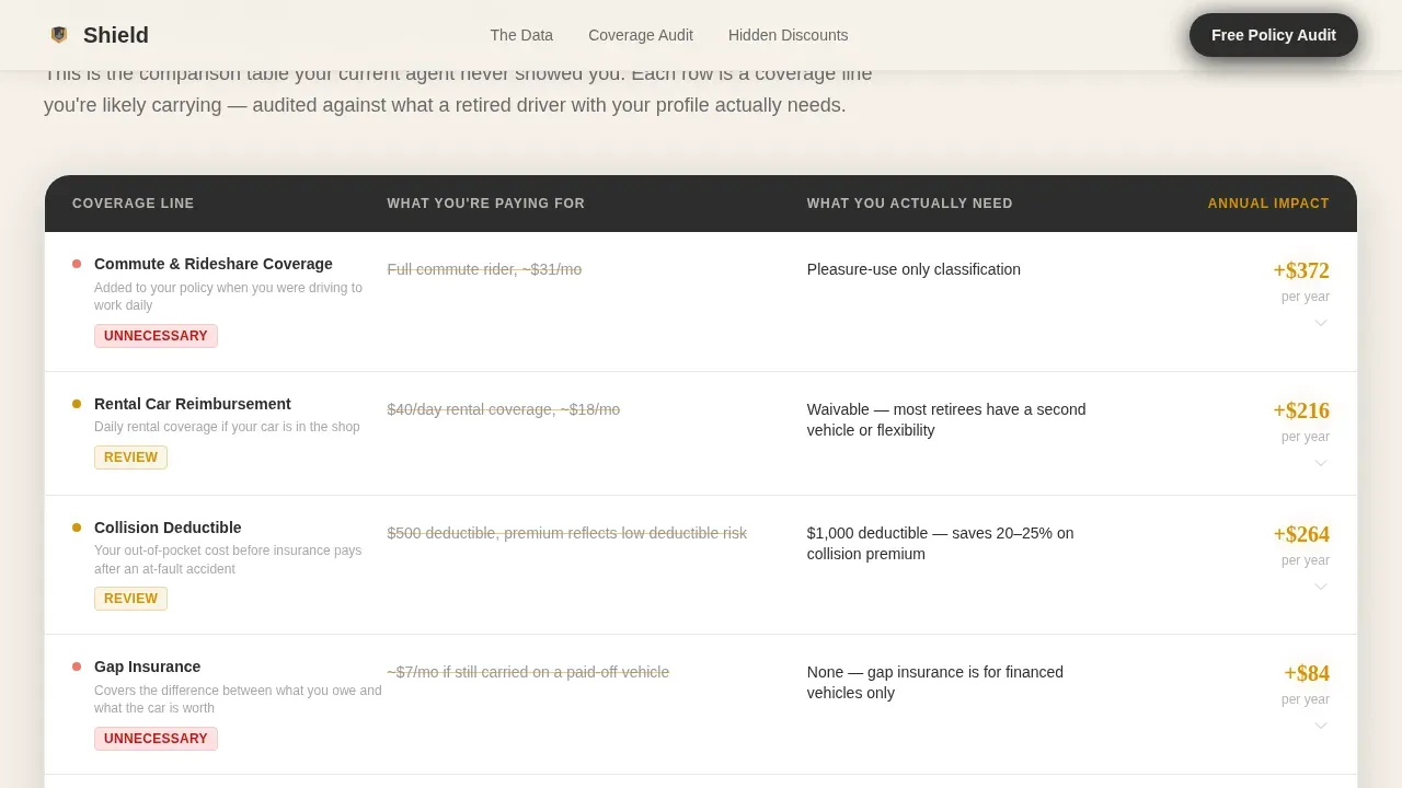
- A five-row coverage comparison table with amber-highlighted savings per line item and a growing cumulative total
- A three-field audit request form plus a secondary PDF lead magnet path for visitors who are not yet ready to act
Feature list
This template ships with six core features drawn directly from the design and structure brief. Each one serves a specific role in the landing page creation process.
Five-Row Coverage Comparison Table
The comparison table is the spine of this landing page. Each row contrasts "What You're Paying For" against "What You Actually Need," with amber callouts showing the savings figure per coverage line. Comparison tables like this help potential customers self-qualify and grasp the value of their options before a quote is ever calculated. The cumulative savings total grows bolder with each scroll, building a case that feels methodical and evidence-based.
National Overpayment Data Dashboard
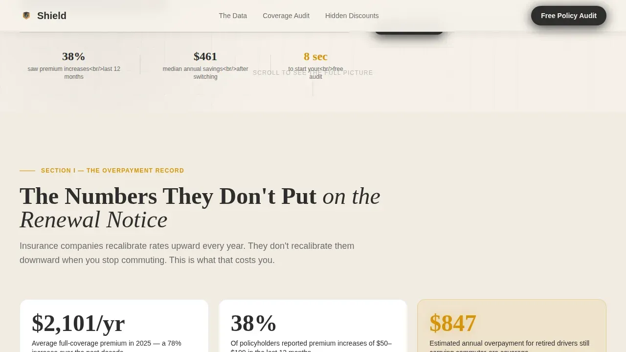
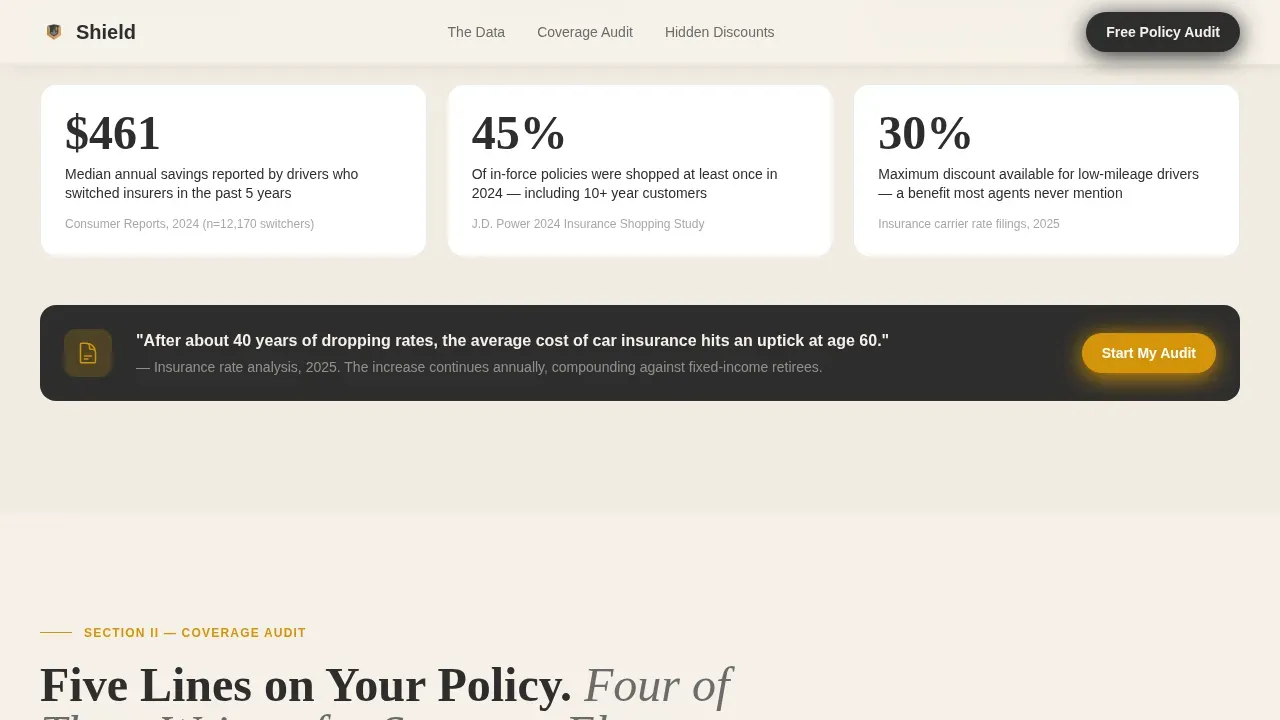
Section two of the page presents sourced statistics on how much retirees overpay nationally for car insurance. The data is displayed as a stats dashboard, not a wall of text. This gives the insurance landing page an industry-report credibility that straightforward sales copy cannot replicate. Users see real numbers tied to real driving patterns before they reach the comparison table.
Free Policy Audit Form
The audit form asks for just three inputs: current monthly premium, zip code, and estimated weekly miles. Simplifying forms on insurance landing pages reduces friction and increases completion rates. This form is designed to take under ten seconds to fill out, removing every possible hesitation from the conversion process. A clear call to action above the form reinforces what the visitor will receive.
PDF Lead Magnet Secondary Path
Visitors who are not ready to request an audit can access a downloadable report by entering only their email address. This secondary path captures warm leads who leave the page suspicious of their current policy but not yet committed. It extends the reach of the insurance landing page beyond the primary conversion event without adding visual clutter.
Hidden Discounts Reveal Section
Section three surfaces low-mileage discounts, garage credits, and bundling options that most agents never mention to retired drivers. Low-mileage savings for retirees often offer discounts of 10 to 30 percent for driving fewer than 7,500 to 10,000 miles annually. Combining home and auto insurance policies can save retirees 15 to 25 percent. This section makes the insurance company look like the one finally telling the truth.
Amber Number Count-Up Animation
Key savings figures animate upward on scroll, drawing the eye to the most financially significant details on the page. This count-up effect is applied to amber-highlighted callout numbers throughout the comparison table and the discounts section. It creates a calculator-like feel without requiring a full interactive tool, keeping the page focused and fast for every device.
Page sections overview
| Section | Purpose |
|---|---|
| Hero headline left | Bold claim plus policy snapshot to stop the scroll immediately |
| Overpayment data dashboard | Sourced national statistics that establish credibility before comparison |
| Coverage comparison table | Five-row side-by-side breakdown of paid versus needed coverage |
| Hidden discounts reveal | Surfaces low-mileage, garage, and bundling savings most agents omit |
| Audit form and lead magnet | Primary three-field form plus PDF email capture for undecided visitors |
| Footer linear row | Clean single-row footer with links and legal details |
Design & branding system
The design follows a Legal Shield editorial style. It feels like a well-organized filing cabinet opened under a brass desk lamp: authoritative without being cold, protective without being patronizing. Typography pairs a heavy serif display face for headlines with a clean sans-serif for body text and form elements.
- Charcoal (#2D2D2D) anchors headers and body text; warm parchment (#F5F0E8) serves as the primary background, evoking aged policy paper
- Amber (#D4940A) highlights savings callouts and comparison table figures, functioning like a cautionary highlighter across key data points
- Muted graphite (#6B6B6B) handles secondary text, table borders, and supporting details without competing with the amber focus areas
Mobile & speed optimization
The template is built desktop-first, which aligns with the retiree demographic that skews toward desktop and tablet browsing. The layout remains fully responsive, so the page performs correctly on any device a visitor uses. Insurance landing pages must be accessible regardless of screen size, and this template is structured to deliver that.
- Scroll-reveal animations and staggered table row entrances are kept at medium intensity, so the page loads fast without heavy scripting
- Server components handle static content sections, and minimal JavaScript keeps the page lean across all device sizes
- The three-field form and the PDF lead magnet path are both fully usable on mobile without layout breaks or pinch-to-zoom issues
How this template helps you convert
An effective insurance landing page focuses on a single action and answers the visitor's key questions upfront. Shield is structured to do exactly that. Every design and content decision points toward one outcome: getting the visitor to request a free policy audit or leave their email address.
- The catchy headline and immediate comparison snapshot create an "aha" moment before the visitor has scrolled a single screen, establishing the problem and the solution in the same visual field
- The escalating comparison tables and amber savings figures build a cumulative case that grows more compelling with each section, so visitors who scroll further are more committed by the time they reach the form
- The simplified three-field form and secondary PDF path give every visitor a natural next step, whether they are ready to act now or need a reason to stay connected with the insurance company
Other information about this template
This template is one example of how a focused insurance landing page can serve a highly specific audience without relying on generic stock imagery or vague benefit claims. The shield retiree auto insurance comparison table landing page template is built for businesses that want clarity over clutter and data over decoration.
- The creation process is straightforward: customize the color tokens, swap in your company's sourced data and savings figures, edit the comparison table rows to reflect your actual plan details, and publish
- No-code platforms make it possible to manage and edit this insurance landing page template without programming knowledge, reducing the time required to launch and allowing quick iterations based on user feedback
- The template can support A/B testing by swapping headline variants or form placement, since the page structure isolates each section cleanly for test comparisons
- Helpful resources for retiree insurance context include published data on mature driver discounts (typically 5 to 15 percent savings for completing a defensive driving course), guaranteed renewability provisions, and state-specific mandates that require insurers to offer seniors completing a safety course a discount
- Comparison tables signal transparency and build trust with modern visitors who are skeptical of insurance sales tactics, and this template treats the comparison format as its primary persuasion tool, not an afterthought
- The template is relevant for any insurance business entering the retiree niche, including those offering health insurance adjacent plan reviews, since a well-informed comparison table helps the general public understand their options across coverage types
- Search engines reward focused, relevant landing pages that answer a clear query; this template's single-topic structure and clear visual hierarchy support that goal naturally
- The best insurance landing pages combine a catchy headline, transparent comparison details, social proof through reviews or sourced statistics, and a friction-free form; this template checks every one of those boxes by default
Theme
Legal Shield
Creative direction
Industry Report
Color system
Charcoal & Amber
Style
Comparison Table
Direction
Freemium/Trial
Page Sections
Five-row Coverage Comparison Table
National Overpayment Data Dashboard
Free Policy Audit Form
PDF Lead Magnet Secondary Path
Hidden Discounts Reveal Section
Amber Count-up Scroll Animation
Related questions
Can I customize the comparison table rows for my specific coverage plan?
Does the template include the PDF lead magnet file?
Is this template suitable for insurance businesses not focused on retirees?
How many form fields does the audit form include by default?
Can I add customer reviews or trust signals to the page?



