Study Abroad Consultancy Landing Page Template
Compass is a single-column study abroad consultancy landing page built around authority and trust. It pairs a bold manifesto header with a scrolling testimonial mosaic, amber-highlighted proof statistics, and a three-field visa checklist download form. The design uses a charcoal and amber palette to feel credible and warm, converting anxious students and parents into qualified leads.
by Rocket studio
Quick summary
Compass is a focused, single-column landing page for a study abroad consultancy. It opens with a stark manifesto, moves through a dense testimonial mosaic with embedded statistics, and ends at two clear conversion paths: a visa checklist download and a free Statement of Purpose (SOP) evaluation. The layout is built to project authority while keeping the experience personal and navigable.
Who this template is for
This template suits consultancies that help students and professionals pursue university admissions and visa approvals in international markets. It works particularly well when your audience already feels anxious and needs reassurance before they will fill in a form.
- Study abroad consultancies handling visa applications, university shortlists, and admission document preparation
- Independent counselors working with undergraduate students, graduate applicants, or working professionals targeting an MBA abroad
- Consulting firms targeting families who compare tuition costs and need a credible, organized first impression
What problem this template solves
Many consultancy pages feel like brochures. They list services but fail to earn trust at the moment a prospective student is most uncertain. This template solves that by making proof the design system rather than an afterthought.
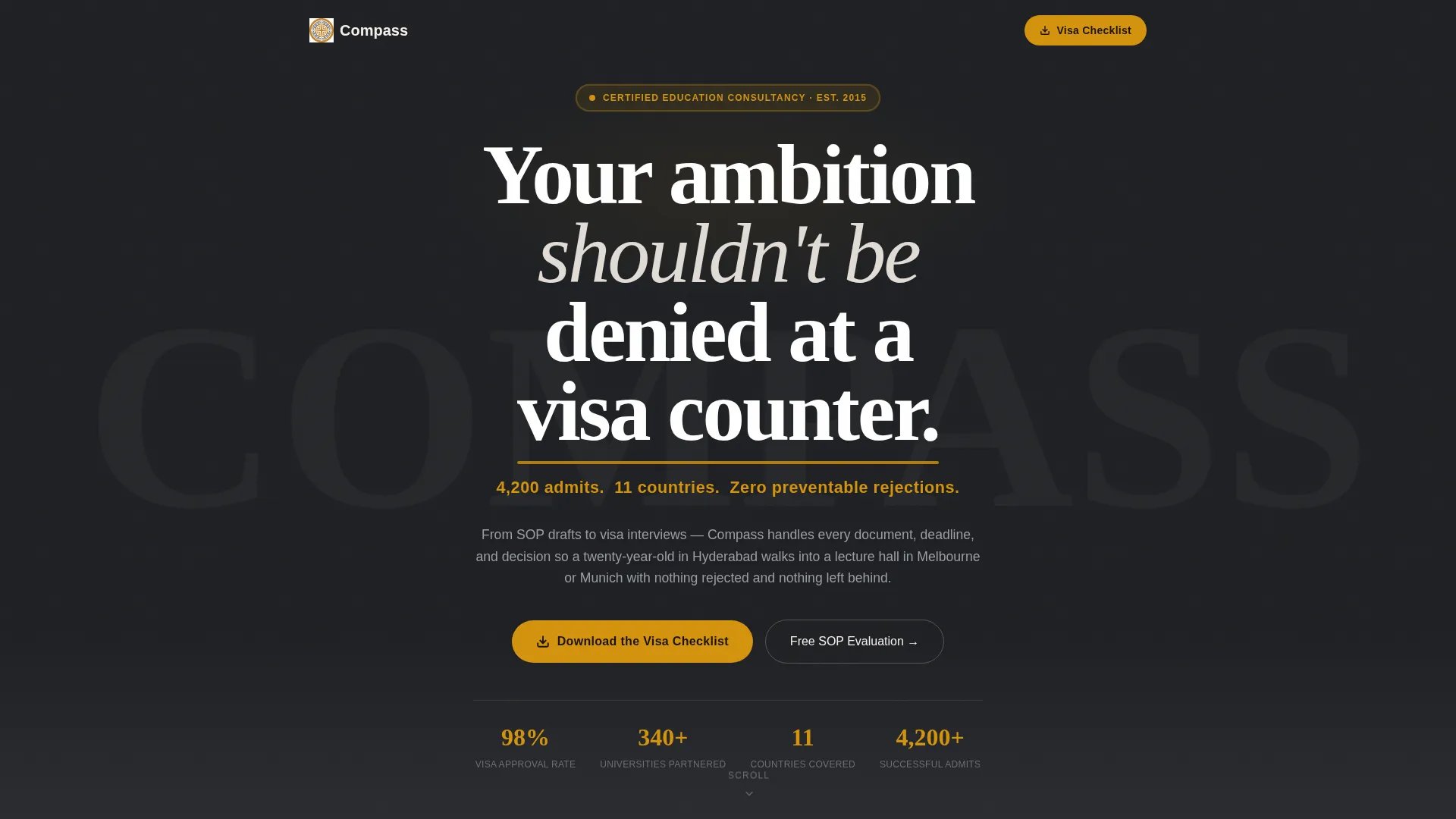
- Students and parents land on a page and immediately see verified outcomes, 4,200 admits, 11 countries, zero preventable rejections, before they read a single service description
- The form flow feels like the opening of a real consultation rather than a generic lead-capture form, reducing abandonment
- Two distinct conversion paths serve different intent levels, capturing both early-stage researchers and high-intent applicants who already have a draft SOP ready
What you get with this template
You receive a fully structured, single-column landing page that moves visitors from skepticism to action through a deliberately paced scroll experience. Every section has a defined role in the conversion sequence.
- A manifesto header block with a bold serif declaration and an amber proof line set on charcoal background
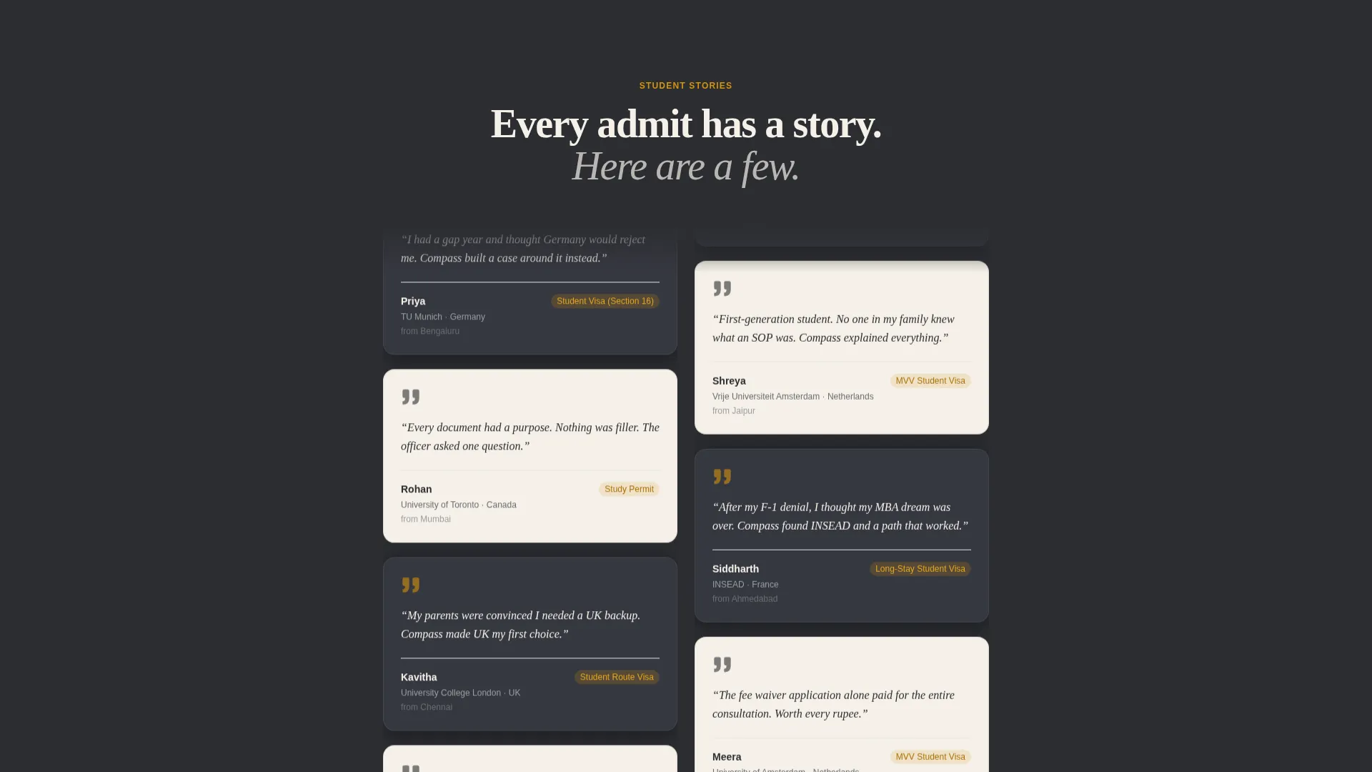
- A testimonial mosaic section with alternating parchment and charcoal cards, each carrying a student name, destination university, visa type, and a direct quote
- A three-field lead-capture form (destination country dropdown, intake year, email) triggering a visa checklist download, plus a secondary SOP document upload path
Feature list
This section covers the core built-in capabilities that make the Compass template function as a trust-first conversion page.
Manifesto Header Block
The header carries a single large-serif declaration in stark white on a deep graphite background. A secondary amber line displays the key proof statistics directly beneath it. There is no image or animation, so the words carry the full visual weight.
Scrolling Testimonial Mosaic
Cards alternate between warm parchment and charcoal backgrounds in a staggered rhythm. Each card shows a student first name, destination university, visa type, and one direct quote. The stagger prevents visual monotony and keeps the eye moving down the page.
Embedded Proof Statistics
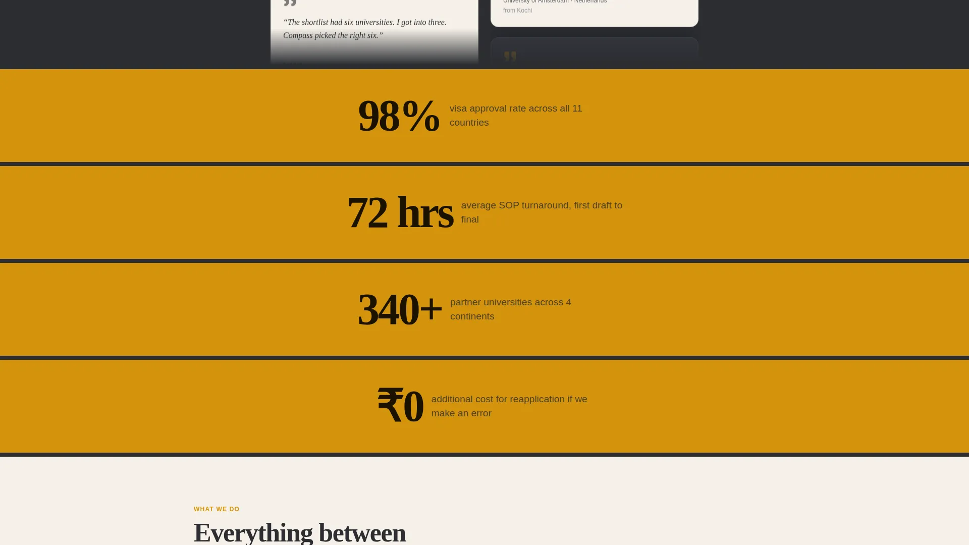
Between testimonial clusters, single full-width statistics appear in amber. These figures include acceptance rates, processing times, and country counts. They give the emotional stories a layer of structural evidence without breaking the scroll rhythm.
Dual Conversion Path Forms
The primary form asks for destination country, intake year, and email, then delivers a visa checklist download. The secondary path provides a document upload field for SOP draft submissions. Both paths qualify leads at different stages of readiness.
Legal Shield Visual Identity
The color system uses deep graphite, warm parchment, burnished amber, and iron gray. The combination echoes a notarized document under a brass lamp: formal enough to be taken seriously, warm enough to feel approachable.
Repeating Amber Call-to-Action Placement
The primary "Download the Visa Checklist" call to action (call to action) appears first after the third testimonial cluster, then again at the footer. Repetition at natural scroll checkpoints ensures visitors encounter the offer at multiple moments of readiness.
Page sections overview
| Section | Purpose |
|---|---|
| Manifesto Header | Opens with bold declaration and amber proof statistics |
| First Testimonial Cluster | Establishes social proof early in the scroll |
| Amber Stat Break | Reinforces credibility with a full-width acceptance figure |
| Second Testimonial Cluster | Deepens the community effect with more student stories |
| Second Stat Break | Adds a processing time or country count as structural proof |
| Third Testimonial Cluster | Completes the mosaic and builds dense peer validation |
| Visa Checklist call to action | Primary conversion form with three qualification fields |
| SOP Evaluation Path | Secondary form for high-intent leads with a draft in hand |
| Footer call to action Repeat | Closes the page with a second checklist download prompt |
Design & branding system
The visual identity is built around what the template calls a Legal Shield theme. Every color and typographic choice is chosen to signal authority and reliability without feeling cold or bureaucratic.
- Deep graphite (#2B2D31) forms the primary background, amber (#D4930D) marks every call to action and highlighted proof point, warm parchment (#F5F0E8) covers content panel backgrounds, and iron gray (#6B6E73) handles body text
- Large serif type anchors the manifesto header, reinforcing the formal tone of a document that has already been reviewed and approved
- The alternating card treatment in the testimonial mosaic uses parchment and charcoal to create visual rhythm without requiring icons or illustrations
Mobile & speed optimization
The single-column flow is designed to translate cleanly to smaller screens without restructuring the layout logic. The staggered card rhythm reads naturally on mobile where two-column grids often break down.
- The single-column structure means no grid reflow is needed on narrow screens; content stacks in the same sequence it was designed in
- The three-field form (dropdown, year selector, email input) is simple enough to complete on a phone without zooming or scrolling inside the field area
- Full-width amber stat breaks retain their impact at any screen width because they rely on text and color rather than complex imagery
How this template helps you convert
The page is designed to reduce hesitation and push two types of visitors toward action: those researching options early and those already committed but needing a trusted partner to help execute.
- The manifesto header and embedded proof statistics establish credibility in the first visible screen, so visitors feel they are in competent hands before they read a single testimonial
- The growing testimonial mosaic creates a community effect that makes the consultancy feel proven across multiple countries, visa types, and student profiles, increasing trust progressively as the visitor scrolls
- The dual form structure means visitors who are not yet ready to share a document can still take a low-commitment first step by downloading the visa checklist, keeping them inside the consultancy's reach
Other information about this template
The Compass template is built specifically for the study abroad consulting niche, where trust is the primary sales barrier. The design choices are intentional responses to that barrier rather than generic professional service aesthetics.
- The page flow was designed with the Testimonial Mosaic creative direction, meaning student stories are the structural backbone rather than a supplementary section
- The form sequence (destination country first, then intake year, then email) mirrors the natural first questions a counselor would ask, making the form feel like the beginning of a real conversation
- This template suits consultancies of varying sizes, from solo counselors to multi-country firms, because the proof content scales with whatever testimonials and statistics you have available
Theme
Educational Guide
Creative direction
Case Study Narrative
Color system
Ink & Paper
Style
Zigzag/Alternating
Direction
Click-Through
Page Sections
Manifesto Header with Proof Line
Alternating Testimonial Mosaic
Full-width Amber Stat Breaks
Dual Lead Capture Forms
Repeating Call to Action Placement Strategy
Legal Shield Color System
Related questions
Can I change the testimonial cards to match my actual student stories?
Does the page support two separate lead forms at once?
Is the amber call-to-action button editable?
How many testimonial cards can I add to the mosaic?
Is this template suitable for a consultancy focused on one destination country?



