Financial Advisory Platform Pre-Launch Website Template
Ledger is a bento grid coming soon landing page built for independent financial advisory platforms. It presents net worth, tax exposure, and retirement runway inside dark glass panel tiles, using live-data visual accents to signal product credibility before launch. Mid-career professionals and independent advisors are the primary audience. The page drives early access signups through a segmented waitlist modal.
by Rocket studio
Quick summary
Ledger is a pre-launch landing page template designed for independent financial advisory platforms. It uses a bento grid layout with dark glass panel tiles to display financial metrics in real time. The page is built to capture early access signups from mid-career professionals and registered investment advisors before the platform goes live.
Who this template is for
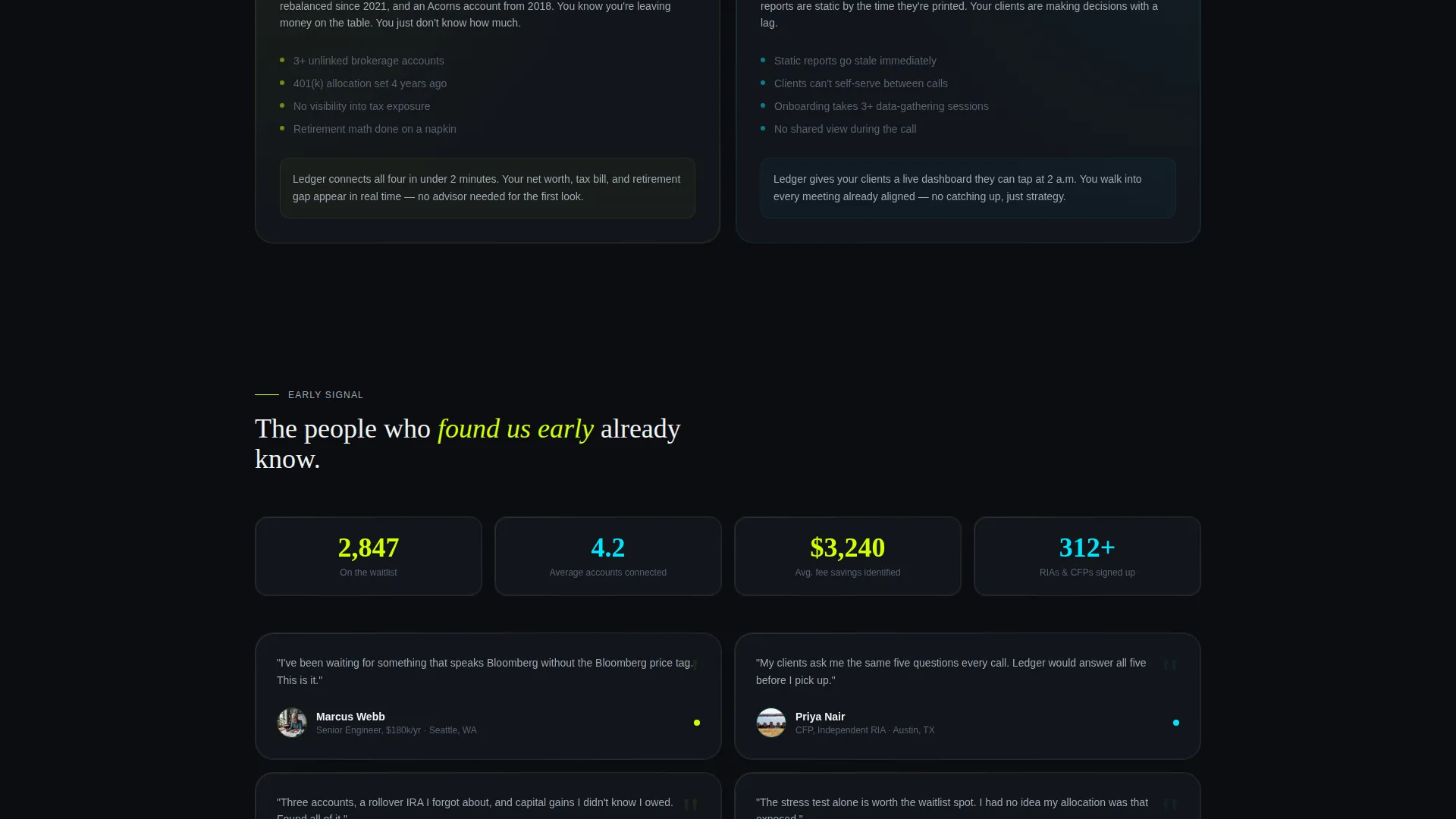
This template is built for people who are launching a financial advisory product and need a credible, data-forward presence before their app is ready. It speaks directly to two groups: clients who want clarity on their finances, and advisors who want to hand clients something sharper than a static report.
- Independent financial advisors and registered investment advisors building a waitlist ahead of launch
- Mid-career professionals managing multiple accounts who want a single-screen financial overview
- Fintech founders positioning a financial dashboard product to early adopters
What problem this template solves
Most coming soon pages say very little. They make a promise but offer no proof. Ledger solves this by turning the landing page itself into a product demonstration, showing financial metrics in motion so visitors can feel what the platform will deliver before it launches.
- Advisors struggle to communicate platform value before launch without a working product to show
- Prospective clients need to see that the tool thinks in the language of money before they commit
- Generic waitlist pages fail to segment leads, making follow-up harder and less relevant
What you get with this template
You get a fully structured single-page layout built around a bento grid that tightens and densifies as the visitor scrolls. Every panel is designed to carry information rather than decoration, and the page closes with a two-path conversion system that captures high-intent and lower-intent visitors at the same time.
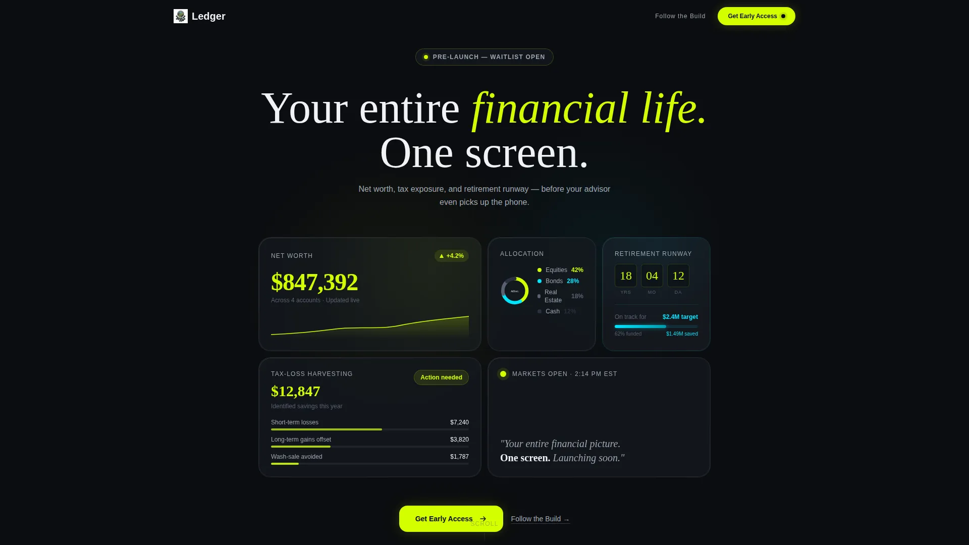
- A dark glass panel header showing live-style financial metrics: net worth, asset allocation, retirement countdown, and tax-loss harvesting savings
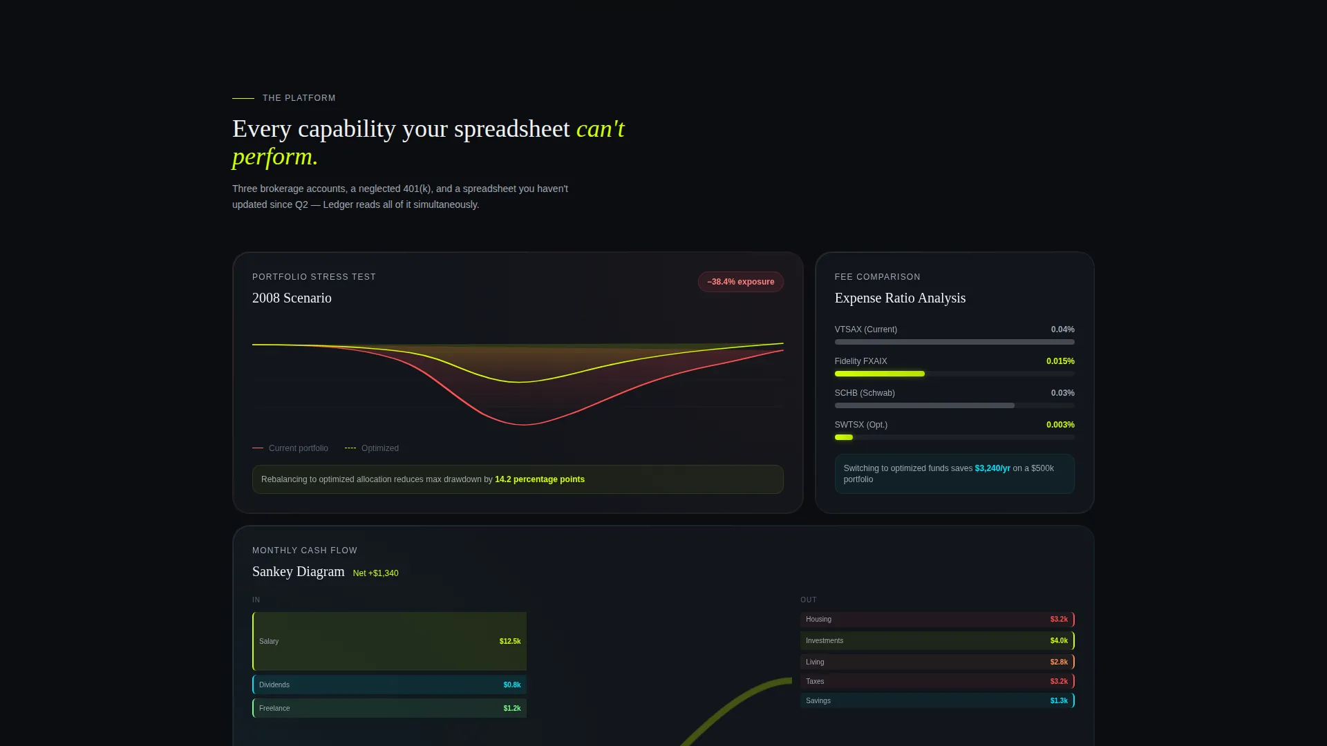
- Bento grid capability panels with micro-animations including a portfolio stress test, fee comparison bars, and a cash flow Sankey diagram
- A modal-driven waitlist form collecting phone number, email, and a single segmentation dropdown
Feature list
This section covers the core design and functional capabilities built into the Ledger template.
Dark Glass Bento Header
The header presents four frosted, semi-transparent tiles floating over a pure black field. Each tile holds one financial metric rendered in large chartreuse type. The panels catch faint ambient edge lighting to suggest depth without heavy three-dimensional effects.
Animated Capability Panels
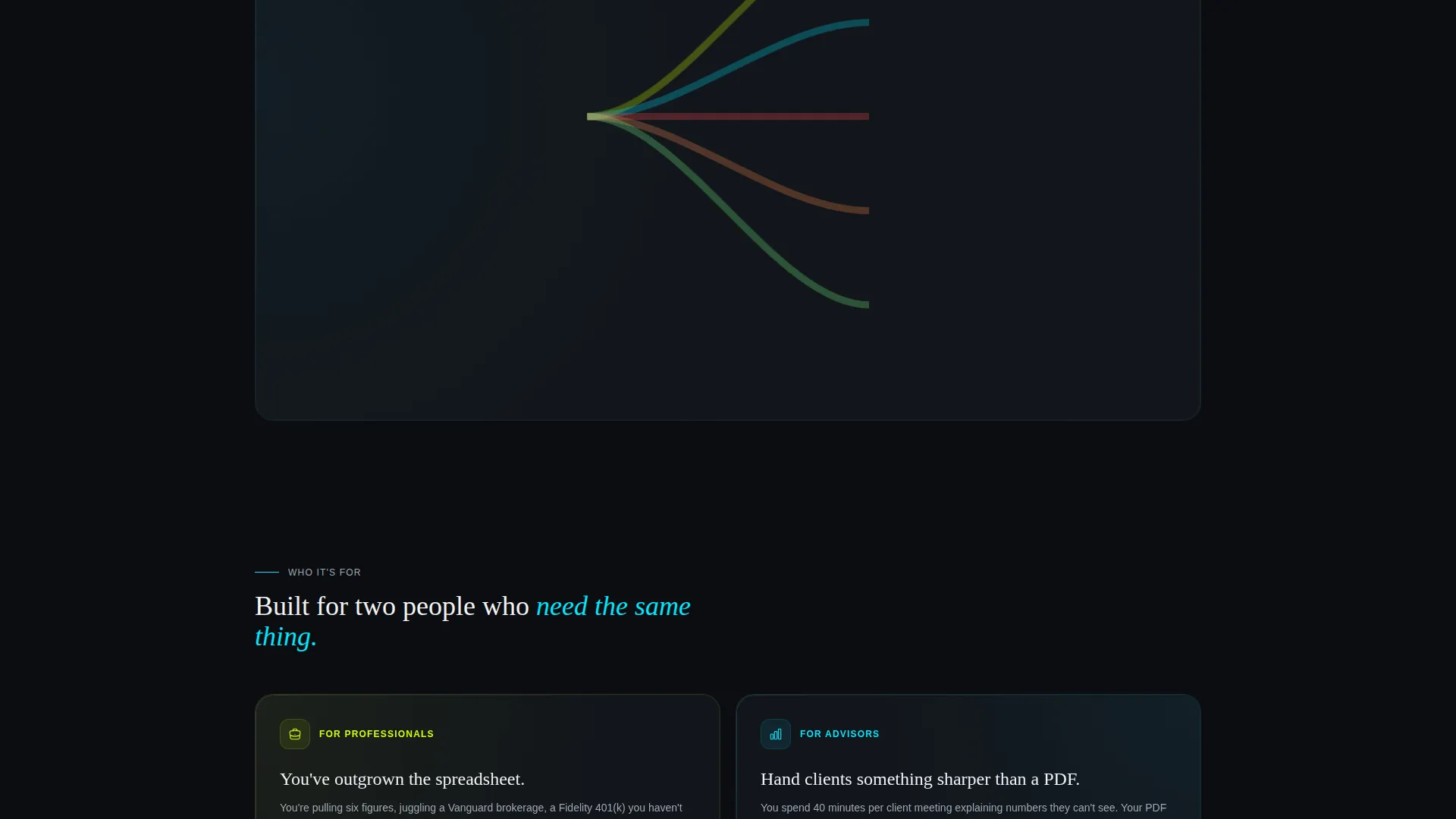
Each bento cell below the header focuses on a single platform capability. Panels include a portfolio stress test running a historical market scenario, a fee comparison bar chart, and a Sankey diagram of monthly cash flow. Numbers count up from zero as each panel enters the viewport.
Scroll-Responsive Grid Density
The bento grid tightens progressively as the visitor scrolls down the page. Panels become smaller and more interconnected toward the bottom, mimicking the experience of zooming out to see a full financial dashboard for the first time.
Dual-Path Conversion System
The primary call to action, labeled "Get Early Access," is pinned to the bottom of the viewport on mobile and embedded in the final bento tile on desktop. A secondary path, "Follow the Build," links to a changelog or social feed for visitors who want a lower-commitment way to stay connected.
Segmented Waitlist Modal
Tapping the primary call to action opens a slim modal that collects phone number first, then email, then a single dropdown asking whether the visitor currently works with a financial advisor. This flow segments the waitlist without adding friction.
Stats-First Scroll Experience
The scroll sequence is designed as a product demonstration. Every panel above the call to action serves as proof that the platform already understands financial data, earning the visitor's trust before asking for contact details.
Page sections overview
| Section | Purpose |
|---|---|
| Dark Glass Header | Display live-style financial metrics in frosted bento tiles |
| Tagline Row | Anchor the product promise with a single zinc-gray descriptor line |
| Stress Test Panel | Animate a portfolio scenario to demonstrate analytical depth |
| Fee Comparison Panel | Show fund fee bars to highlight cost-saving potential |
| Cash Flow Panel | Present a Sankey diagram of monthly income and spending |
| Early Access call to action | Drive waitlist signups via the primary chartreuse button |
| Segmented Modal | Collect phone, email, and advisor-status data from signups |
| Follow the Build | Offer a low-commitment secondary path to stay connected |
Design & branding system
The visual identity follows a Dashboard Pro theme paired with an Acid Digital color system. The palette is built on the principle that every color must convey information rather than serve as decoration. The result feels like a Bloomberg terminal reimagined by a Berlin design studio.
- Core palette: void black (#0B0D10) and graphite panel (#161A21) for all backgrounds; electric chartreuse (#D4FF00) reserved for live data figures, buttons, and notification pips; cool zinc (#A0A8B4) for secondary text; faint cyan (#00E5FF) for graph lines and progress rings
- Typography is large and legible on dark backgrounds, with chartreuse numerals reading immediately as data before the visitor processes any label text
- Frosted glass panel treatment uses faint ambient edge lighting to create perceived depth without gratuitous three-dimensional styling
Mobile & speed optimization
On mobile, the layout shifts to keep the most critical information accessible without horizontal scrolling. The primary call to action is pinned to the bottom of the viewport so it is always visible regardless of scroll position.
- The bento grid reflows for smaller screens, preserving panel hierarchy and data legibility
- The "Get Early Access" button remains fixed at the bottom of the mobile viewport throughout the scroll journey
- The waitlist modal is designed slim and minimal so it does not obscure content on smaller screens
How this template helps you convert
The page earns the tap by showing, not promising. Every design and layout decision is oriented toward reducing skepticism and lowering the friction to sign up.
- The header's live-style financial metrics create immediate product credibility, so visitors arrive at the call to action already convinced the platform thinks in the language of money.
- The dual-path conversion system captures both high-intent visitors ready to sign up and lower-intent visitors who prefer to follow the build, so no audience segment leaves empty-handed.
Other information about this template
This template is categorized under financial advisor website templates and is specifically designed for the financial advisor coming soon page niche. It is a single-page template, not a multi-page website, and is optimized for pre-launch use cases where no live product exists yet.
- Template style: Bento Grid with a Dashboard Pro theme
- Creative direction: Stats-First Impact, meaning the page content functions as a live product preview
- Header concept: Dark Glass Panels with frosted semi-transparent tiles
- Landing page direction: App Download, driving phone number and email capture toward a mobile app waitlist
- Suitable for independent financial advisors, registered investment advisors, and certified financial planners who want a professional pre-launch presence
- The page can support two conversion paths simultaneously without requiring any changes to the core layout
Theme
Dashboard Pro
Creative direction
Stats-First Impact
Color system
Acid Digital
Style
Bento Grid
Direction
App Download
Page Sections
Dark Glass Bento Header
Animated Capability Panels
Scroll-responsive Grid Density
Dual-path Conversion System
Segmented Waitlist Modal
Related questions
Is Ledger a single-page or multi-page template?
Can I edit the financial metrics displayed in the header tiles?
Who is this landing page template designed for?
What conversion paths does the template include?
Does the template include the animated panel effects described in the design brief?


