Patient Portal Landing Page Template
A warm, stats-led landing page for a geriatrician patient portal. It helps aging patients and their adult children check lab results, refill prescriptions, and message their doctor from anywhere. A header dashboard with animated metrics, a side-by-side comparison table, and a Family Caregiver Guide download form make the value clear before asking for anything.
by Rocket studio
Quick summary
This landing page template is built for a geriatrician patient portal. It leads with three animated metric tiles that count up from zero, then delivers a comparison table showing exactly what changes when families use the portal. The page earns trust through hard numbers first, then guides visitors toward downloading a Family Caregiver Guide.
Who this template is for
This template is designed for geriatric care practices that want to convert cautious, first-time digital health users. It speaks directly to two groups who need the same information but arrive from very different places.
- Adult children in their 40s to 60s coordinating a parent's care from another city or state
- Aging patients in their 70s and 80s managing multiple chronic conditions and looking for simpler access to their own records
- Clinic staff who need a clear, trustworthy page to point families toward when onboarding them to the portal
What problem this template solves
Families managing geriatric care face a constant friction loop: phone calls that go to voicemail, lab results waiting in a fax queue, and prescription refills that require a trip across town. This template addresses that gap directly and visibly.
- It replaces vague promises with specific proof, showing time and steps saved for scheduling, lab access, medication management, and caregiver coordination
- It makes the portal feel approachable to users who may be unfamiliar or nervous about digital health tools
- It gives adult caregivers a concrete resource (the Family Caregiver Guide) so they leave the page with something useful in hand
What you get with this template
The template delivers a complete, single-page flow from first impression to conversion. Every section is designed to reduce hesitation and build confidence before the form appears.
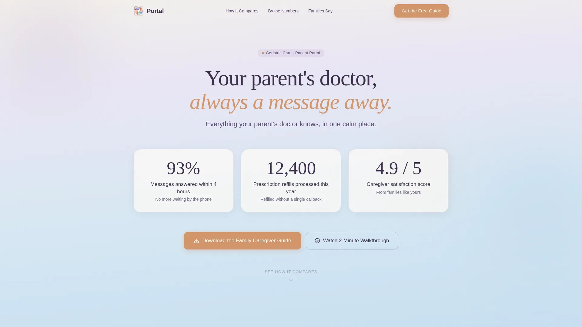
- A hero dashboard with three oversized animated metric tiles floating on a soft watercolor gradient, plus a 22-pixel tagline in elderberry text
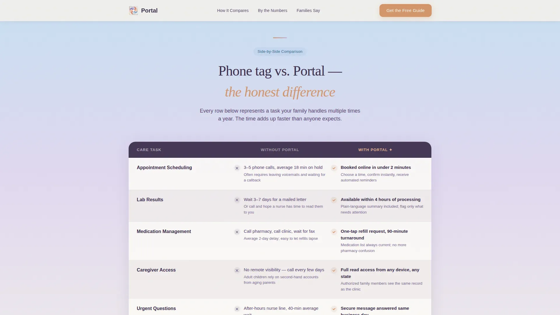
- A structured comparison table contrasting "Without Portal" and "With Portal" across four care dimensions, with row highlight interactivity on scroll
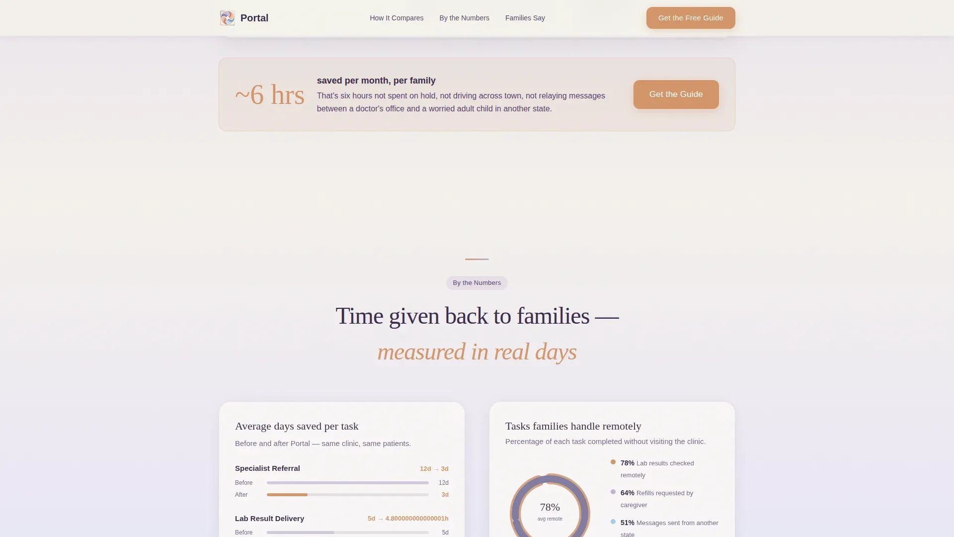
- A stats deep-dive block with a referral timeline, a remote-tasks pie chart, and a video testimonial from an adult caregiver
- A primary call-to-action form collecting only a first name and email in exchange for the Family Caregiver Guide
- A secondary video path offering a two-minute captioned screen recording of the portal in large-text mode
Feature list
This template is built around a small set of high-impact components. Each one is designed to carry real persuasive weight for a cautious, detail-oriented audience.
Animated Metric Dashboard
Three oversized metric tiles sit at the top of the page on a soft gradient field. Each tile displays a real stat from the brief: 93 percent of messages answered within four hours, 12,400 prescription refills processed this year, and a 4.9 out of 5 caregiver satisfaction score. Numbers count up from zero on page load at a pace easy for aging eyes to follow.
Side-by-Side Comparison Table
The comparison table contrasts the portal experience against the phone-tag-and-fax reality across four dimensions: appointment scheduling, lab results, medication management, and caregiver access. Each row reveals a specific time or step saved. Row highlights activate as visitors scroll, keeping attention focused and the data digestible.
Stats Deep-Dive Section
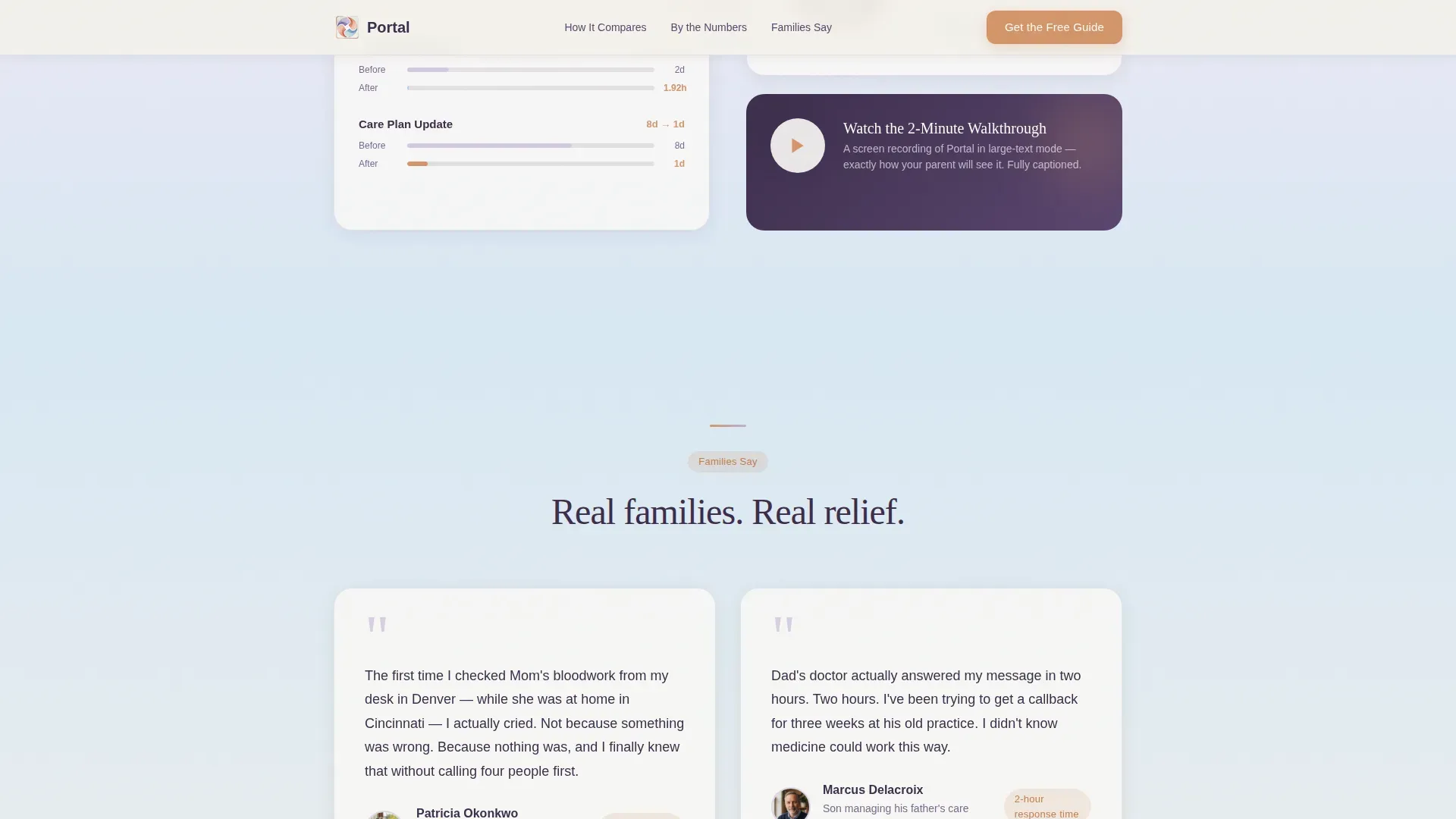
Below the comparison table, the page continues to deliver proof. A timeline shows average days saved per referral, a pie chart breaks down the tasks families handle remotely, and a short video testimonial from an adult daughter adds a human voice to the numbers.
Family Caregiver Guide Form
The primary call-to-action appears after the comparison table, at the moment trust is highest. It asks only for a first name and an email address in exchange for the downloadable Family Caregiver Guide. The form includes built-in validation and sits inside a warm clay button treatment.
Two-Minute Portal Walkthrough
A secondary conversion path offers a captioned screen recording of the portal displayed in large-text mode. The video autoplays inside a modal and shows the interface as calm and legible as the surrounding page design promises.
Page sections overview
| Section | Purpose |
|---|---|
| Hero metric dashboard | Lead with animated proof stats before any ask |
| Comparison table | Show specific time and steps saved side by side |
| Stats deep-dive block | Deepen trust with timeline, chart, and video |
| Video testimonial | Add a real caregiver voice to the data |
| Caregiver Guide form | Capture name and email at peak trust moment |
| Portal video walkthrough | Offer a low-friction secondary conversion path |
| Footer | Single-row linear pattern for clean close |
Design & branding system
The visual identity uses a Cloud Canvas color system built around watercolor washes on heavy cotton paper. Nothing is sharp or clinical. Every transition is soft, every edge dissolves into the next.
- Color palette: morning fog white (#F4F1EB) for backgrounds, deep elderberry (#3B2D4A) for body text, warm clay (#D4956A) reserved for buttons and active states, wisteria mist (#C3B1D6) for accents, and gentle sky (#A8C8E8) for secondary fields
- Typography: Fraunces serif for headlines to add warmth and personality, DM Sans for body copy to keep long passages easy to read
- Motion and texture: backgrounds shift in slow vertical gradients from fog to sky, scroll reveals bring sections in gently, and count-up animations run at a pace suited to older readers
Mobile & speed optimization
The template is designed desktop-first, but every layout decision accounts for older users who may be on a tablet or a phone with reduced dexterity. Legibility is treated as a safety feature, not a preference.
- Font sizes are generous throughout, and touch targets are sized for ease of use on mobile devices
- Scroll reveals and count-up animations use medium-intensity motion so the page stays lively without causing disorientation
- Static page sections use server-rendered components while animated and interactive elements load as client components, keeping the initial view fast and readable
How this template helps you convert
The page is structured so that every scroll brings more evidence before the ask ever appears. Visitors are not asked to trust the portal; they are shown why it is trustworthy.
- The animated dashboard at the top delivers three real numbers immediately, so skeptical caregivers have a reason to keep reading before they have read a single sentence of copy
- The comparison table gives concrete before-and-after context for the four tasks families care about most, making the portal's value feel measurable and personal rather than abstract
- The Family Caregiver Guide form appears only after the stats deep-dive and testimonial, so the request for a name and email arrives at the moment a visitor is most likely to say yes
Other information about this template
This template sits at the intersection of a healthcare resource hub and a conversion-focused landing page. It is built for practices that serve a dual audience: the patient and the caregiver who manages that patient's care from a distance.
- The Soft Gradient theme and Cloud Canvas color system give the page a tone that feels like a trusted family doctor's office rather than a hospital intake form
- The Stats-First Impact creative direction means the page never asks for anything before it has already delivered real value through numbers, comparison, and story
- The template follows a Content and Resource landing-page direction, which means the primary goal is to deliver the Family Caregiver Guide download while building lasting confidence in the portal as a care tool
- The header concept is built around stats and metrics rather than a traditional hero headline, which is a deliberate choice for this audience of results-oriented adult caregivers
Theme
Soft Gradient
Creative direction
Stats-First Impact
Color system
Cloud Canvas
Style
Comparison Table
Direction
Content/Resource
Page Sections
Animated Metric Dashboard Header
Side-by-side Comparison Table
Stats Deep-dive Block
Family Caregiver Guide Form
Captioned Portal Walkthrough Video
Related questions
Who is the primary audience for this landing page template?
Can I update the metric numbers in the animated dashboard?
What does the comparison table cover?
Does the page include a way to collect leads?
Is this template suitable for patients who are not comfortable with technology?



