Trusted Financial Advisory Landing Page Template
Ledger is a sidebar companion landing page built for financial planners who want to turn first-time visitors into booked consultations. It combines a typographic manifesto header, escalating client case study sections, and a persistent scheduling sidebar into one restrained, authoritative layout that earns trust before asking for anything.
by Rocket studio
Quick summary
Ledger is a single-page template designed for financial planning practices. It opens with a bold serif manifesto, guides visitors through anonymized client narratives, and keeps a booking widget visible at all times via a persistent left sidebar. The layout is clean, the color palette is measured, and every section builds confidence toward one action: booking a first conversation.
Who this template is for
This template suits financial planners who work with real people navigating genuinely complex money situations. It is built for practices that want to demonstrate expertise through storytelling rather than a list of services.
- Independent financial planners who serve dual-income households, small-business owners, and recent retirees
- Practices where the first meeting is complimentary and the goal is to reduce booking friction
- Financial professionals who want a sophisticated web presence without a generic corporate feel
What problem this template solves
Most financial planner landing pages list credentials and hope visitors connect the dots. Ledger solves the trust gap differently. It shows prospective clients a version of their own situation before asking them to take any action.
- Visitors who feel their finances are too messy or too specific rarely book without seeing relevant context first
- A static contact form gives no signal about what kind of help is available or whether the planner understands their situation
- Generic layouts fail to communicate the depth and human side of financial planning work
What you get with this template
You get a complete, structured landing page that guides a visitor from first impression to scheduled appointment. Every section has a clear role, and nothing competes for attention unnecessarily.
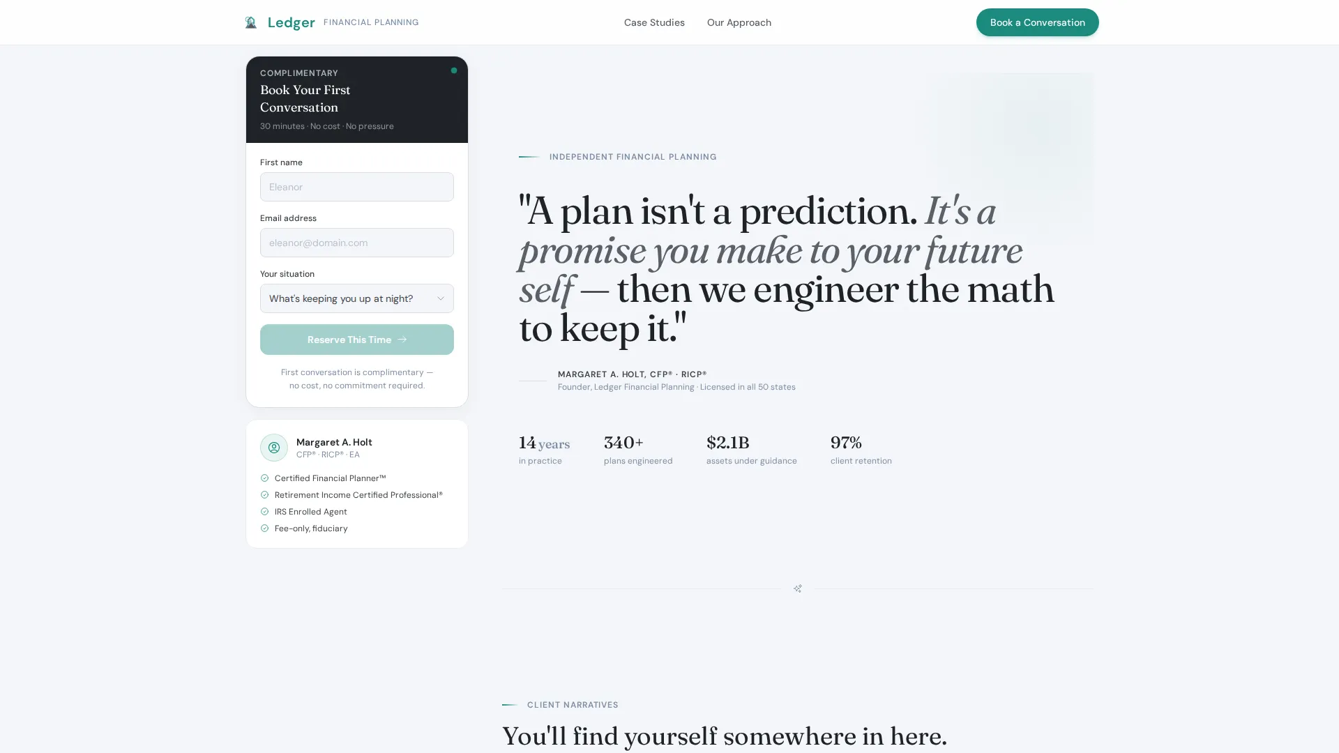
- A typographic manifesto header with a weighted serif statement and attributed credentials below
- A persistent left sidebar with a three-field scheduling widget that scrolls with the visitor
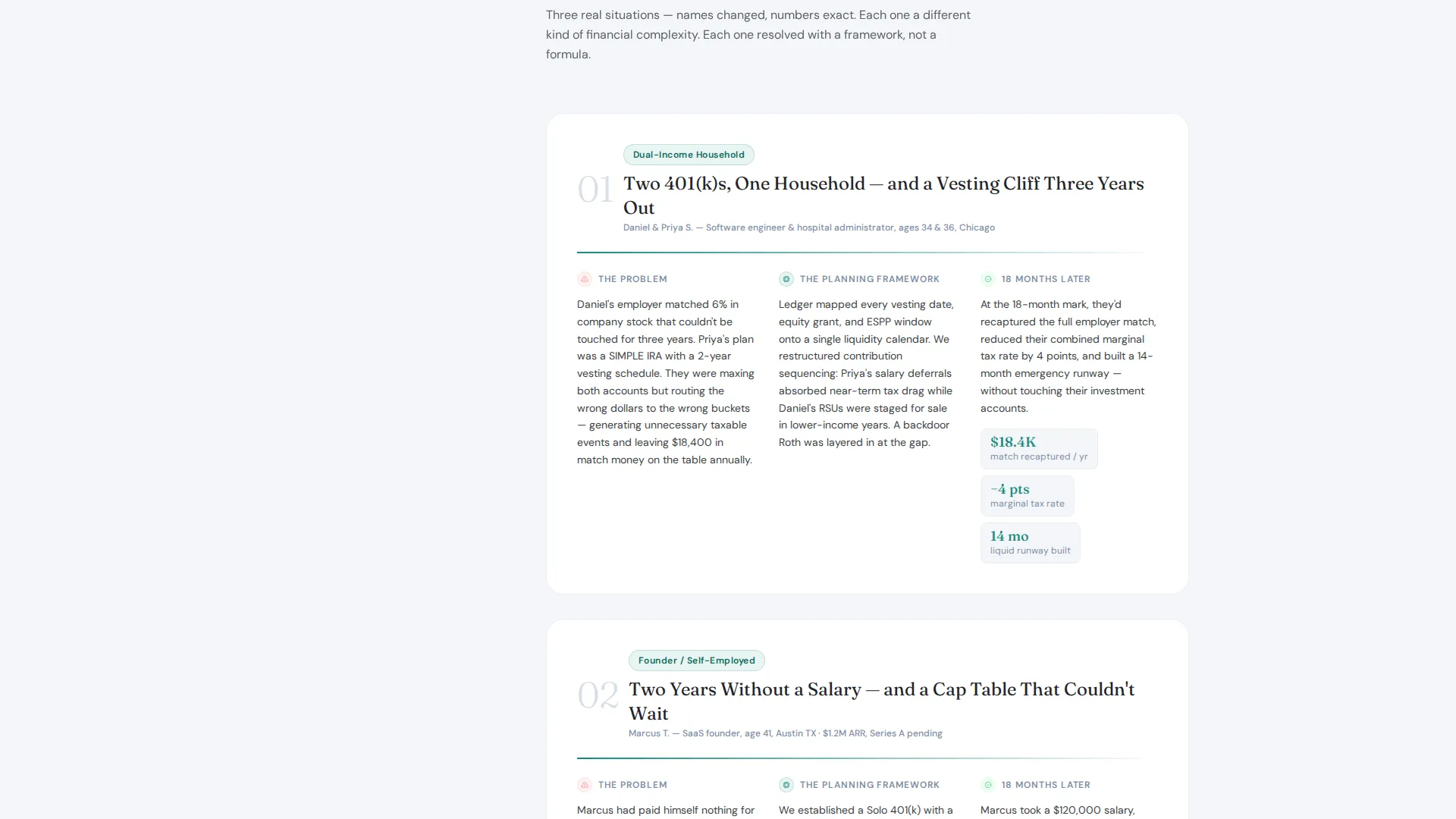
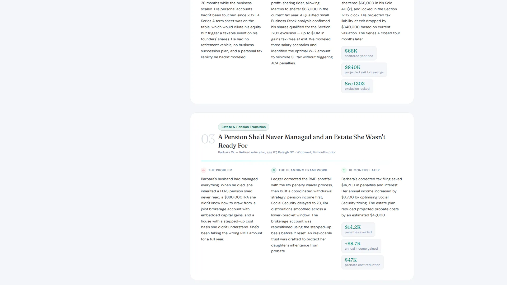
- A case study narrative body that introduces three escalating client scenarios with problems, frameworks, and outcomes
Feature list
This template is built around four functional ideas: a strong opening statement, trust-building narratives, a frictionless booking path, and a restrained visual system that never distracts from the content.
Typographic Manifesto Header
The header holds a single large serif statement against a cloud-white background. No images or illustrations compete for attention. The planner's name and credentials appear below in small graphite caps, grounding the authority claim immediately.
Persistent Scheduling Sidebar
A left-side widget stays fixed as the visitor scrolls. It presents three fields: first name, email, and a dropdown asking what is keeping the visitor up at night. Selecting a dropdown option reveals an embedded calendar with thirty-minute slots. A subtle line beneath the calendar confirms the first meeting is complimentary.
Escalating Case Study Sections
Each scroll section introduces one anonymized client scenario. The template covers three distinct situations: a couple with competing retirement account strategies, a founder who had not separated personal income from business payroll, and a widow navigating an inherited pension. Each story moves through the problem, the planning framework applied, and the measurable outcome eighteen months later.
Dropdown Intent Qualification
The scheduling sidebar dropdown offers four options: Retirement readiness, Tax strategy, Estate transfer, and Not sure yet. This small interaction helps the visitor self-identify before the conversation starts, reducing hesitation and making the booking feel relevant rather than generic.
Corporate Precision Visual System
The Cloud Canvas color palette uses soft cumulus white for backgrounds, graphite wool for body text, muted slate blue for secondary headings and divider lines, and a single decisive teal reserved for calls to action and active-state indicators. The result is a quietly authoritative layout that feels considered rather than busy.
Page sections overview
| Section | Purpose |
|---|---|
| Manifesto Header | Opens with a bold serif statement and planner credentials |
| Persistent Scheduling Sidebar | Keeps the booking widget always visible as the user scrolls |
| Case Study One | Introduces the dual-income couple and competing retirement strategies |
| Case Study Two | Covers the founder separating personal income from business payroll |
| Case Study Three | Follows the widow navigating an unfamiliar pension structure |
| Sidebar Calendar Reveal | Displays thirty-minute booking slots after a dropdown selection |
| Complimentary Session Note | Confirms the first meeting is free beneath the embedded calendar |
Design & branding system
The visual identity follows a Corporate Precision theme built around the Cloud Canvas color system. Every color in the palette has a specific role and is not used interchangeably.
- Soft cumulus white (#F4F6F9) covers primary backgrounds; graphite wool (#3B3F45) anchors body text and the sidebar
- Muted slate blue (#7C8DA5) appears on secondary headings and divider lines to create visual hierarchy without weight
- Decisive teal (#1A8A7D) is reserved exclusively for calls to action and active-state indicators, making the booking action immediately recognizable
Mobile & speed optimization
The layout is built with a sidebar companion structure, meaning the scheduling widget and content body are designed to coexist cleanly on wider screens. On smaller viewports, the sidebar can stack appropriately so the booking path remains accessible.
- The three-field form is intentionally minimal, reducing load and cognitive effort on any device
- Large serif typography is set for legibility at scale, keeping the manifesto header readable without relying on imagery
How this template helps you convert
Ledger earns trust progressively before it ever asks a visitor to act. By the time someone reaches the sidebar form, they have already recognized their own situation in at least one case study.
- The manifesto header sets the planner's voice and philosophy in a single sentence, giving the visitor an immediate sense of who they are considering working with.
- The escalating case study narrative mirrors the range of client situations the practice handles, so visitors self-qualify and arrive at the form already convinced of relevance.
- The persistent sidebar and complimentary session note remove every practical barrier to booking, keeping the conversion path open from the first scroll to the last.
Other information about this template
Ledger is built specifically for financial planning practices that rely on relationship-led business development rather than high-volume lead capture. The template is a sidebar companion landing page, meaning it pairs the narrative body with a scheduling tool that never disappears from view.
- The template is categorized under Professional Services for Financial Planner Online Presence
- The Case Study Narrative creative direction is intentional: stakes escalate across the three stories so visitors see the practice handles both straightforward and layered situations
- The "What's keeping you up at night?" dropdown is designed to reduce the emotional barrier to booking a financial planning consultation
- This template supports a complimentary first-meeting model and is well suited for practices where the discovery call is the primary conversion goal
Theme
Corporate Precision
Creative direction
Case Study Narrative
Color system
Cloud Canvas
Style
Sidebar Companion
Direction
Booking/Scheduling
Page Sections
Typographic Manifesto Header
Persistent Scheduling Sidebar
Escalating Case Study Narrative
Dropdown Intent Qualification
Complimentary Session Confirmation
Cloud Canvas Color System
Related questions
Who is the Ledger template designed for?
Does the template include a scheduling or booking tool?
Can I customize the case study stories and planner credentials?
What makes this layout different from a standard contact page?
Is the complimentary first-meeting offer built into the design?



