Virtual Consultation Landing Page Template
A hub-and-spoke landing page built for geriatrician virtual consultations. The template opens with a warm multi-step form, guides visitors through a transparent care process, and ends each section with a clear call to action. It is designed to help families, older adults, and referring physicians book a specialist video visit with confidence.
by Rocket studio
Quick summary
This landing page template is built for a geriatrician virtual consultation practice. It opens with a progressive multi-step form and uses an anchor navigation structure to walk visitors through the full care process. Each spoke section dissolves a specific concern, from what happens during a visit to what it costs, before asking for a booking commitment.
Who this template is for
This template serves practices and clinicians who offer specialist geriatric care by video. It speaks directly to the three audiences most likely to land on this page.
- Adult children managing an aging parent's care from a distance, often juggling multiple specialists and prescriptions
- Retired couples navigating concerns about memory, medications, or mobility decline
- Primary care physicians who need to refer complex elderly patients to a geriatric specialist
What problem this template solves
Geriatric care is complex and emotionally loaded. Most visitors arrive with anxiety, not certainty. A standard contact form or clinical services list does nothing to reduce that anxiety.
- Visitors do not understand what a geriatric consultation actually involves, so they hesitate to book
- Families managing care remotely feel overwhelmed and need to trust the practice before sharing sensitive information
- The multi-step form, timestamped visit walkthrough, and transparent pricing all work together to replace hesitation with confidence
What you get with this template
You get a complete single-page layout structured around five content spokes, each anchored in the navigation bar. Every section is designed to answer the next logical question a cautious visitor would ask.
- A progressive multi-step form in the hero section that starts with one gentle question and builds toward a scheduled appointment
- Four detailed spoke sections covering the consultation process, assessment domains, family communication, and pricing
- A secondary conversion path that captures email addresses from visitors who are not yet ready to book
Feature list
The following features are built into this template based on the source brief.
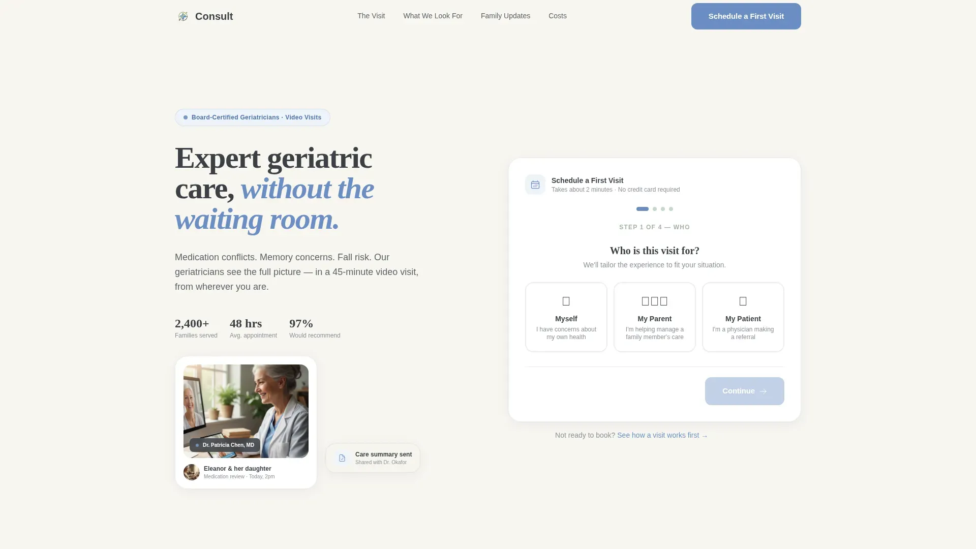
Progressive Multi-Step Form
The hero form opens on a single warm question: "Who is this visit for?" Visitors choose from three illustrated options. Four progress dots guide them through patient age range, primary concern, insurance provider, and preferred appointment window. No wall of fields, no clinical coldness.
Anchor Navigation with Spoke Sections
A sticky anchor navigation bar links directly to each of the four content spokes. This keeps visitors oriented and lets them jump to the section that addresses their most pressing concern first, whether that is cost, process, or what the doctor actually looks for.
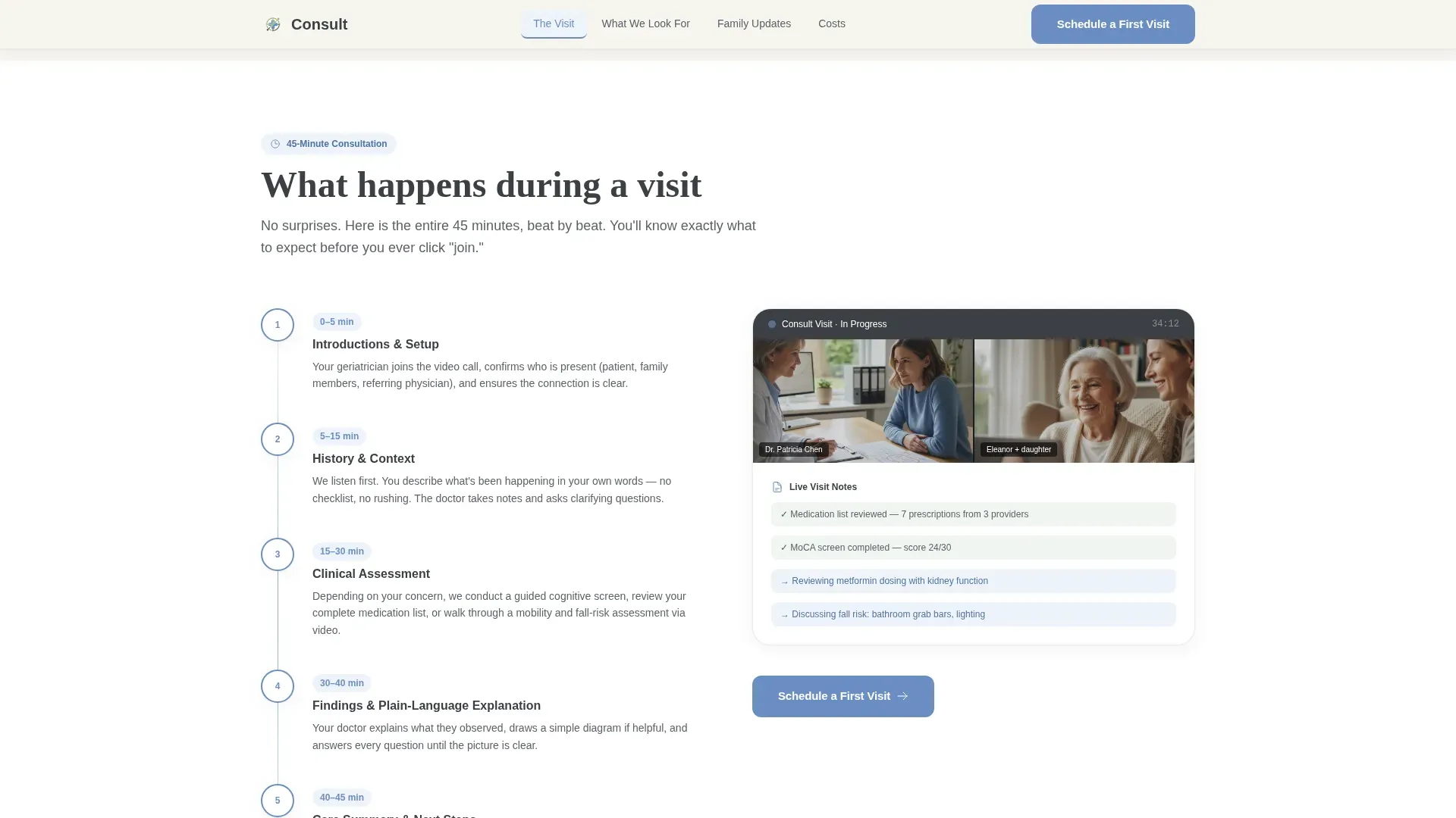
Timestamped Visit Walkthrough
The "What Happens During a Visit" section walks through the full 45-minute consultation beat by beat. Timestamped illustrations show what happens at each stage, making the unfamiliar feel structured and approachable.
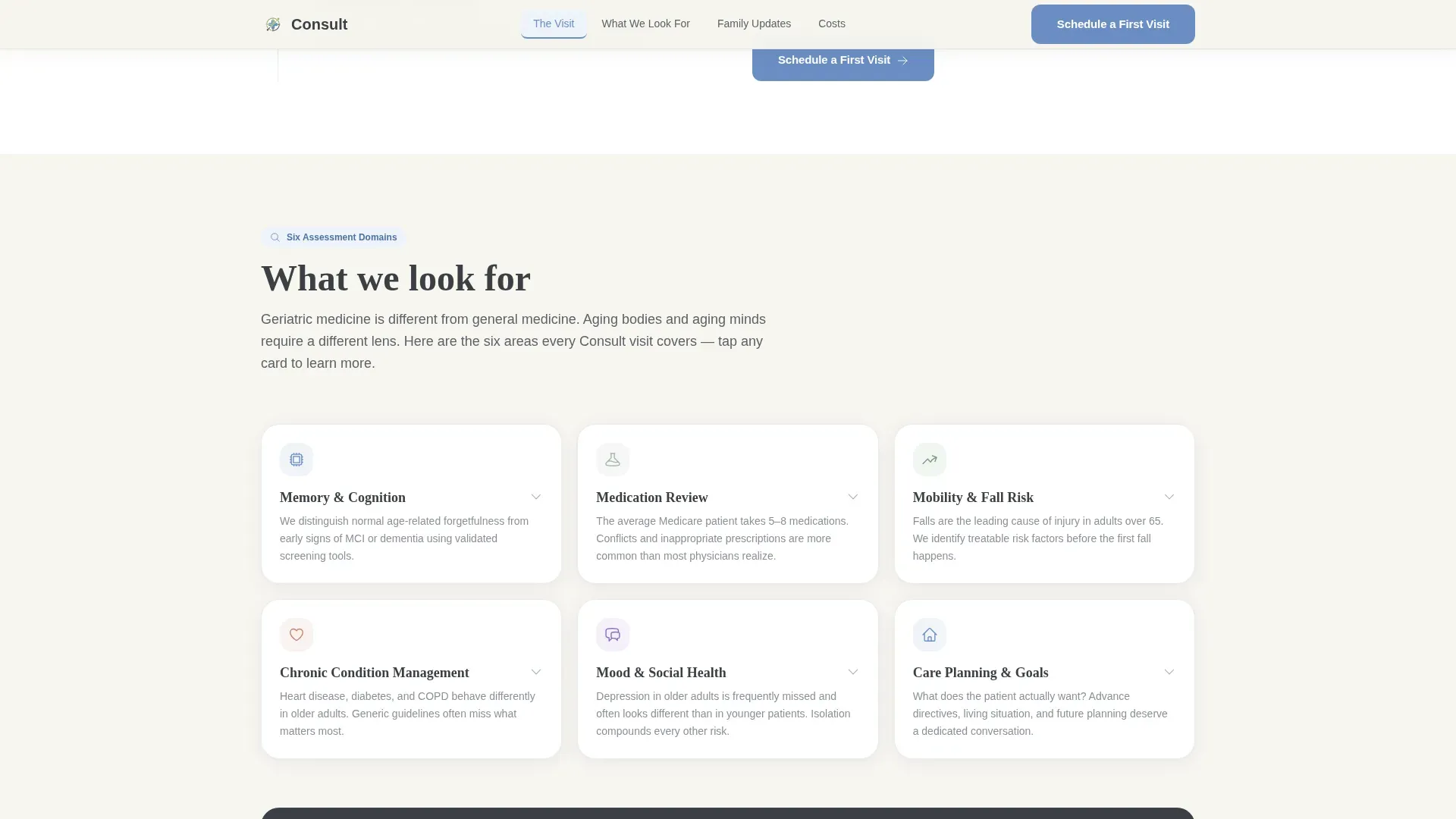
Expandable Assessment Domain Cards
The "What We Look For" section presents six geriatric assessment domains in expandable bento-style cards. Visitors can open only the domains relevant to their situation, from cognition and medication review to fall risk, without reading through everything at once.
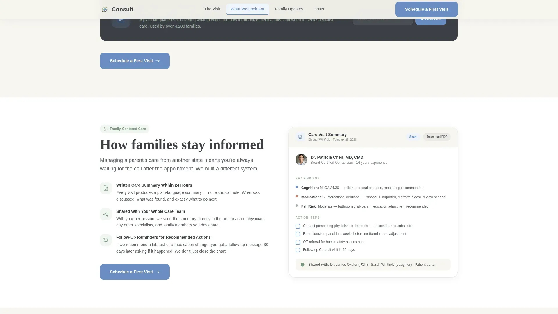
Shared Care Summary Visual
The "How Families Stay Informed" section shows the shared care summary document that families receive after each visit. This directly addresses the concern of a remote caregiver who cannot be in the room during the appointment.
Transparent Pricing Section
The "What It Costs" section lays out insurance acceptance and self-pay rates clearly. Transparent pricing removes one of the most common reasons a visitor leaves without booking.
Page sections overview
| Section | Purpose |
|---|---|
| Hero with Form | Warm multi-step entry point that identifies the visitor's role and begins the booking flow |
| Anchor Navigation Bar | Sticky hub that links to each spoke section and highlights the active section on scroll |
| What Happens During a Visit | Timestamped walkthrough of the 45-minute video consultation |
| What We Look For | Six expandable assessment domains from cognition to fall risk |
| How Families Stay Informed | Visual of the shared care summary sent to families after each visit |
| What It Costs | Insurance acceptance details and transparent self-pay pricing |
| Footer | Single-row linear footer with contact and legal links |
Design & branding system
The visual identity follows an Educational Guide theme. The palette and typography work together to feel like a well-lit reading room rather than a clinical portal.
- Color system uses soft warm white (#F7F5F0) as the background, muted sage (#A3B5A6) for secondary elements, deep charcoal slate (#3B3F45) for body text, and cornflower (#6B8EC4) for interactive elements and navigation highlights
- Typography pairs DM Sans for body text with Fraunces display serif for headings, creating a warm and readable contrast between approachable and authoritative
Mobile & speed optimization
The template is built mobile-first because the primary audience, adult caregivers, is most likely arriving on a phone. Interactive elements are isolated to keep static sections fast.
- Multi-step form and expandable accordion cards are built as client-side components, while all static spoke sections render as fast static markup
- Scroll reveal animations and form step transitions are set to medium intensity, keeping the experience smooth without slowing down the page on lower-end devices
How this template helps you convert
The entire page is structured around a principle of earning the click before asking for it. Transparency is the conversion mechanism.
- The multi-step form in the hero section reduces friction by starting with one illustrated question instead of a full intake form, which lowers the barrier to beginning the booking flow
- Each spoke section answers the next logical anxiety before it surfaces, so by the time a visitor reaches the "Schedule a First Visit" call to action at the end of each section, their most common objections have already been addressed
- The secondary conversion path, a downloadable Family Caregiver Guide offered in exchange for an email address, captures visitors who are not yet ready to book but are still in the research phase
Other information about this template
This template is purpose-built for the geriatric telemedicine niche and reflects the specific communication needs of that audience.
- The hub-and-spoke structure with anchor navigation is well suited to the multi-audience nature of geriatric care, where a daughter, a retired couple, and a referring physician all need different reassurances from the same page
- Social proof elements including board certification callouts, patient outcome statistics, and a testimonial pull-quote are included in the layout to build clinical credibility before a visitor commits
- The template is localized for English-language audiences in the United States, using USD pricing and US date format throughout
Theme
Educational Guide
Creative direction
Transparent Process
Color system
Cloud Canvas
Style
Hub & Spoke (Anchor Nav)
Direction
Lead Generation
Page Sections
Progressive Multi-step Booking Form
Anchor Navigation Hub
Timestamped Visit Walkthrough
Expandable Assessment Domain Cards
Family Care Summary Visual
Transparent Self-pay Pricing Section
Related questions
Who is this landing page template designed for?
What does the multi-step form include?
Can visitors get something without booking right away?
What are the spoke sections included in this template?
Is this template built for mobile visitors?


