Rigorous Healthcare Landing Page Template
A split-screen landing page built for hospital safety consultancies. It leads with an animated hospital floor plan that highlights twelve common failure points, then walks visitors through a rigorous audit methodology section by section. The primary call to action gates a 40-point pre-survey checklist behind a two-field form, earning trust before asking for a meeting.
by Rocket studio
Quick summary
This is a single-page, section-led landing page template for a hospital safety and compliance consultancy. It opens with a full-viewport infographic header, moves through a transparent methodology flow, and closes with two conversion points: a gated checklist download and a gap analysis request. The design uses a carbon fiber palette to project clinical precision and authority.
Who this template is for
This template is built for consultancies that work directly inside healthcare facilities. It speaks to buyers who already understand the stakes and need proof of rigor, not a pitch.
- Hospital safety officers preparing for Joint Commission survey visits
- Risk managers overseeing multiple campuses with overlapping compliance gaps
- Chief Nursing Officers (CNOs) who need a credible outside partner to audit entrenched workarounds
What problem this template solves
Most safety consultancy pages rely on generic trust signals and vague service descriptions. That approach fails with experienced healthcare buyers who evaluate vendors the same way they evaluate clinical protocols.
- Visitors can not quickly assess whether a consultancy's process is thorough enough for high-stakes regulatory environments
- The absence of real findings data leaves safety officers guessing about scope and depth
- Generic calls to action do not match the buying stage of a risk manager who already knows they have a problem
What you get with this template
You get a fully structured landing page that earns credibility by showing methodology, not just claiming it. Every section is designed to advance visitor trust from awareness to action.
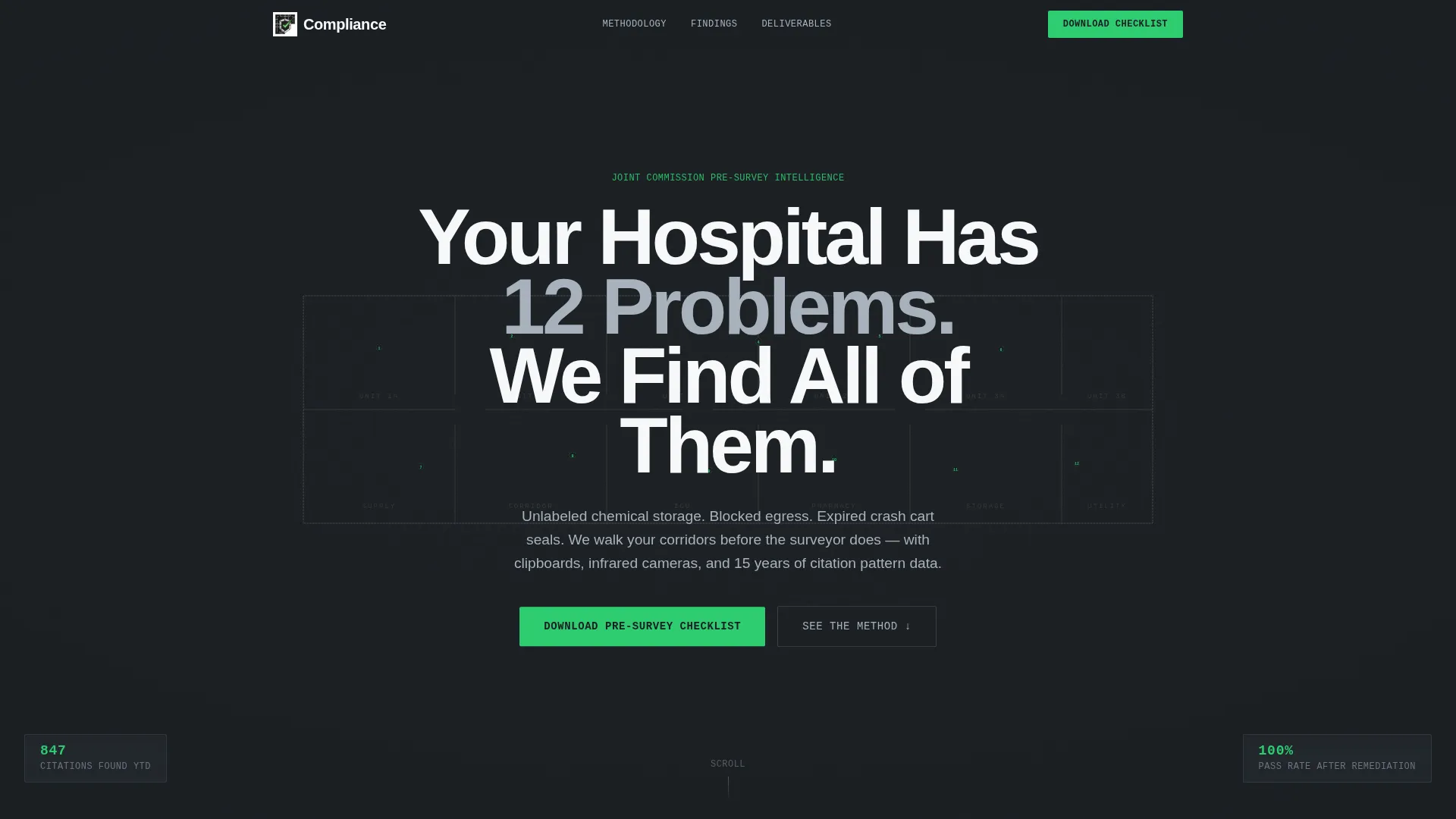
- A full-viewport animated infographic header with twelve pulsing failure-point hotspots and embedded citation statistics
- A split-screen methodology flow pairing physical consultant actions with tangible deliverable previews
- Two conversion points: a gated 40-point pre-survey checklist form and a secondary gap analysis request call to action
Feature list
This template includes purposeful layout and interactive components drawn directly from the brief. Each feature supports the goal of converting informed, skeptical healthcare buyers.
Animated Infographic Header
A stylized hospital floor plan rendered in silver linework against structural black fills the full viewport. Twelve hotspots pulse at common failure locations, each displaying an embedded statistic such as "34% of citations" or "Found in 7 of 10 audits." The headline fades in over the visualization, replacing stock photography with data as the visual anchor.
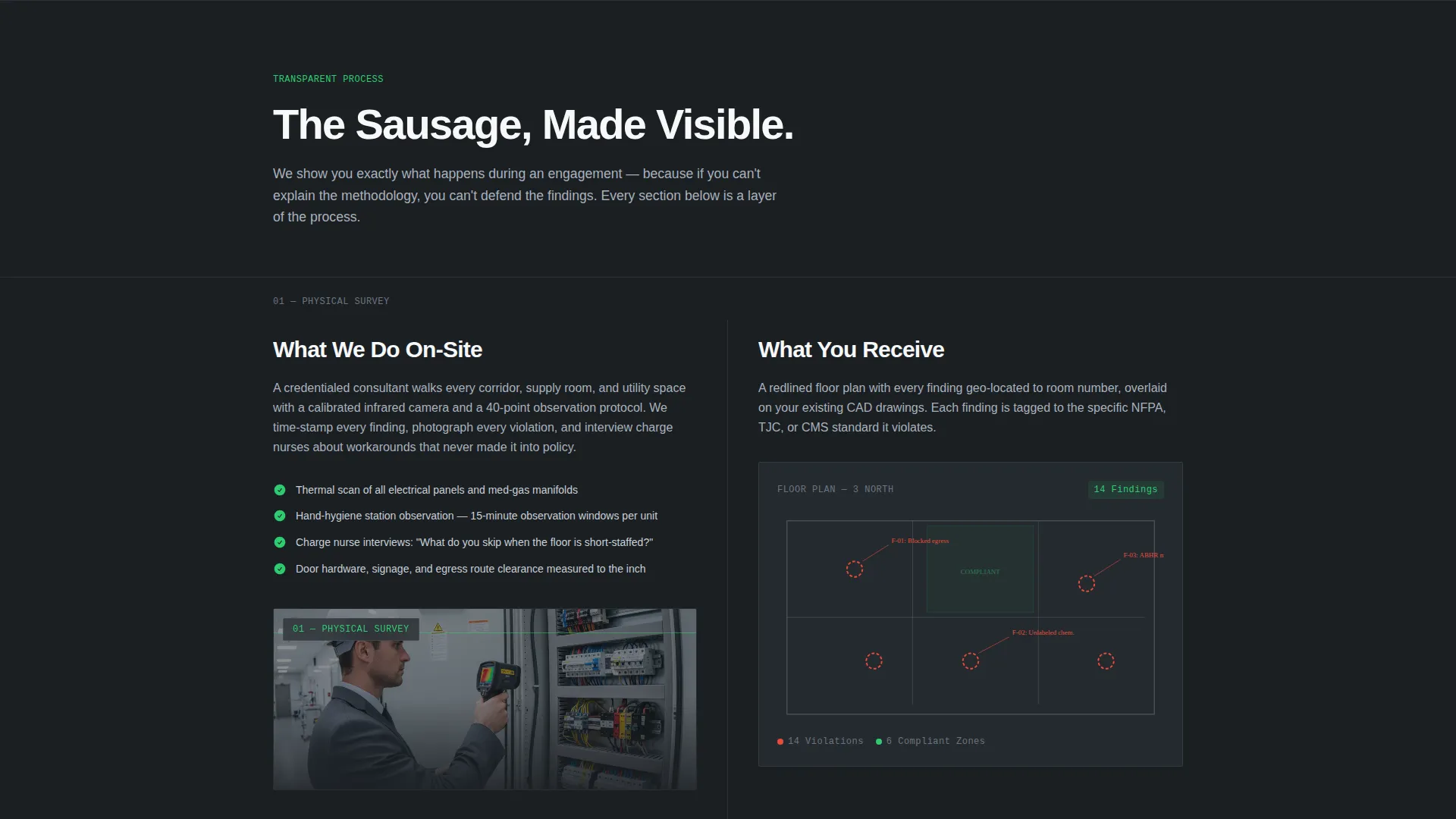
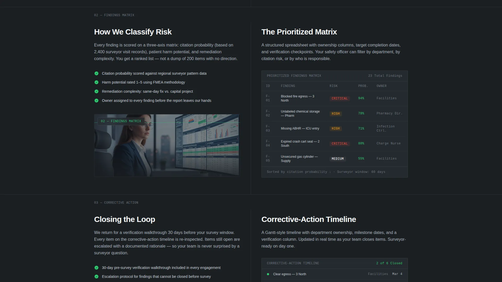
Split-Screen Methodology Sections
Each methodology section divides the screen 50/50. The left side shows what the consultant physically does on-site, such as a thermal scan of an electrical panel or an observation at a hand-hygiene station. The right side shows the resulting deliverable, such as a redlined floor plan, a prioritized findings matrix, or a corrective-action timeline with ownership columns.
Gated Checklist Download Form
The primary call to action captures a work email and facility bed count in exchange for a 40-point pre-survey self-audit checklist. The form is minimal by design, lowering friction while qualifying leads by facility size.
Secondary Gap Analysis call to action
A second conversion point appears after the methodology sections, targeting visitors who are already past the awareness stage. The placement respects the visitor's reading journey before asking for a direct engagement.
Carbon Fiber Visual Identity
The color system uses structural black, surgical-instrument silver, sterile-field white, and compliance-green reserved exclusively for checkmarks, progress indicators, and calls to action. No stock photography appears anywhere in the template.
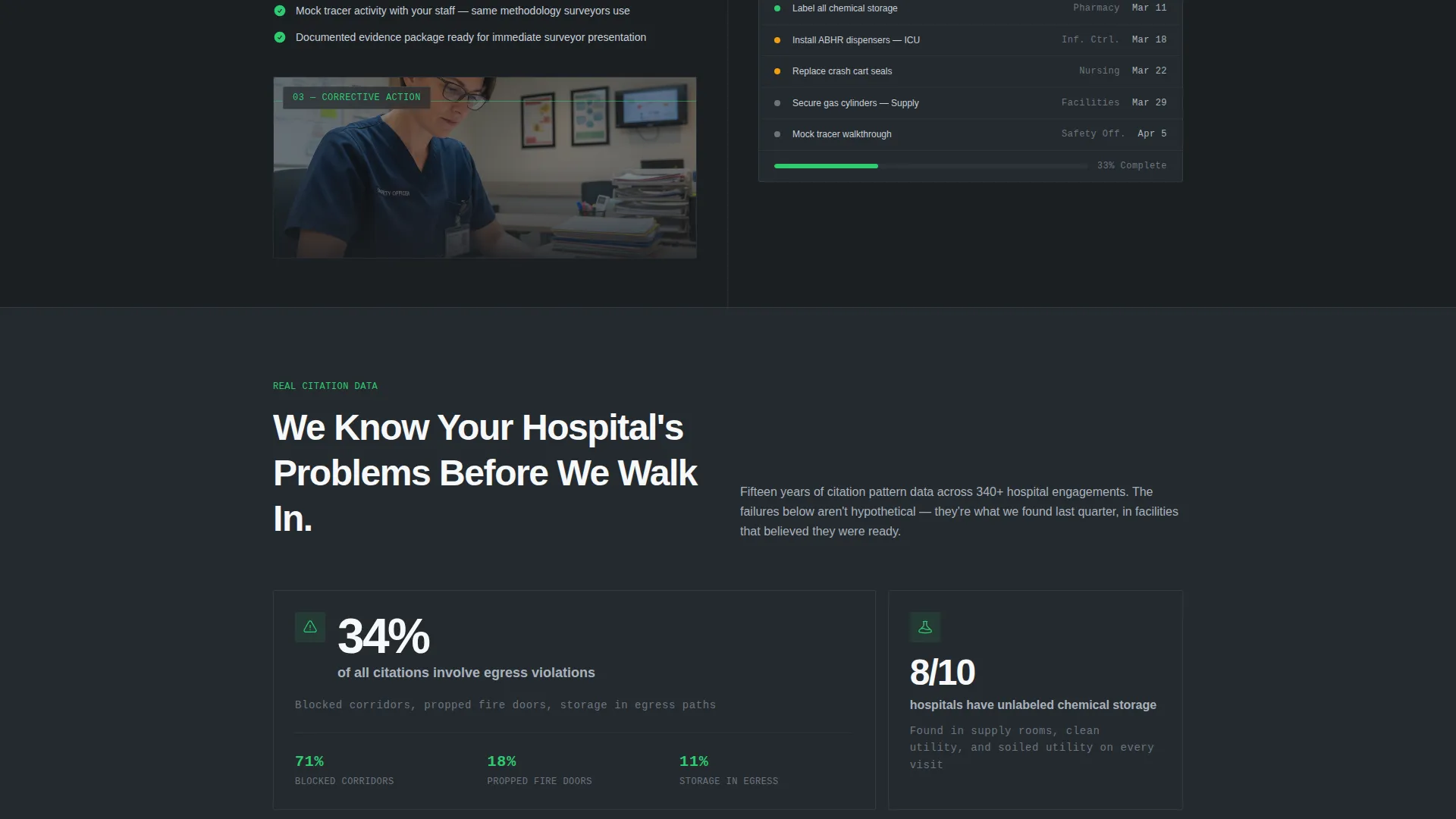
Real Findings Data Integration
Every section surfaces actual findings statistics embedded in the layout, such as failure rates and audit frequency data. This approach positions the consultancy as an expert who already understands each visitor's specific problems before a conversation begins.
Page sections overview
| Section | Purpose |
|---|---|
| Infographic Header | Establishes urgency with animated floor plan hotspots and embedded citation stats |
| Headline Fade-In | Delivers the core positioning statement across the data visualization |
| Methodology: Physical Audit | Shows on-site consultant actions paired with thermal and observational evidence |
| Methodology: Deliverables | Presents redlined floor plans and prioritized findings matrices as tangible outputs |
| Methodology: Corrective Timeline | Displays ownership-column action plans to demonstrate post-audit accountability |
| Checklist Download Form | Gates the 40-point pre-survey checklist behind a two-field lead capture form |
| Gap Analysis call to action | Converts mid-funnel visitors with a direct request for a scoped gap analysis |
Design & branding system
The visual identity follows a Medical Clarity theme built on a carbon fiber color system. Every color choice carries a functional role, eliminating decorative ambiguity.
- Structural black (#1B1F23) and sterile-field white (#F7F8FA) form the primary contrast foundation, with surgical-instrument silver (#A8B2BD) used for linework, borders, and secondary text
- Compliance-green (#2ECC71) appears exclusively on checkmarks, progress indicators, and call-to-action elements, reserving its meaning for confirmed passage
- No stock photography is used anywhere; data visualizations, floor plan linework, and deliverable previews carry all visual weight
Mobile & speed optimization
The split-screen layout adapts across screen sizes so methodology sections remain readable and scannable on smaller devices. The template is structured for lean rendering without unnecessary visual assets.
- The 50/50 split-screen sections stack vertically on mobile, preserving the left-side action and right-side deliverable pairing in a readable single-column flow
- Animated hotspots in the header are lightweight SVG-based elements, keeping the infographic functional without heavy media files
- The two-field checklist form is touch-optimized, with large input targets suitable for mobile completion
How this template helps you convert
The conversion architecture is built around progressive trust, not pressure. Visitors are shown evidence of rigor at every scroll depth before any ask is made.
- The animated infographic header immediately signals that this consultancy operates with data precision, creating credibility before a single word of copy is read.
- The split-screen methodology sections replace vague service claims with visible process transparency, making the consultancy's approach feel so thorough that alternatives seem inadequate by comparison.
- The gated checklist earns the lead by delivering genuine value first, while the secondary gap analysis call to action captures visitors who are already ready to engage directly.
Other information about this template
This template is designed as a Content/Resource landing page, making it well suited for consultancies whose sales cycle begins with demonstrated expertise rather than a discovery call.
- The 40-point pre-survey checklist functions as a foot-in-the-door asset, surfacing gaps the facility team cannot close without outside support
- The bed count field in the checklist form qualifies leads by facility scale without adding friction from a longer intake questionnaire
- The template's section-by-section methodology reveal is structured to serve both first-time visitors exploring compliance support options and returning visitors who came back after completing the self-audit
- This layout works particularly well for consultancies preparing hospital clients for regulatory body survey visits, where the cost of an undetected citation is far higher than the cost of a proactive audit
Theme
Engineering Blueprint
Creative direction
Step-by-Step Guide
Color system
Midnight Blue
Style
Card Grid (Modular)
Direction
Content/Resource
Page Sections
Animated Hospital Floor Plan Header
Split-screen Methodology Flow
Gated Pre-survey Checklist Form
Secondary Gap Analysis Call to Action
Carbon Fiber Color System
Embedded Real Findings Data
Related questions
Who is this landing page template built for?
What are the two conversion points on this page?
Can the hotspot statistics in the header be customized?
Does this template use stock photography?
How does the split-screen layout behave on smaller screens?


