Dental Digital Transformation Consultant Landing Page
Comply is a single-page landing page template built for dental digital transformation consultancies. It pairs a Legal Shield visual theme with an Arctic White color system and a FAQ-driven comparison table layout. The page guides practice owners from doubt to booking with structured objection-handling sections, a compliance-focused manifesto header, and a clear scheduling call to action.
by Rocket studio
Quick summary
Comply is a booking-focused landing page template designed for dental digital transformation consultants. It uses an authoritative Legal Shield theme, a crisp Arctic White palette, and a scroll-driven FAQ structure. Each section dismantles a specific objection, then closes with a comparison table. The result is a page that builds trust systematically and earns the booking before the visitor reaches the bottom.
Who this template is for
This template is built for consultants and firms that help dental practices modernize their operations. It speaks directly to the frustrations of people managing complex technology transitions in clinical environments.
- Dental digital transformation consultants pitching to practice owners and office managers
- DSO operations directors standardizing workflows across multiple locations
- Consulting firms offering HIPAA-compliant migration and patient recall modernization services
What problem this template solves
Most professional services landing pages either oversell with vague promises or undersell with dry feature lists. Neither approach works for a high-stakes audience that has already been burned by incompatible software vendors and failed audits.
- Practice owners need to see that their existing data and workflows will survive the transition
- Office managers need specific, side-by-side proof that the new system is safer than the old one
- Operations directors need a page that treats compliance as a given, not a sales pitch
What you get with this template
The template delivers a fully structured, single-page layout that moves a skeptical visitor from awareness to a confirmed booking appointment. Every section is purposeful and nothing is decorative.
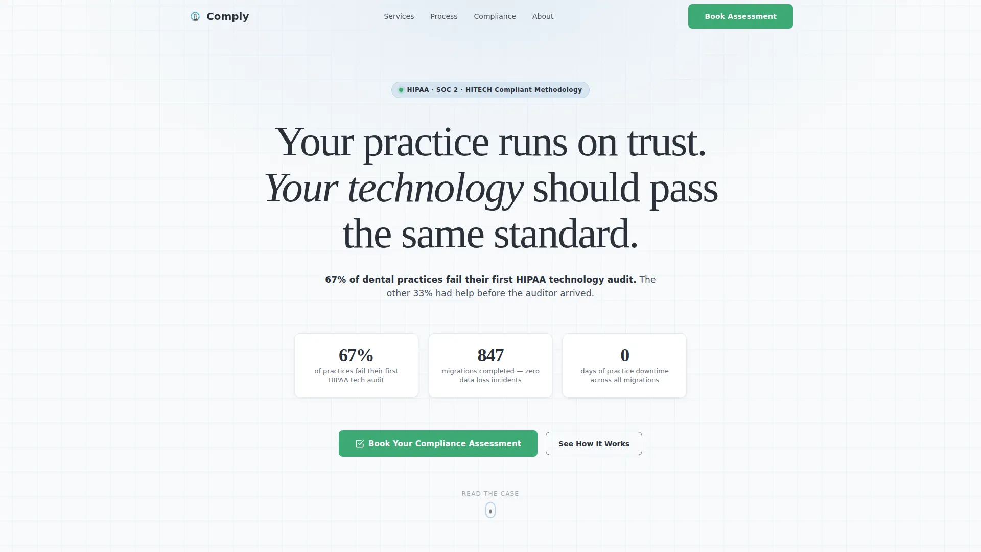
- A manifesto-style header with an oversized serif quote and a compliance-focused statistic subline
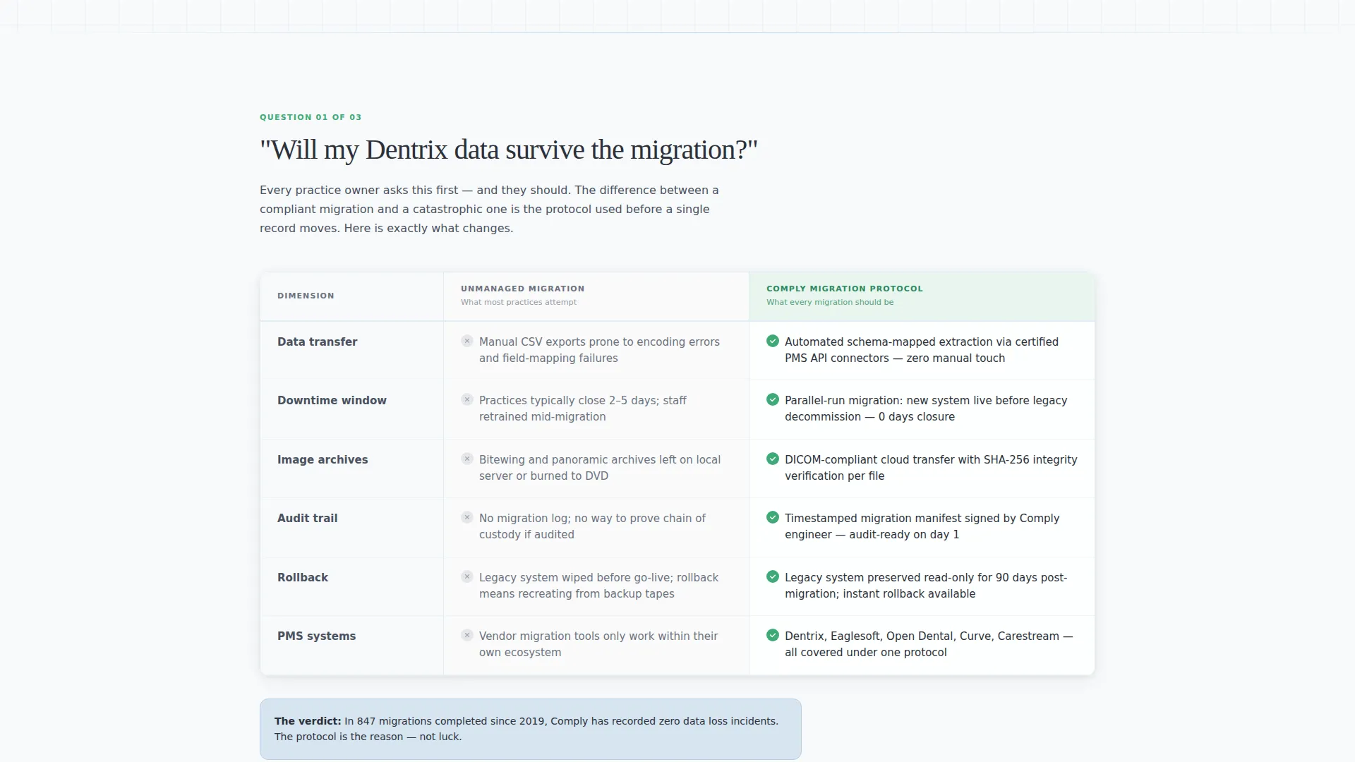
- FAQ-anchored scroll sections, each paired with a side-by-side comparison table
- A scheduling form with practice-specific fields and a secondary lead capture path for checklist downloads
Feature list
This section covers what the template actually includes and how each component earns its place on the page.
Manifesto Header with Compliance Statistic
The header opens with a single oversized charcoal serif line: "Your practice runs on trust. Your technology should pass the same standard." A smaller sans-serif subline follows, citing the specific statistic that 67% of dental practices fail their first HIPAA technology audit. No image or illustration is used. The typography and negative space carry full authority.
FAQ-Driven Comparison Table Sections
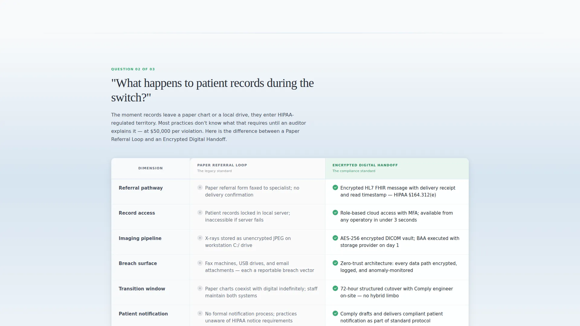
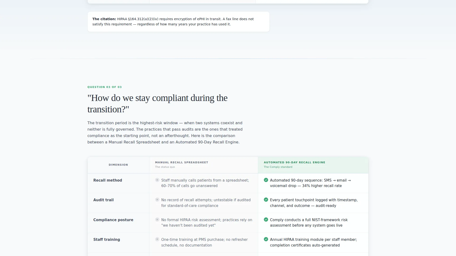
Each scroll section is anchored by a real question that practice owners actually ask. The question expands into a comparison table contrasting the legacy workflow against the transformed one. Column labels are specific and descriptive, for example "Paper Referral Loop" versus "Encrypted Digital Handoff" or "Manual Recall Spreadsheet" versus "Automated 90-Day Recall Engine." This structure builds a case across multiple sections without repeating itself.
Booking and Scheduling Form
The primary call to action is a scheduling widget labeled "Book Your Compliance Assessment." The form collects practice name, number of operatories, current practice management software via a dropdown with four options, and a preferred assessment date. The form appears after the third FAQ section, once the page has surfaced enough doubt about the visitor's current setup.
Secondary Lead Capture Path
Visitors who are not ready to book can download the HIPAA Technology Checklist by submitting their email address. This secondary path qualifies interested visitors into a nurture sequence without requiring the full commitment of a booked call. Both conversion paths coexist on the same page without competing visually.
Legal Shield Visual Theme
The page uses a strict four-color system. Clinical white and sterilization-blue handle all backgrounds. Compliance-grade charcoal is used exclusively for text. Verification green appears only on checkmarks, confirmation states, and the primary call-to-action button. The palette signals authority and cleanliness before a single line of copy is read.
Structured Objection-Handling Layout
The page is designed like a closing argument. Each FAQ section dissolves one specific objection. By the time the visitor reaches the booking form, the only remaining question is when to start. The scroll sequence is intentional: it does not introduce the call to action until the case has been made across at least three full objection-handling sections.
Page sections overview
| Section | Purpose |
|---|---|
| Manifesto Header | Opens with authority using a compliance statistic and oversized serif quote |
| FAQ Section One | Addresses data migration fears with a side-by-side comparison table |
| FAQ Section Two | Answers patient records questions during the transition period |
| FAQ Section Three | Covers compliance continuity with a legacy versus modern workflow table |
| Booking Form | Captures scheduling intent after objections are resolved |
| Secondary Lead Capture | Offers checklist download for visitors not ready to book |
Design & branding system
The visual identity follows a Legal Shield theme built entirely on the Arctic White color system. Every design decision reinforces clinical precision and compliance authority.
- Four-color palette: clinical white (#F8FAFB), sterilization-blue (#D6E4F0), compliance-grade charcoal (#2B303A), and verification green (#3DAA75) reserved strictly for confirmed or actionable states
- Typography pairing of oversized charcoal serif for headers and clean sans-serif for body copy, with negative space used as a structural element rather than filler
- Green accent used only for checkmarks, confirmation indicators, and the primary call-to-action button, never decoratively
Mobile & speed optimization
The layout is built with a single-column scroll structure that adapts cleanly to smaller screens. Comparison tables are the most structurally demanding elements on the page, and the template handles them with clarity on both desktop and mobile viewports.
- Comparison tables reformat for narrow screens so column labels and row content remain readable without horizontal scrolling
- The scheduling form fields stack vertically on mobile, keeping the booking flow accessible without requiring a desktop session
- Negative space and typographic hierarchy remain intact at all screen sizes, preserving the authoritative visual tone on any device
How this template helps you convert
The conversion logic is baked into the scroll sequence itself. The page does not ask for a booking before it has earned one.
- The manifesto header establishes stakes immediately with a specific, credible statistic, giving the visitor a reason to keep reading before any service claim is made.
- Each FAQ-driven comparison section removes one more reason to delay, so the visitor arrives at the booking form with their primary objections already addressed rather than still forming.
- The secondary lead capture path ensures that visitors who are not yet ready to book still convert into a qualified lead, keeping the page useful across different levels of buyer readiness.
Other information about this template
This template is categorized under Professional Services, specifically within the Dental Consulting subcategory and the Dental Digital Transformation Consultant niche. It is designed for high-trust, high-stakes service offers where the audience is skeptical and the competition is a status quo that feels familiar even when it is failing.
- The template style is a Comparison Table layout, making it well suited for any consultancy that needs to contrast old processes with new ones in a credible and structured way
- The creative direction is FAQ-Driven, which means the copy structure is designed around real objections rather than feature announcements
- The header concept is a Quote/Manifesto, an approach that works especially well when the service is authoritative and the audience responds to direct, confident language
- The landing page direction is Booking and Scheduling, meaning every design decision is oriented toward a confirmed calendar appointment as the primary conversion goal
- The template is named Comply and is part of a broader set of niche-specific professional services templates available on the platform
Theme
Legal Shield
Creative direction
FAQ-Driven
Color system
Arctic White
Style
Comparison Table
Direction
Booking/Scheduling
Page Sections
Manifesto Header with Compliance Statistic
Faq-driven Comparison Table Sections
Booking and Scheduling Form
Secondary Lead Capture Path
Legal Shield Color System
Structured Objection-handling Scroll Sequence
Related questions
What type of business is this template built for?
Can I change the comparison table column labels to match my services?
Does the scheduling form connect to a calendar tool?
Can I remove the secondary lead capture section if I only want bookings?
What makes this template different from a generic professional services page?



