Food Safety Consultant Landing Page Template
Comply is a split-screen food safety consultant landing page template built around a versus comparison layout. It targets restaurant group operators, food manufacturing quality assurance leads, and ghost kitchen founders who need audit-ready positioning. The design uses a Data Command color system and escalating comparison panels to turn visitor self-doubt into clear, confident action.
by Rocket studio
Quick summary
Comply is a single-page food safety consultant template designed around a 50/50 split-screen, checklist-versus comparison layout. It moves visitors through escalating audit scenarios, from daily operations to post-audit reporting, until the case for professional compliance support is impossible to ignore. Every visual decision reinforces authority, clarity, and readiness.
Who this template is for
This template is built for food safety consultants who serve high-stakes clients operating under real regulatory pressure. It speaks directly to the operational reality those clients live every day.
- Restaurant group operations managers overseeing multiple sites at once
- Food manufacturing quality assurance leads facing British Retail Consortium recertification cycles
- Ghost kitchen founders who scaled their operations faster than their Hazard Analysis and Critical Control Point plans could follow
What problem this template solves
Food safety consultants struggle to communicate the difference between reactive scrambling and proactive compliance management. Prospects often underestimate the gap until they have already failed an audit. This template closes that perception gap before the conversation even starts.
- Visitors cannot easily picture the cost of a DIY compliance approach until they see it compared side by side
- Consultants need a page that earns trust fast, especially with operations managers who are skeptical of outside vendors
- Generic service pages do not reflect the structured, documentation-first nature of real audit preparation work
What you get with this template
You get a fully structured, single-page layout that guides visitors from curiosity to conversion through a rhythm of escalating comparisons. Every section is designed to prompt honest self-assessment.
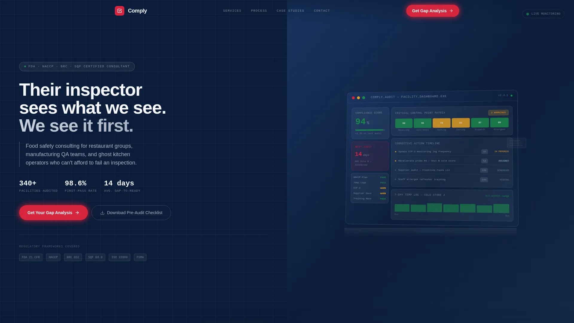
- A split-screen hero with an audit dashboard mockup, animated headline, and frosted glass overlay
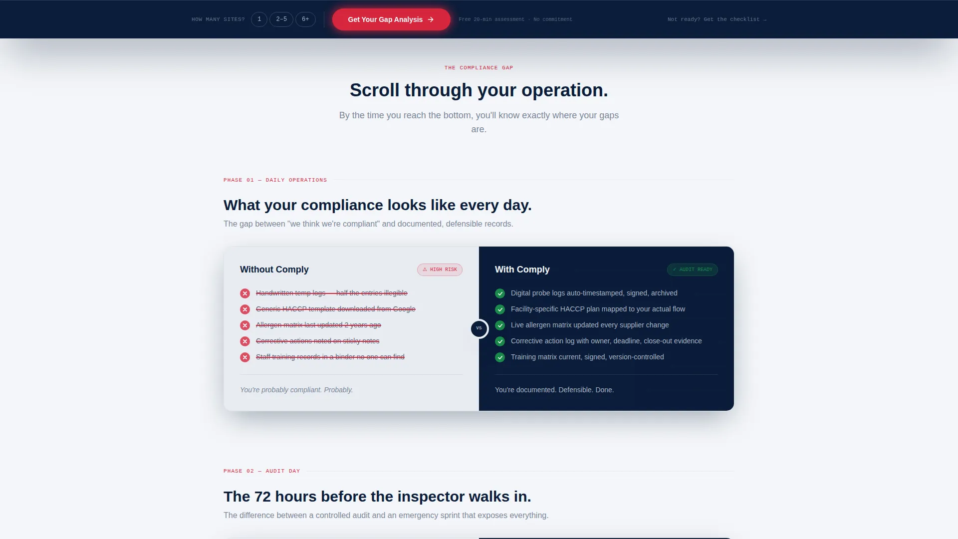
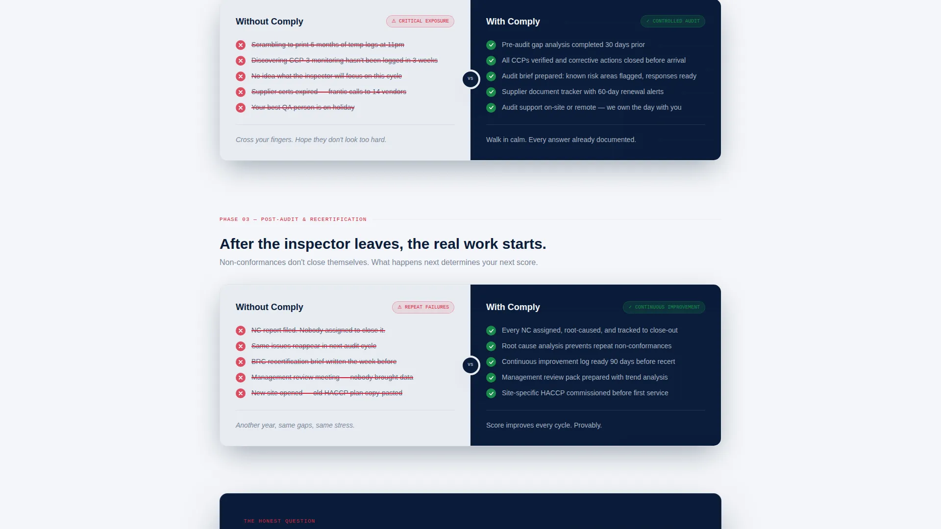
- Scroll-triggered checklist versus panels covering daily operations, audit day, and post-audit reporting
- A persistent bottom bar with a primary call to action and a secondary lead magnet path for earlier-stage visitors
Feature list
This template delivers a focused set of layout and conversion components grounded in the source brief. Each one serves the food safety consulting sales context directly.
Split-Screen Hero with Dashboard Mockup
The header opens with a high-fidelity monitor mockup showing a proprietary audit dashboard. Visible data includes a 94% facility compliance score, a color-coded critical control point matrix with amber warnings, a corrective action timeline, and a countdown to the next scheduled audit. A frosted glass overlay carries the headline into view on load.
Scroll-Triggered Versus Comparison Panels
Three escalating comparison panels animate on scroll. Each panel places the unmanaged, do-it-yourself approach on the left and the consultant-managed approach on the right. Checkmarks and strike-throughs reveal as the visitor scrolls, making the gap between the two approaches progressively clearer and more urgent.
Persistent Bottom Bar with Qualifying call to action
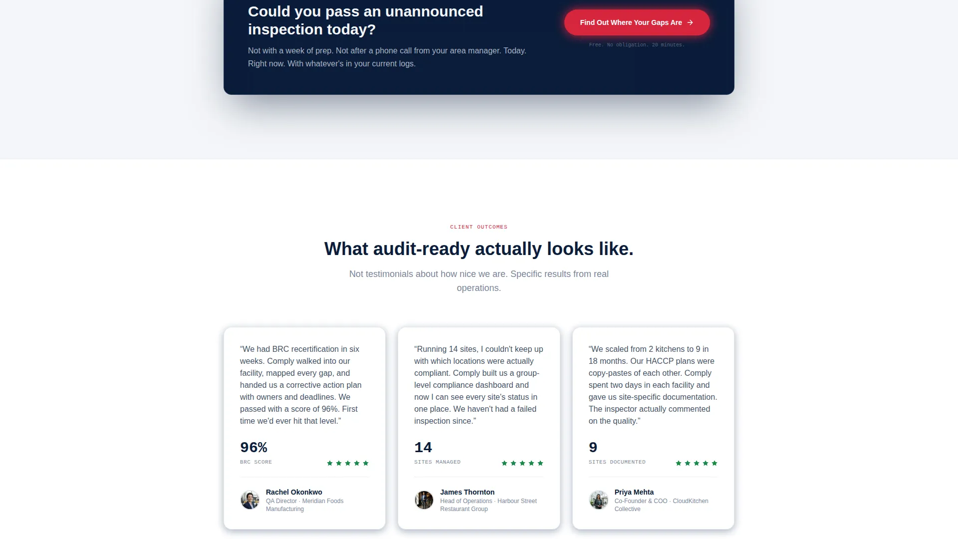
After the final comparison panel, a sticky bottom bar surfaces and stays visible. It presents the primary call to action, "Get Your Gap Analysis," alongside a single-line qualifier asking the visitor how many sites they manage. This soft qualification step improves lead relevance without adding friction.
Lead Magnet Secondary Path
A secondary conversion path offers a downloadable pre-audit checklist for visitors who are not yet ready to book a consultation. It captures email address and facility type, giving the consultant a warm lead pool to nurture over time.
Data Command Visual Design System
The entire layout uses a Navy Authority color palette: deep regulatory navy, stainless-steel gray, clinical white, and corrective-action red reserved strictly for alert states and key differentiators. The visual language feels like an industrial monitoring interface, which reinforces the consultant's technical credibility.
Audit-Rhythm Content Structure
The page content follows a deliberate three-phase rhythm: daily operations, audit day, and post-audit reporting. Each phase escalates the stakes. By the time a visitor reaches the call to action, they have mentally audited their own operation against each comparison and identified their own gaps.
Page sections overview
| Section | Purpose |
|---|---|
| Hero Header | Introduce the consultant's audit dashboard and headline |
| Comparison Panel One | Contrast daily operations approaches side by side |
| Comparison Panel Two | Contrast audit-day preparation and readiness |
| Comparison Panel Three | Contrast post-audit reporting and follow-through |
| Persistent Bottom Bar | Surface the primary call to action with site qualifier |
| Lead Magnet Block | Capture early-stage leads via pre-audit checklist offer |
Design & branding system
The visual identity follows a Data Command theme that borrows the language of industrial monitoring systems. Every color and layout choice signals authority, precision, and zero tolerance for ambiguity.
- Deep regulatory navy (#0B1D3A) anchors the layout as the primary background and structural color
- Stainless-steel gray (#A8B2C1) and clinical white (#F4F6F9) provide contrast for content panels and text hierarchy
- Corrective-action red (#D7263D) appears only in alert states and key differentiator callouts, never as decoration
Mobile & speed optimization
The split-screen layout is structured to reflow cleanly on smaller screens without losing the versus comparison logic that drives conversion. The template keeps layout complexity purposeful rather than decorative.
- Comparison panels stack vertically on mobile so the left-versus-right logic remains readable in a top-versus-bottom format
- The persistent bottom bar is designed to stay visible on mobile without obscuring primary content
- Dashboard mockup imagery is cropped and scaled to remain legible at smaller viewport widths
How this template helps you convert
Every structural decision in Comply is built to narrow the distance between a skeptical visitor and a booked consultation. The page does not ask for trust; it builds it through evidence.
- The scroll-triggered comparison panels make visitors self-audit before they reach the call to action, so by the time they see "Get Your Gap Analysis," they already know they need it.
- The two-path conversion system captures both ready buyers through the primary call to action and earlier-stage visitors through the lead magnet, so no traffic leaves empty-handed.
Other information about this template
Comply sits within the Safety and Emergency category, specifically in the Safety Consulting and Services subcategory. It is designed to serve the food safety consulting niche, where trust, documentation credibility, and regulatory fluency are the primary purchase signals.
- The template style is informed by a Card Grid modular approach, with each comparison panel functioning as a self-contained content module
- The creative direction draws from a Step-by-Step Guide structure, moving visitors through a logical progression rather than overwhelming them with information at once
- The header concept uses a Product Screenshot approach, grounding the consultant's proprietary process in a visible, tangible artifact rather than abstract claims
- The overall landing page direction is Content and Resource led, meaning the page earns conversion by delivering genuine insight before asking for anything
Theme
Engineering Blueprint
Creative direction
Step-by-Step Guide
Color system
Midnight Blue
Style
Card Grid (Modular)
Direction
Content/Resource
Page Sections
Split-screen Hero with Audit Dashboard
Scroll-triggered Versus Comparison Panels
Persistent Bottom Bar with Site Qualifier
Lead Magnet Secondary Conversion Path
Data Command Navy Authority Color System
Audit-rhythm Three-phase Content Structure
Related questions
Who is this template designed for?
Can I customize the comparison panel content for my specific services?
What does the lead magnet path collect from visitors?
Does the persistent bottom bar stay visible throughout the whole page?
Is this template suitable for a consultant focused on one facility type only?


