Safety Consulting Landing Page Template
Comply is a single-column landing page template built for workplace safety consultants. It guides operations directors, site managers, and HR leads through a structured audit narrative, from gap analysis to ongoing monitoring, using a dark command-center aesthetic, amber compliance indicators, and two conversion paths designed to capture both ready buyers and early-stage leads.
by Rocket studio
Quick summary
Comply is a focused, single-column landing page template for workplace safety consulting firms. It presents the consultancy's process as a numbered audit sequence, builds credibility through visual rigor, and closes with two conversion paths: a site assessment request form and a downloadable compliance checklist. Every design decision reinforces authority before asking for action.
Who this template is for
This template is built for safety consulting practices that serve industrial and commercial clients. It speaks directly to buyers who are under regulatory pressure and need a partner who understands the floor, not just the paperwork.
- Operations directors at mid-size manufacturers managing shift safety
- Site managers overseeing concurrent construction or build projects
- HR leads who have received a compliance citation and need a clear path forward
What problem this template solves
Safety consulting is a credibility-first sale. A generic service page rarely earns trust from buyers who have seen incidents up close. This template solves the problem of looking too polished to be practical.
- Buyers often cannot tell whether a consultant has real field experience or only office-level knowledge
- The template's audit-module structure and unglamorous photography signal hands-on expertise immediately
- Two conversion paths capture both decision-ready buyers and cautious leads who are still evaluating
What you get with this template
The template delivers a complete, ready-to-customize single-column landing page. Every section is pre-structured so you can drop in your own content without rethinking the layout or the conversion logic.
- A half-page header combining a left-aligned headline with a high-contrast production-floor photograph
- Four numbered audit modules with animated amber checkmarks that build the case for partnership as visitors scroll
- A dual-path conversion system: a site assessment request form and a gated PDF lead magnet
Feature list
This template packages the following capabilities into a single, deployable landing page.
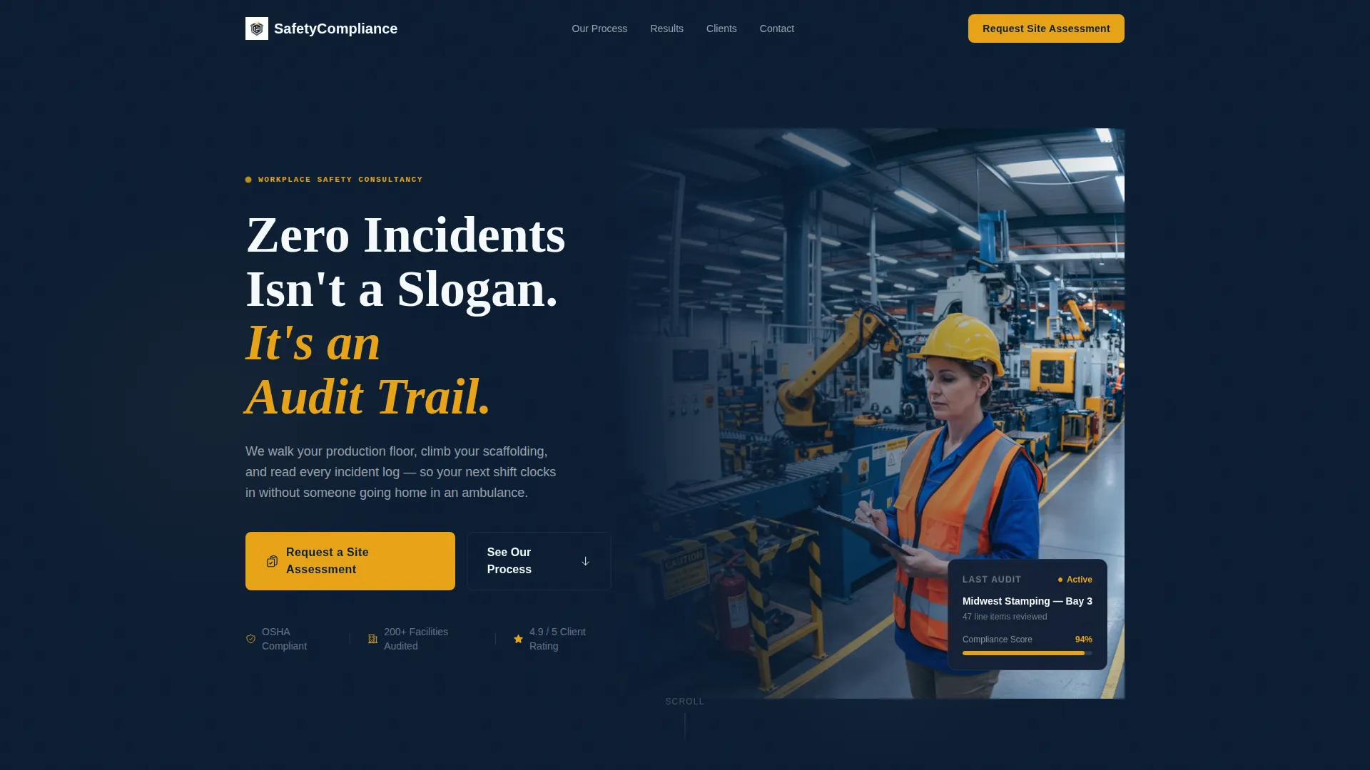
Half-Page Photo and Text Header
The header splits into a left-aligned text block and a right-side candid photograph. The image shows a consultant marking a clipboard on an active production floor, hard hat on and hi-vis vest lit by overhead fluorescents. The composition is intentionally unglamorous and immediately credible.
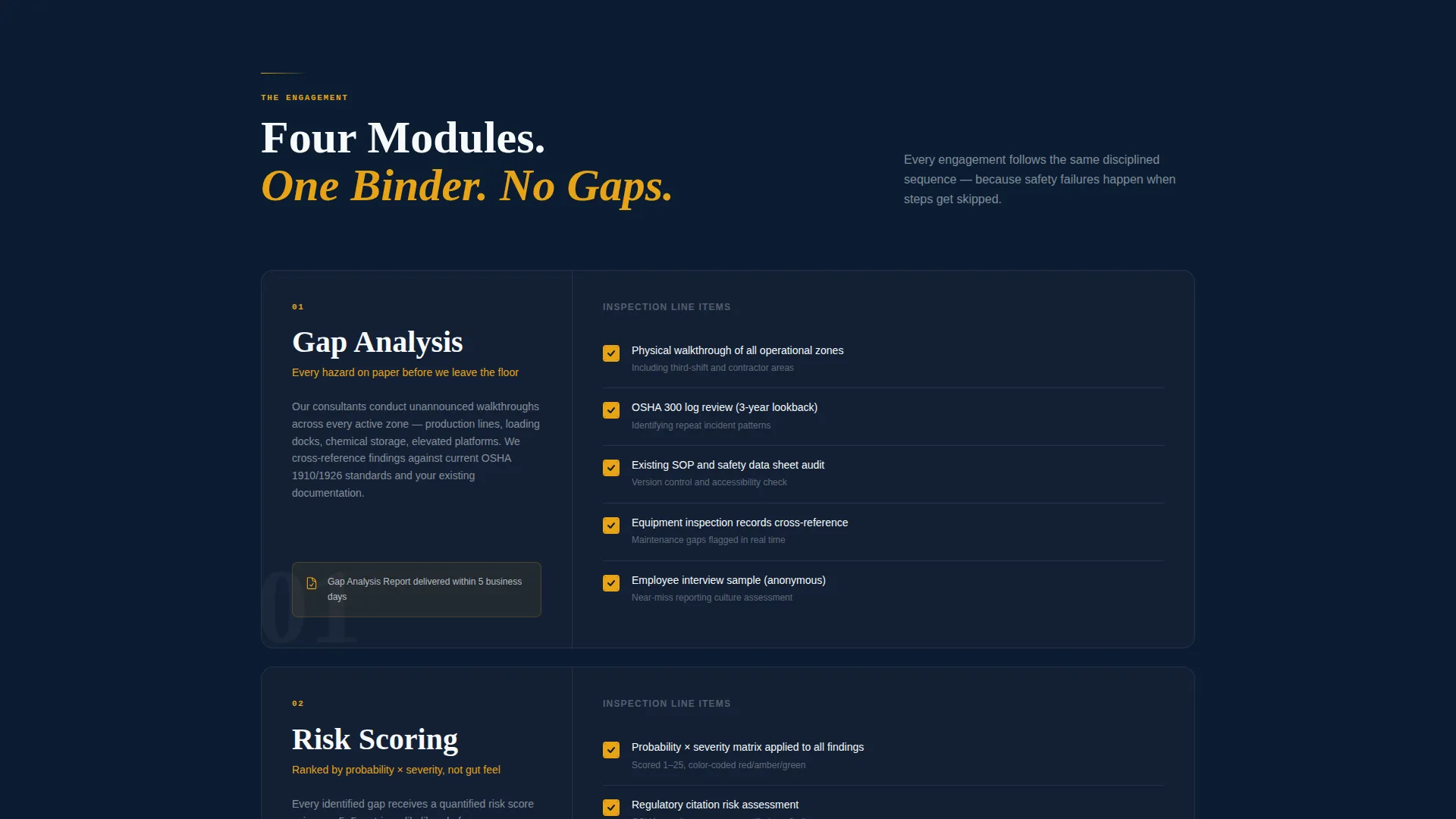
Numbered Audit Module Sections
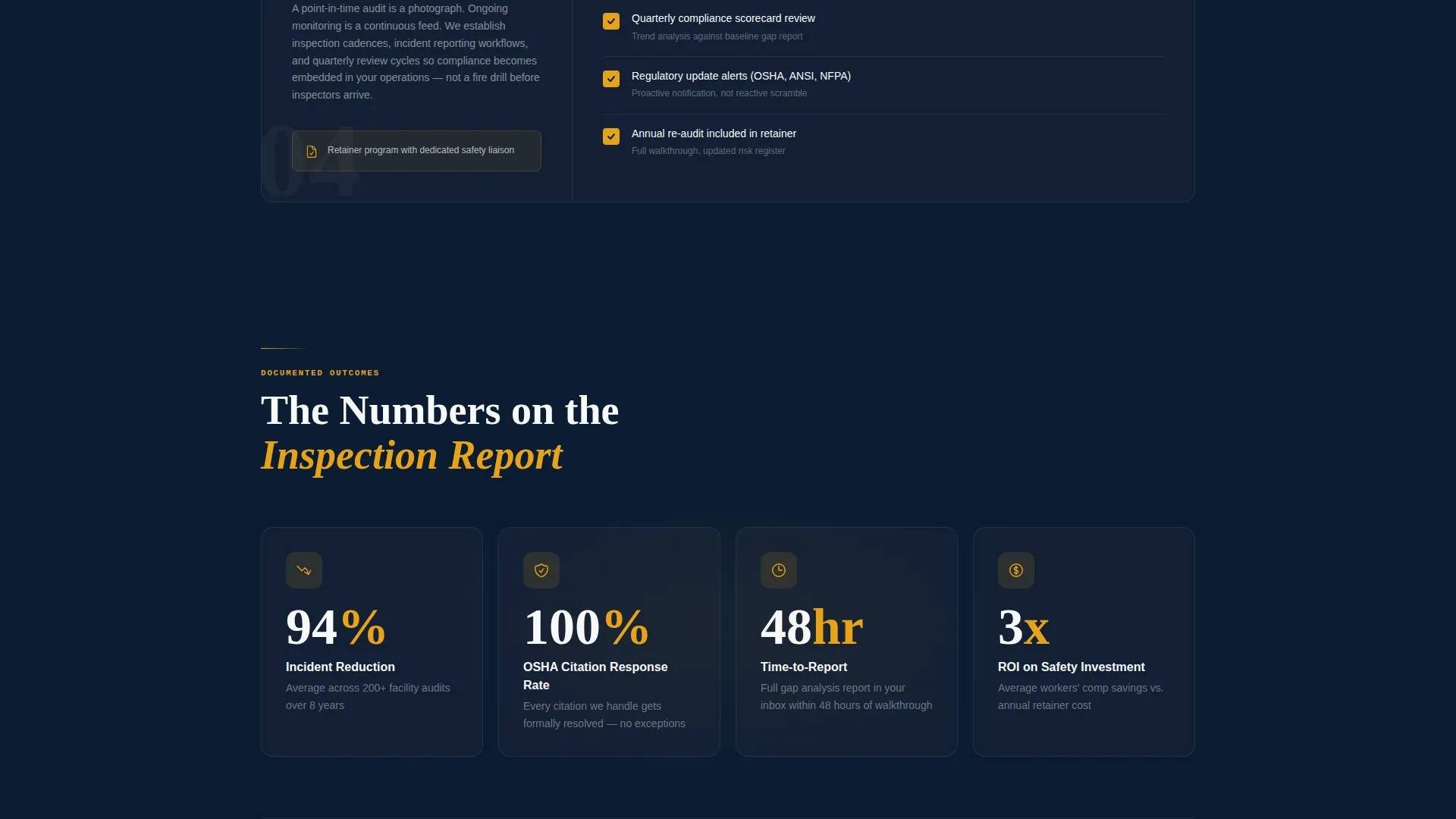
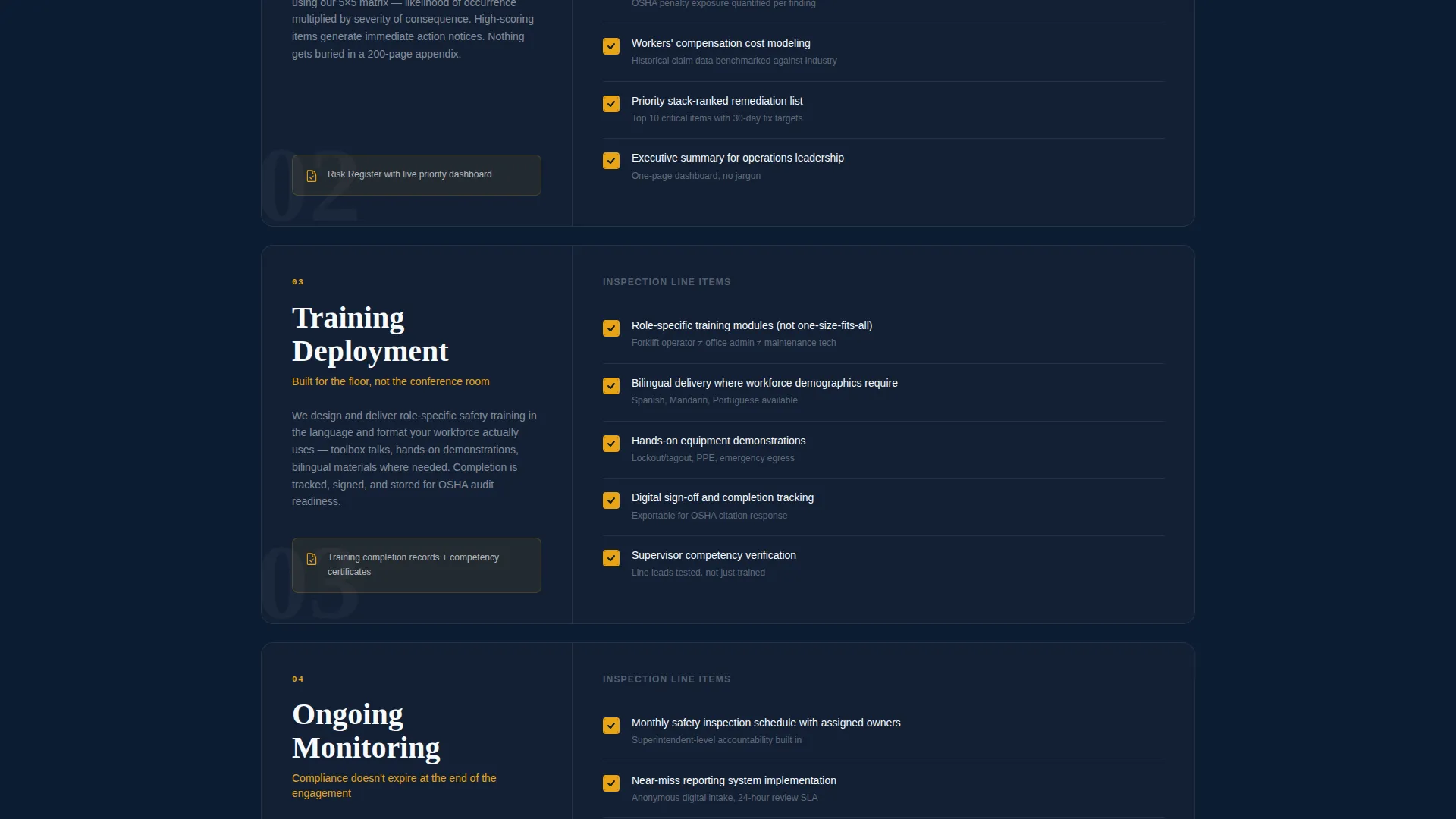
Four scroll sections are formatted like chapters of an inspection report: "01, Gap Analysis," "02, Risk Scoring," "03, Training Deployment," and "04, Ongoing Monitoring." Each module presents line items as a structured checklist, making the consultancy's process feel systematic and thorough.
Animated Amber Checkmark Line Items
Within each audit module, individual line items animate into view with amber checkmarks as the visitor scrolls. The animation turns the page into a living audit document. Visitors experience the process accumulating in real time, not just read about it.
Dual Conversion Path Layout
The primary call to action, "Request a Site Assessment," appears immediately below the header and again at the bottom of the page. A secondary path offers a downloadable PDF, "Get Our 12-Point Compliance Checklist," gated behind an email address and job title field for lead capture.
Site Assessment Request Form
The contact form collects company name, facility type via a dropdown (manufacturing, construction, warehousing, energy, or other), number of employees, and a free-text field labeled "Describe your most pressing safety concern." The form is positioned for high-intent buyers who are ready to talk.
Command-Center Visual System
The Midnight Blue color system uses deep navy as the primary background, reinforced steel gray for secondary surfaces, signal white for body text, and caution amber reserved exclusively for calls to action, checkmarks, and compliance status indicators. The palette feels deliberate and authoritative without relying on decorative elements.
Page sections overview
| Section | Purpose |
|---|---|
| Header with photo | Lead with headline and real production-floor image |
| Primary call to action block | Prompt immediate site assessment requests |
| Gap Analysis module | Introduce the consultancy's diagnostic starting point |
| Risk Scoring module | Show how hazards are ranked and prioritized |
| Training Deployment module | Explain how corrective programs are rolled out |
| Ongoing Monitoring module | Demonstrate sustained compliance support |
| PDF lead magnet | Capture early-stage leads with gated checklist |
| Bottom call to action form | Close the page with the full assessment request form |
Design & branding system
The visual identity follows a Service Utility theme. Every color choice has a functional reason, matching the discipline the consultancy itself applies on-site.
- Deep command-center navy (#0B1D33) as the primary background, reinforced steel gray (#4A5568) for secondary surfaces, and signal white (#F7FAFC) for body text
- Caution amber (#E8A317) used exclusively for calls to action, checkmarks, and compliance status indicators to keep visual hierarchy clear
- Heavy white type for headlines and a half-page candid photograph that prioritizes field authenticity over stock-photo polish
Mobile & speed optimization
The single-column flow adapts naturally to smaller screens. Vertical stacking is the default layout structure, which means the audit module sequence reads cleanly on any device without layout breakpoints disrupting the narrative order.
- The header photograph and text stack vertically on mobile, keeping the headline prominent and the image fully visible
- Amber checkmark animations are designed to trigger on scroll across both desktop and mobile viewports
- The dual-path conversion layout presents each form and lead magnet as its own distinct block, keeping tap targets clear on touch screens
How this template helps you convert
The page is built for business-to-business conversion where trust has to be earned before a form is submitted.
- The audit module structure makes the consultancy's methodology visible and systematic, reducing the buyer's uncertainty before they reach any call to action.
- The dual conversion path meets buyers at two different levels of readiness: the site assessment form captures decision-ready contacts, while the gated checklist PDF captures leads still in evaluation mode.
Other information about this template
This template fits naturally into a safety consulting practice that serves regulated industries where compliance documentation is part of daily operations.
- The template style follows a single-column flow with numbered, module-based sections rather than a card grid, keeping the audit narrative linear and easy to follow
- The page is designed for business-to-business use cases in sectors including manufacturing, construction, warehousing, and energy
- The downloadable checklist format reflects a common content strategy in safety consulting, where practical resources build trust before a sales conversation begins
Theme
Engineering Blueprint
Creative direction
Step-by-Step Guide
Color system
Midnight Blue
Style
Card Grid (Modular)
Direction
Content/Resource
Page Sections
Half-page Photo and Text Header
Numbered Audit Module Layout
Animated Amber Checkmark Items
Dual Conversion Path System
Detailed Site Assessment Form
Midnight Blue Command-center Palette
Related questions
Can I customize the audit module labels for my own process?
Does the contact form support multiple facility types?
Is this template suitable for a solo safety consultant?
What kind of photography works best with this template?
Can I remove the lead magnet section and use only the assessment form?


