Telecom Compliance Consultant Landing Page Template
Comply is a comparison table landing page template built for telecom environmental compliance consultants. It layers award badge credentials, a pre-versus-post metrics table punctuated by client testimonial tiles, and a click-through call to action into one authoritative, evidence-stacked page. The visual identity feels like a well-organized compliance binder: structured, warm, and impossible to dismiss.
by Rocket studio
Quick summary
Comply is a single-page template designed for a telecommunications sustainability consultancy. It opens with embossed credential badges, moves through a structured comparison table with embedded client testimonials, and closes with a clear click-through call to action. Every section is organized to build trust before asking for anything, guiding decision-makers toward requesting a compliance gap analysis.
Who this template is for
This template is built for professionals who need to communicate regulatory credibility fast. It speaks directly to the people responsible for environmental accountability in telecommunications infrastructure.
- Network operations vice presidents managing Environmental, Social, and Governance (ESG) disclosure deadlines
- Regulatory affairs directors at regional carriers navigating state-level emissions mandates
- Tower company chief operating officers who need environmental impact statements that hold up through public comment periods
What problem this template solves
Telecommunications infrastructure leaders often struggle to find a consultancy that can demonstrate real compliance outcomes, not just promises. A generic services page does not build the institutional trust these buyers need before they hand over a project.
- Decision-makers arrive skeptical and need credentials before they read a single claim
- There is no quick way to show before-and-after compliance outcomes on a standard services page
- Client voices and hard metrics are scattered, not organized like a case that builds to a verdict
What you get with this template
You get a fully structured landing page that organizes proof in the right order, from credentials to outcomes to client testimony, and then directs visitors to take one clear action.
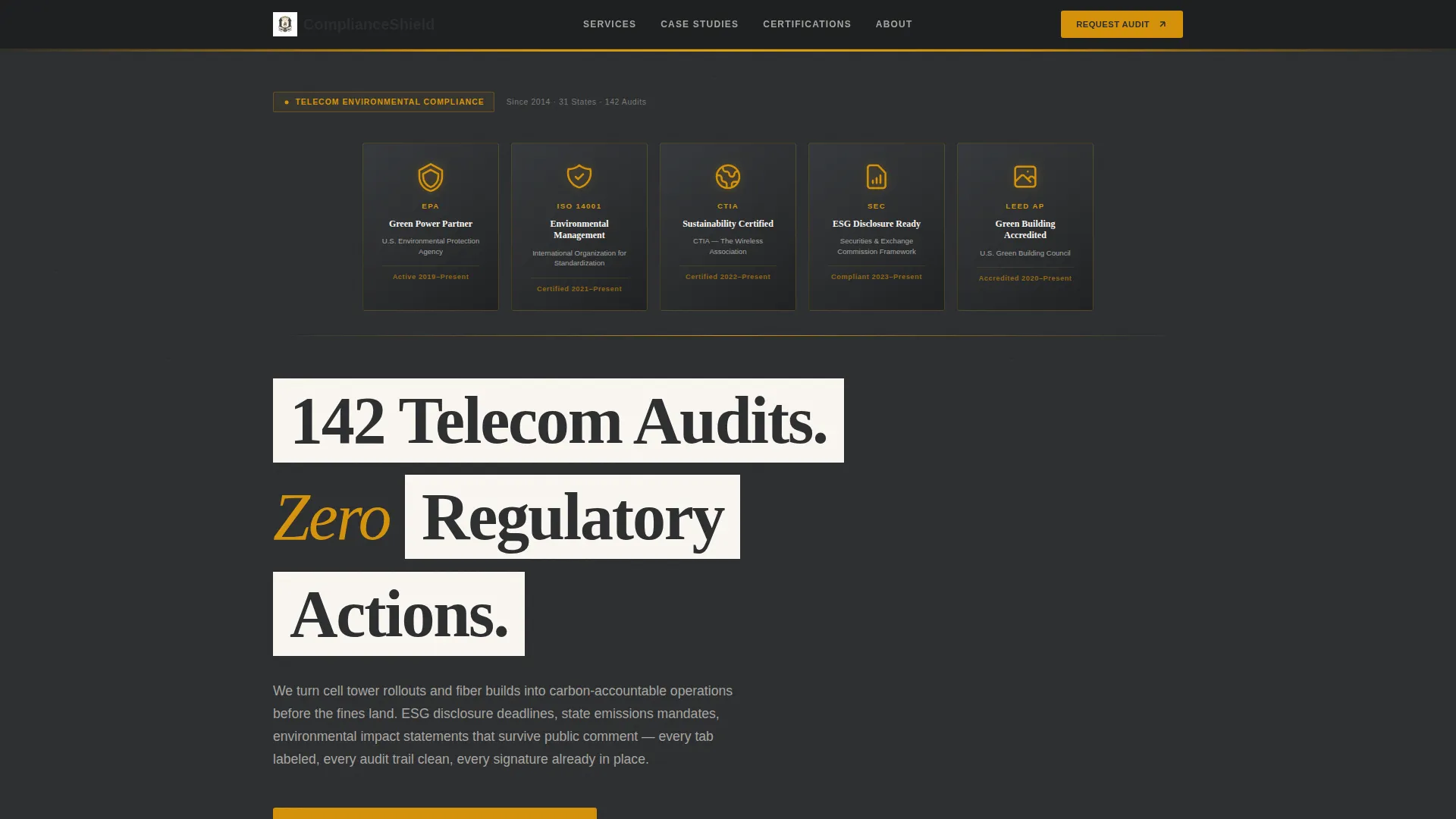
- An embossed award badge header ribbon showing regulatory credentials on a charcoal field
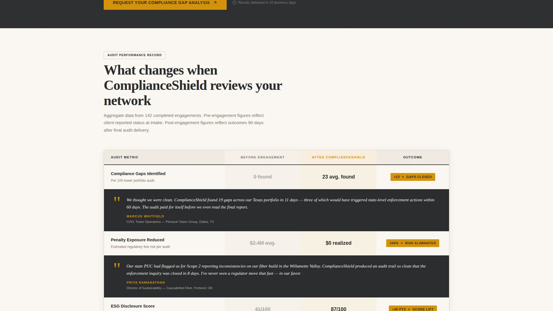
- A pre-engagement versus post-engagement comparison table with embedded client testimonial tiles
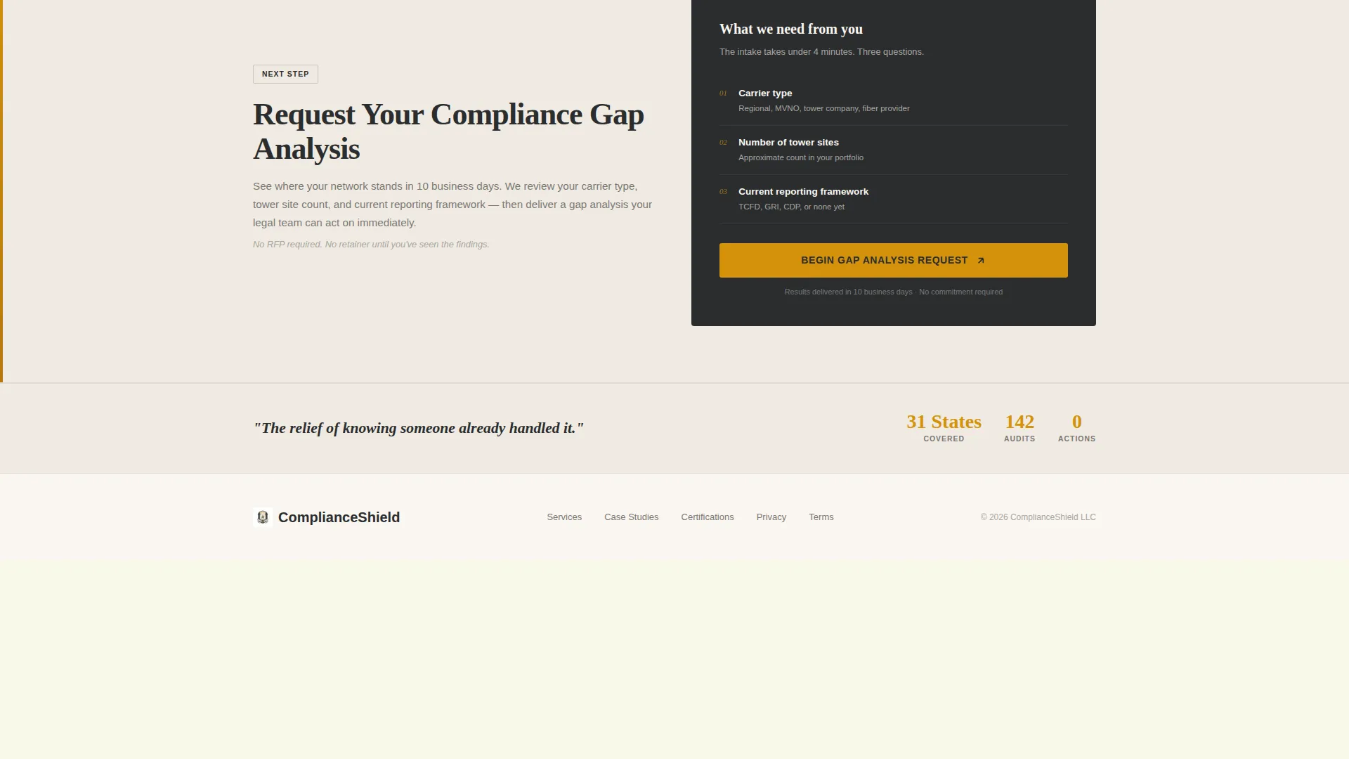
- Two strategically placed call-to-action buttons that drive clicks to an intake page, with no form on this page
Feature list
This template is built around a specific sequence of proof-building components. Each one serves a distinct persuasive function.
Embossed Award Badge Header
The header opens with a horizontal ribbon of credential shields. Each badge is rendered as an embossed metallic shield on a charcoal background, catching a subtle amber highlight as if stamped into metal. The headline beneath them reads in archival cream, letting the track record speak first.
Pre versus. Post Comparison Table
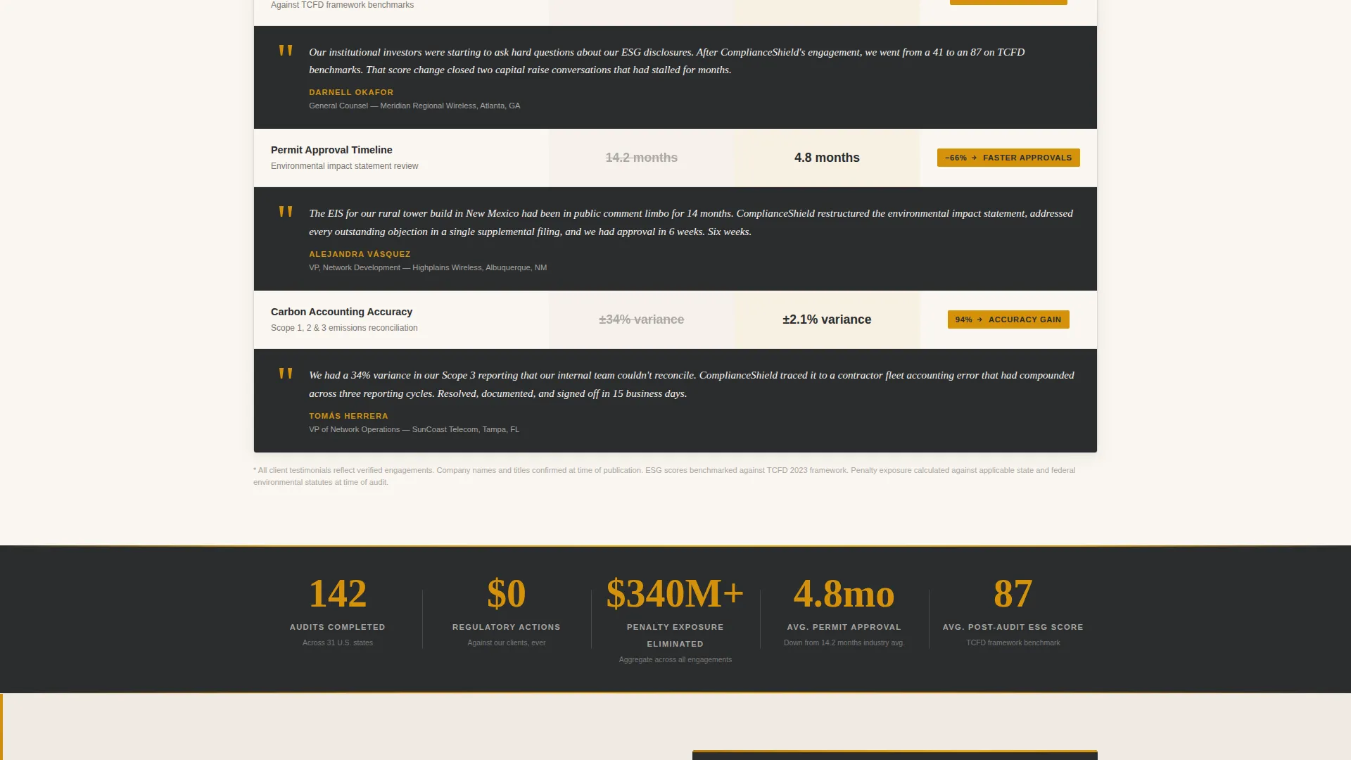
The core of the page is a structured comparison table showing before-and-after metrics. Columns cover compliance gaps found, penalty exposure reduced, ESG score improvement, and permit approval timelines. The table uses charcoal borders and amber data callouts to make critical numbers stand out.
Testimonial Mosaic with Quote Tiles
Each row of the comparison table is punctuated by a client quote tile that slides in from the margin. The voices represent a tower company chief operating officer, a fiber provider sustainability lead, and a regional carrier general counsel. Together they function like case law, each one reinforcing the verdict the data already makes.
Dual Click-Through Call to Action
The primary call-to-action button, labeled "Request Your Compliance Gap Analysis," appears first after the badge header. It resurfaces below the comparison table with a supporting line: "See where your network stands in 10 business days." There is no form on this page; the click carries the visitor to a short intake page.
No-Photography Credential Layout
The page uses no stock photography and no abstract graphics. The visual weight comes entirely from the badges, the table structure, and the testimonial tiles. This keeps the tone authoritative and document-grade rather than decorative.
Page sections overview
| Section | Purpose |
|---|---|
| Badge Header Ribbon | Opens with embossed credential shields and a single headline to establish authority immediately |
| Primary call to action Button | Amber button placed after the badge header to capture early high-intent visitors |
| Comparison Metrics Table | Shows pre-engagement and post-engagement compliance outcomes across four key metrics |
| Testimonial Quote Tiles | Client voices embedded in table rows to pair numbers with real-world witness accounts |
| Secondary call to action Block | Resurfaces the call to action below the table with a reassuring timeline statement |
Design & branding system
The visual identity follows a Legal Shield theme built around a Charcoal and Amber color system. Every color choice reinforces authority, warmth, and document-grade credibility.
- Deep regulatory charcoal (#2B2D2F) anchors headers and table borders; archival cream (#FAF6F0) holds the reading space
- Document-stock warm gray (#A8A5A0) softens secondary text; caution amber (#D4920B) activates on hover states, badges, and data callouts
- Typography and layout evoke a well-organized compliance binder: structured tabs, clean audit trails, and every element in its proper place
Mobile & speed optimization
The layout is designed to stay readable and persuasive on any screen size. The comparison table and testimonial mosaic adapt without losing the structured hierarchy that makes them convincing.
- The badge ribbon, comparison table, and testimonial tiles are structured for clear vertical stacking on smaller screens
- Call-to-action buttons remain prominent and tappable at every scroll position on mobile viewports
- The no-photography approach keeps the visual layer lean, relying on structured layout rather than heavy image assets
How this template helps you convert
This template is engineered to earn the click before it asks for it. Every section adds a layer of proof so that by the time the visitor reaches the call to action, the decision feels like a conclusion, not a leap.
- The badge header establishes institutional credibility in seconds, before the visitor reads a single word of copy, so skeptical buyers stay on the page
- The comparison table makes compliance outcomes concrete and comparable, turning abstract consulting value into visible before-and-after numbers that decision-makers can reference internally
- The testimonial mosaic pairs each row of data with a named client voice, building an evidentiary case that no single metric or quote could make alone, and the call to action lands after that case is already closed
Other information about this template
This template is part of the Comply brand identity, designed specifically for the telecommunications compliance consulting niche. It suits consultants who serve carriers, tower companies, and fiber infrastructure operators under active environmental regulatory pressure.
- The intake page linked from the call-to-action button collects carrier type, number of tower sites, and current reporting framework
- The Corporate Precision theme and Content/Resource landing-page direction make this layout well-suited for regulatory-sector professional services
- The template is designed to function without a contact form on the main page, keeping the page focused on proof delivery rather than data collection
- Color and layout choices are intentional for print-adjacent professional contexts where credibility reads before color does
Theme
Corporate Precision
Creative direction
Logo Wall Authority
Color system
Plum Executive
Style
Sidebar Companion
Direction
Content/Resource
Page Sections
Embossed Award Badge Header Ribbon
Pre Versus. Post Comparison Table
Testimonial Mosaic with Slide-in Quote Tiles
Dual-placement Click-through Call to Action
No-photography Credential Layout
Related questions
Who is the primary audience for this landing page template?
Does this page include a contact form?
What metrics does the comparison table display?
Can this template work for other professional services niches?
What credential badges are included in the header section?



