Compliance Consultancy Landing Page Template
Comply is a single-page compliance consultancy landing page built for regulatory professionals who need to project authority from the first scroll. It combines an editorial magazine aesthetic with a zigzag team layout, a friction-light contact form, and a dual conversion path, helping mid-market firms in finance, healthcare, and technology find the right compliance partner fast.
by Rocket studio
Quick summary
Comply is a precision-designed landing page template for compliance consultancies serving mid-market firms. It leads with an oversized editorial headline, introduces the team through alternating portrait-and-credential sections, and closes prospects through two deliberate conversion paths. The layout earns trust through faces and track records before it ever asks for a meeting.
Who this template is for
This template is built for compliance professionals who advise businesses navigating complex regulatory environments. It suits practices that win clients through credibility and expertise rather than volume or price.
- Compliance consultancies advising fintechs, regional banks, or healthcare networks on frameworks such as the Sarbanes-Oxley Act (SOX), Anti-Money Laundering (AML) standards, and the General Data Protection Regulation (GDPR)
- Independent compliance officers or small advisory firms launching or refreshing their professional online presence
- Sector-specific practices targeting general counsels, chief financial officers, or operations directors at growing mid-market organizations
What problem this template solves
Compliance consultancies often struggle to translate deep expertise into a web presence that resonates with skeptical, senior buyers. A generic agency template signals the wrong thing to a general counsel who reads regulatory filings for a living.
- Buyers like audited fintechs or regional banks under regulatory scrutiny need to feel confident in the people they hire, not just the services listed
- Most templates bury the team or omit them entirely, leaving the page feeling anonymous at exactly the moment trust matters most
- The absence of a clear, low-friction conversion path means privacy-conscious compliance professionals leave without engaging
What you get with this template
This template delivers a fully structured, single-page layout that introduces the firm's principals, communicates regulatory authority, and captures qualified leads through two purposeful entry points.
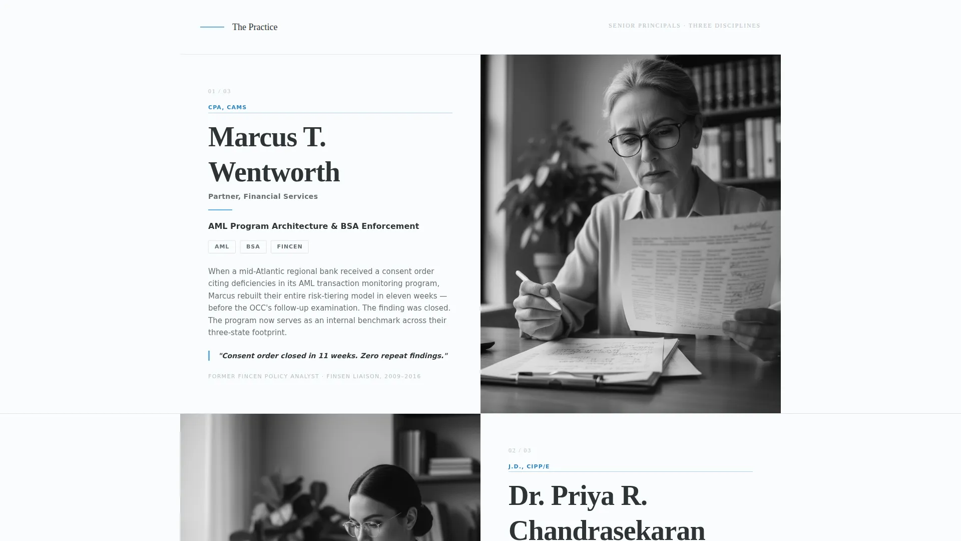
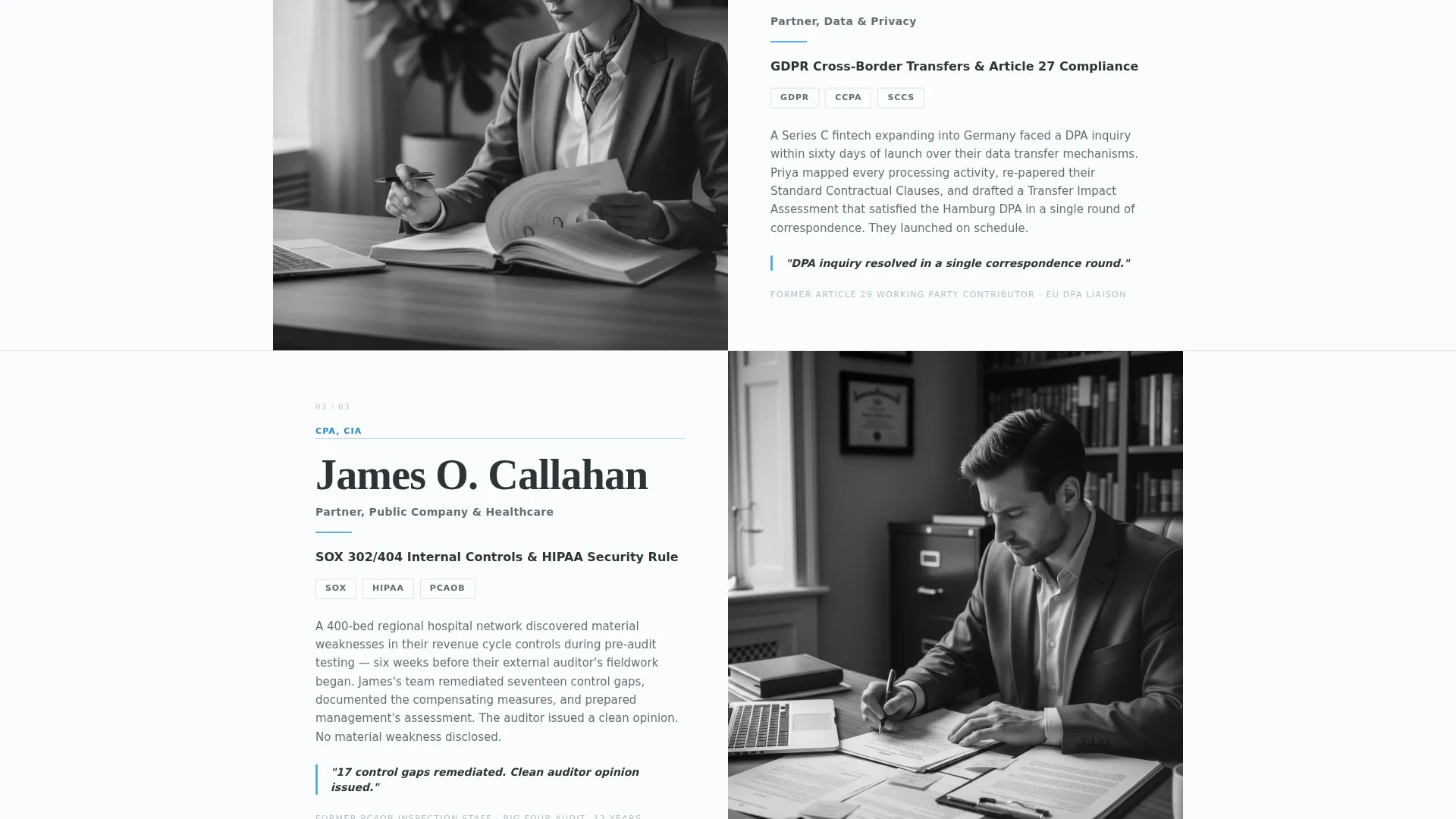
- A full zigzag team section where each principal's portrait alternates sides alongside their regulatory specialty, career credential, and a brief client-impact narrative
- A primary contact form collecting company name, industry vertical, primary compliance concern, and work email, with no phone field to reduce friction
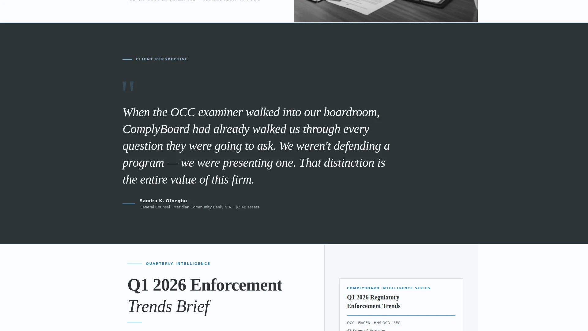
- A secondary conversion path: a downloadable quarterly enforcement trends brief gated behind email only, for prospects not yet ready to schedule a call
Feature list
This template is built around a clear set of components, each designed with a specific role in the compliance consultancy context.
Giant Headline Header
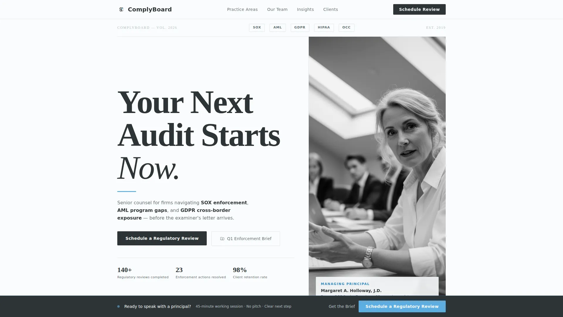
The header leads with an oversized editorial serif headline set flush left, consuming roughly sixty percent of the viewport. The right forty percent holds a tightly cropped, black-and-white documentary-style portrait of a senior compliance lead. A thin sky-blue rule separates the headline from a single subline naming the firm's three core regulatory frameworks.
Zigzag Team Layout
Each scroll section pairs a named principal's portrait on one side with their regulatory specialty, career credential, and a client-impact narrative on the other. The image alternates sides with every section, creating a visual cadence that mirrors a magazine feature spread and builds trust through real faces and track records.
Full-Width Pull Quote Break
Midway through the team sequence, the zigzag pattern pauses for a single full-width pull quote from a client general counsel, set in oversized italic type. This interruption reinforces social proof at the point where a prospect is already forming an opinion about the firm.
Dual Conversion Path
The primary call to action, "Schedule a Regulatory Review," appears beneath the header subline and again as a fixed bottom bar that activates after the second zigzag section. The secondary path offers a downloadable enforcement trends brief gated behind email only, giving hesitant prospects a lower-commitment entry into the funnel.
Friction-Light Lead Form
The contact form captures four fields: company name, industry vertical via dropdown (financial services, healthcare, technology, or other), primary compliance concern as free text with a 140-character limit, and work email. The deliberate absence of a phone field respects the privacy sensitivities of compliance professionals.
Editorial Color and Typography System
The Slate and Sky color system uses deep charcoal slate for primary text, mid-tone graphite for secondary copy and pull quotes, open-sky blue as the sole accent on links, buttons, and highlighted data points, and broadsheet white for generous negative space between alternating blocks. The palette reads as cool, authoritative, and precise.
Page sections overview
| Section | Purpose |
|---|---|
| Header with headline | Establishes authority and names the firm's core regulatory focus |
| Principal one block | Introduces first team member with portrait, specialty, and client impact |
| Principal two block | Continues zigzag with second team member, image on opposite side |
| Principal three block | Deepens team credibility with third principal and credential detail |
| Client pull quote | Full-width social proof break, set in oversized italic |
| Principal four block | Resumes zigzag rhythm, reinforcing depth of team bench |
| Enforcement brief offer | Secondary conversion path for prospects not ready for a call |
| Primary call to action section | Hosts the "Schedule a Regulatory Review" form |
| Fixed bottom bar | Persistent call to action that appears after the second zigzag section |
Design & branding system
The visual identity follows an Editorial Magazine theme. Every design decision reinforces the sense of a carefully typeset policy journal rather than a standard service website.
- Color system: deep charcoal slate (#2D3436) for primary text, mid-tone graphite (#636E72) for secondary copy and pull quotes, open-sky blue (#5DADE2) for links, buttons, and accents, and broadsheet white (#FAFCFD) for section backgrounds
- Typography: oversized editorial serif for headlines and pull quotes; the scale and weight carry authority without requiring decorative elements
- Photography style: black-and-white, documentary-grain portraits with direct eye contact, avoiding stock-photo warmth in favor of a credible, journalistic feel
Mobile & speed optimization
The layout is designed to translate its editorial authority cleanly across screen sizes. The alternating image-and-text rhythm adapts naturally to a single-column stacked view on smaller devices.
- The zigzag sections reflow to stacked portrait-above-text blocks on mobile, preserving the team narrative without losing the visual hierarchy
- The fixed bottom bar call to action remains accessible on mobile, keeping the primary conversion action within reach throughout the scroll
- Generous negative space between sections reduces visual clutter on smaller screens and keeps the page feeling deliberate rather than compressed
How this template helps you convert
The conversion strategy is built on the principle that senior buyers need to trust the people before they trust the firm. Every layout decision works toward that outcome.
- The team-forward zigzag structure means a visitor has met multiple named principals, seen their credentials, and read a client impact story before the persistent call to action bar even appears, making the ask feel earned rather than premature.
- The dual conversion path accommodates two distinct buyer readiness levels: prospects ready for a direct conversation can schedule a regulatory review immediately, while those still evaluating can download the enforcement trends brief and enter the funnel at a lower commitment level.
- The friction-light form removes common barriers for privacy-conscious compliance professionals by asking only for the information needed to qualify the conversation, with no phone field and a short free-text compliance concern field that invites specificity.
Other information about this template
This template is purpose-built for the compliance officer business website context, where niche credibility matters more than broad appeal.
- The template suits a professional services positioning strategy where the consultancy competes on regulatory depth and named-partner reputation rather than on price or service breadth
- The B2B partnership direction means all copy placeholders and layout decisions are oriented toward senior decision-makers, general counsels, chief financial officers, and operations directors, rather than general web traffic
- The Editorial Magazine theme and Slate and Sky color system are designed to feel native to the world of policy documents, enforcement briefs, and regulatory correspondence that the target audience reads daily
- This template is a strong fit for compliance officer online presence use cases where the goal is to convert a small number of highly qualified inbound prospects rather than drive high volume
Theme
Editorial Magazine
Creative direction
Team & People
Color system
Slate & Sky
Style
Zigzag/Alternating
Direction
Partnership/B2B
Page Sections
Oversized Editorial Header
Zigzag Team Sections
Full-width Pull Quote
Dual Conversion Path
Friction-light Contact Form
Related questions
Can I customize the team sections with my own principals and credentials?
What industry options does the form dropdown include?
Do I need to offer a downloadable brief to use this template?
Does this template work for a solo compliance officer as well as a larger firm?
When does the fixed bottom bar appear on the page?



