Healthcare Digital Transformation Consulting Landing Page
Comply is a healthcare digital transformation landing page template built for consultancies that modernize hospital systems, clinic workflows, and payer platforms. It pairs an authoritative Navy Authority color system with an Educational Guide narrative structure, teaching visitors before selling to them, and drives lead generation through a progressive contact form and a gated Digital Readiness Scorecard download.
by Rocket studio
Quick summary
Comply is a single-page landing page template for healthcare digital transformation consultancies. It uses a zigzag alternating layout to introduce named consultants, explain real transformation challenges, and build trust through engagement metrics. A manifesto header sets the tone, and two clear conversion paths, a readiness call form and a scorecard download, capture leads at every stage of buyer intent.
Who this template is for
This template is built for consultancies that help health systems move faster, smarter, and safer. It speaks directly to firms whose clients include senior clinical and operational leaders navigating complex technology change.
- Healthcare digital transformation consultancies serving hospital systems, specialty practices, payers, or public health organizations
- Consulting teams whose principals include former clinicians, health IT specialists, or compliance strategists
- Firms targeting decision-makers such as Chief Medical Information Officers, Chief Operating Officers, and practice managers
What problem this template solves
Healthcare consultancies often struggle to communicate the depth of their work in a format that earns immediate trust from skeptical, time-poor executives. A generic service page does not convey clinical credibility or regulatory seriousness.
- Visitors leave before understanding why interoperability stalls, why clinician adoption fails, or why change management breaks down
- A lack of clear proof points makes it hard to differentiate the consultancy from generalist technology vendors
- No obvious next step means qualified visitors exit without converting to a conversation or a self-qualification tool
What you get with this template
You get a fully structured single-page layout that leads with a manifesto, builds trust through consultant profiles, and closes with a lead generation form. Every section is designed to teach and then convert.
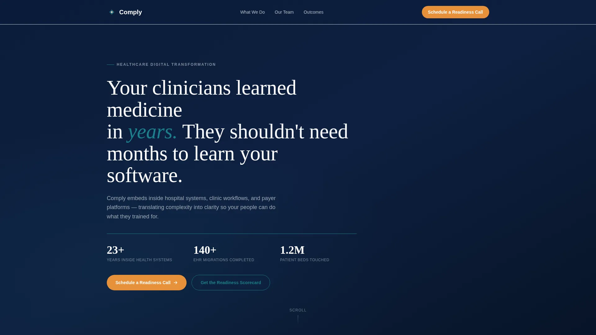
- A full-viewport Quote/Manifesto header in deep navy with a serif typographic statement and three credential counters separated by a teal rule
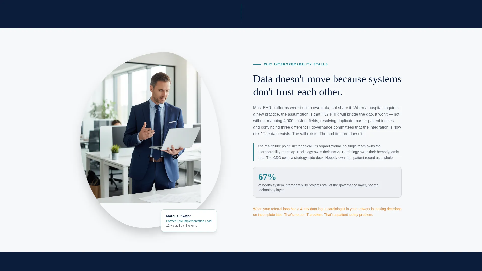
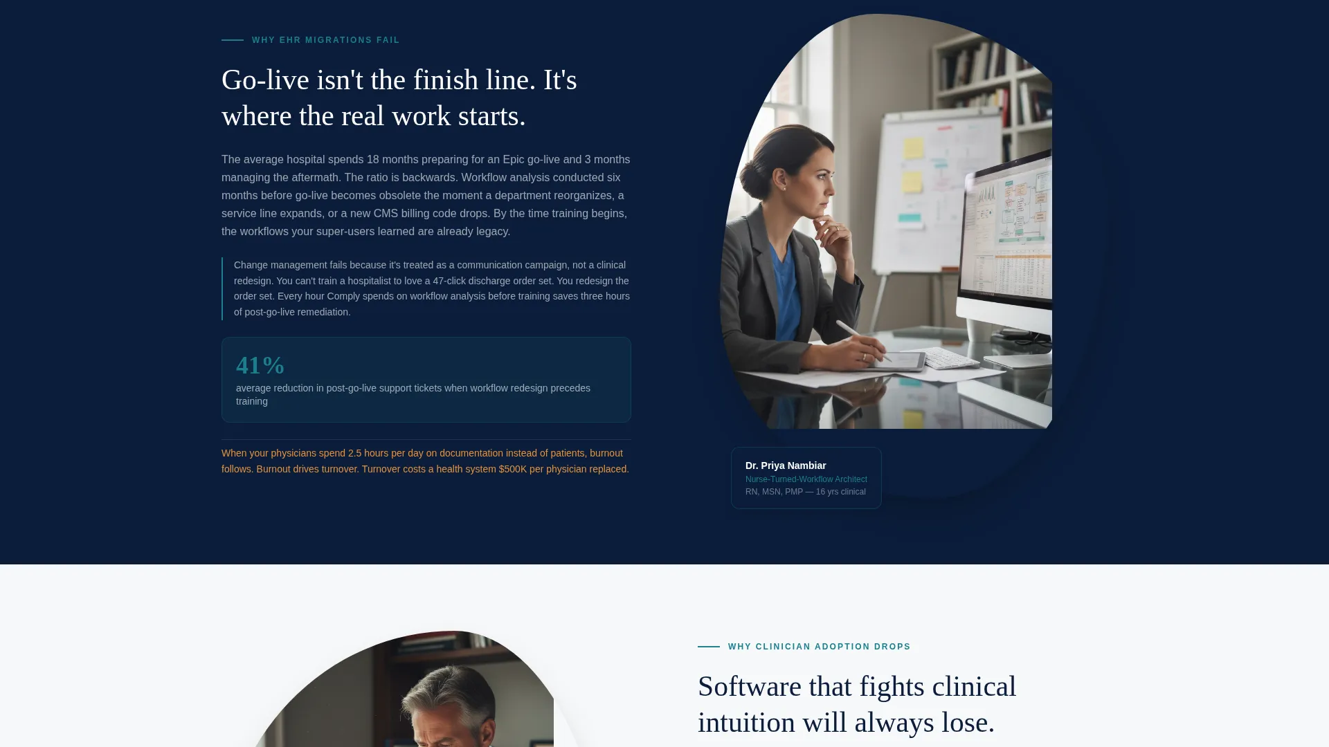
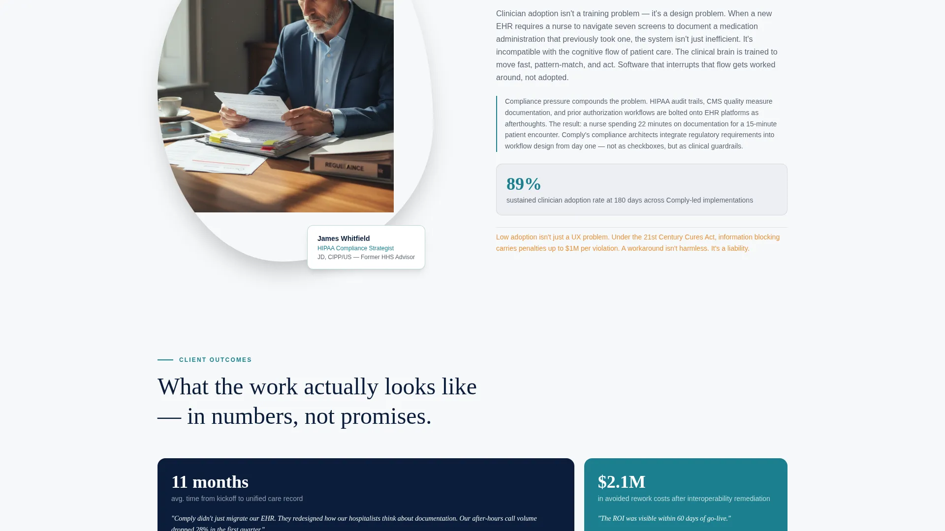
- Zigzag alternating sections pairing named consultant portraits with transformation discipline copy, each ending in a real engagement metric
- A dual-conversion footer combining a progressive lead form and a gated Digital Readiness Scorecard download
Feature list
This template is built around a deliberate set of structural and visual components that serve a specific purpose in the healthcare consulting context.
Full-Viewport Manifesto Header
The header fills the entire screen with a single serif typographic statement on deep navy. Below the manifesto, a thin teal rule separates the declaration from three credential counters, combined years inside health systems, completed migrations, and beds touched, grounding the promise in evidence before the visitor scrolls.
Zigzag Alternating Consultant Sections
Each section alternates a named consultant portrait left or right alongside a focused transformation discipline. The copy explains why a specific challenge exists, such as why interoperability stalls or why clinician adoption drops, before closing with a real metric from a past engagement.
Progressive Lead Generation Form
A short, structured form collects organization type, primary challenge, and preferred contact window. It asks only what is needed to start a productive conversation, with no pricing or scope disclosed at this stage.
Gated Digital Readiness Scorecard
A secondary conversion path offers a downloadable scorecard gated behind name and work email. This captures visitors who are not yet ready to speak with a consultant but are ready to assess their own readiness.
Educational Narrative Structure
Every zigzag section follows a teach-first, sell-second sequence. Visitors learn the root cause of a real healthcare technology problem before they encounter any call to action, building trust through relevance rather than persuasion.
Dual Call-to-Action Anchoring
The primary call to action, "Schedule a Readiness Call," appears at both the manifesto header and the page base. This repetition ensures the conversion prompt is available at the moment a visitor first commits and again at the moment they finish reading.
Page sections overview
| Section | Purpose |
|---|---|
| Manifesto Header | Opens with a single authoritative serif statement on deep navy, anchoring consultant credibility |
| Credential Counters | Three quiet metrics below the teal rule ground the manifesto in verifiable evidence |
| Zigzag Consultant One | Introduces first named consultant and their transformation discipline with a real engagement metric |
| Zigzag Consultant Two | Presents second named consultant, escalating stakes from operational friction to regulatory risk |
| Zigzag Consultant Three | Features third named consultant, raising the narrative to patient safety consequences |
| Lead Generation Form | Progressive short form capturing organization type, challenge, and preferred contact window |
| Scorecard Download | Secondary gated path offering the Digital Readiness Scorecard for self-qualifying visitors |
| Page Base call to action | Repeats the primary call to action to close the page with a clear next step |
Design & branding system
The visual identity follows an Educational Guide theme built around a Navy Authority color palette. The combination feels authoritative enough to cite and warm enough to keep reading, much like a well-worn clinical reference sitting on a desk.
- Command-grade navy (#0B1D3A) and clinical white (#F7F8FA) alternate as section backgrounds in a steady rhythm; trust-signal teal (#1A7F8E) underlines key metrics and credential markers; warm human accent (#E8913A) appears only on calls to action and pull-quotes
- Clean serif typography carries the manifesto and section headings, reinforcing the Educational Guide direction and signaling depth of expertise to clinical and operational readers
Mobile & speed optimization
The template layout is designed to reflow cleanly from desktop to smaller screens, preserving the zigzag structure and the readability of the credential counters and consultant sections.
- Alternating portrait-and-copy rows stack vertically on mobile so consultant profiles and discipline copy remain paired and legible
- The progressive lead form and scorecard download fields are sized for touch input, reducing friction for visitors accessing the page on a phone or tablet
How this template helps you convert
The page is structured so that trust accumulates before any ask is made. By the time a visitor reaches either conversion point, they have already learned something useful and seen real evidence of results.
- The manifesto header and credential counters establish authority immediately, so visitors have a reason to keep reading before any service is described
- The teach-first zigzag sections escalate stakes from operational friction to regulatory risk to patient safety, making the cost of inaction feel concrete and personal
- The dual-path conversion close, a readiness call form for engaged buyers and a scorecard download for self-qualifying visitors, ensures the page captures intent at every level of decision-making readiness
Other information about this template
This section covers additional context that may help you evaluate whether Comply fits your consultancy's needs and existing workflow.
- The template is suited for consultancies whose principals have backgrounds in health information technology, clinical workflow design, or regulatory compliance, as the copy framing reflects those credentials
- The zigzag layout and Educational Guide narrative structure work particularly well for firms differentiating themselves from generalist vendors by emphasizing domain depth and practitioner credibility
- The amber-orange accent color (#E8913A) is intentionally reserved for calls to action and pull-quotes only, keeping visual hierarchy clean and ensuring conversion points stand out without competing with the authoritative navy-and-white body sections
- The Digital Readiness Scorecard component functions as a mid-funnel asset, making it useful for consultancies that have a longer sales cycle and need a way to stay relevant with prospects who are researching but not yet ready to commit
- This template is designed as a single landing page and does not include multi-page navigation or a blog structure
Theme
Educational Guide
Creative direction
Team & People
Color system
Navy Authority
Style
Zigzag/Alternating
Direction
Lead Generation
Page Sections
Full-viewport Manifesto Header
Zigzag Alternating Consultant Sections
Teach-first Educational Narrative
Progressive Lead Generation Form
Gated Digital Readiness Scorecard
Dual Call-to-action Anchoring
Related questions
Can I adapt the consultant profiles to match my actual team?
Does the template include both conversion paths out of the box?
Is the manifesto header editable for our own brand voice?
What organization types does the lead form address?
Can this template work for a consultancy focused on one specific area such as compliance?



