Fitness Consulting Booking Website Template
Comply is a split-screen landing page template built for fitness compliance consultants. It pairs an Executive Suite visual identity with a high-urgency booking flow. The dark, chrome-accented design communicates authority instantly. From the glow-lit header to the escalating compliance-risk sections, every layout choice moves facility owners toward scheduling a professional audit.
by Rocket studio
Quick summary
Comply is a single-page template designed for a fitness compliance consultancy. It opens with a cinematic dark header, builds credibility through a scrolling logo wall, and escalates urgency through paired compliance-risk and resolution sections. The primary conversion path ends at a three-field booking form. A secondary email capture offers a free pre-audit checklist for visitors who need more time.
Who this template is for
This template is built for professionals who audit gym floors, studio operations, and wellness facilities for regulatory gaps. It speaks directly to consultants whose clients face real financial and legal exposure from failed inspections.
- Multi-location fitness franchise owners managing renewal audits across several sites
- Boutique studio founders approaching their first lease or certificate of occupancy review
- University recreation directors working with reduced liability budgets who need a credible, efficient audit partner
What problem this template solves
Fitness compliance consultants often struggle to communicate the severity of regulatory risk before a prospect is ready to book. A generic services page does not convey that a missed AED (automated external defibrillator) placement or an incorrectly measured ADA (Americans with Disabilities Act) pathway can result in fines, facility shutdowns, or personal liability.
- Visitors do not feel the urgency of an upcoming inspection until they see specific violation fines and regulation codes
- Prospects without an immediate audit need often leave without sharing contact details, meaning warm leads go cold
- A vague service description fails to differentiate a specialist consultant from a general business advisor
What you get with this template
This template delivers a fully structured, section-by-section landing page layout that guides the visitor from awareness to booking in one scroll. Every visual and content decision reinforces the consultant's authority and the stakes of non-compliance.
- A fixed-nav pill button, a mid-page call-to-action, and a full-width booking section at the bottom, all pointing to the same scheduling form
- A three-field sequential booking form covering facility type, number of locations, and preferred audit week
- An email capture path for the pre-audit checklist that warms prospects who are not yet ready to schedule
Feature list
This section describes the core layout and design capabilities built into the Comply template.
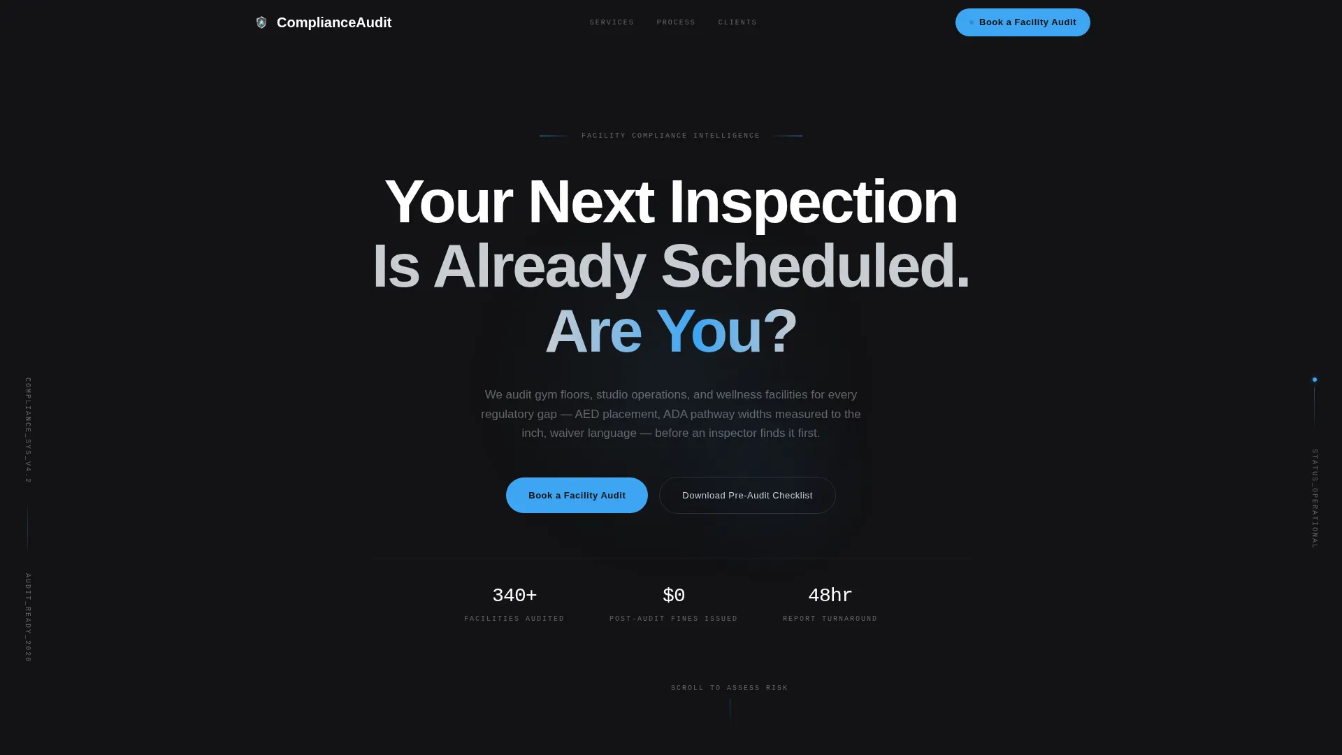
Dark Full-Bleed Glow Header
The header fills the entire viewport in forge black. A slow-breathing radial glow in cold electric blue pulses behind a single line of chrome-white headline type. The effect suggests a scanning system running in the background, setting a tone of precision and surveillance before the visitor reads a single word.
Escalating Split-Screen Risk Sections
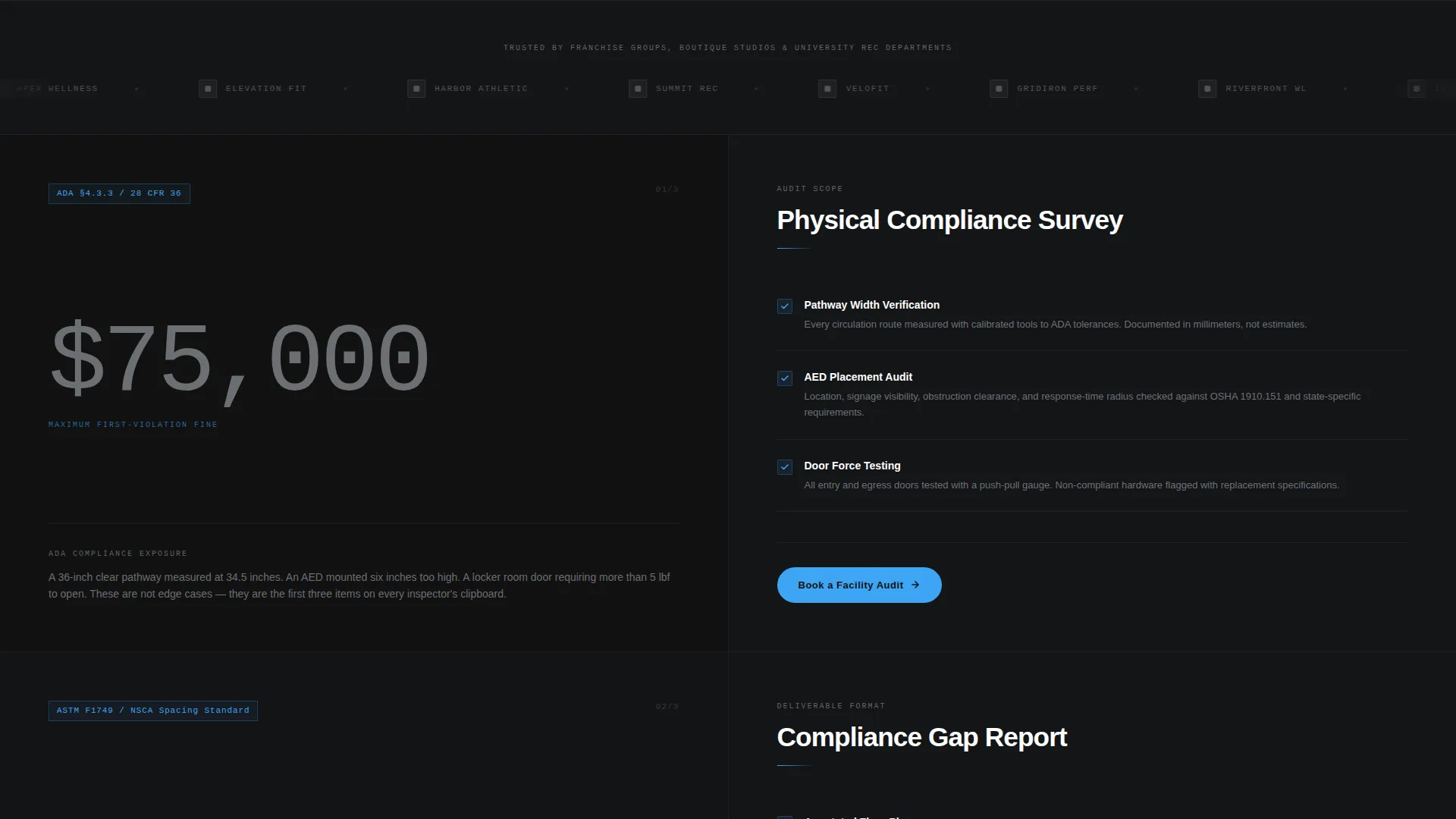
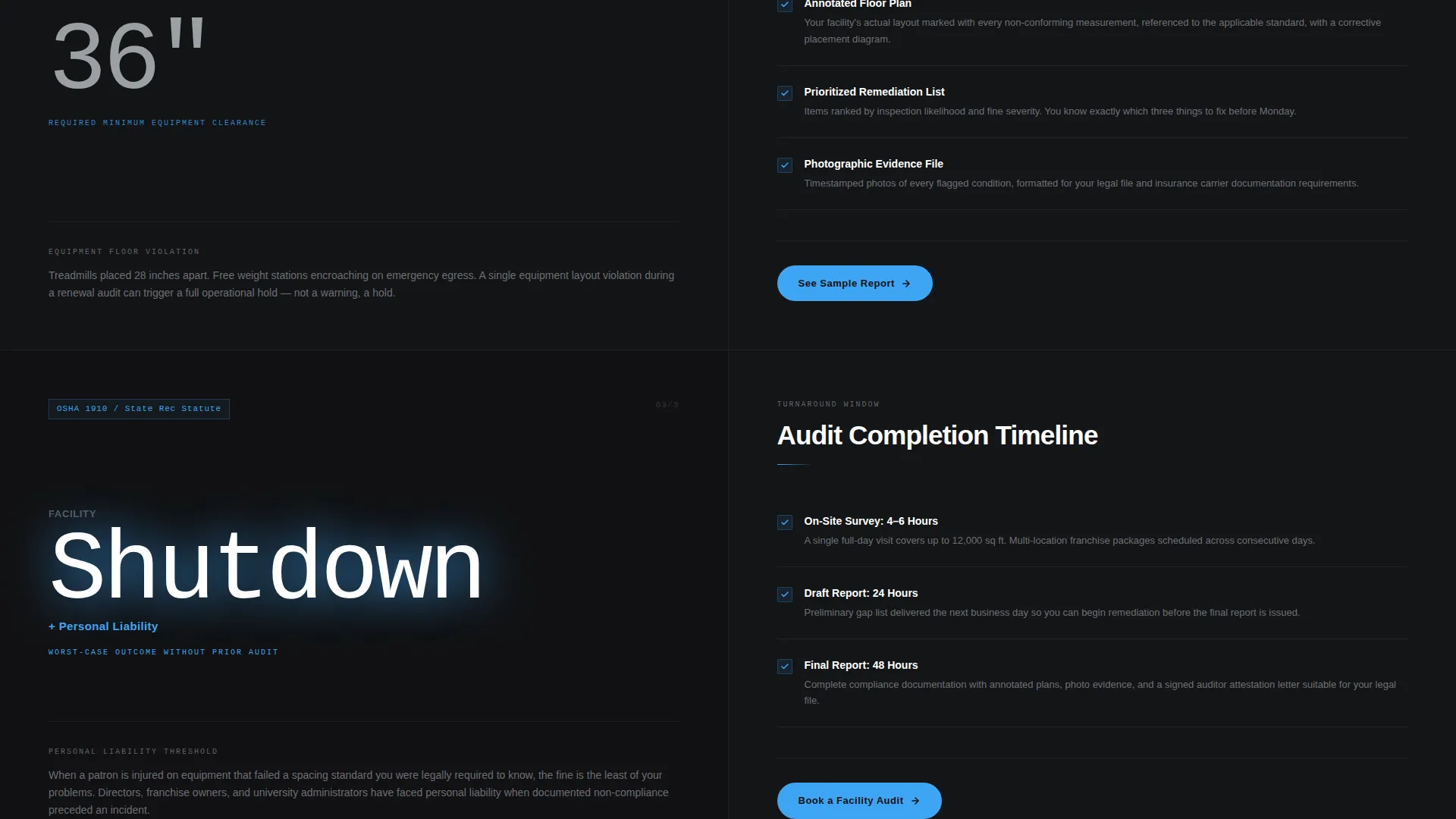
Each section divides the screen 50/50. The left panel presents a compliance risk in oversized type, such as a regulation code number, a violation fine amount, or a citation category. The right panel presents the consultant's response: audit scope, deliverable format, and turnaround window. Stakes rise from minor citation to facility shutdown to personal liability as the visitor scrolls.
Infinite Marquee Logo Wall
Immediately below the header, a horizontal band of grayscale client logos scrolls on a slow, continuous marquee. Franchise badges, university crests, and studio wordmarks establish social proof before any claim is made. The slow pace feels deliberate, not rushed, matching the Executive Suite tone.
Three-Field Sequential Booking Form
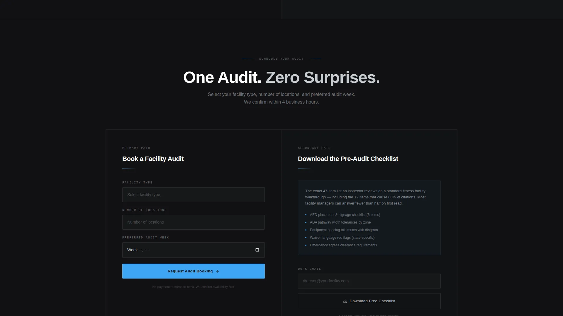
The primary conversion element asks three questions in order: facility type selected from a dropdown, number of locations chosen from a single selector, and preferred audit week picked from a date picker. The sequence feels like a structured intake process, not a generic contact form.
Pre-Audit Checklist Email Capture
A secondary conversion path captures the email addresses of visitors who are not ready to book. The offer is a downloadable pre-audit checklist that mirrors what an inspector reviews. Receiving it shows prospects exactly which items they cannot confidently answer, warming them toward a future booking.
Fixed Pill Navigation Button
The call-to-action button lives in the top navigation bar as a fixed pill and remains visible throughout the entire scroll. This ensures that a visitor ready to book at any point in the page can act immediately without scrolling back to the top.
Page sections overview
| Section | Purpose |
|---|---|
| Dark Glow Header | Hook visitor with high-stakes headline |
| Fixed Nav Button | Keep booking call to action always visible |
| Logo Wall Marquee | Establish client credibility immediately |
| Mid-Page call to action | Re-engage visitors after logo wall |
| Split Screen: Citation Risk | Show minor violation stakes and resolution |
| Split Screen: Shutdown Risk | Escalate to facility-closure consequences |
| Split Screen: Liability Risk | Raise stakes to personal legal exposure |
| Three-Field Booking Form | Convert ready visitors to audit appointments |
| Checklist Email Capture | Warm leads not yet ready to book |
Design & branding system
The visual identity follows an Executive Suite theme built on a Monochrome Steel palette. Every color choice reinforces the idea of a controlled, high-stakes environment where nothing is left to chance.
- Core palette includes forge black (#111113), brushed gunmetal (#3B3F45), and polished chrome (#C8CDD3) for all structural surfaces and typography
- Cold electric blue (#3DA5F4) is reserved exclusively for interactive elements such as buttons, links, and the header glow effect
- No stock photography of gyms or fitness equipment appears anywhere; the visual language relies entirely on darkness, controlled light, and typographic precision
Mobile & speed optimization
The split-screen layout is structured to reflow cleanly on smaller screens. Each paired section stacks vertically so compliance risks and resolutions remain readable without horizontal scrolling.
- The fixed pill navigation button remains accessible on mobile viewports so the booking path is never lost during scroll
- The marquee logo wall adjusts its pace and spacing to remain legible on narrower displays without breaking the infinite scroll effect
How this template helps you convert
The page is designed around a progressive urgency model. Each section raises the cost of inaction before presenting the consultant's solution, so by the time the visitor reaches the booking form, the case for acting has already been made.
- The escalating split-screen structure moves visitors from mild concern to genuine urgency across three risk levels, making the booking form feel like a rational next step rather than a sales push
- Two distinct conversion paths, the direct booking form and the checklist email capture, ensure that both ready-to-act prospects and still-researching visitors leave the page as potential clients
Other information about this template
This template is part of the Professional Services category within the Fitness Consulting subcategory. It is specifically designed for the fitness compliance consultant niche and carries an intersection match score that reflects a tight alignment between the visual system, conversion direction, and target audience.
- The template style is Split Screen (50/50), a layout well-suited to presenting problem-solution pairs in a single viewport
- The creative direction is Logo Wall Authority, meaning credibility is established visually before any written claims appear
- The header concept is Dark Full-Bleed with a Glow effect, a design pattern that signals precision and consequence rather than energy or enthusiasm
- The landing page direction is Booking and Scheduling, which means every design and copy decision points toward a calendar-based conversion rather than a product purchase or a resource download
Theme
Executive Suite
Creative direction
Logo Wall Authority
Color system
Monochrome Steel
Style
Split Screen (50/50)
Direction
Booking/Scheduling
Page Sections
Dark Full-bleed Glow Header
Escalating Split-screen Risk Layout
Infinite Logo Wall Marquee
Three-field Sequential Booking Form
Pre-audit Checklist Email Capture
Fixed Pill Navigation Call to Action
Related questions
Who is this landing page template designed for?
Can I customize the compliance risk stats and regulation codes in the split-screen sections?
What information does the booking form collect from a visitor?
How does the pre-audit checklist email capture work?
Does this template include the checklist document or client logo files?



