HR Software | Free Website Template | Rocket
Comply is a card-grid landing page template built for government and public sector HR software. It uses a Hero's Journey scroll structure, a search-box header with animated stat cards, and a Dopamine Pop color system to make civil service hiring feel manageable. The design moves visitors from frustration to clarity and guides them toward a product demo with minimal friction.
by Rocket studio
Quick summary
Comply is a modular, card-grid landing page template designed for government and public sector HR software. It opens with a search-box header that speaks directly to HR analysts, county directors, and agency talent officers. The Hero's Journey scroll arc transforms visitor frustration into confident action, ending at a low-friction click-through to a guided product demo.
Who this template is for
This template is built for teams selling software that simplifies civil service hiring, classification rules, and compliance workflows. It speaks the language of public sector HR professionals who are stretched thin and skeptical of vendor hype.
- County HR directors managing large workforces with small teams
- State agency talent officers competing against private sector salaries
- Municipal HR clerks who inherited undocumented hiring processes
What problem this template solves
Public sector HR software is genuinely complex to market. The buyers are experienced, time-poor, and tired of generic promises. This template solves the problem of earning trust quickly with a page that feels like a knowledgeable colleague rather than a sales deck.
- Visitors arrive overwhelmed by classification audits, hiring backlogs, and outdated spreadsheets
- Generic landing pages fail to reflect the specific language and pain points of civil service HR work
- Most templates bury the value proposition behind long-form text or slow-loading hero images
What you get with this template
You get a fully structured, single-page landing page built around a narrative scroll experience. Every section is purposefully ordered to move a skeptical government HR buyer from recognition to action.
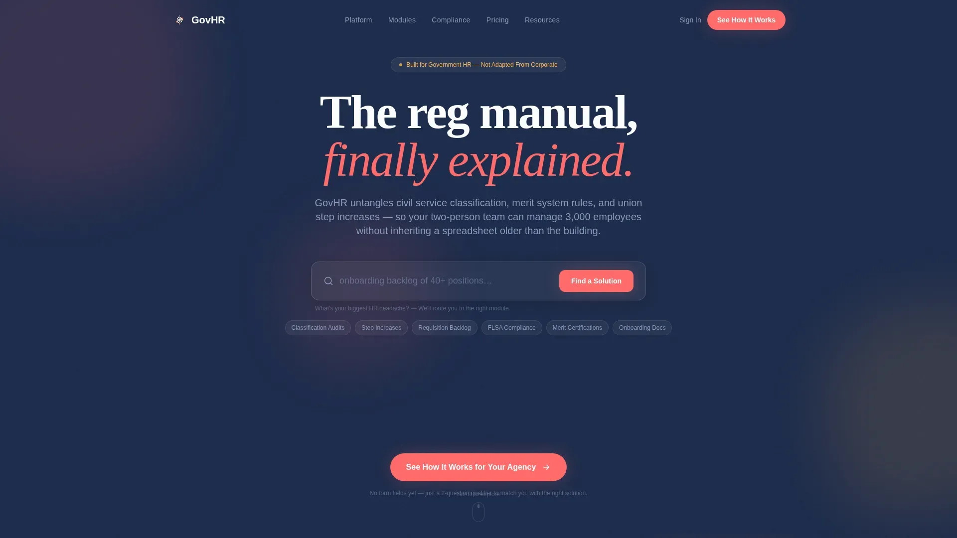
- A centered search-box header with cycling ghost-text prompts and three animated stat cards
- A Hero's Journey card-grid layout covering Old World pain points, feature reveals, module cards, and a before-and-after metrics dashboard card
- A click-through conversion path with a two-question qualifier intermediary page and a persistent bottom-bar call to action
Feature list
This template includes purpose-built components grounded in the source brief. Each one serves the HR software buyer's journey directly.
Search-Box Header with Animated Stat Cards
The header centers a large input field with ghost-text cycling through real HR pain points such as time-to-hire exceeding 90 days and classification audit preparation. Below it, three animated stat cards display key metrics with a subtle bounce animation. The section feels like the start of an answer, not a pitch.
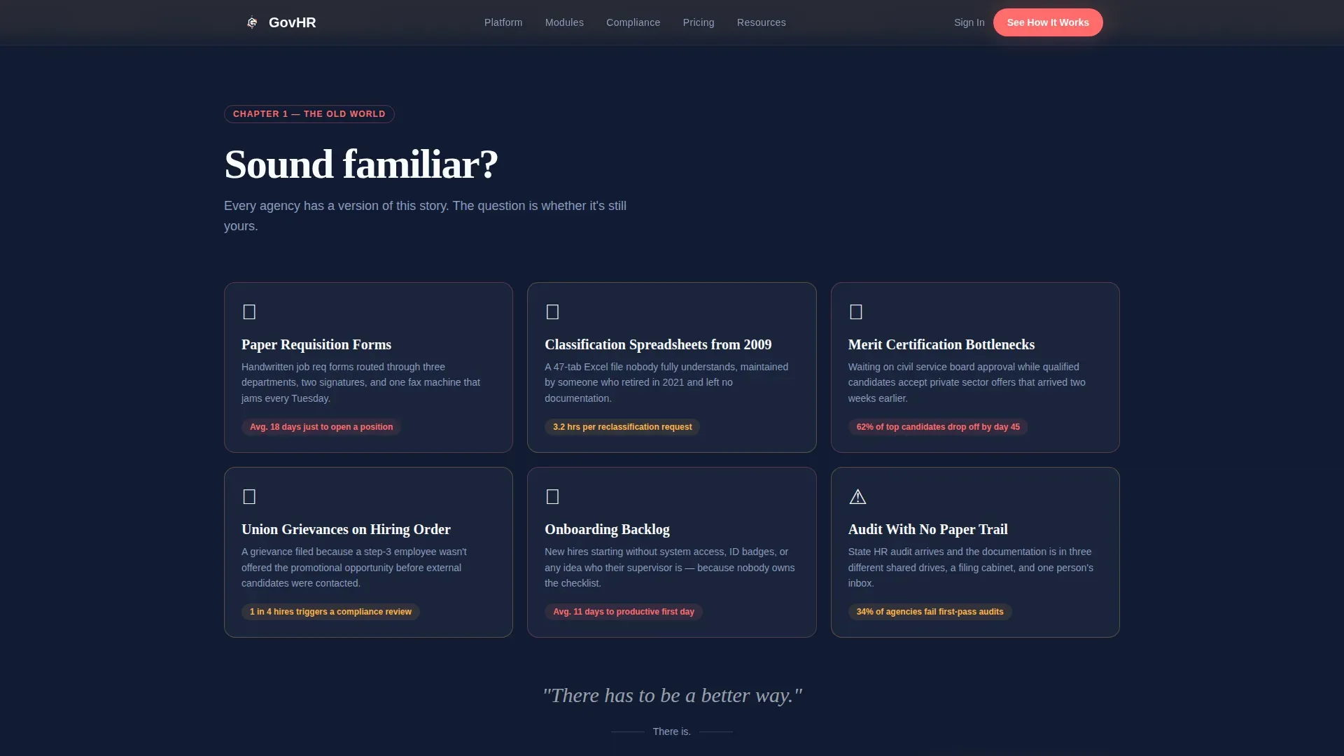
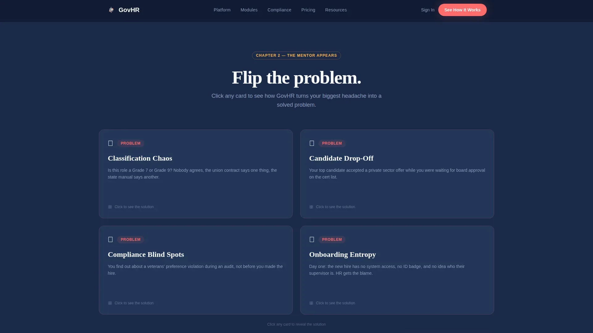
Hero's Journey Card Grid Layout
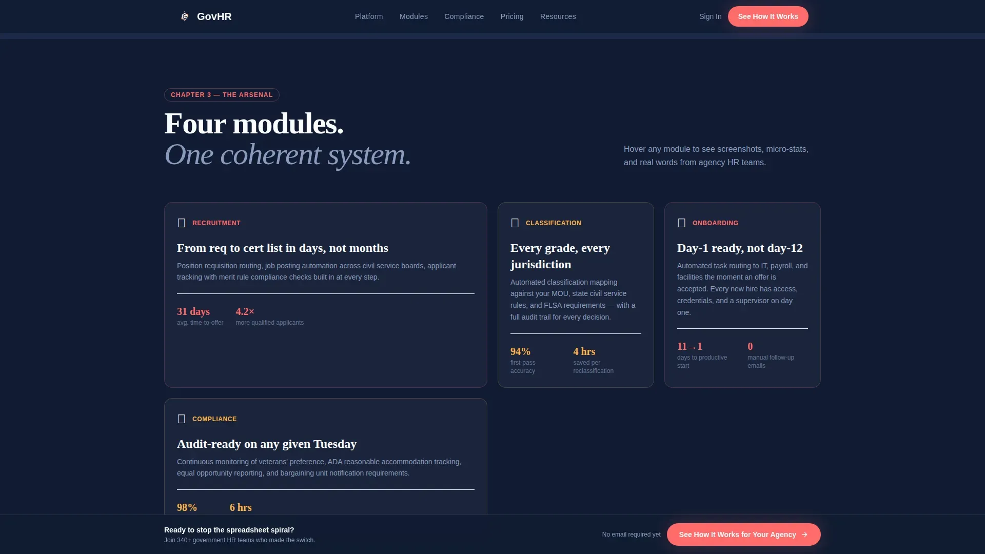
The page scrolls as a transformation arc. It opens with illustrated "Old World" vignette cards showing tangled workflows and paper requisition forms. Feature cards then flip from problem to solution on click, and module cards for recruitment, classification, onboarding, and compliance expand on hover to reveal screenshots, micro-stats, and one-line testimonials from real agency titles.
Before-and-After Metrics Dashboard Card
A dedicated climax section lets visitors toggle between legacy process timelines and post-implementation timelines. This single interactive card makes the software's impact concrete and comparative without requiring visitors to imagine the difference themselves.
Click-Through Conversion Path
The primary call to action reads "See How It Works for Your Agency." It appears first beneath the header and repeats as a persistent bottom bar after the third card section. Clicking routes to a short intermediary page with only two qualifier questions: agency size range and primary pain point. No name or email is required at this stage.
Dopamine Pop Visual System
The color system pairs deep civic navy as the primary background with electric coral on buttons and progress indicators. Optimistic marigold highlights badge accents, and crisp policy white surfaces card backgrounds. The result is authoritative enough for a government procurement review and visually engaging enough to hold attention.
Modular Card Architecture
Every content block is a self-contained card. This modular structure makes it straightforward to reorder sections, swap out module topics, or adjust the number of feature cards without rebuilding the layout from scratch.
Page sections overview
| Section | Purpose |
|---|---|
| Search Box Header | Opens with HR pain-point input and animated stat cards |
| Old World Cards | Illustrates tangled legacy workflows as vignettes |
| Feature Flip Cards | Reveals software solutions to each pain point on click |
| Module Card Grid | Covers recruitment, classification, onboarding, compliance |
| Metrics Dashboard Card | Toggles legacy versus. post-implementation timelines |
| Primary call to action Bar | Persistent bottom-bar call to action after third section |
| Qualifier Intermediary | Two-question page for agency size and pain point |
Design & branding system
The Educational Guide theme shapes every visual decision. The palette is the Dopamine Pop color system, chosen to make compliance feel approachable without sacrificing the authority needed for government procurement contexts.
- Deep civic navy (#1B2A4A) as the primary background, electric coral (#FF6B6B) on buttons and progress indicators, optimistic marigold (#FFB347) for highlights and badge accents, and crisp policy white (#FAFBFC) on card surfaces
- Card surfaces use clean white to create a sticky-note-on-whiteboard feel that signals clarity and organization
- Animated elements including stat card bounces and hover-expand module cards add energy without distracting from the message
Mobile & speed optimization
The card-grid structure is naturally suited to mobile viewports. Each card is a discrete unit that stacks cleanly without losing the narrative progression of the Hero's Journey scroll arc.
- Modular cards reflow into single-column stacks on smaller screens while preserving section order and visual hierarchy
- The persistent bottom-bar call to action remains accessible at all scroll depths on mobile devices
- Ghost-text cycling and hover interactions are designed with touch-friendly fallbacks in mind
How this template helps you convert
The conversion strategy is built on trust before ask. The page earns credibility through specificity and then removes every unnecessary barrier before the demo request.
- The search-box header mirrors the visitor's own language, creating immediate recognition that this page understands their actual problems rather than a generalized HR category.
- The Hero's Journey arc builds narrative momentum so each scroll feels like progress, reducing bounce by giving visitors a reason to keep reading before a call to action appears.
- The two-question qualifier intermediary page replaces a traditional lead capture form, lowering resistance at the most critical conversion moment and positioning the demo as a personalized experience the visitor has already shaped.
Other information about this template
This template is categorized under HR and Hiring with a specific focus on government and public sector HR software. It suits agencies and vendors operating in a niche where procurement decisions require demonstrated credibility alongside visual engagement.
- The template style is Card Grid (Modular), meaning sections can be adapted for different software modules or audience segments without structural rebuilding
- The creative direction follows the Hero's Journey framework, making it suitable for software products that represent a meaningful before-and-after shift for their users
- The header concept is a Search Box, a deliberate choice for audiences who are problem-aware and arrive with a specific question already forming in their minds
- The landing page direction is Click-Through, prioritizing trust-building and value delivery before any form submission or lead capture
Theme
Educational Guide
Creative direction
Hero's Journey
Color system
Dopamine Pop
Style
Card Grid (Modular)
Direction
Click-Through
Page Sections
Search-box Header with Stat Cards
Hero's Journey Card Grid
Before-and-after Metrics Toggle
Click-through Conversion Path
Dopamine Pop Color System
Modular Card Architecture
Related questions
Who is this landing page template designed for?
Can I customize the module card sections for different software features?
What makes the click-through conversion path different from a standard lead form?
Does the before-and-after metrics dashboard card require real data?
Is this template suitable for a government procurement review context?


