Digital Retirement Account Landing Page Template
Compound is a dashboard-style landing page built for millennial retirement planning. It uses a five-step quiz to show visitors their exact retirement gap before asking for any contact information. The layout combines a dramatic typographic hero, a three-column comparison journey, and a live projection graph to turn finance anxiety into clear, actionable momentum.
by Rocket studio
Quick summary
Compound is a single-page finance landing page designed for millennial retirement account services. It leads with a bold typographic hero, walks visitors through a diverging comparison journey, and delivers a personalized gap analysis through a five-question quiz. The page earns conversions by showing users their own data first, making every click feel like progress.
Who this template is for
This landing page is built for finance teams and founders who serve the 28-to-42-year-old professional audience. It suits FinTech products, retirement advisory services, and wealth management platforms targeting digitally native clients.
- Retirement account platforms targeting senior individual contributors and startup founders
- Freelance-finance and wealth advisory services serving millennial clients
- Finance business teams running targeted ads campaigns toward jargon-averse professionals
What problem this template solves
Most finance landing pages either overwhelm visitors with jargon or undersell the urgency of starting early. This template solves the trust gap. It shows the real cost of inaction before it ever asks for a lead.
- Visitors leave generic finance pages without understanding their personal retirement shortfall
- Clients feel shame about not knowing enough, so standard lead capture forms repel rather than convert
- Finance ads sent to cold landing pages lose conversions because the page offers no immediate value
What you get with this template
You get a complete, high-performing landing page built around a quiz-first conversion flow. Every section is designed to generate qualified lead data while building trust through plain-language finance content.
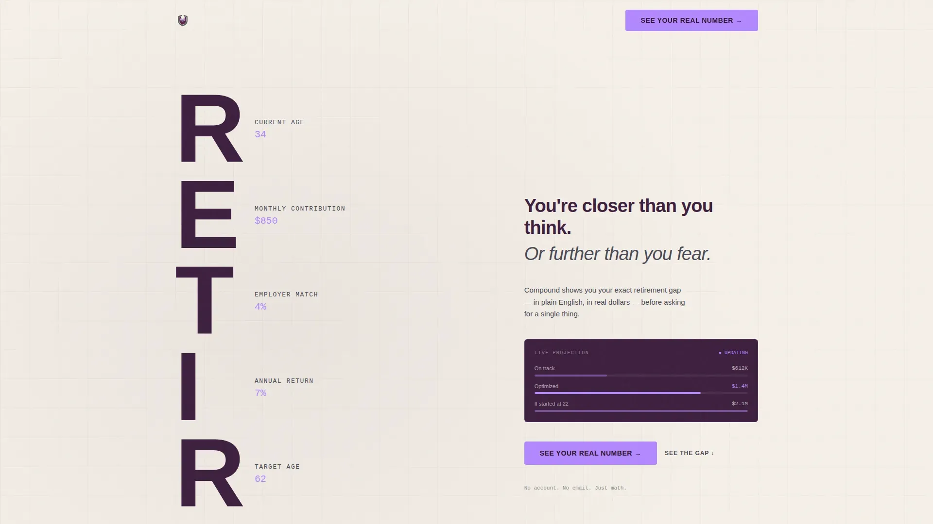
- A stacked typographic hero with animated data labels counting up to personalized defaults
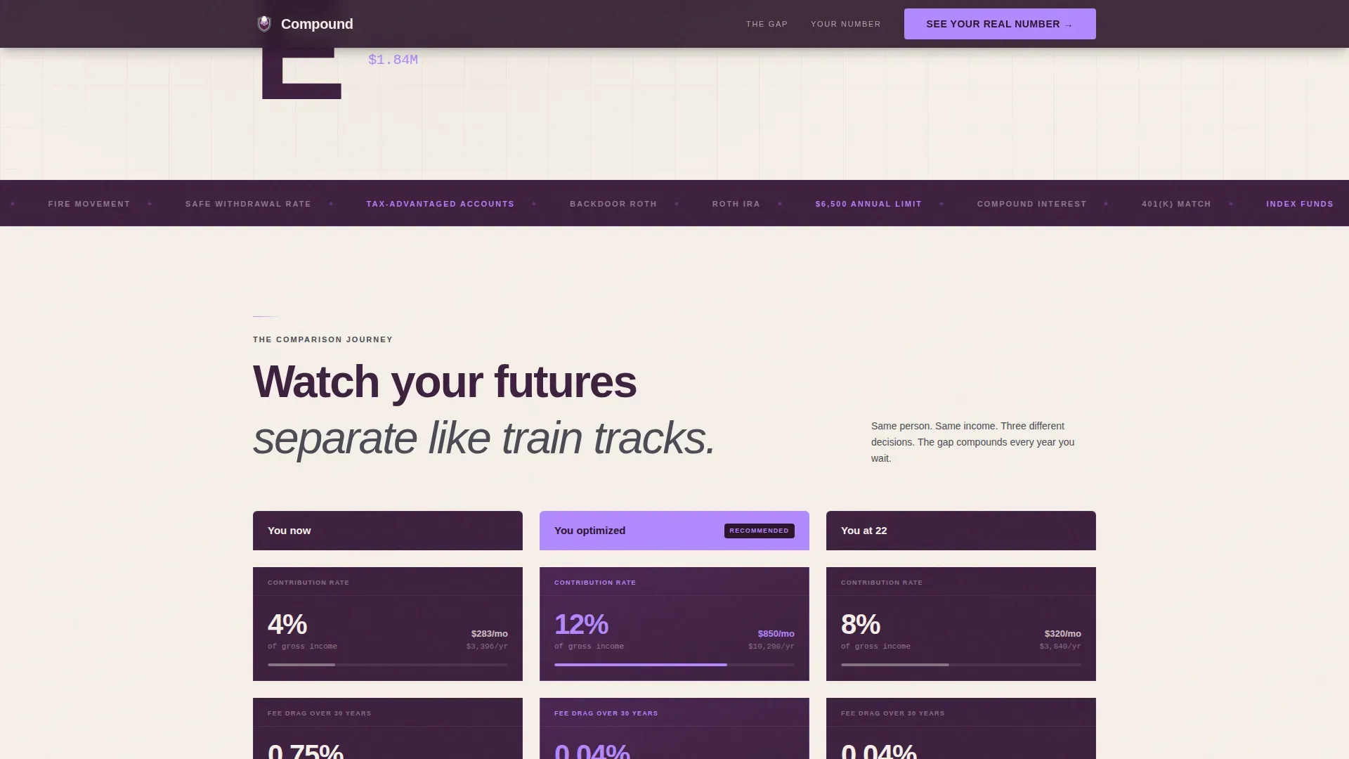
- A four-module comparison journey showing three diverging financial futures side by side
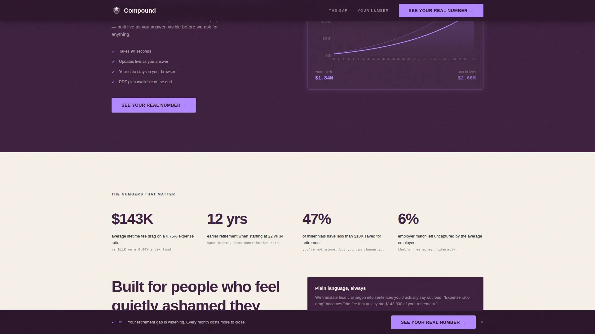
- A five-step assessment with a live projection graph that builds as each answer is submitted
Feature list
This landing page ships with a focused set of features aligned to finance lead generation and quiz-driven conversions.
Stacked Type Tower Hero
The hero fills the left viewport with the word "RETIRE" set one letter per line in condensed type. Each letter carries a live data label in electric lilac: current age, monthly contribution, employer match, annual return, target age, and projected balance. Numbers animate on load, counting up to default values.
Comparison Journey Module
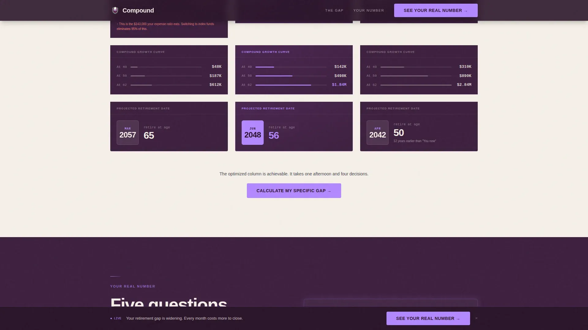
Three parallel dashboard cards display "You now," "You optimized," and "You if you'd started at 22." The layout renders identical grid structures with diverging numbers across four modules: contribution rates, fee drag, compound growth curves, and projected retirement date as a calendar page. Columns animate on scroll entry, widening the gap between futures visually.
Five-Step Quiz with Live Graph
The assessment delivers one question per screen: current age, current savings, monthly contribution, employer match, and target retirement age. Each answer updates a live Recharts projection graph in electric lilac. The final screen reveals a personalized gap analysis with two paths forward, showing users their finance picture before requesting contact details.
PDF Plan Gated Conversion
A secondary conversion path offers a downloadable plan behind an email field. The page earns this lead by delivering real, personalized data first. The sequence feels like a tool delivering services, not a form demanding access.
Persistent Call-to-Action Bar
After the second scroll module, a bottom bar appears with the primary call to action: "See Your Real Number." It stays visible as visitors continue scrolling, keeping the conversion prompt present without interrupting the content flow.
Plain-Language Data Labels
Every data point is labeled in clear, plain language. Fee drag is described as "this is the $143,000 your expense ratio eats." This approach educates visitors on finance concepts without requiring prior knowledge, reducing shame and increasing lead quality.
Page sections overview
| Section | Purpose |
|---|---|
| Hero Type Tower | Animate personalized retirement data labels on load |
| Comparison Journey | Show three diverging financial futures across four modules |
| Quiz Assessment Flow | Capture lead data through a five-step live projection tool |
| Methodology Strip | Build credibility with plain-language social proof |
| Final call to action Section | Gate PDF plan download behind an email lead capture form |
| Footer | Minimal single-row layout with copyright and rights information |
Design & branding system
The visual identity follows a Startup Velocity theme rendered through the Plum Executive color system. Deep plum dominates section backgrounds, parchment breathes between data modules, and electric lilac fires only on live, updating elements.
- Deep boardroom plum (#3D1F3E) for section backgrounds and card surfaces
- Warm parchment (#F5F0E8) for spacing and reading comfort between data blocks
- Electric lilac (#B388FF) reserved exclusively for live data points, progress bars, and interactive states
- Graphite (#2C2C34) for all body text, axis labels, and data descriptions
- Typography: Plus Jakarta Sans for body and user interface elements, DM Sans for data labels, condensed weight for the hero tower
Mobile & speed optimization
The template is built desktop-first to match the brokerage-app experience at 6 AM, but it is fully responsive across all screen sizes. Many users access retirement account pages on mobile devices, making responsive layout essential.
- Server Components handle static sections to keep pages fast on first load
- Client Components power the quiz and live chart for smooth interactive updates
- Responsive grid layout adapts the comparison journey and quiz flow across breakpoints
How this template helps you convert
A high-converting landing page for retirement finance must earn trust before asking for anything. This template is structured to do exactly that.
- The quiz shows visitors their personal retirement gap first, making the "See Your Real Number" call to action feel like a natural next step rather than a sales push.
- The comparison journey creates emotional tension by making the cost of inaction visible, which drives visitors deeper into the page and toward the lead capture.
- The PDF download gated behind an email field provides a secondary conversion path that feels like a valuable service, not a barrier to access.
Other information about this template
This template is well suited for finance services teams running paid ads campaigns across multiple audience segments. Targeted ads sent to relevant landing pages can lead to significantly higher conversions and lower cost-per-acquisition. The layout is simple to customize for different retirement products or contribution scenarios, and changes to data defaults can be made quickly.
- Finance landing page templates help build trust and generate qualified leads for retirement plans business clients
- Personalized landing pages can turn ad clicks into customers and boost conversion rates, especially when the page reflects the visitor's own data
- A/B testing landing page variations and using analytics feedback to guide decisions are both supported by the clean, modular layout
- The page includes space for legal disclosures, privacy policy links, and terms of service, which are required on all landing pages for financial products
- Compound interest generates returns on both the principal and previously earned interest; the template visually represents this difference between compound growth and linear growth to help users learn the stakes
- Finance landing page templates like this one can simplify payments flows and lead-gen campaigns, and can promote services ranging from invoicing software to retirement advisory programs
- All copyright and rights notices are included in the minimal footer, keeping the page legally complete without cluttering the layout
- Teams can save time by starting from this structured template rather than building a finance lead generation page from scratch in minutes
Theme
Startup Velocity
Creative direction
Comparison Journey
Color system
Plum Executive
Style
Dashboard/Data Grid
Direction
Quiz/Assessment
Page Sections
Stacked Type Tower Hero
Four-module Comparison Journey
Five-step Live Projection Quiz
PDF Plan Gated Download
Persistent Bottom Call to Action Bar
Plain-language Data Labels
Related questions
Who is this landing page template designed for?
Does the quiz show visitors their data before asking for contact information?
How does the comparison journey section work?
Can this template support different retirement account types?
Is the layout easy to adapt for specific ad campaigns?



