SaaS Consulting Portfolio Website Template
Compound is an editorial-style landing page template built for solo SaaS growth consultants. It pairs a deep charcoal and amber color system with a persistent sidebar chapter index, a lead-generating animated activation chart header, and a transparent case study layout that walks prospects through each consulting phase before asking for their contact details.
by Rocket studio
Quick summary
Compound is a single-page consultant landing page template designed around radical transparency. It opens with an animated activation curve that shows real results before introducing the consultant. A persistent sidebar keeps chapter navigation visible at all times, while the main column walks through each consulting phase with the specificity of a published case study.
Who this template is for
This template is built for solo SaaS growth consultants who win clients by showing their thinking, not just their credentials. It suits practitioners who work in short, intensive sprints and need a page that earns trust before asking for anything.
- Solo strategists embedded in Series A and Series B SaaS teams
- Growth consultants advising founders on trial-to-paid conversion and expansion revenue
- Portfolio operators helping private equity teams move net revenue retention across multiple platforms
What problem this template solves
Most consulting landing pages lead with a biography and a testimonial carousel. Compound flips that structure. The template is designed for consultants whose best sales tool is the quality of their process, not a polished headshot or a client logo wall.
- Prospects arrive skeptical and leave before reaching any contact form
- The consulting method stays invisible, making it hard for buyers to self-qualify
- Two separate conversion paths are needed for ready buyers and early-stage visitors who want a framework first
What you get with this template
Compound delivers a fully structured single-page layout that guides a prospect from curiosity to contact through four clearly defined consulting chapters. Every section is built to carry dense, specific content without feeling heavy.
- An animated header chart section with a caption-style proof statement before any biography
- A persistent sidebar with a locked chapter index (Diagnosis, Remodel, Instrument, Transfer) and a pinned primary call to action
- A dual conversion system: a lead form for qualified buyers and a gated content download for earlier-stage visitors
Feature list
Compound ships with a focused set of layout and interaction features. Each one serves the core goal of building credibility through transparency and capturing leads through two distinct paths.
Animated Activation Curve Header
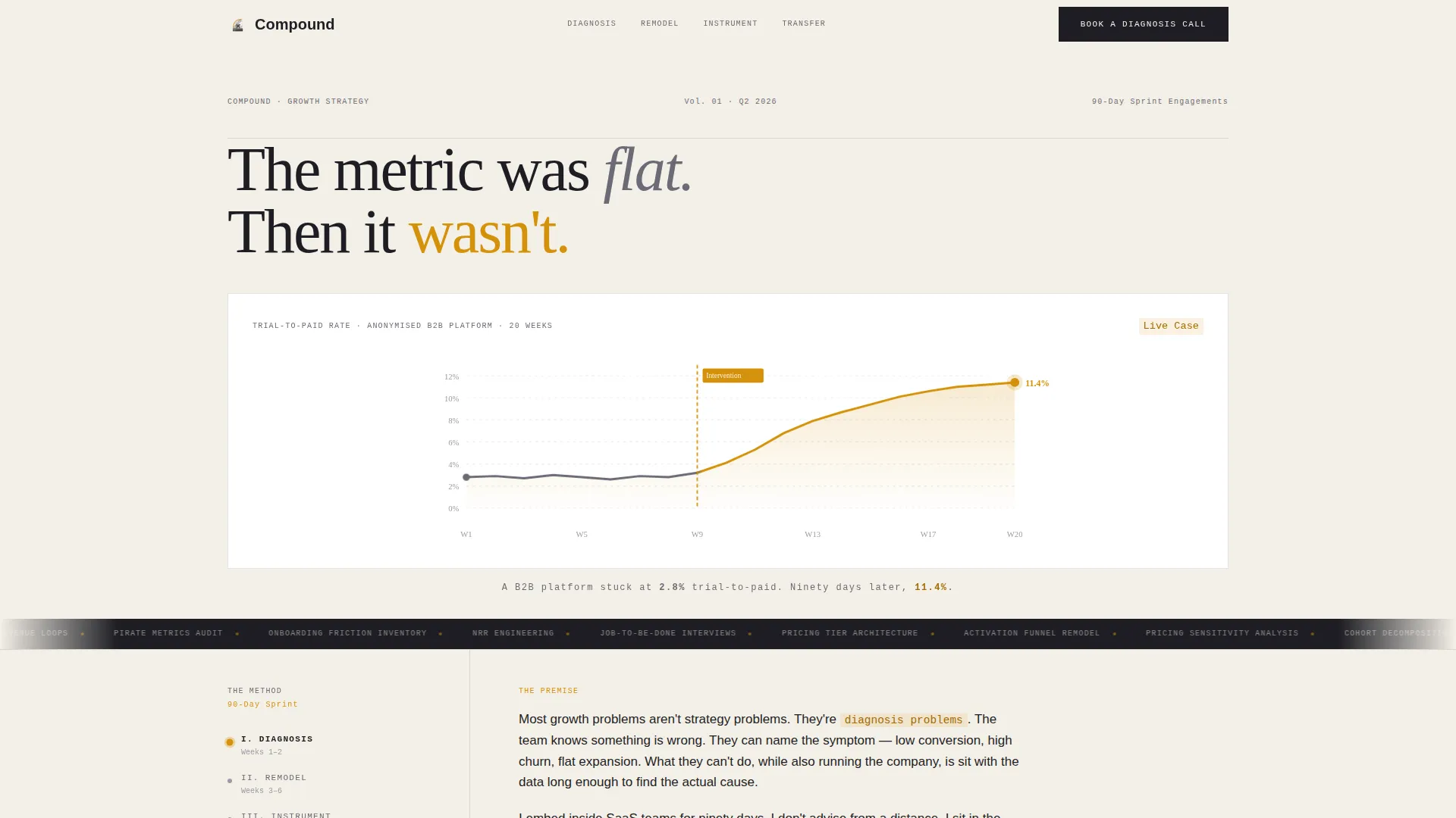
The header opens with a large-format chart that animates into view. An amber vertical line marks the exact intervention point on the activation curve. A single caption line reads like a magazine deck and delivers the proof statement before any other content appears.
Persistent Sidebar Chapter Index
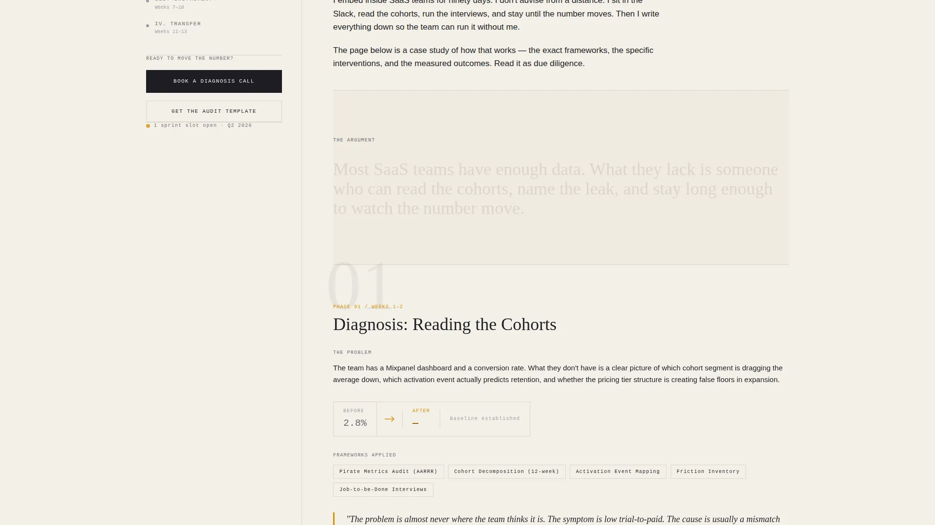
As the reader scrolls, the sidebar locks into place and stays visible. It displays the four consulting chapters as a chapter index, giving the reader a sense of structure and progress. The pinned call to action at the bottom of the sidebar stays one glance away throughout the entire page.
Four-Phase Case Study Layout
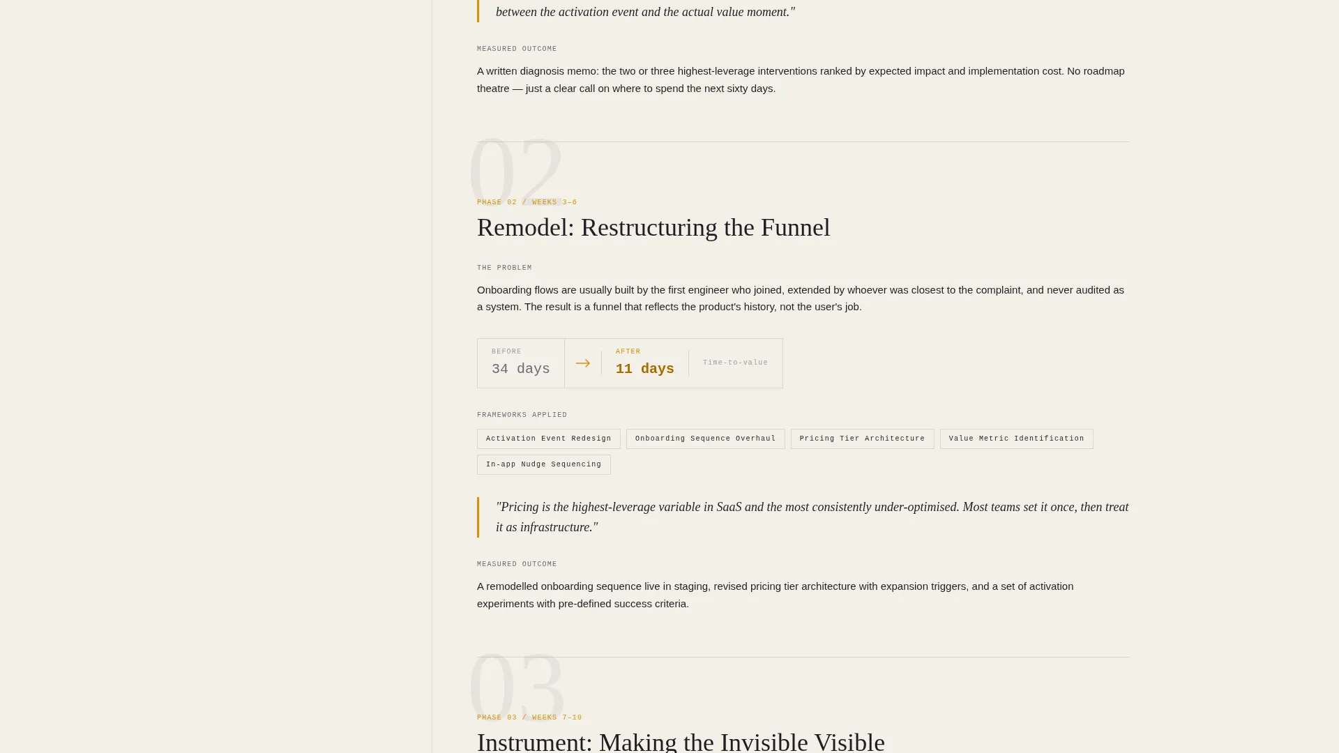
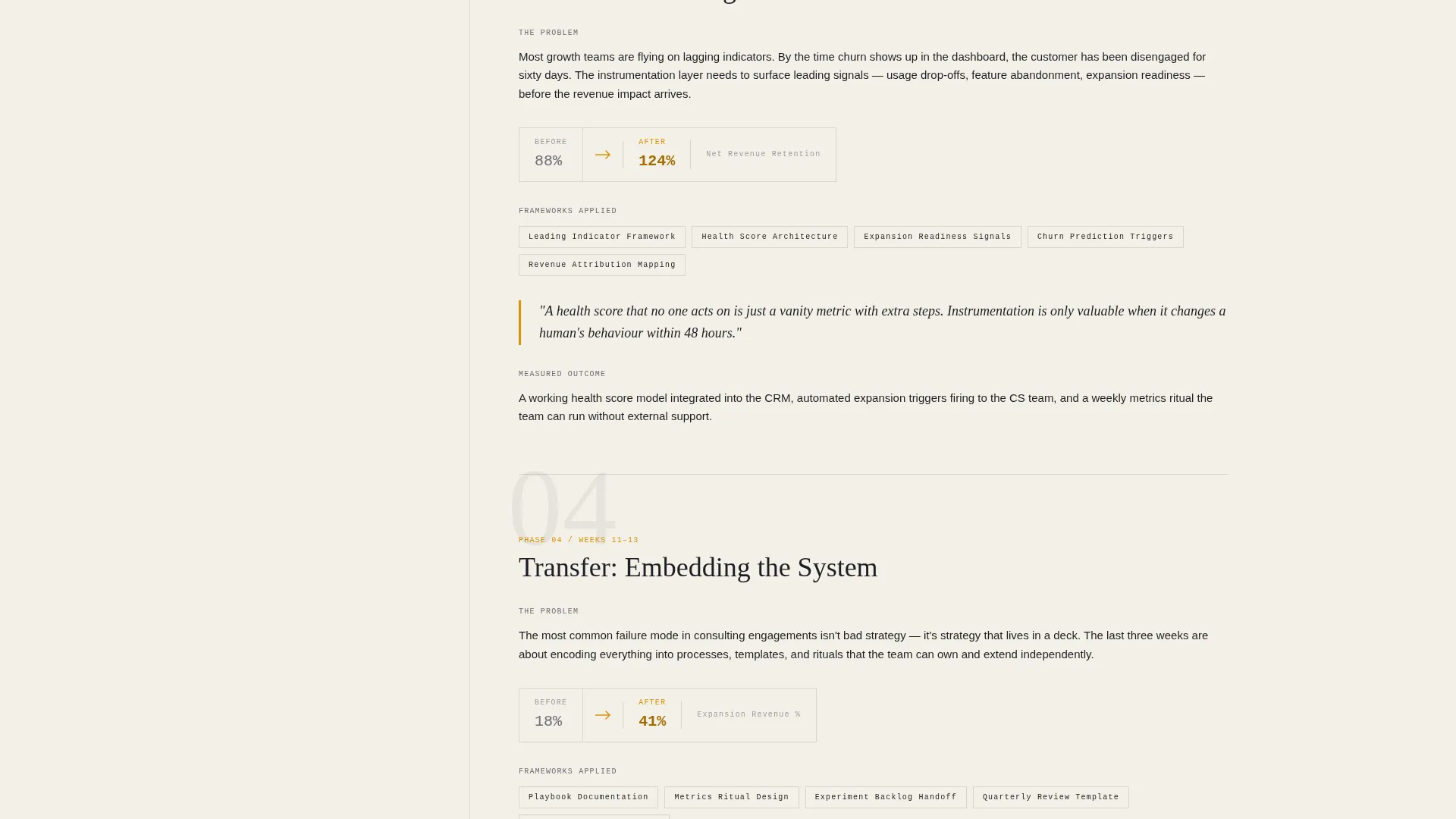
The main content column is organized into four chapters: Diagnosis, Remodel, Instrument, and Transfer. Each chapter opens with the raw problem, walks through the exact frameworks applied, and closes with the measured outcome. The structure mirrors a long-form magazine feature.
Dual Conversion Path System
The primary lead form collects annual recurring revenue (via dropdown bands), the single metric the prospect most wants to move, and an email address. A secondary download path captures earlier-stage visitors with email only, offering a gated activation audit template.
Editorial Magazine Visual System
The charcoal and amber color system applies deep charcoal to the main content column, warm parchment to the sidebar, and molten amber to pull quotes, highlighted metrics, and hover states. The result feels like a high-quality printed business journal rather than a typical SaaS marketing page.
Pull Quote and Metric Highlighting
Amber styling is applied selectively to pull quotes and key metrics throughout the case study sections. This draws the reader's eye to the most important data points without interrupting the reading flow of the surrounding body text.
Page sections overview
| Section | Purpose |
|---|---|
| Animated chart header | Opens with proof before introducing the consultant |
| Caption proof statement | Delivers the result in one magazine-style sentence |
| Chapter index sidebar | Gives persistent navigation and keeps call to action visible |
| Diagnosis chapter | Presents the raw client problem and audit approach |
| Remodel chapter | Shows pricing and funnel frameworks applied |
| Instrument chapter | Details measurement and cohort decomposition work |
| Transfer chapter | Explains handoff and how results are sustained |
| Primary lead form | Captures qualified buyers with ARR and metric fields |
| Secondary download call to action | Gated resource path for earlier-stage visitors |
Design & branding system
The template uses an editorial magazine design language anchored by a charcoal and amber palette. Every color choice has a specific role, so the page feels intentional rather than decorative.
- Deep charcoal (#1E1E24) fills the main content column; warm parchment (#F4F0E8) defines the persistent sidebar; molten amber (#D4910A) highlights pull quotes, key metrics, and hover states; and quiet graphite (#6B6B76) handles body text and secondary labels
- Typography and layout follow a densely typeset magazine feature style, balancing ink-rich authority with enough whitespace to keep long-form content readable
- The sidebar and main column split creates a clear visual hierarchy that separates navigation from narrative without competing for attention
Mobile & speed optimization
The sidebar chapter index and main content column are designed to reflow cleanly on smaller screens. The layout prioritizes the reading experience so that dense, case study content remains scannable on any device.
- The persistent sidebar transitions appropriately for narrow viewports so chapter navigation does not obstruct the main content
- The animated header chart is built to load as a layout-integrated element rather than a heavy external asset
- Form fields for both conversion paths are sized and spaced for comfortable input on touch screens
How this template helps you convert
Compound earns the conversion by proving competence before making any request. The structure is deliberate: show the data, explain the thinking, then offer two ways to take the next step.
- The animated activation curve and caption proof statement establish credibility in the first few seconds, so skeptical buyers stay on the page long enough to engage with the case study content.
- The pinned sidebar call to action and dual conversion system mean that whether a visitor is ready to book a call or just wants the audit framework, there is always a relevant next step within reach.
Other information about this template
Compound is categorized under Professional Services and SaaS Consulting, making it a strong fit for consultants who need to differentiate themselves in a market where most competitors rely on generic service-page layouts.
- The template style follows a sidebar companion layout with a split content-and-navigation structure suited to long-form, chapter-based consulting narratives
- The four consulting chapter labels (Diagnosis, Remodel, Instrument, Transfer) are part of the layout structure and can be relabeled to match a consultant's own methodology
- The secondary gated download path (the activation audit template) is included as a designed section within the page, giving consultants a built-in lead magnet placement without needing a separate page
- The page is built for a single consultant brand, not an agency or multi-person team, and the copy architecture reflects that solo authority positioning throughout
Theme
Legal Shield
Creative direction
Case Study Narrative
Color system
Plum Executive
Style
Split Screen (50/50)
Direction
Booking/Scheduling
Page Sections
Animated Activation Curve Header
Persistent Sidebar Chapter Index
Four-phase Case Study Layout
Dual Conversion Path System
Editorial Magazine Visual System
Pull Quote and Metric Highlighting
Related questions
Can I change the four chapter labels in the sidebar?
What does the dual conversion system include?
Is this template suitable for a consulting team rather than a solo consultant?
Does the animated chart in the header use real data?
What kind of SaaS consulting work does this template suit best?



