Financial Advisor Blog & Content Platform Website Template
Compound is a scroll-reveal landing page template built for financial advisor blogs that need to command attention fast. It uses a glassmorphic dark-mode design system, stat-first progressive reveals, and two lean conversion paths to turn curious readers into qualified leads. The layout speaks directly to first-generation wealth builders who want proof before they trust anyone with their money.
by Rocket studio
Quick summary
Compound is a single-page financial advisor blog landing page template designed around a Stats-First Impact philosophy. It opens with a full-bleed void-black header, ignites trust with a single glowing portfolio stat, then walks visitors through progressively revealed blog cards that each lead with a number. Two low-friction conversion paths run quietly in the background.
Who this template is for
This template is built for financial advisors and advisory firms who write seriously about money and want their blog to reflect that credibility. It suits practices that serve sophisticated, self-directed clients rather than general audiences.
- Independent financial advisors who publish market commentary, tax strategy, or retirement planning content
- Advisory firms targeting startup founders, dual-income professionals, or small business owners sitting on untapped wealth
- Financial content teams who want their editorial work to generate qualified leads, not just page views
What problem this template solves
Most financial advisor blog pages look like they were built to check a box. The design is safe, the copy is vague, and the call to action arrives before the visitor has any reason to trust the brand. Compound flips that sequence entirely.
- Advisors struggle to convert blog readers into consultation requests because the page builds no intellectual authority before asking for contact details
- Generic blog layouts bury the most compelling proof points, like specific return figures or fee-impact statistics, inside paragraphs that readers skip
- Standard lead forms ask too many questions too early, creating friction that causes high-intent visitors to leave before converting
What you get with this template
You get a complete, production-ready single-page layout structured to deliver authority first and ask for contact details second. Every section is purposefully sequenced to match how a financially literate reader actually evaluates a new advisor.
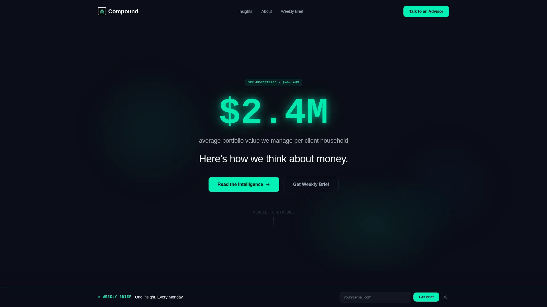
- A dark full-bleed header section where a single mint-glow portfolio stat lands before any navigation or logo appears
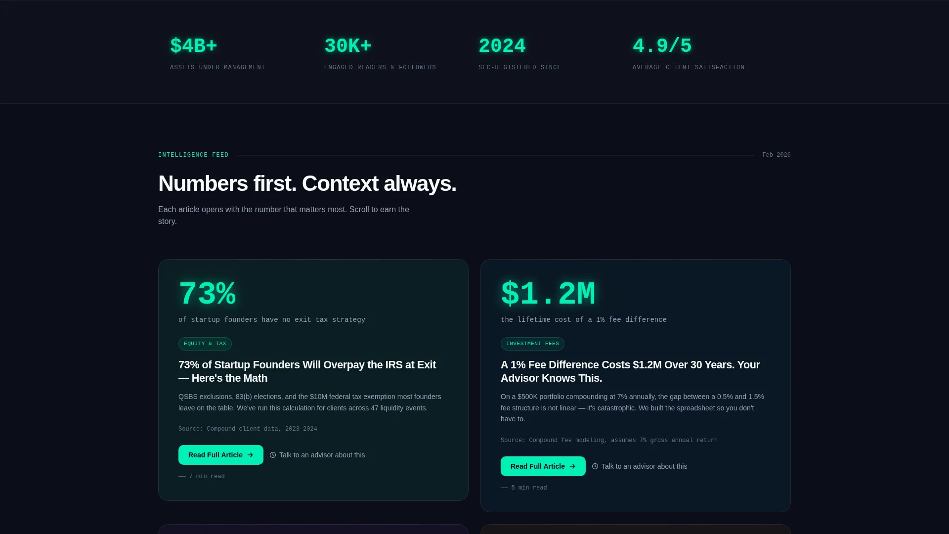
- A scroll-reveal blog card sequence where each card opens with a bold percentage or dollar figure before revealing the article title
- A persistent bottom bar lead capture form and a secondary in-card scheduler path, both designed for minimal friction
Feature list
This template is built around a clear set of capabilities drawn directly from the design brief. Each feature serves one goal: earning the reader's trust before asking for anything.
Stat-First Scroll Reveal Sequence
Each blog section is hidden until the visitor scrolls into range. A headline number, such as "73%" or "$1.2M", materializes through the frosted glass panel first. The card surface then resolves around it, revealing the full article title. This slot-machine rhythm makes the blog feel like discovery rather than a reading list.
Dark Full-Bleed Void Header
The header is pure void black with no image, illustration, or navigation competing for attention. A single portfolio statistic ignites in electric mint with a soft radial glow. A one-line slate subhead fades in one beat later. The sequence is designed to land like a single, decisive fact rather than a branding exercise.
Glassmorphic Card System
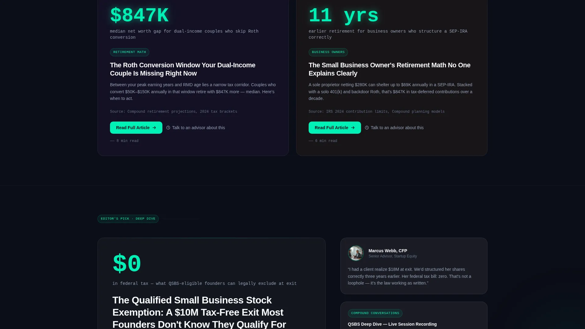
Blog content cards use frosted panel white at 8% opacity over the void-black background, with soft blur backdrops and light-catching borders. Cards stack with parallax depth so later cards float visually above earlier ones, creating a layered dashboard feel that rewards continued scrolling.
Persistent Bottom Bar Lead Capture
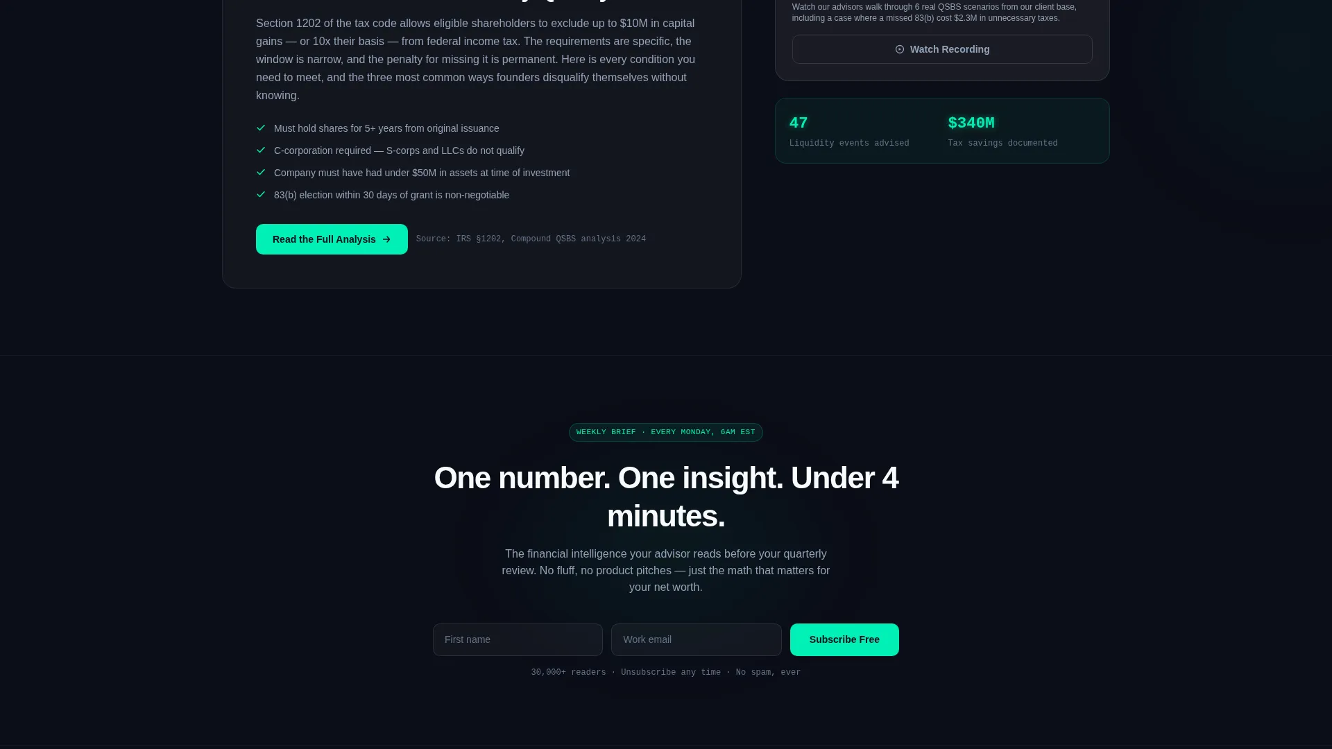
After the third scroll reveal, a frosted-glass bottom bar slides up with a "Get Our Weekly Brief" prompt in electric mint. The form collects first name and email only. Two fields, zero friction. The bar stays visible as the visitor continues reading without blocking content.
In-Card Advisor Scheduler
Each blog card includes a secondary conversion link: "Talk to an advisor about this topic." This opens a scheduler flow that collects name, email, a portfolio range dropdown (under $500K, $500K to $2M, $2M and above), and a single open-text field asking what is keeping the visitor up at night. The qualifier question surfaces intent without a lengthy intake form.
Electric Mint Glow Accent System
The primary accent color, electric mint at hex #00F0B5, is used exclusively on stats, call-to-action elements, and key highlight moments. It pulses like a heartbeat monitor against the dark background, drawing the eye to the most important figures on the page without visual clutter.
Page sections overview
| Section | Purpose |
|---|---|
| Void Black Header | Opens with a single glowing stat before any navigation appears |
| First Stat Reveal | Introduces the "73% of startup founders" article hook |
| Second Stat Reveal | Surfaces the "$1.2M lifetime fee difference" article hook |
| Progressive Blog Cards | Stacks additional frosted-glass article cards with parallax depth |
| Persistent Bottom Bar | Slides up after third reveal with the weekly brief signup form |
| In-Card Scheduler | Embeds a qualified lead form inside each individual blog card |
Design & branding system
The visual identity runs on a Startup Velocity theme expressed through a glassmorphic color system. Every color choice serves the goal of making financial data feel alive and authoritative rather than stiff or institutional.
- Void black (#0B0D17) fills the infinite background; frosted panel white (white at 8% opacity) surfaces each card; electric mint (#00F0B5) marks every stat and call-to-action moment; cool slate (#94A3B8) carries all body text
- Card borders catch light like condensation on glass, while soft blur backdrops keep the layered dashboard reading clean and focused
- Typography and spacing reinforce a fintech dashboard aesthetic: precise, data-forward, and confident without being cold
Mobile & speed optimization
The progressive reveal layout is structured with a mobile reading experience in mind. Glassmorphic layers and parallax stacking are expressed through CSS-based composition rather than heavy asset loading, keeping the visual richness practical for smaller screens.
- Cards reflow into a single-column stack on mobile so the stat-first reveal sequence reads naturally from top to bottom without horizontal overflow
- The bottom bar lead form collapses to a compact pill on smaller viewports, keeping the two-field prompt visible without covering content
How this template helps you convert
The conversion logic in Compound is built around earning trust before asking for contact details. Every design and structural decision reflects this sequence.
- The header stat and progressive reveal sequence establish intellectual authority through specific numbers before any form or call-to-action appears, so the visitor arrives at the conversion point already convinced
- The two-path conversion system, a frictionless weekly brief form and a qualifying in-card scheduler, captures both early-stage readers and high-intent prospects in the same scroll without interrupting either group
Other information about this template
Compound is categorized under financial advisor website templates and is specifically shaped around the financial advisor blog page niche. It is suited for practices that publish content-driven thought leadership and want that content to do active lead generation work.
- The template style is Scroll Reveal (Progressive), meaning content sections animate into view as the visitor scrolls rather than loading all at once
- The creative direction is Stats-First Impact, a deliberate choice to lead with quantified proof points rather than brand messaging or service descriptions
- The header concept is Dark Full-Bleed with Glow, using pure black and a single mint-lit stat as the entire above-the-fold experience
- The landing page direction is Lead Generation, with two distinct conversion paths designed to capture contacts at different stages of visitor intent
- The theme is Startup Velocity, reflecting a fintech-native visual language that resonates with founders, operators, and professionals who think in numbers
Theme
Startup Velocity
Creative direction
Stats-First Impact
Color system
Glassmorphic
Style
Scroll Reveal (Progressive)
Direction
Lead Generation
Page Sections
Stat-first Scroll Reveal Sequence
Dark Full-bleed Void Header
Glassmorphic Layered Card System
Persistent Bottom Bar Lead Form
In-card Advisor Scheduler
Electric Mint Glow Accent System
Related questions
Who is this landing page template best suited for?
What conversion paths does this template include?
Can I customize the stat figures and article titles shown in the cards?
How does the scroll reveal animation work in this template?
Does this template work for a financial advisor blog that is just getting started?



