Smart Teen Education Savings Landing Page Template
The Compound Smart Teen Education Savings landing page template is a sidebar-companion, single-page fintech layout built for 529 account platforms targeting parents of teens aged 13 to 18. It pairs a data-driven narrative structure with a fixed left-panel table of contents, an inline projection calculator, and scroll-triggered chart animations to turn compound interest urgency into account sign-ups.
by Rocket studio
Quick summary
The Compound template is a focused, one page fintech layout designed to convert parents into 529 account openers. It uses a fixed sidebar navigation, Bloomberg-terminal-style data visualizations, and an inline projection calculator to make compound interest feel immediate and inevitable. The Startup Velocity theme, Monochrome Steel palette, and Stacked Type Tower hero combine to deliver a premium financial education experience.
Who this template is for
This template is built for fintech founders, edtech startups, and financial service brands launching a teen and youth education savings platform. It works equally well for independent advisors and credit unions who want a dedicated landing page for 529 plan promotion. The design language speaks directly to data-literate, financially motivated adults who need to be shown the numbers before they act.
- Parents of teens aged 13 to 18 who are actively looking to save money for college costs
- Grandparents and other family members who want to contribute to a tax-advantaged savings account rather than give cash gifts
- Guidance counselors and school financial-aid teams sharing resources with families as practical conversation starters
What problem this template solves
Tuition inflation keeps climbing, yet most families delay opening a 529 plan because the process feels opaque and the urgency is invisible. A generic savings page cannot communicate the real cost of waiting. Teens and parents both need a financial literacy experience that makes the math tangible, not theoretical.
- Parents struggle to visualize the difference between starting a savings habit at age 14 versus age 18, which is precisely where compound interest does its most powerful work
- Standard templates bury the call to action under passive copy, while this layout places the primary conversion trigger directly inside the sidebar after the second content chapter
- The financial plan is never presented as overwhelming; the template breaks it into clear data chapters that build urgency one finding at a time
What you get with this template
You get a complete sidebar-companion landing page layout built around five structured content chapters. Every element from the animated hero to the inline calculator is designed to serve one financial plan: move a hesitant parent from awareness to account opening in a single scroll session.
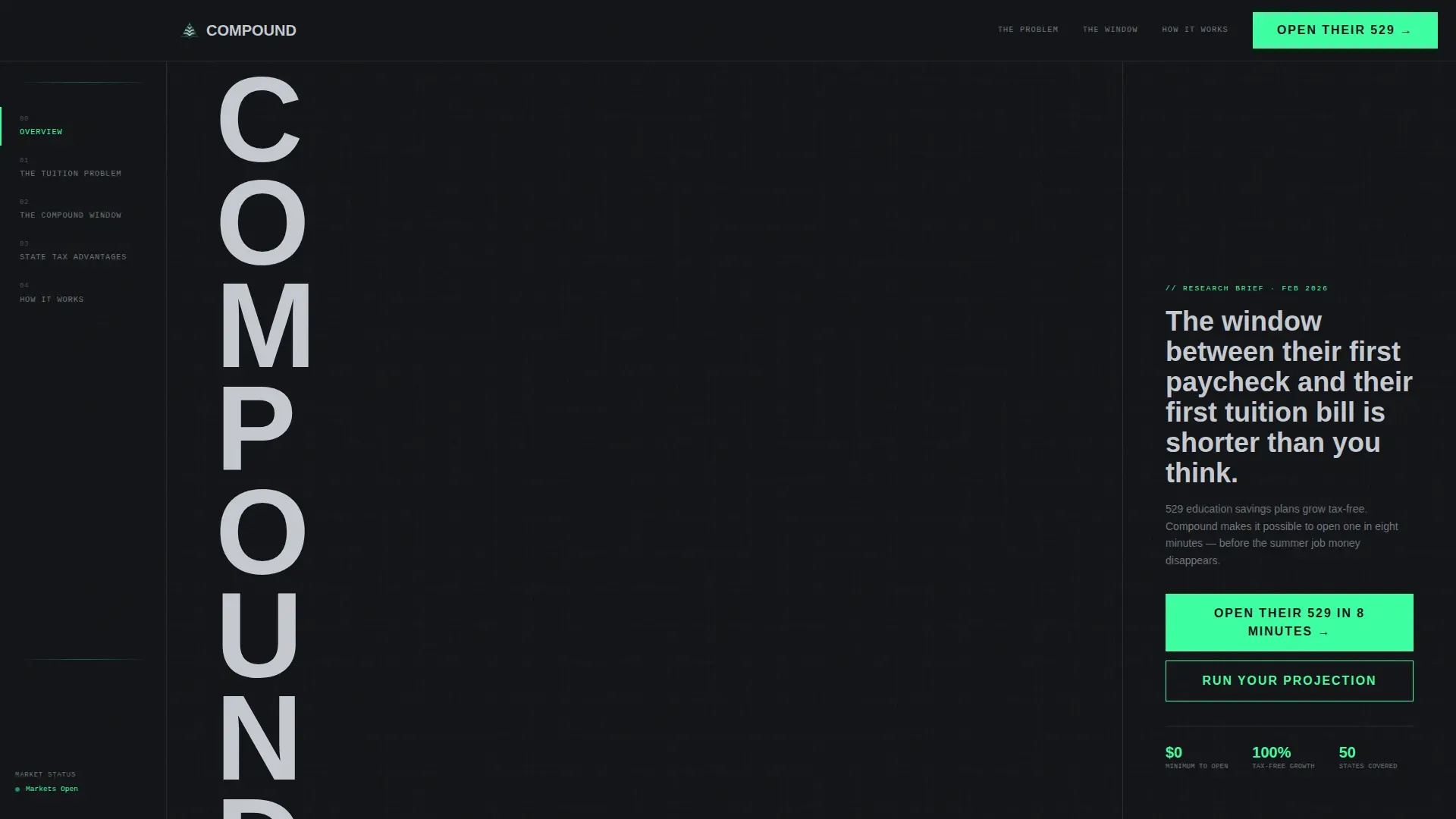
- A Stacked Type Tower hero where each letter of "COMPOUND" reveals a live data point on hover, including average 529 return rate, tuition inflation, and tax savings per $10,000 contributed
- A fixed left-panel sidebar that functions as a living table of contents with chapter markers for "The Tuition Problem," "The Compound Window," "State Tax Advantages," and "How It Works," each one highlighting as the visitor scrolls past
- An inline projection calculator where parents enter their child's age and a monthly contribution amount to see a mint-green animated growth curve plotting projected balance at age 18
Feature list
The template ships with purpose-built components for every stage of the 529 conversion journey. Each feature reinforces financial literacy and makes the case for acting now rather than later.
Stacked Type Tower Hero
The hero section sets a single letter of "COMPOUND" per row, scaled to fill the full viewport height. On hover, each letter reveals a key data point, average return rate, tuition inflation since 2010, or tax savings per $10,000 contributed. A mint-green aggregate counter ticks upward at the base, showing total dollars saved across platform users. No images compete with the numbers. The layout uses Barlow Condensed at ultra-condensed weight so the typography alone communicates authority.
Fixed Sidebar Table of Contents
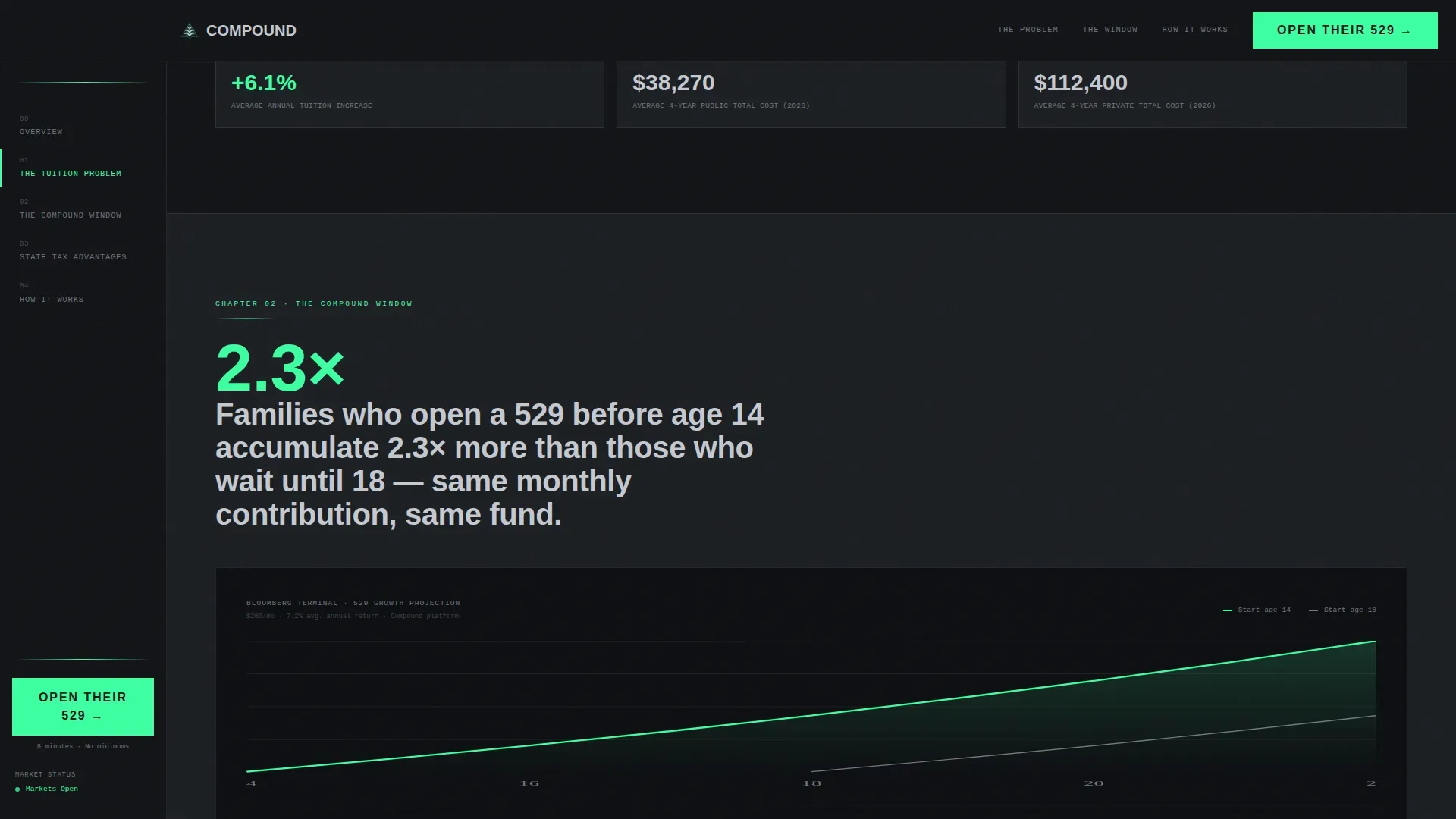
A persistent left-panel sidebar keeps chapter markers visible at all times. The four chapters, "The Tuition Problem," "The Compound Window," "State Tax Advantages," and "How It Works", each highlight in electric mint as the corresponding section enters view. The primary call to action, "Open Their 529 in 8 Minutes," appears inside the sidebar after the second chapter, placing the conversion moment at peak urgency. This structure makes it easy for busy parents to orient themselves and jump directly to the section most relevant to their financial plan.
Bloomberg-Terminal Data Sections
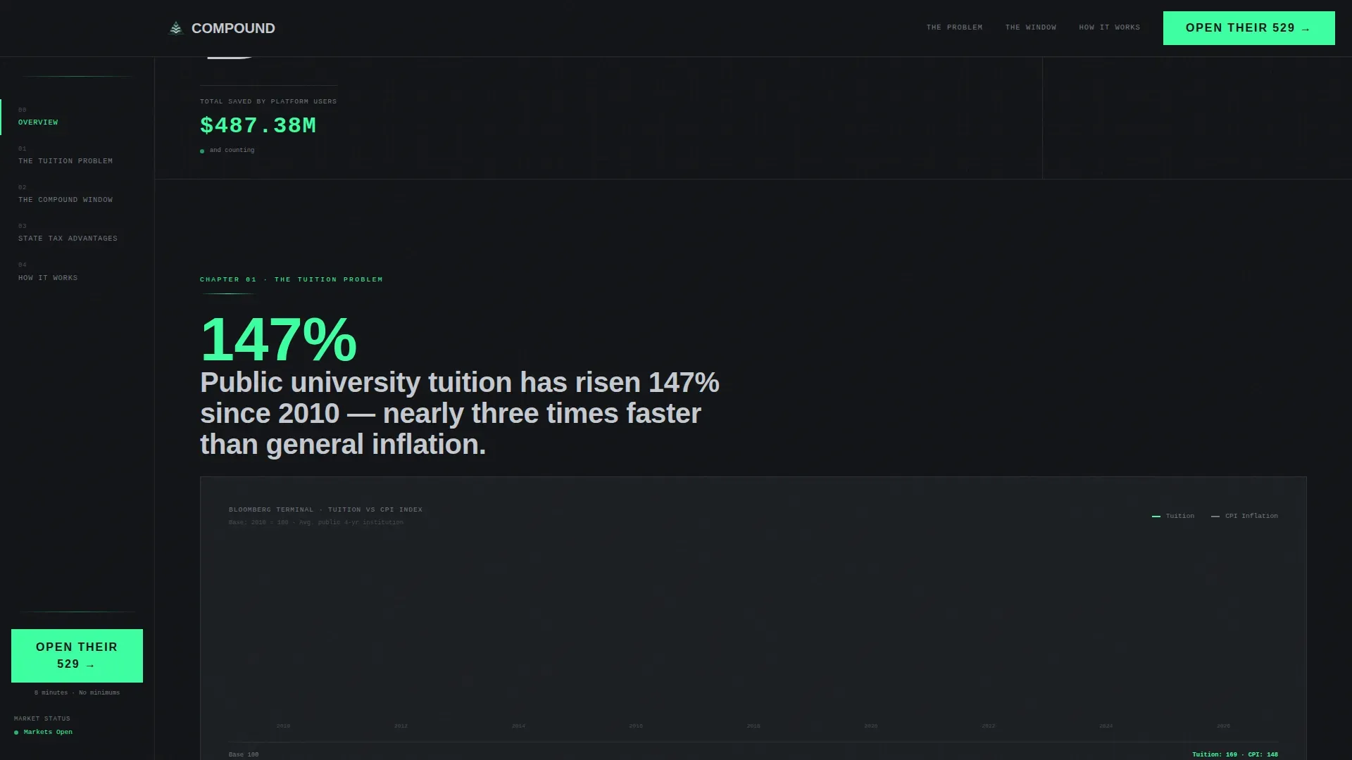
Each content chapter opens with a bold statistical finding presented as a headline-level data point. For example, families who open a 529 before age 14 accumulate significantly more than those who start at age 18. Charts drawn in brushed chromium and electric mint on a forge-black background render like Bloomberg terminal outputs. GSAP ScrollTrigger powers draw-on-scroll animations so each chart builds in front of the reader, making the lesson feel live rather than static. This approach to financial education is concrete rather than aspirational.
Inline Projection Calculator
The "Run Your Projection" secondary call to action opens a live calculator directly on the page. Parents enter their child's current age and a monthly contribution figure. The calculator plots a mint-green compound interest growth curve, animating the balance upward to age 18. This tool makes the power of the original investment visible in real time. It demonstrates how interest earned compounds on itself, turning small consistent deposits into meaningful college savings. The curve animation is driven by a Client Component so it stays responsive without slowing static content.
Interactive State Tax Grid
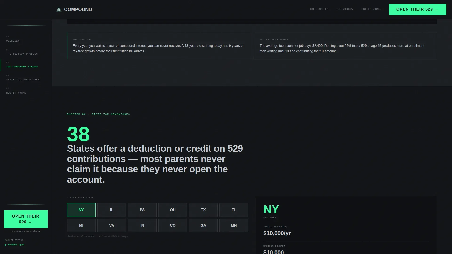
A dedicated section presents a selectable state grid displaying 529 tax benefit data. Parents can choose their state and immediately see the potential tax deduction or credit tied to their contributions. This addresses one of the most persuasive and least-understood advantages of 529 plan investing. Taxes are a real cost driver for families, and surfacing state-specific data at the right moment in the narrative reinforces the urgency to act.
Full-Width Conversion Bar
After the final data section, a full-width bar repeats the primary call to action: "Open Their 529 in 8 Minutes." This placement catches visitors who read to the end and need one final prompt before committing. The bar uses the electric mint accent exclusively, consistent with the template's rule that the mint color appears only on interactive elements and live data points. No additional form sits on the landing page; all clicks route to the custodial account setup flow.
Page sections overview
| Section | Purpose |
|---|---|
| Stacked Type Hero | Establish brand authority and display live platform savings data |
| The Tuition Problem | Present tuition inflation data through a Bloomberg-style bar chart |
| The Compound Window | Compare age-14 versus age-18 savings growth with side-by-side charts |
| State Tax Advantages | Interactive state grid showing 529 tax benefit data by location |
| How It Works | Four-step mechanics overview paired with the inline projection calculator |
| Footer | Linear single-row footer with minimal navigation and legal copy |
Design & branding system
The Monochrome Steel color system creates the feel of a fintech pitch deck printed on matte black card stock. Every surface is cool and industrial, deliberately stripped of warmth so that the numbers do all the talking. The electric mint accent earns its visibility by appearing only on interactive elements and live data outputs, which trains the reader's eye to treat mint as a signal of something worth clicking or watching.
- Forge-black (#121417) forms the full-bleed page background; brushed chromium (#71767E) and milled aluminum (#C5C9D0) handle body text and supporting labels, creating a clear typographic hierarchy without relying on color contrast tricks
- Barlow Condensed at ultra-condensed weight handles all hero and chapter heading typography; DM Sans handles all body copy, keeping long-form financial plan sections highly readable at any size
- Electric mint (#3DFFA2) is strictly reserved for interactive elements, live counter ticks, chart draw animations, calculator curve output, and the primary call-to-action bar, never used for decorative purposes
Mobile & speed optimization
The desktop-first layout centers its sidebar companion experience on wider screens where a fixed left panel adds genuine navigational value. On mobile, the sidebar collapses into a sticky top navigation bar so readers can still jump between chapters without losing orientation. Server Components handle all static content sections while Client Components power animations, the live counter, and the projection calculator, keeping the overall load balanced.
- The sidebar converts to a horizontal sticky chapter nav on smaller screens, preserving the table-of-contents function without occupying vertical space that mobile readers need for content
- Static data sections, including the tuition chart copy and state tax grid labels, are rendered server-side, leaving only the interactive calculator, GSAP animations, and live counter as client-rendered elements
How this template helps you convert
The template is engineered around a single conversion path: get a parent to click "Open Their 529 in 8 Minutes" and begin the custodial account setup. Every design and copy decision serves that one goal, consistent with the Rule of One principle for high-converting financial landing pages.
- The sidebar plants the call to action at exactly the moment emotional urgency peaks, after the visitor has absorbed the tuition inflation data and the compound interest comparison, so the prompt to act arrives when motivation is highest rather than at the bottom of a long scroll
- The projection calculator makes the financial future feel personal rather than statistical; when a parent enters their child's age and sees the mint growth curve animate toward a real dollar balance, the decision to open a savings account shifts from abstract to concrete
- The full-width conversion bar after the final section provides a clean second chance for readers who needed to process the full narrative before committing, eliminating the need for a follow-up email or retargeting sequence to recapture undecided visitors
Other information about this template
The Compound Smart Teen Education Savings landing page template is built for the Teen and Youth Finance niche within the broader Finance and Insurance category. It reflects a deep intersection of Startup Velocity theme, Industry Report creative direction, Monochrome Steel color system, Click-Through landing page direction, and Sidebar Companion template style. The content architecture is grounded in key concepts from financial literacy and financial education that parents, grandparents, and guidance counselors already recognize.
- Financial planning for teens involves learning budgeting, saving, basic investing ideas, and credit habits; this template surfaces those concepts as data-backed chapter findings rather than listicle advice, giving the brand a credible, research-led voice
- The template supports conversation starters between parents and teens by making financial literacy visible as a shared family activity; when a parent runs the projection calculator with their teenager, goal setting becomes a collaborative rather than directive exercise
- Teens benefit from understanding key concepts like how compound interest works, the difference between a savings account and a mutual fund, how interest rates affect long-term balance, and why managing money early builds a stronger financial future
- The financial habits modeled through the page narrative, tracking spending, automating savings, keeping an emergency fund, and learning how credit works, mirror what financial education research recommends for teens aged 13 to 18
- A savings account pays interest on deposited money over time; a 529 plan takes that idea further by adding tax advantages that a standard bank savings account cannot offer, making the price of inaction measurable in lost tax savings and slower compound interest accumulation
- The template's data sections are designed for illustrative purposes, showing families how their investments could grow based on historical return assumptions; any figures shown in the calculator should be treated as projections rather than guarantees
- Many banks offer youth checking accounts with joint parent access; a debit card and basic budget practice are often a teen's first introduction to managing money, and this template positions the 529 as the logical next step after those basics are in place
- Concepts such as credit history, financial independence, and the difference between borrowing to pay expenses versus investing earnings for the future are woven into the narrative as secondary lessons without distracting from the primary 529 conversion goal
- A government agency such as the federal deposit insurance corporation (FDIC) insures standard bank deposits, but 529 plan investments are held in securities and are not FDIC insured accounts; the template can include appropriate disclosure language in the footer to keep the financial plan compliant and trustworthy
- Unicorn Platform offers free education-specific templates with drag-and-drop customization options for teams that want to adapt this layout's structure without coding from scratch
Theme
Startup Velocity
Creative direction
Industry Report
Color system
Monochrome Steel
Style
Sidebar Companion
Direction
Click-Through
Page Sections
Stacked Type Tower Hero with Hover Data
Fixed Sidebar Table of Contents
Bloomberg-terminal Chart Sections
Inline Compound Interest Calculator
Interactive State Tax Advantage Grid
Full-width Post-narrative Call to Action Bar
Related questions
Who is the primary audience for this template?
Does the template include a sign-up form on the page?
How does the inline projection calculator work?
Does the sidebar work on mobile screens?
What typography and color tokens does the design system use?



