Pharmacy & Drugstore Comparison Website Template
A single-column compounding pharmacy landing page built around patient education and trust. The template guides visitors through a three-step medication audit, a toggleable checklist, a side-by-side pharmacy comparison, and a four-step process walkthrough. It closes with a free guide download form. The result feels like a knowledgeable pharmacist walking you through every question you were afraid to ask.
by Rocket studio
Quick summary
This compounding pharmacy landing page template puts patient education before the sales pitch. Visitors move through a guided self-assessment, learn the difference between mass-produced and compounded medications, and arrive at a free resource download already feeling informed. The layout is calm, clinical, and warm enough to actually read.
Who this template is for
This template is built for independent compounding pharmacies and specialty pharmacists who serve patients that standard medications cannot help. It works equally well for practices that want to generate consultation leads through education rather than hard selling.
- Compounding pharmacies treating patients with medication intolerances, swallowing difficulties, or discontinued drug needs
- Pediatric and veterinary practices that regularly need custom-dosed formulations
- Hormone therapy providers whose patients need precise milligram-level adjustments
What problem this template solves
Most pharmacy websites list services without explaining why those services matter. Patients who need compounded medications often arrive confused, skeptical, or unsure whether compounding is even an option for them. This template solves that gap directly.
- It replaces clinical jargon with plain-language explanations that patients can read and understand on their own
- It helps visitors self-identify their need before they ever speak to a pharmacist
- It gives the pharmacy a credible first impression by leading with knowledge, not a contact form
What you get with this template
You get a complete single-column landing page designed specifically for compounding pharmacy patient education and lead generation. Every section is purposeful, and the layout flows logically from awareness to trust to action.
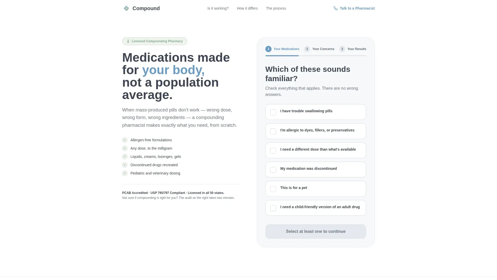
- A three-step multi-step form header functioning as a personal medication audit with a live progress bar
- A toggleable checklist section, a side-by-side pharmacy comparison block, a four-step process walkthrough, and a resource download form
- A Cloud Canvas color system, Plus Jakarta Sans headings, and DM Sans body text pre-configured throughout
Feature list
A paragraph introducing the core capabilities of this template: each feature below is built into the layout and designed to move an undecided patient toward a confident next step.
Three-Step Medication Audit Form
The header opens with a multi-step form labeled "Your Medications," "Your Concerns," and "Your Results." Visitors check plain-language boxes describing their situation. A thin prescription-pad blue progress bar starts at 33 percent before the first tap, immediately signaling forward momentum.
Toggleable Symptom Checklist
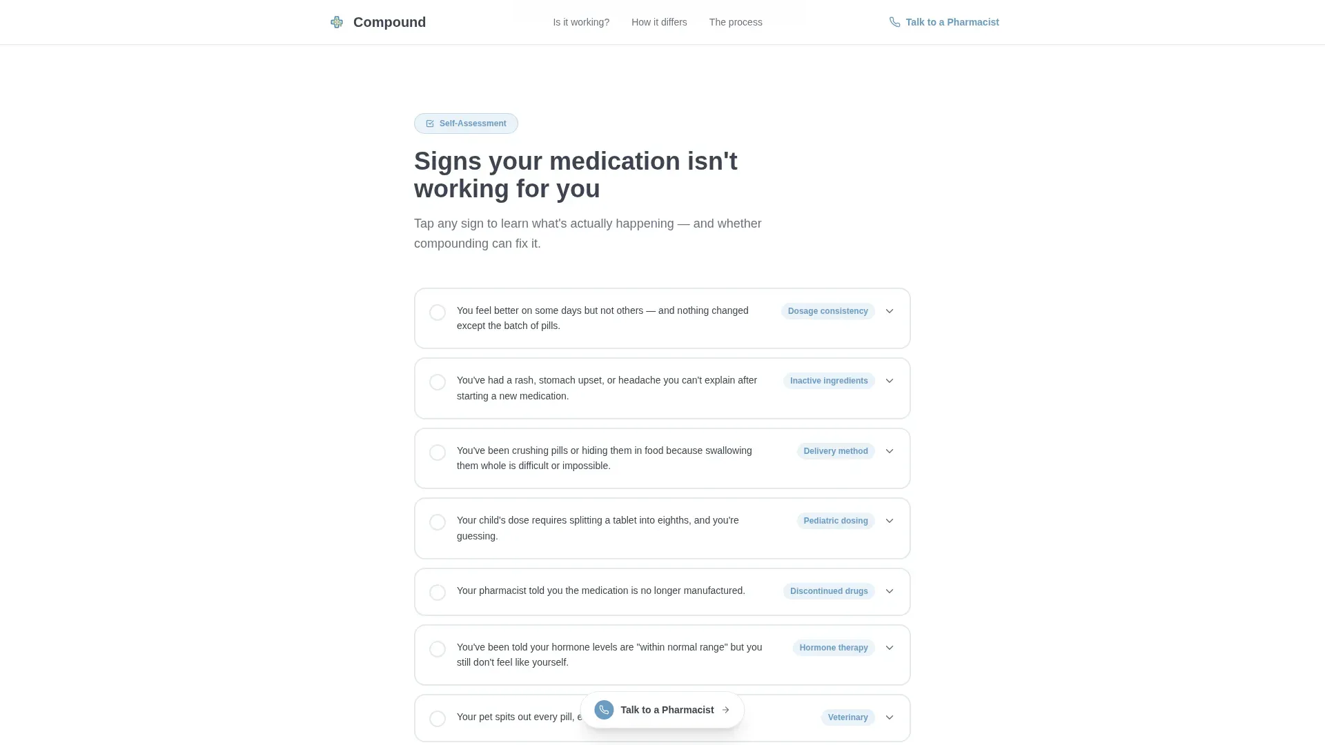
Section one presents "Signs Your Medication Isn't Working For You" as a list of tappable items. Each item expands on tap to reveal a short plain-language explanation. Visitors build personal context as they scroll without ever feeling lectured.
Side-by-Side Pharmacy Comparison
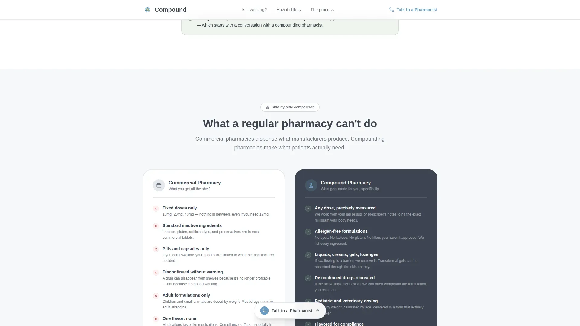
Section two displays mass-produced medication limitations alongside compounding capabilities in matching bento-style cards. The comparison is written in conversational language so patients can see the difference clearly and quickly.
Four-Step Process Walkthrough
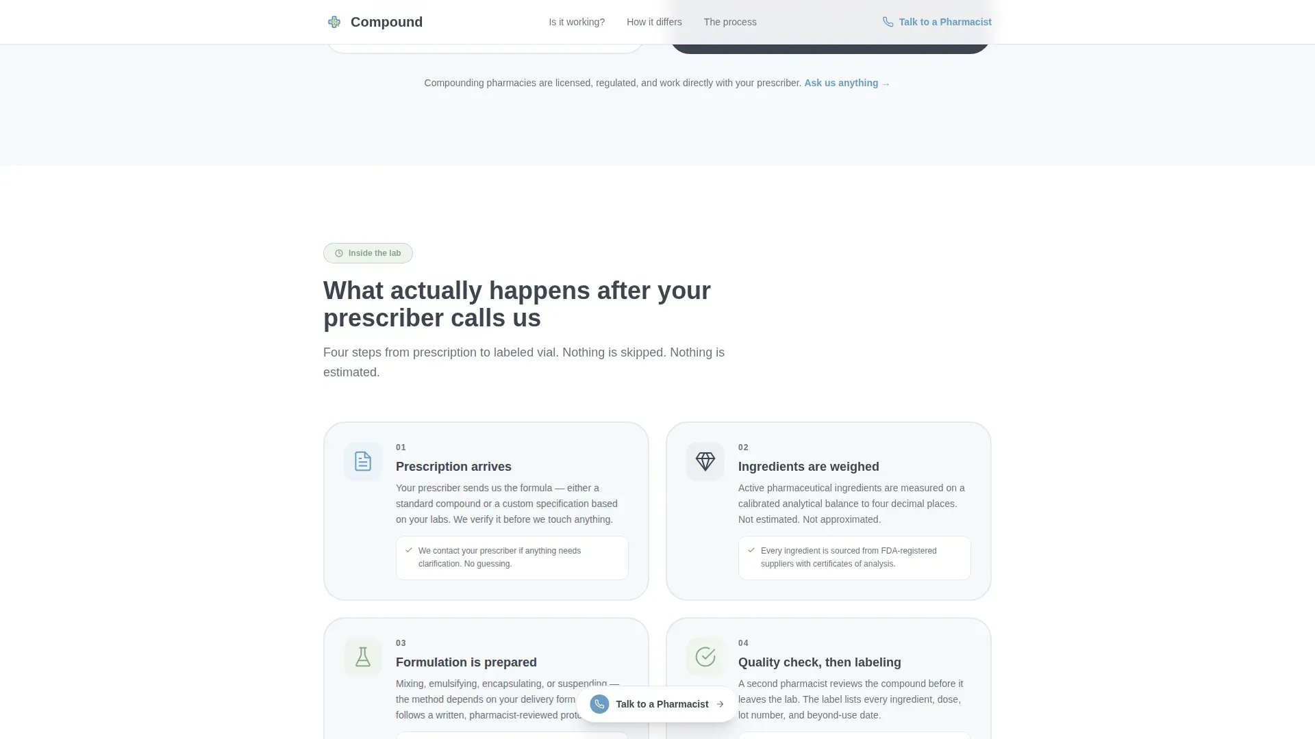
Section three walks visitors through the compounding process in four numbered steps. Each step pairs a hand-drawn-style illustration, including a mortar and pestle, digital scale, quality testing, and labeled vial, with a brief plain-language description.
Free Guide Download Form
The primary call to action exchanges a downloadable PDF covering compounding basics, insurance questions, and a doctor conversation script for an email address and a single dropdown selecting the visitor's primary concern. The form appears after the educational sections, so trust is already established.
Floating Secondary Call to Action
A "Talk To A Pharmacist" text link with a phone icon floats at the bottom of the viewport throughout the scroll experience. It never competes with the guide offer but stays within reach for visitors who prefer a direct conversation.
Page sections overview
| Section | Purpose |
|---|---|
| Medication Audit Header | Three-step form that helps visitors self-identify their medication needs |
| Symptom Signs Checklist | Toggleable list that builds personal awareness of compounding relevance |
| Pharmacy Comparison Cards | Side-by-side bento cards contrasting mass-produced versus compounded options |
| Process Walkthrough Steps | Four illustrated numbered steps explaining how compounding works |
| Guide Download Form | Email capture with dropdown exchanged for a free educational PDF |
| Floating Pharmacist Link | Persistent secondary call to action for direct phone contact |
Design & branding system
The visual identity follows an Educational Guide theme using the Cloud Canvas color system. The palette feels like a freshly printed patient handout on heavyweight paper: clinical enough to trust, warm enough to actually read.
- Soft cumulus white (#F7F8FA) dominates the background, calm graphite (#3D4551) carries all body text, and prescription-pad blue (#6B9BC3) highlights interactive elements and section anchors
- Quiet sage green (#88A68B) appears only for checkmarks, progress indicators, and trust signals, reserving its color meaning for confirmation and safety
- Plus Jakarta Sans is used for all headings; DM Sans handles body text throughout, keeping reading strain low
Mobile & speed optimization
This template is built mobile-first, recognizing that patients often research medication options on their phones during waiting room visits or between appointments. Every interactive element is sized and spaced for thumb-friendly use.
- Oversized checkboxes in the audit form, accordion toggles in the checklist, and tap-target sizing throughout are all designed for one-handed mobile use
- Scroll reveal animations, accordion toggles, step transitions, and the progress bar use a medium animation level that feels responsive without being distracting
- Server Components handle static sections while Client Components manage the multi-step form and toggleable checklist, keeping interactive areas fast without slowing down the full page load
How this template helps you convert
The conversion strategy is built on a simple principle: give answers first, earn the click second. By the time a visitor reaches the download form, they have already learned enough to trust the source.
- The three-step audit form engages visitors immediately by asking questions that feel personal and relevant, framing the pharmacy as a listener rather than a service provider
- The checklist and comparison sections deepen understanding progressively, so visitors arrive at the call to action feeling educated rather than sold to
- The free PDF offer, exchanged for only an email and one dropdown selection, keeps the barrier to conversion low while capturing a qualified lead with a declared primary concern
Other information about this template
This template is part of a broader category of healthcare and patient education landing pages designed for specialty pharmacy practices in the United States market. It is localized for English (USA), with standard US pharmacy context and USD pricing structures in mind.
- The footer follows a Linear Single-Row pattern, keeping the page clean and focused without adding navigation complexity
- Trust signals including sage-colored checkmarks, credential badge placements, and patient scenario cards are built into the layout to reinforce credibility throughout the scroll
- The template style is Single Column Flow, meaning all content is stacked vertically for a guided, distraction-free reading experience that works especially well for educational content
Theme
Educational Guide
Creative direction
Checklist & Audit
Color system
Cloud Canvas
Style
Single Column Flow
Direction
Content/Resource
Page Sections
Three-step Medication Audit Form
Toggleable Symptom Checklist
Side-by-side Pharmacy Comparison
Illustrated Process Walkthrough
Free Resource Download Form
Persistent Pharmacist Contact Link
Related questions
Who is this landing page template designed for?
What does the multi-step form in the header actually do?
Can I use this template to collect patient leads?
What is included in the free downloadable guide offer?
Does the floating call to action compete with the main conversion goal?



