Pharmacist Profile Booking Website Template
Compound is a masonry-style personal brand landing page built for pharmacists who have turned clinical expertise into a public practice. The before/after slider header, curated grid layout, and persistent booking call-to-action work together to move health-conscious visitors from curiosity to a confirmed appointment, without a single form on the page.
by Rocket studio
Quick summary
Compound is a single-page personal brand template designed for pharmacists building a direct-to-client practice. The masonry grid layout, before/after slider header, and dual call-to-action placement create a scrollable experience that earns trust card by card. Visitors arrive confused about their medications and leave with a booking confirmed.
Who this template is for
This template is built for pharmacists who have moved beyond the dispensary counter and now offer direct clinical guidance. It suits practitioners whose value lives in education, interpretation, and personal attention rather than product sales.
- Clinical pharmacists launching a personal brand or independent consulting practice
- Pharmacists creating content around drug interactions, supplement guidance, or prescription literacy
- Healthcare professionals who want a portfolio-style page that doubles as a booking funnel
What problem this template solves
Most health professionals rely on generic bio pages that list credentials but fail to communicate real-world value. Visitors arrive with specific anxieties and leave without a clear next step. This template solves that disconnect.
- It replaces a static resume page with a living demonstration of clinical expertise through the masonry grid
- It removes the friction of a contact form by routing every booking click directly to a scheduling page
- It captures undecided visitors with a secondary email opt-in tied to a practical downloadable resource
What you get with this template
You get a fully structured single-page layout with every visual element and interaction point defined. The design system, grid behavior, and call-to-action placement are all built in, ready to be populated with your content.
- A before/after slider header, masonry content grid, persistent floating call-to-action button, and inline grid call-to-action cards
- A Monochrome Steel color system with surgical white, instrument steel, charcoal slate, and clinical teal accent
- Dual call-to-action pathways: a primary booking button and a secondary email capture for a downloadable resource
Feature list
This template packages a set of purpose-built components that work together to present a pharmacist's brand with precision and momentum.
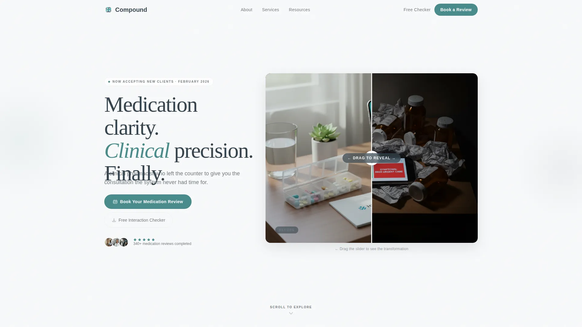
Before/After Slider Header
The header opens with an interactive slider the visitor drags themselves. The left side shows a chaotic nightstand with pill bottles and contradictory search results. The right reveals the same space transformed by clarity and organization. The headline fades in after the interaction: "Your pharmacist finally has time for you."
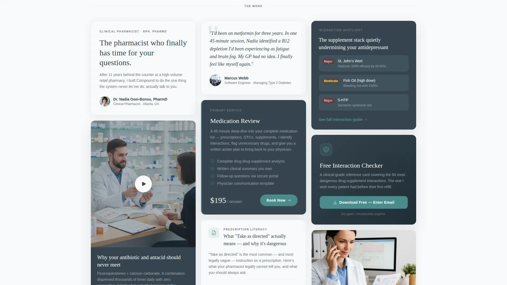
Masonry Content Grid
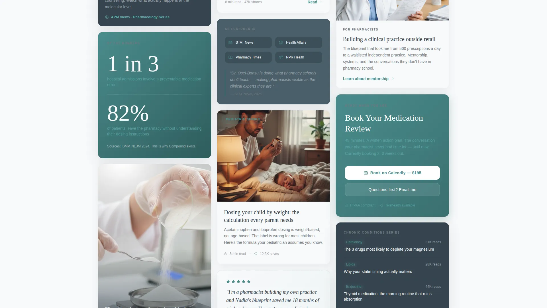
The page uses an uneven, breathing grid that places content cards at varying sizes. Video cards, testimonial cards, service cards, and editorial photos tile together without repeating the same dimensions. The diagonal pull of the layout guides the eye naturally through escalating layers of credibility.
Persistent Floating Call-to-Action
A teal "Book Your Medication Review" button anchors to the bottom-right corner throughout the scroll. It remains visible at every point on the page without interrupting the reading experience. No form is required, the click routes directly to a scheduling page loaded with service options.
Embedded Grid Call-to-Action Cards
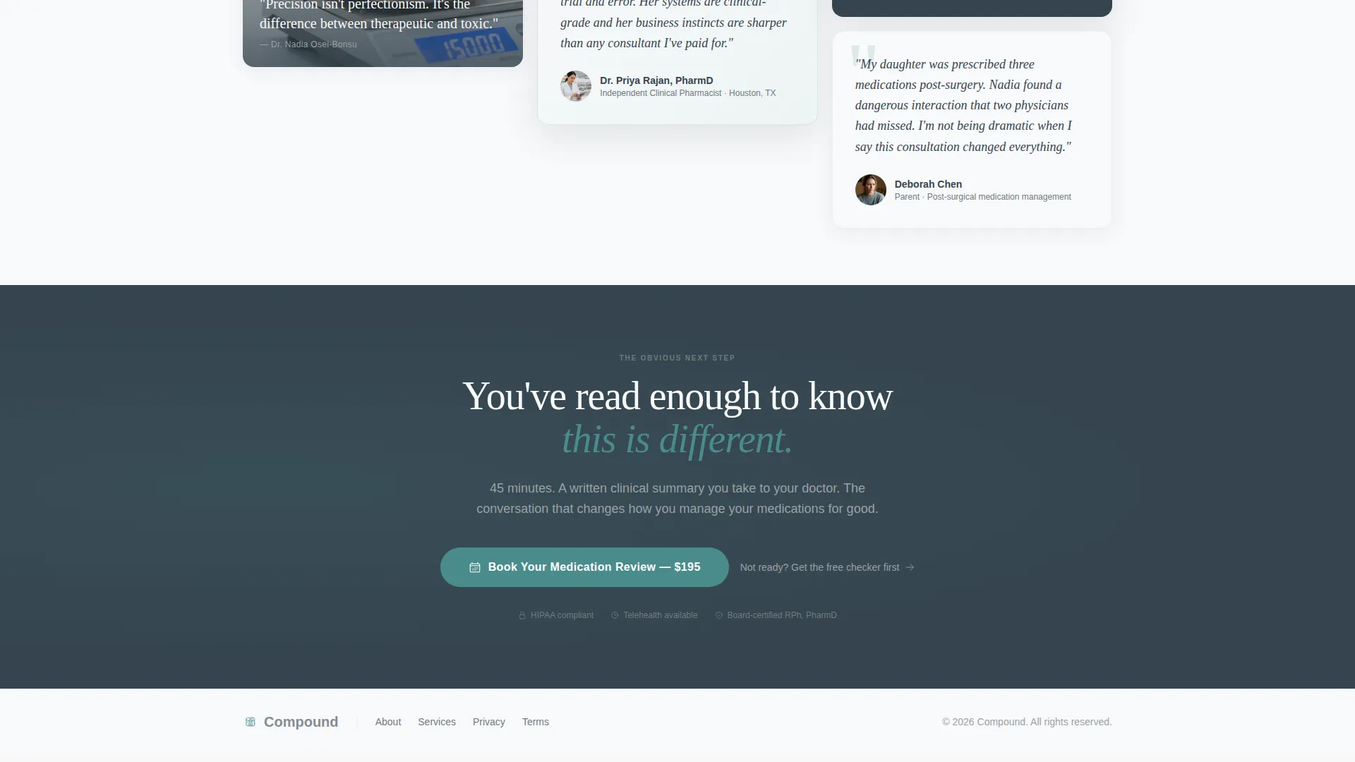
Two dedicated call-to-action cards are placed within the masonry grid at roughly one-third and two-thirds of the scroll depth. They match the visual language of surrounding content cards, so they feel native rather than promotional. Each one reinforces the primary booking action at the exact moments credibility peaks.
Secondary Email Capture
A "Download the Interaction Checker" call-to-action captures email addresses from visitors who are not yet ready to book. It gives undecided visitors a low-commitment way to enter the practice's ecosystem. The offer is practical and relevant, matching the clinical tone of the entire page.
Atelier Studio Visual Theme
The Atelier Studio theme applies a gallery-like sensibility to the layout. Backgrounds alternate between surgical white and charcoal slate to create depth and visual rhythm across the grid. The design feels like a curated studio wall, not a sales page.
Page sections overview
| Section | Purpose |
|---|---|
| Before/After Slider | Invites interaction, sets transformation narrative |
| Animated Headline | Reveals core brand promise post-interaction |
| Masonry Content Grid | Displays expertise through varied content cards |
| Video Content Card | Demonstrates clinical communication style live |
| Testimonial Pull Quote | Builds trust through oversized social proof |
| Service Product Card | Introduces the medication review offering |
| Editorial Photo Card | Adds visual credibility and personal brand texture |
| Media Feature Row | Escalates authority with third-party recognition |
| Grid call to action Card (One-Third) | Captures booking intent at first credibility peak |
| Grid call to action Card (Two-Thirds) | Reinforces booking action at second credibility peak |
| Email Capture Section | Retains undecided visitors with downloadable offer |
| Persistent Floating call to action | Maintains booking access throughout entire scroll |
Design & branding system
The design language draws from the visual vocabulary of a compounding laboratory, sterile, precise, and quietly beautiful. Every color choice and typographic decision reinforces the pharmacist's authority without feeling clinical in a cold or unwelcoming way.
- Color palette: surgical white (#F8F9FA) for primary backgrounds, instrument steel (#71797E) for body typography, charcoal slate (#36454F) for alternate grid backgrounds, and clinical teal (#4A8C8C) reserved exclusively for interactive elements and call-to-action buttons
- Typography follows the Atelier Studio theme with steel gray text carrying the quiet authority of a prescription label, while oversized serif pull quotes add editorial weight to testimonial cards
- Background alternation between surgical white and charcoal slate sections creates visual depth across the masonry grid, giving the page the feel of a curated studio wall rather than a scrollable brochure
Mobile & speed optimization
The template is designed to adapt across screen sizes while preserving the visual logic of the masonry grid. The layout prioritizes the interaction elements and call-to-action placement at every viewport.
- The masonry grid reflows responsibly for smaller screens, keeping card content readable without collapsing the visual hierarchy
- The persistent floating call-to-action button remains accessible at the bottom of the screen on mobile, so the booking path is never more than one tap away
- The before/after slider is touch-enabled, allowing mobile visitors to drag the reveal themselves and experience the same transformation narrative as desktop users
How this template helps you convert
The page is built around a click-through model, meaning every design decision drives toward a single primary action: booking a medication review. The layout earns that click through demonstrated competence rather than promotional pressure.
- The masonry grid structures content in escalating credibility waves, video content, then social proof, then service offer, then media features, so each scroll position builds on the last and primes the visitor for the call-to-action
- Two embedded grid call-to-action cards placed at the one-third and two-thirds scroll marks intercept visitors at peak engagement moments, while the persistent floating button ensures the booking path is always visible
- The secondary email capture retains visitors who are not ready to book, converting a potential exit into a warm lead through a practical, low-barrier downloadable resource
Other information about this template
This template is a strong fit for pharmacists who want their personal brand landing page to reflect the same precision they bring to clinical practice. It is built on a click-through model that avoids on-page forms entirely, keeping the experience clean and focused.
- The template style is Masonry/Pinterest, which suits content-rich practices with multiple proof points, service types, and media appearances to display
- The immersive visual creative direction means the design does the selling through atmosphere and curation rather than through copy volume or promotional language
- This template is categorized under Personal and Resume with a Pharmacist Profile subcategory, making it a precise match for independent practitioners in clinical and health-adjacent niches
Theme
Atelier Studio
Creative direction
Immersive Visual
Color system
Monochrome Steel
Style
Masonry/Pinterest
Direction
Click-Through
Page Sections
Interactive Before/after Slider Header
Masonry Pinterest-style Grid
Persistent Floating Booking Button
Dual Embedded Grid Ctas
Secondary Email Capture Call to Action
Monochrome Steel Color System
Related questions
Does this template include a contact form?
Can I use this template if I offer more than one service?
What if a visitor is not ready to book right away?
Is this template suitable for a pharmacist just starting to build an online presence?
Can the slider and grid be filled with my own content?



