Precision Pharmacy Consulting Landing Page Template
Compound is a pharmacy consulting landing page template built for firms that help independent pharmacies, small chains, and hospital outpatient departments recover DIR fee losses, pass audits, and fix broken workflows. The page pairs human credibility with hard before-and-after numbers, guiding every visitor toward a booked assessment or a free DIR fee recovery checklist download.
by Rocket studio
Quick summary
Compound is a single-page consulting template designed for pharmacy-focused advisory firms. It opens with a split photo-and-headline header, flows through team profiles and comparison tables, and closes with a booking form. The layout alternates human credibility with measurable outcome data, so visitors trust both the consultants and the results before they ever click a button.
Who this template is for
This template is built for pharmacy consulting firms that serve independent operators, small chains, and hospital outpatient departments. If your practice generates results around reimbursement recovery, regulatory readiness, or operational redesign, this page frames those results clearly.
- Independent pharmacy consultants focused on DIR fee recovery and PBM dispute resolution
- Healthcare advisory firms handling Drug Supply Chain Security Act (DSCSA) serialization and 340B split-billing audit preparation
- Boutique consulting practices that need a credible, conversion-ready web presence without a full development build
What problem this template solves
Pharmacy consulting firms often struggle to communicate specialized value on a general-purpose web page. Prospects show up with complex, high-stakes problems and need fast proof that the firm understands those problems exactly. A generic service page does not build that trust quickly enough.
- Visitors cannot easily compare their current situation against what the firm delivers, so they leave without booking
- Consultant profiles get buried in long text blocks instead of being paired with the specific outcomes they have produced
- There is no low-friction path for prospects who are researching but not yet ready to commit to a call
What you get with this template
The template delivers a structured, single-page layout built around proof and action. Every section earns the next scroll by combining a human face with a hard number or a clear next step.
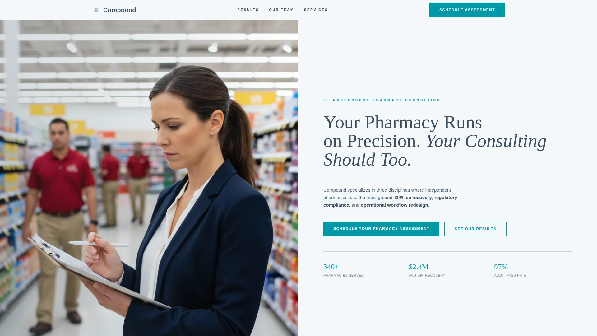
- A split-screen hero section with a headline, service pillar summary, and a teal call-to-action (call to action) button visible above the fold
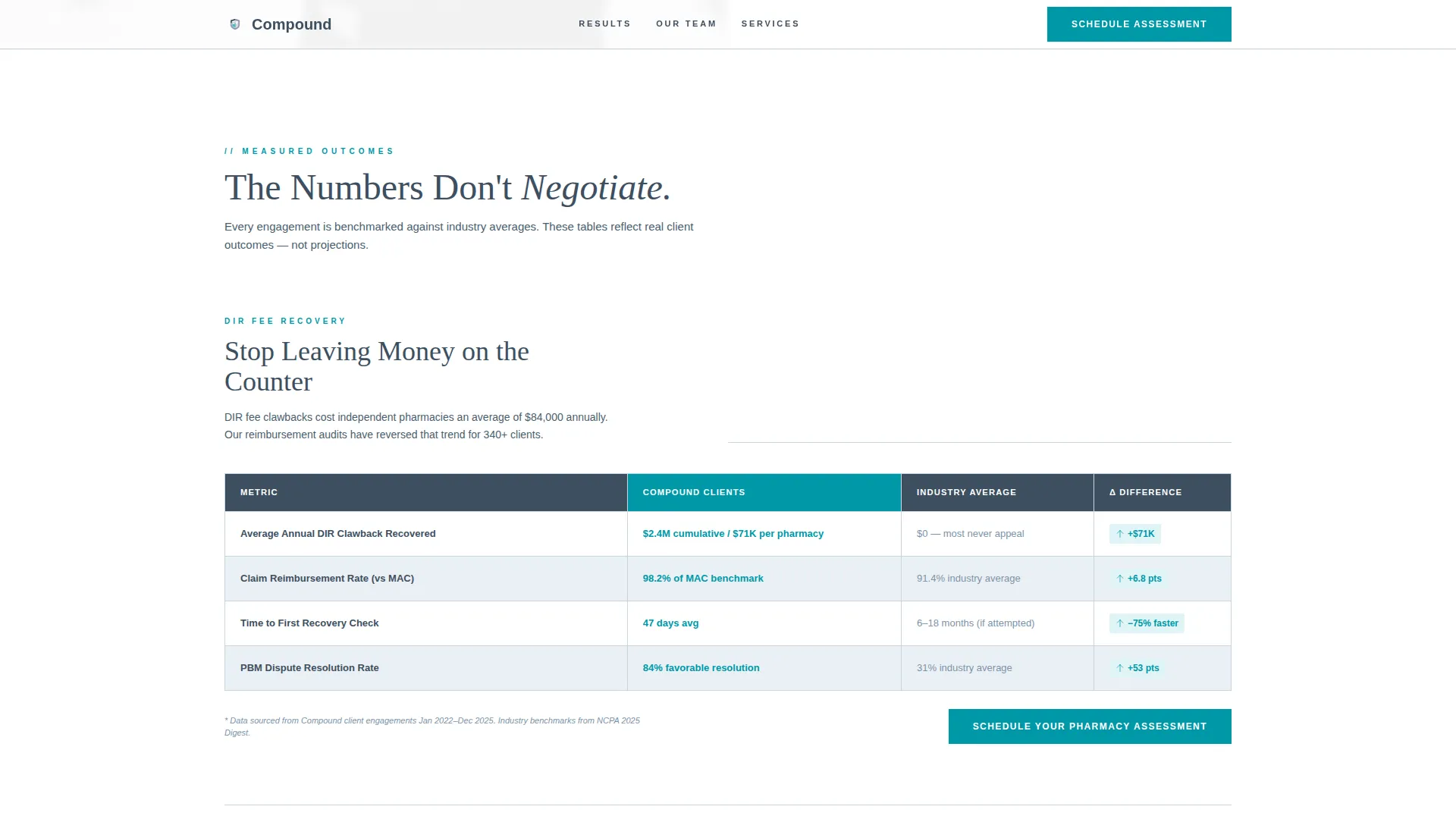
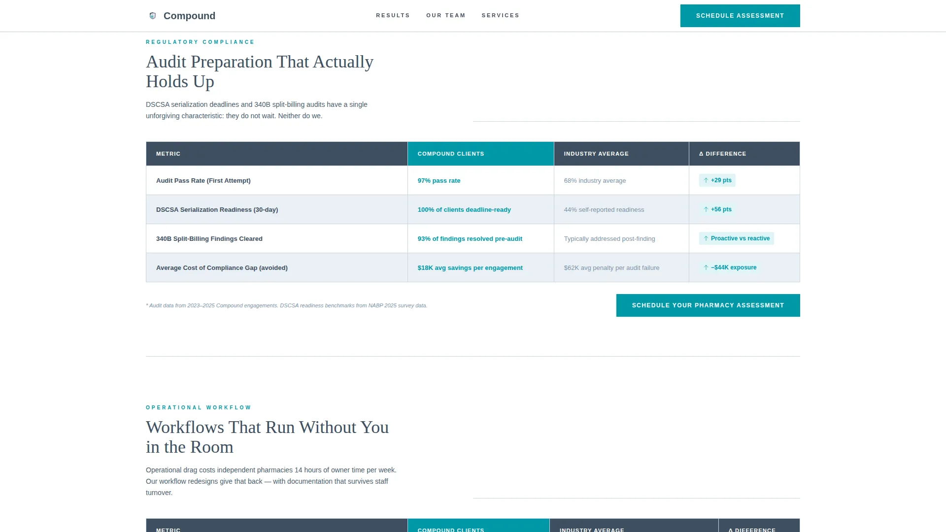
- Alternating consultant profile cards and before-and-after comparison tables showing metrics like average claim reimbursement rates, audit pass percentages, and time-to-compliance benchmarks
- A booking form with pharmacy-type and primary-challenge dropdowns, plus a lead magnet modal offering a downloadable DIR fee recovery checklist in exchange for an email
Feature list
This template is built around a small set of high-impact components. Each one earns its place by solving a specific conversion or credibility problem.
Split-Screen Hero Section
The header divides the viewport into a warm consultant-and-owner photograph on the left and a headline plus call to action on the right. The headline names all three service pillars. The teal booking button is visible without scrolling, so visitors can act the moment they decide.
Before-and-After Comparison Tables
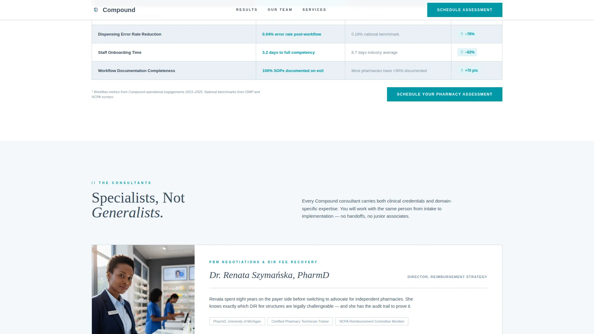
Structured data tables appear between team profiles, showing the firm's client outcomes against industry averages. Metrics include average claim reimbursement rates, audit pass percentages, and time-to-compliance figures. Rows reveal with staggered animations powered by GSAP ScrollTrigger on scroll.
Consultant Profile Cards
Each consultant is introduced individually with their specialty, a client-result stat, and their photo. The profiles alternate with comparison tables to build a rhythm of human trust followed by numerical proof. Specialties shown include reimbursement optimization, regulatory compliance, and operational workflow.
Booking and Assessment Form
The primary booking form collects pharmacy type (independent, small chain, or hospital outpatient), primary challenge from a dropdown, and preferred consultation window. It is built as an interactive Client Component so the dropdowns and validation work without a full page reload.
Lead Magnet Modal
A secondary conversion path offers a free downloadable DIR fee recovery checklist. Visitors who are not ready to book can enter their email to receive the checklist. This captures high-intent prospects still in the research phase.
Sticky Mobile call to action Bar
On mobile screens, a persistent bottom bar repeats the "Schedule Your Pharmacy Assessment" call to action. It stays visible throughout the entire scroll so the booking prompt is never more than a tap away.
Page sections overview
| Section | Purpose |
|---|---|
| Hero photo split | Establishes credibility and presents the primary booking call to action above the fold |
| Comparison tables | Demonstrates before-and-after client outcomes with industry benchmark data |
| Consultant profile cards | Pairs each specialist with their focus area and a concrete client result stat |
| Service pillars block | Names the three core offerings: reimbursement, compliance, and workflow |
| Booking form | Captures consultation requests with pharmacy type and challenge dropdowns |
| Lead magnet modal | Converts researchers into leads via a free DIR fee checklist download |
| Footer row | Provides a clean single-row navigation and contact reference |
Design & branding system
The visual identity follows a Corporate Precision theme built to feel like a freshly printed compliance report. Every color choice has a specific job, and nothing competes for attention with the primary action.
- Color palette: soft cumulus white (#F4F7FA) for backgrounds, clinical slate (#3D4F5F) for headings and table borders, muted periwinkle (#7B93A8) for secondary text, and decisive teal (#0097A7) reserved exclusively for calls to action and active comparison highlights
- Typography: DM Serif Display is used for headlines to give authority and weight; Plus Jakarta Sans handles all body and label text for clean readability at small sizes
- The overall aesthetic is structured and editorial, designed to feel trustworthy and easy to reference rather than decorative or promotional
Mobile & speed optimization
The template is desktop-first by design, reflecting how pharmacy owners and practice managers typically research consulting services. Mobile is fully supported with purpose-built optimizations.
- Static sections use server-rendered components for fast initial load; interactive elements like the booking form and lead magnet modal are scoped to client-side components only
- The sticky bottom call to action bar on mobile ensures the booking action remains accessible at every scroll depth without disrupting the reading experience
- GSAP ScrollTrigger animations are scoped to reveal effects and staggered table rows, keeping motion purposeful rather than performance-heavy
How this template helps you convert
Every layout decision in this template is built to move a skeptical, high-stakes buyer from research to booked appointment. The page does not ask for trust before it has earned it.
- The hero section puts a human moment and a clear value headline in front of every visitor first, before any service description appears, so the emotional case is made before the logical one
- Alternating comparison tables and consultant profiles build compounding credibility: each section answers a different objection, so by the bottom of the page the visitor has seen both the people and the proof
- The dual conversion path, a direct booking form plus a low-commitment lead magnet download, ensures visitors at different decision stages both have a clear and natural next step
Other information about this template
This template is part of a broader set of professional services landing page templates designed for structured, outcome-driven consulting practices. A few practical notes for teams evaluating or customizing the template are listed below.
- The footer uses a linear single-row pattern, keeping the bottom of the page clean and uncluttered without a large multi-column footer block
- The booking form dropdowns include preset options for pharmacy type and primary challenge, but both can be updated to match the firm's actual service intake language
- The template's color system is named Cloud Canvas and is built for easy brand replacement: the four-color palette uses clearly labeled roles so substituting a firm's own primary color does not break the layout logic
- Animation intensity is set to medium by default; GSAP ScrollTrigger powers the comparison table row reveals and section stagger effects throughout the page
- The template supports a USA English localization setup with date fields formatted as MM/DD/YYYY and currency references in USD
Theme
Corporate Precision
Creative direction
Team & People
Color system
Cloud Canvas
Style
Comparison Table
Direction
Booking/Scheduling
Page Sections
Split-screen Hero with Teal Call to Action
Before-and-after Comparison Tables
Consultant Profile Cards
Booking Form with Intake Dropdowns
Lead Magnet Modal
Sticky Mobile Booking Bar
Related questions
Can I update the consultant profiles to feature my real team members?
What does DIR fee mean, and why is it central to this template?
Can the before-and-after comparison tables show my firm's own numbers?
Does the lead magnet modal connect to an email marketing platform automatically?
Is this template designed for a large consulting firm only, or can a solo consultant use it?



