Employee Wellness & Benefits Directory Website Template
Conceive is a modular card grid landing page built for a fertility benefits provider targeting VP-level People Ops leaders and HR directors at tech companies. It opens with an interactive search box that triggers a five-question assessment, stacks case study proof cards by employer size, and funnels visitors toward a personalized gap analysis delivered after email capture.
by Rocket studio
Quick summary
Conceive is a sharp, proof-dense landing page for a fertility benefits provider. It uses a card grid layout to stack compressed employer case studies from startup to enterprise scale. A search-triggered micro-assessment pulls visitors into a five-question quiz, and every section moves toward one outcome: making inaction feel riskier than signing up.
Who this template is for
This template is built for a very specific audience inside the benefits and HR space. If your sales motion targets People Ops decision-makers at growth-stage or public tech companies, this page speaks their language directly.
- VP-level People Ops leaders at Series B through public tech companies evaluating fertility benefits
- HR directors fielding internal questions about IVF coverage gaps and employee retention risk
- Benefits brokers building renewal decks who need a fertility line item without a carve-out process
What problem this template solves
Many fertility benefits providers struggle to convert sophisticated HR buyers who need proof, not a product brochure. A generic page loses these visitors fast because it cannot answer the one question they actually have: what is this gap costing us right now?
- HR buyers need measurable outcomes, not feature lists, to justify a new benefits line item
- Brokers need a fast secondary path that does not force them through an employer-focused quiz flow
- The pitch has to match the pace and density of a board-level business case, not a wellness blog
What you get with this template
This template delivers a fully structured single-page layout designed around proof and conversion. Every component serves a specific role in moving the right visitor toward the right next step.
- A search box header with cycling ghost-text prompts that triggers an embedded five-question assessment
- A modular case study card grid that scales proof from 200-person startups to 10,000-person public companies
- A sticky bottom bar call to action and a secondary broker path to capture two distinct buyer types
Feature list
This template is purpose-built around the behaviors of senior HR buyers. Each feature below reflects a deliberate structural decision from the source brief.
Interactive Search-Triggered Assessment Header
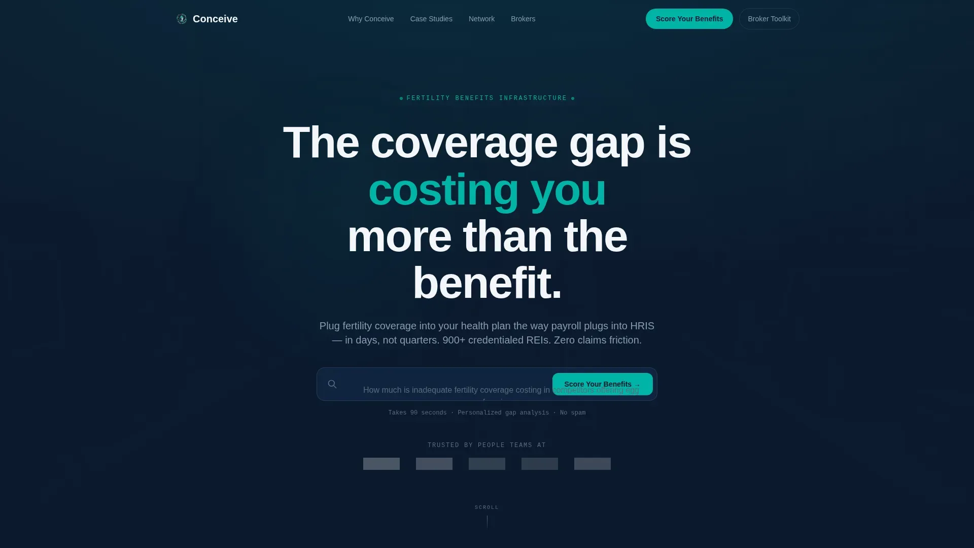
The header centers a single search input on a deep navy background. Ghost-text cycles through cost-framing prompts like turnover cost per departure and average IVF out-of-pocket. Typing immediately launches a five-question micro-assessment, pulling visitors into the quiz before they consciously decide to engage.
Five-Question Personalized Quiz Flow
The quiz collects company headcount via a slider, current fertility coverage level, top hiring competitor, annual voluntary turnover percentage, and a work email address. Results are gated behind email capture and delivered as a personalized gap analysis PDF benchmarked against industry data.
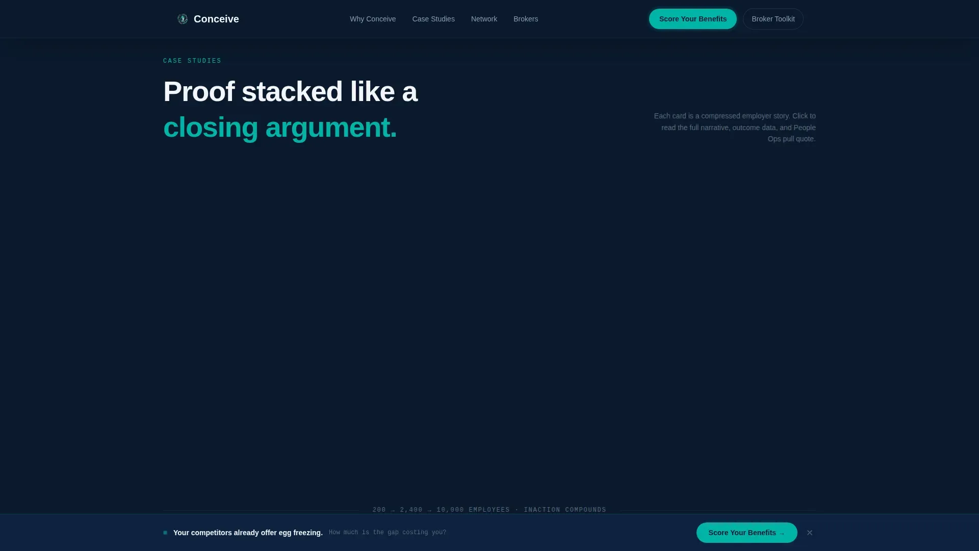
Modular Case Study Card Grid
Each card in the grid represents a compressed employer story. It displays company size, industry tag, the specific coverage gap, and the measurable outcome after implementation. On click, cards flip or expand to reveal a two-paragraph narrative and a pull quote from a People Ops lead.
Escalating Proof Sequence
Cards are ordered by employer size, starting with a 200-person startup and building to a 2,000-person scaleup, then a 10,000-person public company. This progression is intentional: it builds inevitability by showing that companies at every stage have faced and solved the same problem.
Sticky Conversion Bar
After the third row of case study cards, a sticky bottom bar appears carrying the primary call to action: "Score Your Fertility Benefits." It remains visible as the visitor scrolls, reinforcing the next step without interrupting the narrative flow of the card grid.
Dual-Path Call-to-Action Architecture
The page serves two buyer types without forcing either through the wrong funnel. The primary path routes employers into the quiz and gap analysis. The secondary path, labeled "Request a Broker Toolkit," captures benefits consultants who are building renewal decks on behalf of employer clients.
Page sections overview
| Section | Purpose |
|---|---|
| Search Box Header | Launches cost-framing quiz via interactive input |
| Social Proof Row | Displays five employer logos to build instant trust |
| Case Study Grid | Stacks employer proof cards in escalating company size |
| Sticky call to action Bar | Keeps primary quiz action visible after card row three |
| Broker Secondary Path | Captures benefits consultants through a separate call to action |
Design & branding system
The visual identity follows a Startup Velocity theme built on a Navy Authority color system. The palette is deliberately minimal and data-room serious, every color choice earning its place like a line on a pitch deck slide.
- Deep command navy (#0B1A2E) anchors all backgrounds; crisp signal white (#F4F6F9) surfaces card faces for clean contrast
- Confident teal (#00B4A6) fires on calls to action and metric callouts, signaling performance the way a green trendline signals growth
- Muted steel (#5C6B7A) handles body text and secondary labels, keeping the density readable without competing with the primary data points
Mobile & speed optimization
The card grid layout is modular by design, which means it adapts naturally to narrower viewports without sacrificing the escalating proof sequence. Each card is a self-contained unit, so the layout reflows cleanly as screen width changes.
- The sticky conversion bar is positioned to remain functional on mobile without blocking card content
- The quiz flow is structured as a linear five-step sequence that works as a focused single-column experience on smaller screens
How this template helps you convert
Every structural decision in this template points toward a single outcome: getting a qualified HR buyer to submit their work email and receive a personalized gap analysis.
- The search box header converts passive readers into active participants before they finish reading the first screen, using a cost-framing prompt to make the quiz feel personally relevant.
- The escalating card grid stacks proof in a sequence that mirrors a closing argument, each employer story raising the cost of inaction until the primary call to action feels like the obvious next step.
Other information about this template
This template is a strong fit for fertility benefits providers entering or scaling within the employer benefits market. A few additional details worth knowing before customizing and launching the page.
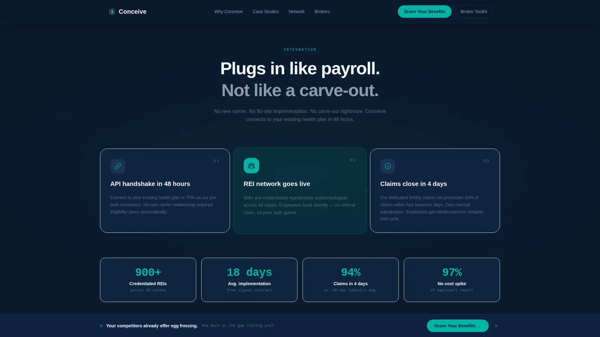
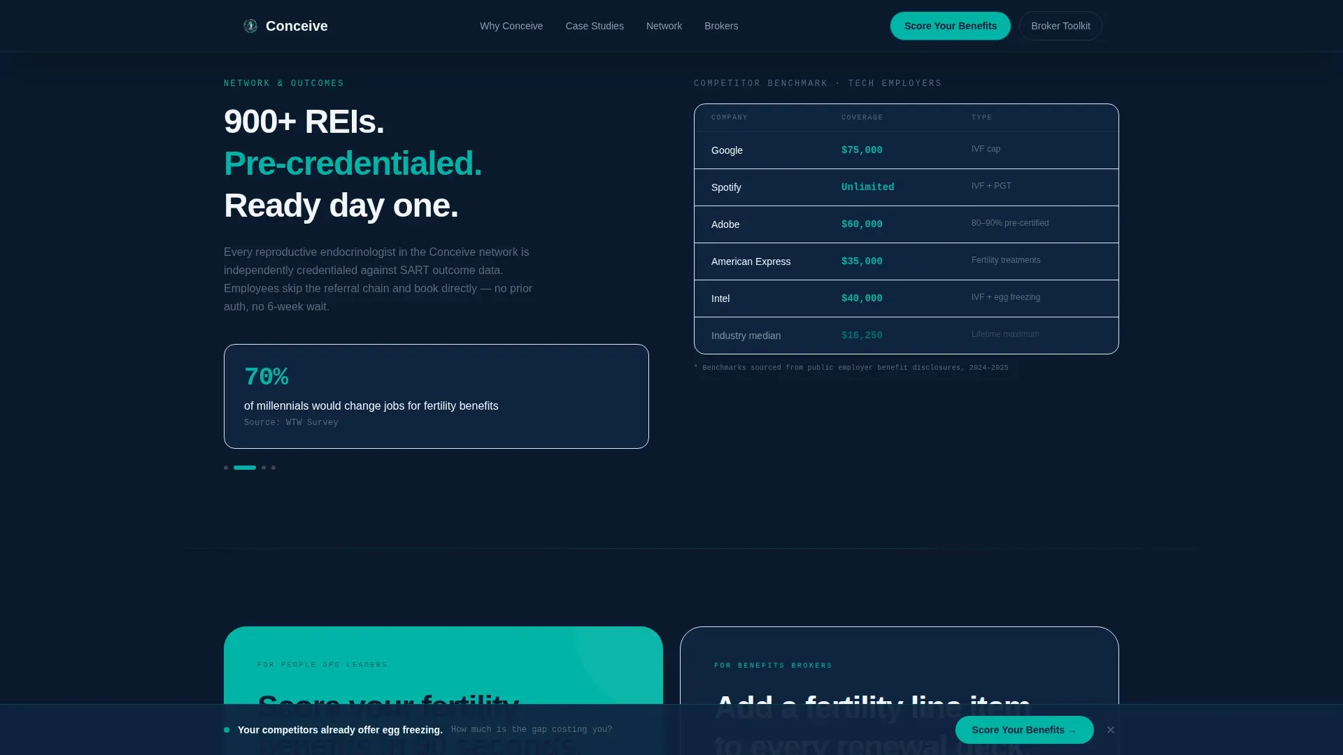
- The network of 900-plus reproductive endocrinologists already credentialed can be referenced in card narratives or proof callouts to reinforce the ready-to-deploy positioning
- The "fast integration, zero claims friction" messaging maps directly to the concerns of HR directors who have been burned by carve-out complexity in previous benefits cycles
- This template is categorized under HR and Hiring, specifically within the Employee Wellness and Benefits subcategory, making it relevant for platforms and marketplaces serving that vertical
- The Case Study Narrative creative direction means the copy framework is built to accept real client stories; placeholder cards should be replaced with verified employer outcomes before launch
- The dual-path architecture is designed to serve both direct employer buyers and benefits brokers without requiring a separate page build for each audience
Theme
Startup Velocity
Creative direction
Case Study Narrative
Color system
Navy Authority
Style
Card Grid (Modular)
Direction
Quiz/Assessment
Page Sections
Search-triggered Assessment Header
Five-question Quiz with Gated PDF Delivery
Modular Case Study Card Grid
Escalating Employer Proof Sequence
Sticky Bottom Conversion Bar
Dual-path Call-to-action Architecture
Related questions
Who is the primary audience this landing page is designed to reach?
What does the five-question quiz collect and deliver?
Can this template serve two different buyer types at once?
What makes the card grid more effective than a standard testimonial section?
When does the sticky call to action bar appear on the page?


