Fertility Wearable Landing Page Template
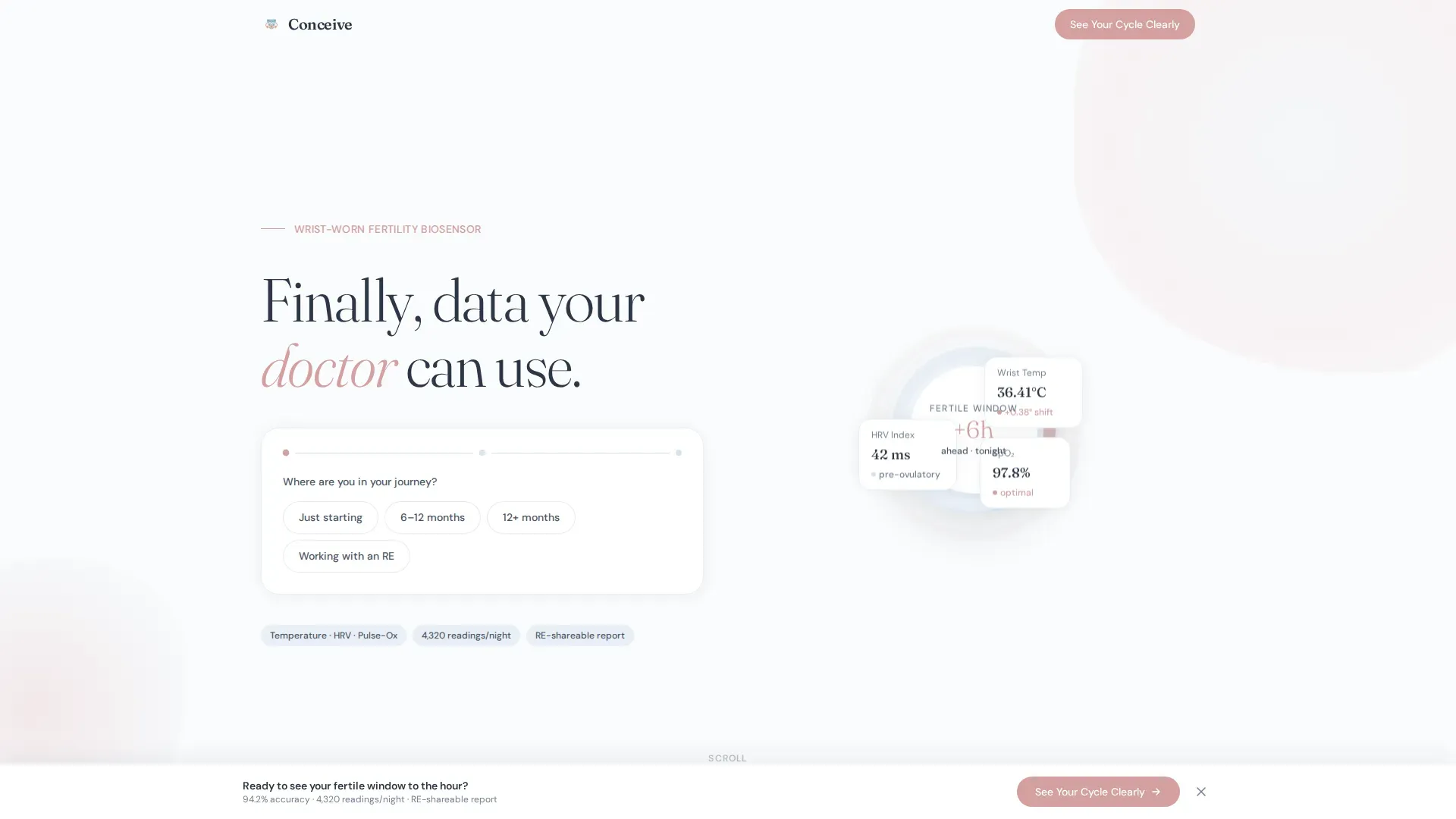
Conceive is a hub-and-spoke landing page template built for a fertility wristband that tracks basal temperature, heart-rate variability, and overnight pulse-ox. It uses a three-step intake form, named expert panels, and a click-through structure to convert couples deep in their fertility journey into confident, informed buyers ready to hand clinical data to their doctor.
by Rocket studio
Quick summary
Conceive is a single-page, anchor-navigated landing page template designed for a wrist-worn fertility monitor. It opens with a three-step intake form that personalizes content without asking for an email. Four expert-led spoke sections build clinical trust, and a warm-rose call-to-action button carries the visitor's answers directly to the product purchase page.
Who this template is for
This template speaks directly to people who have moved well past the basics of tracking ovulation. It is designed for femtech brands launching a clinical-grade wearable that needs to earn trust from an informed, emotionally invested audience before asking for a purchase.
- Femtech founders and product teams launching a reproductive health wearable
- Direct-to-consumer fertility brands that need to convert medically literate buyers
- Teams building tools designed to complement care from a reproductive endocrinologist
What problem this template solves
Couples who have been trying to conceive for over a year arrive at product pages already skeptical. Generic marketing copy and star-rating badges do not move them. They need clinical specificity, credible voices, and data they can carry into a doctor's appointment.
- Standard landing pages lead with marketing claims that informed buyers immediately dismiss
- Fertility-focused visitors need layered, expert-backed evidence before they feel safe purchasing
- Most templates cannot personalize the experience to where a visitor is in their fertility journey
What you get with this template
This template delivers a complete hub-and-spoke landing page built around four expert panel sections and a state-driven intake form. Every section has a defined clinical purpose and a clear visual hierarchy that guides the visitor from curiosity to confidence.
- A three-step personalization form in the header that tailors the visible content without collecting an email address
- Four anchor-navigated spoke sections, each led by a named clinician or data specialist
- A fixed-bottom call-to-action bar and a full-width final call-to-action that pass visitor answers as URL parameters to the product page
Feature list
This template is built around a specific set of functional and design components drawn directly from the product brief.
Three-Step Intake Form
The header form runs three gentle steps: journey stage, cycle length range via a minimal slider, and priority preference. It never requests an email. Instead, it uses the visitor's answers to tailor the page content and encode those answers as URL parameters on the call-to-action click, routing buyers to the right product bundle.
Hub-and-Spoke Anchor Navigation
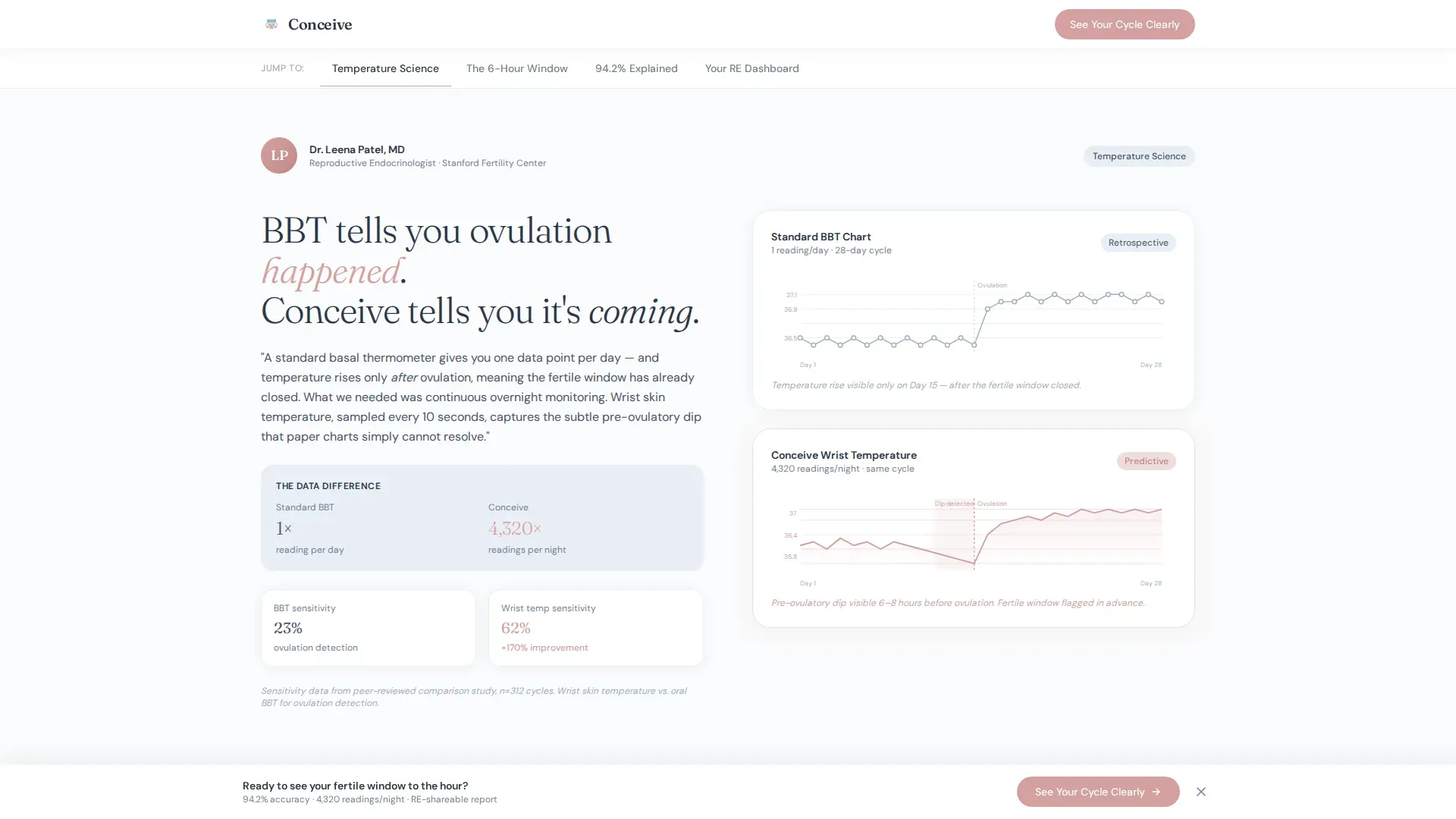
An anchor navigation bar connects the hero to four named spoke sections. Visitors can jump directly to the panel most relevant to them, whether that is temperature granularity, the six-hour prediction window, the accuracy figure, or the clinician-facing dashboard view.
Named Expert Panel Sections
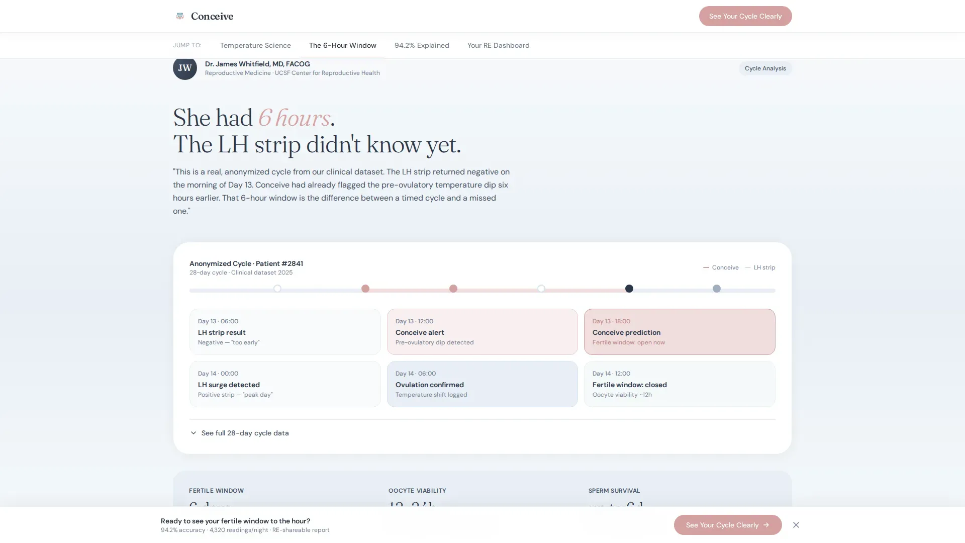
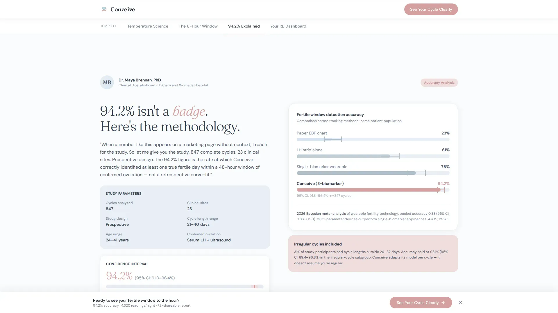
Each spoke section features a real, credentialed clinician or biostatistician speaking to one specific concern. The design mirrors eavesdropping on a fertility conference: Dr. Leena Patel covers wrist temperature versus standard basal body temperature, Dr. James Whitfield presents an anonymized real-cycle chart, and a biostatistician breaks down the 94.2 percent accuracy figure with a confidence-interval visual.
State-Driven Content Personalization
The three-step intake form is built with client-side state management. The answers a visitor selects in the header update which content emphasis appears as they scroll, making the page feel like a personal consultation rather than a broadcast.
Click-Through Call-to-Action System
The primary call-to-action, "See Your Cycle Clearly," appears as a fixed-bottom bar after the second spoke section and again at full width after the final expert panel. Both instances carry URL parameters from the intake form so the product page displays the correct bundle automatically.
Scroll-Linked Animation System
The template uses medium-intensity scroll-linked reveals and staggered card entries throughout the spoke sections. A subtle parallax effect runs on the hero visual. Client components are used only where interactivity requires them, keeping the rest of the page static for reliable rendering.
Page sections overview
| Section | Purpose |
|---|---|
| Hero Intake Form | Personalizes page content via three-step form with anchor nav |
| Temperature Truth | Dr. Leena Patel on wrist temperature versus standard BBT granularity |
| The 6-Hour Window | Dr. James Whitfield presents anonymized cycle chart with prediction comparison |
| The 94.2% Number | Biostatistician breaks down accuracy with confidence-interval visual |
| Your RE Dashboard | Shows clinicians what shared wearable data looks like in practice |
| Fixed call to action Bar | Appears after second spoke; carries URL parameters to product page |
| Full-Width Final call to action | Repeats call-to-action after final expert panel at maximum visual weight |
| Minimal Footer | Horizontal flow footer with essential links, no distracting content |
Design & branding system
The visual identity follows a Healing Space theme that reads like a Scandinavian fertility clinic at dawn. It is sterile enough to feel trustworthy and warm enough to feel human. Typography pairs Fraunces serif headlines with DM Sans body text for a literary-yet-readable combination.
- Arctic White (#FAFBFC) as the primary background, Glacier Blue (#E8EFF5) for card surfaces and section dividers, and Soft Graphite (#4A5568) for body text
- Warm Rose (#D4A0A0) is reserved exclusively for call-to-action elements and data-positive indicators, keeping the accent meaningful and visually distinct
- Fraunces handles all display and headline roles; DM Sans handles body copy, form labels, and supporting text throughout
Mobile & speed optimization
The template is designed desktop-first but places equal care on the mobile experience. The emotional decision to purchase a fertility device often happens late at night on a phone, and the layout accounts for that context with a single-column flow and thumb-friendly form controls.
- Static hero markup with client components activated only for the intake form and cycle chart interactions, keeping initial load clean
- Scroll-linked animations use staggered reveals and subtle parallax that degrade gracefully on smaller viewports without breaking the reading flow
- The fixed-bottom call-to-action bar is designed for mobile-thumb reach, with tap targets and spacing suited to one-handed use
How this template helps you convert
Conversion in this template is not driven by urgency tactics or discount banners. It is earned section by section, as each expert panel removes a specific layer of doubt. By the time the visitor reaches the final call-to-action, three credentialed clinicians have already made the case.
- The intake form makes the visitor feel heard before they scroll, establishing trust from the first interaction and reducing early bounce
- Each expert panel deepens credibility progressively: from "does it work" to "how it works" to "what your doctor will see," matching the visitor's actual decision-making process
- URL parameter passing on the call-to-action click means the product page already knows which bundle to show, removing friction at the final conversion step
Other information about this template
This template is categorized under Health and Medical, with a specific focus on infertility care and femtech wearable products. It is localized for the United States market, priced in USD, and written in American English. The landing page direction is click-through, meaning there are no on-page purchase fields; all transactions happen on the linked product page.
- The footer follows a horizontal flow pattern with minimal content to avoid distracting visitors near the end of the page
- Social proof in the template relies on named clinician credentials, a confidence-interval visualization, an anonymized real-cycle chart, and references to peer-reviewed study data, all defined in the brief
- The template is built as a hub-and-spoke anchor navigation landing page, a structure well suited to products that require staged trust-building before conversion
Theme
Healing Space
Creative direction
Expert Panel
Color system
Arctic White
Style
Hub & Spoke (Anchor Nav)
Direction
Click-Through
Page Sections
Three-step Personalization Form
Named Expert Panel Sections
Hub-and-spoke Anchor Navigation
Click-through Call to Action System
State-driven Content Display
Scroll-linked Animation System
Related questions
Does this template collect email addresses from visitors?
Can I replace the expert panel names with my own clinical advisors?
How does the URL parameter handoff work on the call-to-action?
What animations are included in this template?
Is this template designed for desktop or mobile users?



