Infertility Care Booking Website Template
Conceive is a single-column infertility telehealth landing page built for reproductive endocrinology practices. It opens with an oversized patient testimonial card, then unfolds as a sequence of real fertility questions answered by named physicians. A three-step consultation booking form and a secondary email capture path together turn empathetic content into qualified leads.
by Rocket studio
Quick summary
Conceive is a warm, FAQ-driven landing page for infertility telehealth services. It guides exhausted, hopeful patients from a single floating testimonial card through a sequence of honest physician-answered questions, and closes with a frictionless three-step booking form. Every section earns trust before asking for anything.
Who this template is for
This template is built for reproductive medicine practices and fertility telehealth providers who want to reach patients before they ever set foot in a waiting room. It works especially well for small clinics and independent reproductive endocrinologists building a direct patient pipeline online.
- Reproductive endocrinologists offering remote consultations and protocol reviews
- Fertility telehealth startups serving women tracking cycles, couples post-IUI, and patients with PCOS
- Clinics wanting to replace cold, clinical web pages with something that actually speaks to patients
What problem this template solves
Most fertility clinic websites feel like intake forms. They list services, show stock photography, and ask for a call before they have said a single thing worth trusting. Patients searching at midnight for answers to vulnerable questions find pages that do not answer them.
- Patients arrive already exhausted and dismissed; the page needs to prove competence and warmth before asking for any personal detail
- FAQ-style content that mirrors real search questions is missing from most telehealth pages, leaving high-intent visitors without reason to stay
- Generic contact forms create friction; a three-step, situational booking flow lowers the barrier to a first consultation
What you get with this template
You get a complete, single-column landing page structure designed specifically for fertility telehealth lead generation. Every section is purposeful and ordered to mirror the emotional journey of a patient moving from curiosity to readiness.
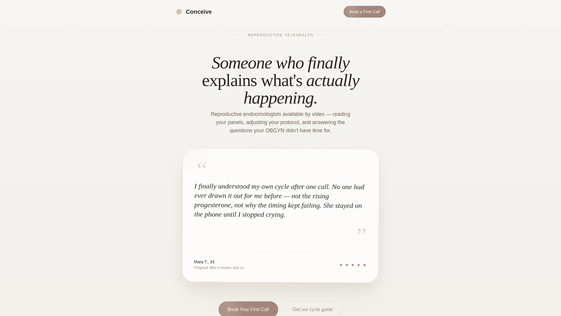
- A floating testimonial card hero with a handwritten-style quote, patient first name, age, and outcome line
- Three FAQ blocks, each anchored by a real patient question and answered in warm, medically precise language by a named physician with visible credentials
- A three-step consultation booking form covering situation, timeline, and preferred call window, plus a secondary low-friction email capture path
Feature list
Floating Testimonial Card Hero
The page opens with a single oversized card on a fog-white field. Handwritten-style quotation marks frame a real patient quote, followed by a first name, age, and a brief outcome line. A faint blush shadow gives the card physical presence without imagery or clinical photography.
FAQ-Driven Content Sections
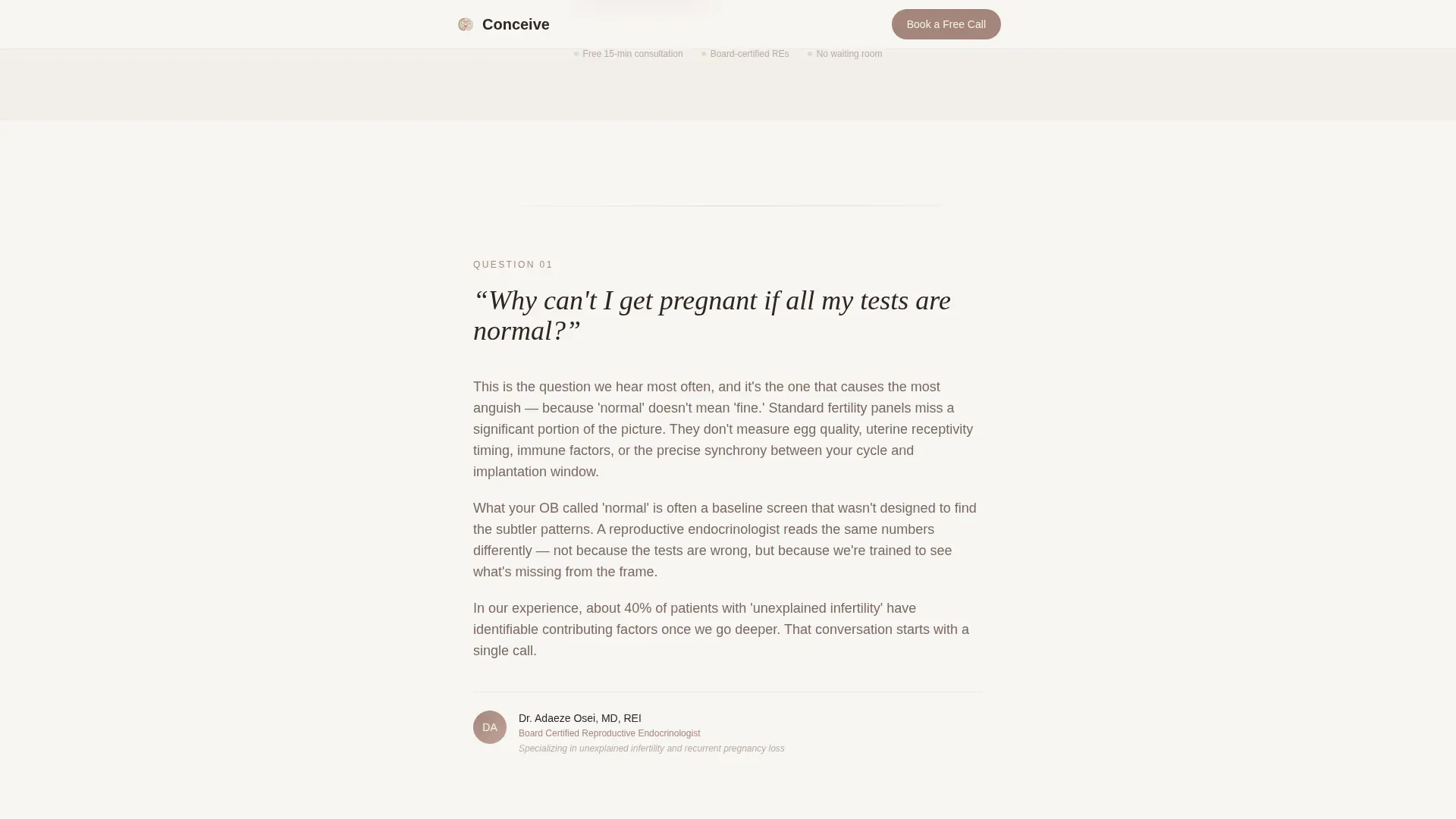
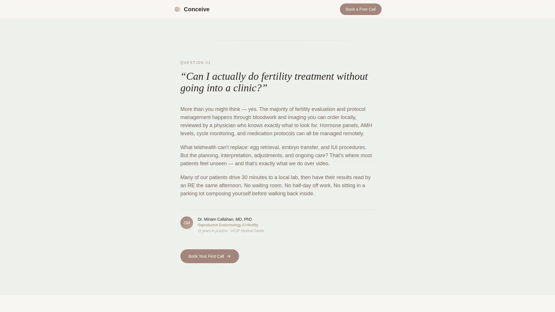
Three full FAQ blocks unfold as patients scroll. Each block anchors on a question real patients type at midnight, answered in plain and medically honest language. The questions grow more vulnerable as you scroll, reflecting the patient's own emotional journey.
Named Physician Answer Blocks
Every FAQ answer is attributed to a named reproductive endocrinologist with visible credentials. This structure builds trust through specificity. Readers see a real professional speaking to their question, not a generic article.
Three-Step Consultation Booking Form
The booking form asks only three things in sequence: what best describes the patient's situation, how long they have been trying, and their preferred time window for a free 15-minute consultation. A stepped form state reduces cognitive load and completion anxiety.
Secondary Email Capture Path
A clearly labeled alternative path, "Not ready to talk? Get our cycle guide," captures email addresses with zero friction. This keeps lower-intent visitors in the funnel without forcing them toward a phone call they are not ready for.
Repeating Warm-Clay Call to Action
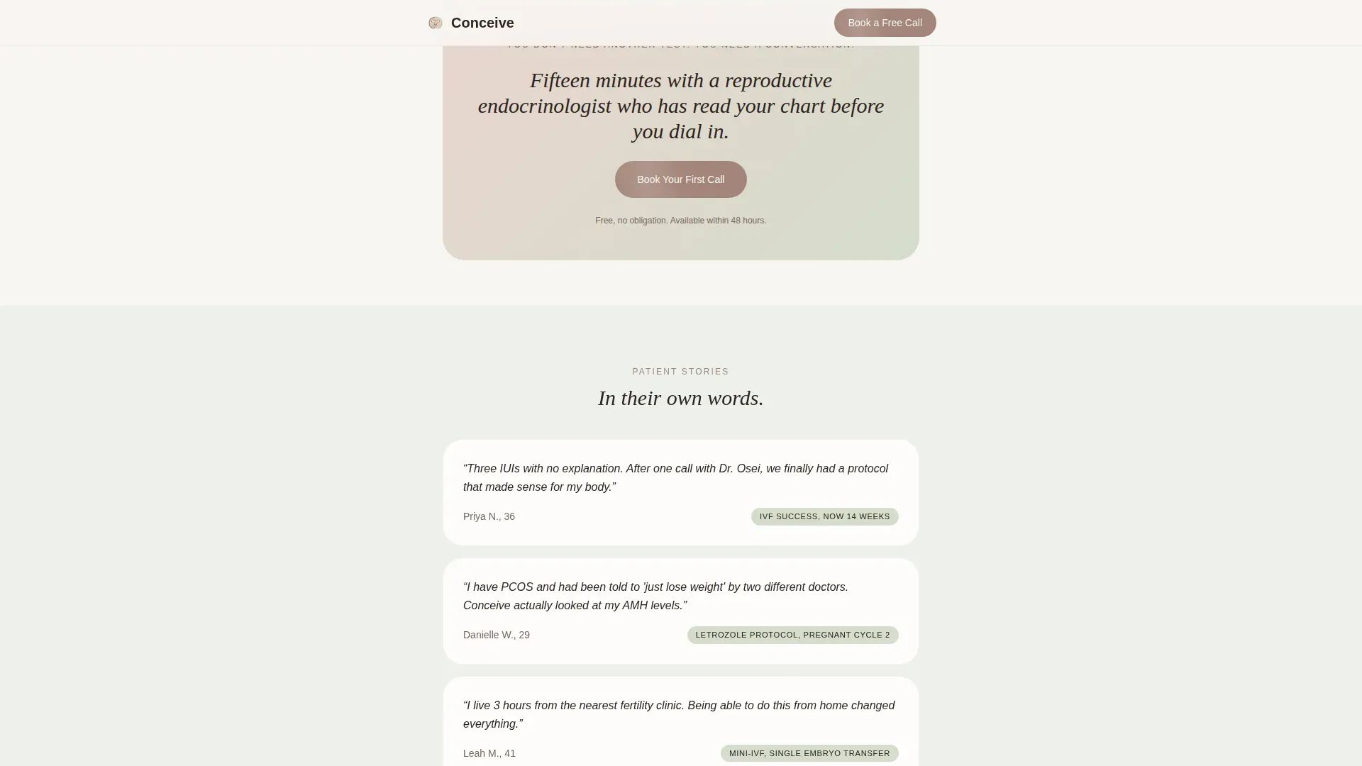
The primary call to action, "Book Your First Call," appears after every third question block. It is always rendered in warm clay on fog-white, quiet and consistent rather than urgent or pressuring.
Page sections overview
| Section | Purpose |
|---|---|
| Testimonial Card Hero | Opens the page with a real patient quote and outcome to establish immediate emotional trust |
| FAQ Block One | Answers "Why can't I get pregnant if all my tests are normal?" with physician attribution |
| Mid-Page Call to Action | Places a warm-clay booking prompt after the first question to capture early-intent visitors |
| FAQ Block Two | Answers "Can I do fertility treatment without going into a clinic?" to validate telehealth care |
| FAQ Block Three | Answers "Is it worth trying IVF at 38?" with honest, credential-backed physician perspective |
| Consultation Booking Form | Three-step form capturing situation, timeline, and preferred call window |
| Secondary Capture Path | Low-friction email opt-in for visitors not yet ready to book a call |
| Footer | Minimal horizontal footer pattern with essential links |
Design & branding system
The visual identity follows an Organic Flow theme with a Soft Mist color palette. The goal is to feel like linen curtains diffusing early light, nothing clinical, nothing sharp, every surface soft and breathable. Typography pairs Fraunces serif italic headlines with DM Sans body text for a warm editorial feel.
- Color palette: fog white (#F7F5F2), pale sage (#D5DCCD), muted blush (#E8D5CE), and warm clay (#A3857A) for buttons and interactive accents
- Typography: Fraunces italic for display headings, DM Sans for body copy, creating contrast between emotional warmth and readable clarity
- No stock photography, no baby imagery, no ultrasound visuals; the page relies entirely on language, spacing, and color to carry emotional weight
Mobile & speed optimization
This template is built mobile-first, reflecting the reality that most patients are reading on a phone, often early in the morning while tracking their basal body temperature. The single-column flow adapts naturally to small screens without layout complexity.
- Single-column structure means every section stacks cleanly on mobile without horizontal scroll or collapsed grids
- Server Components handle static content sections, with client-side rendering limited to the interactive three-step booking form
- Soft fade-in scroll animations and a gentle float on the testimonial card are tuned to medium intensity, avoiding jarring motion on any device
How this template helps you convert
The page is structured to earn the lead before asking for it. Trust is built section by section through honest content, so by the time a visitor reaches the booking form, they already feel understood.
- Each FAQ block answers a real patient question first, then naturally reveals a layer of the service without a hard sell, turning content into qualification
- The three-step booking form reduces friction by breaking a single request into three small, situational choices, making completion feel approachable rather than clinical
- The secondary email capture path ensures that visitors who are not yet ready to book still enter the funnel, giving the practice a second opportunity to convert them later
Other information about this template
This template is localized for English (US) audiences, with date formatting in MM/DD/YYYY and pricing references in USD where relevant. It is designed for the specific emotional and informational needs of the infertility care space and is not a general-purpose medical template.
- The Organic Flow theme and Soft Mist color system are intentional choices for the infertility telehealth niche, where clinical coldness actively erodes patient trust
- Animation is set to medium intensity: soft fade-in on scroll and a gentle float effect on the testimonial card, with no jarring transitions that could feel disorienting on mobile
- The template structure supports a named-physician content model, meaning each FAQ answer block includes a credential line, which reinforces medical authority without requiring a separate "Meet the Team" page
- The FAQ-driven creative direction mirrors the way real patients research infertility online, aligning page structure with genuine search behavior at the section level
Theme
Organic Flow
Creative direction
FAQ-Driven
Color system
Soft Mist
Style
Single Column Flow
Direction
Lead Generation
Page Sections
Floating Testimonial Card Hero
Faq-driven Scroll Structure
Named Physician Answer Blocks
Three-step Consultation Form
Secondary Email Capture Path
Repeating Contextual Call to Action
Related questions
Can I customize the FAQ questions and physician names in this template?
Does the booking form connect to a scheduling tool?
Is this template suitable for a solo reproductive endocrinologist practice?
What happens to visitors who are not ready to book a call?
Can I use this template if I also offer in-person consultations?



