Infertility Care Booking Website Template
Conceive is a fertility mental wellness landing page template built for digital therapy apps serving IVF patients, couples post-loss, and partners navigating infertility grief. It combines an award badge header, testimonial-comparison mosaic, and a three-step booking flow to move emotionally exhausted visitors from first scroll to a free orientation session booking with warmth and clinical credibility.
by Rocket studio
Quick summary
Conceive is a single-page booking template for a fertility-focused digital therapy app. It opens with trust credentials, flows through alternating patient testimonials and comparison tables, and closes with a structured scheduling flow. The design uses a Soft Mist color palette and Testimonial Mosaic layout to make visitors feel safe, supported, and ready to book.
Who this template is for
This template is built for fertility mental wellness app founders, reproductive health startups, and digital therapy teams who serve people mid-treatment. It suits anyone who needs to convert emotionally raw visitors into booked orientation sessions without feeling clinical or transactional.
- Women mid-IVF cycle, post-loss, or after failed transfers who need structured emotional support
- Partners who feel excluded from the fertility grief conversation and want a couples-inclusive space
- Reproductive health app teams who need a landing page that earns trust before asking for a booking
What problem this template solves
People navigating infertility often feel unseen by standard mental health platforms. Generic therapy apps do not address failed transfers, unexplained diagnoses, or the specific grief of monthly negatives. This template solves the credibility and emotional connection gap for fertility therapy apps trying to reach a highly research-oriented audience.
- Visitors arrive emotionally guarded and need proof before they will engage with any call to action
- Standard booking pages feel cold to IVF patients who are already overwhelmed by clinical portals
- App founders have no structured way to present clinical outcomes alongside patient stories in a single persuasive flow
What you get with this template
This template delivers a complete single-page layout with every section needed to take a first-time visitor from quiet skepticism to a confirmed booking slot. Each section is purposefully sequenced to build emotional resonance before presenting clinical evidence.
- A structured five-section landing page: hero with award badges, testimonial-comparison mosaic, how-it-works flow, partner comparison section, and a booking call-to-action with sticky bar
- Interactive comparison tables showing guided protocol outcomes versus unstructured therapy versus no support, and solo apps versus couples-inclusive platforms
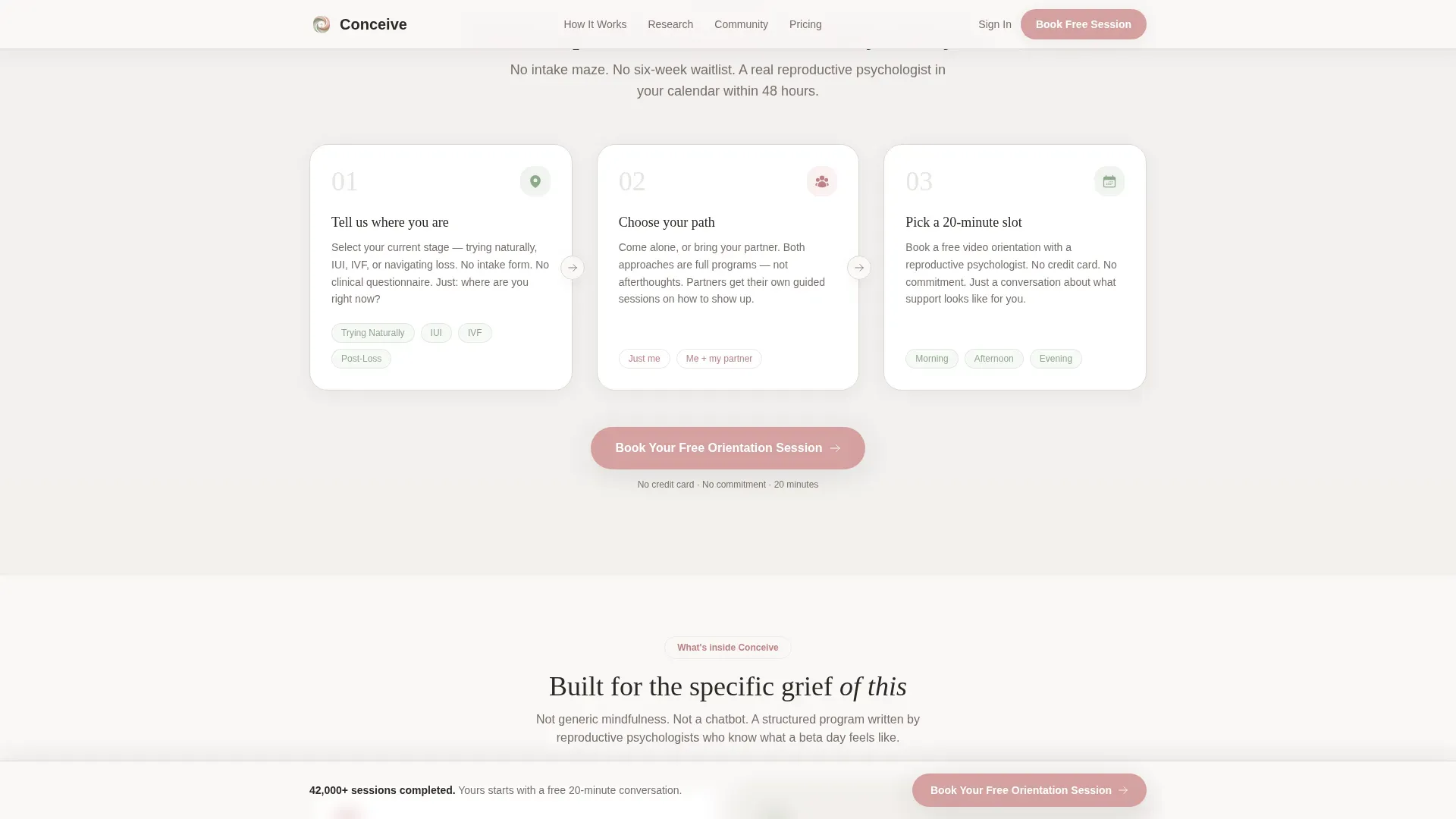
- A three-step booking modal: treatment stage selection, solo or couples choice, and a 20-minute video slot picker with no credit card required
Feature list
This template includes a focused set of interactive and visual components, each designed around the specific emotional and informational needs of fertility therapy visitors.
Award Badge Header Field
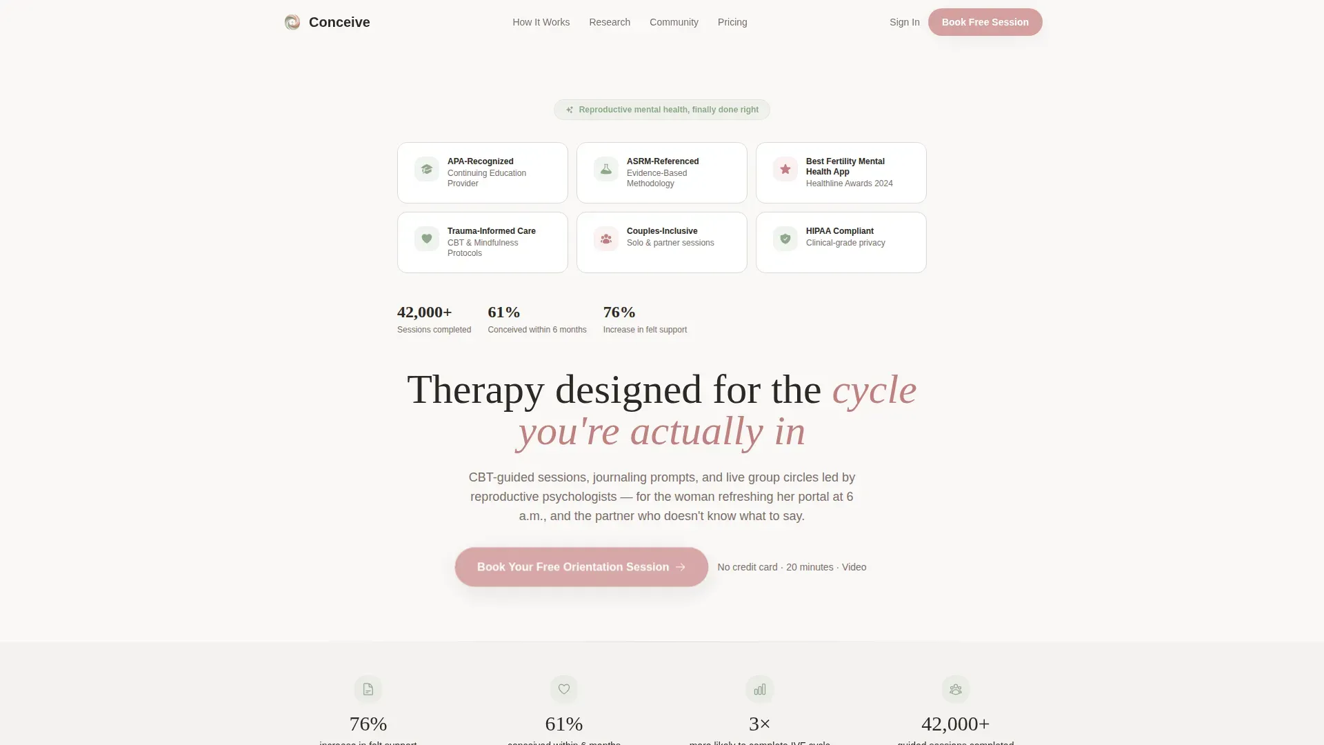
The hero opens with a clean array of trust credentials on a linen white background. Badges reference APA recognition, an American Society for Reproductive Medicine (ASRM)-referenced methodology, a "Best Fertility Mental Health App 2024" award, and a live session counter showing 42,000+ completed sessions. Staggered reveal animations bring each badge in on scroll without feeling showy.
Testimonial Mosaic Layout
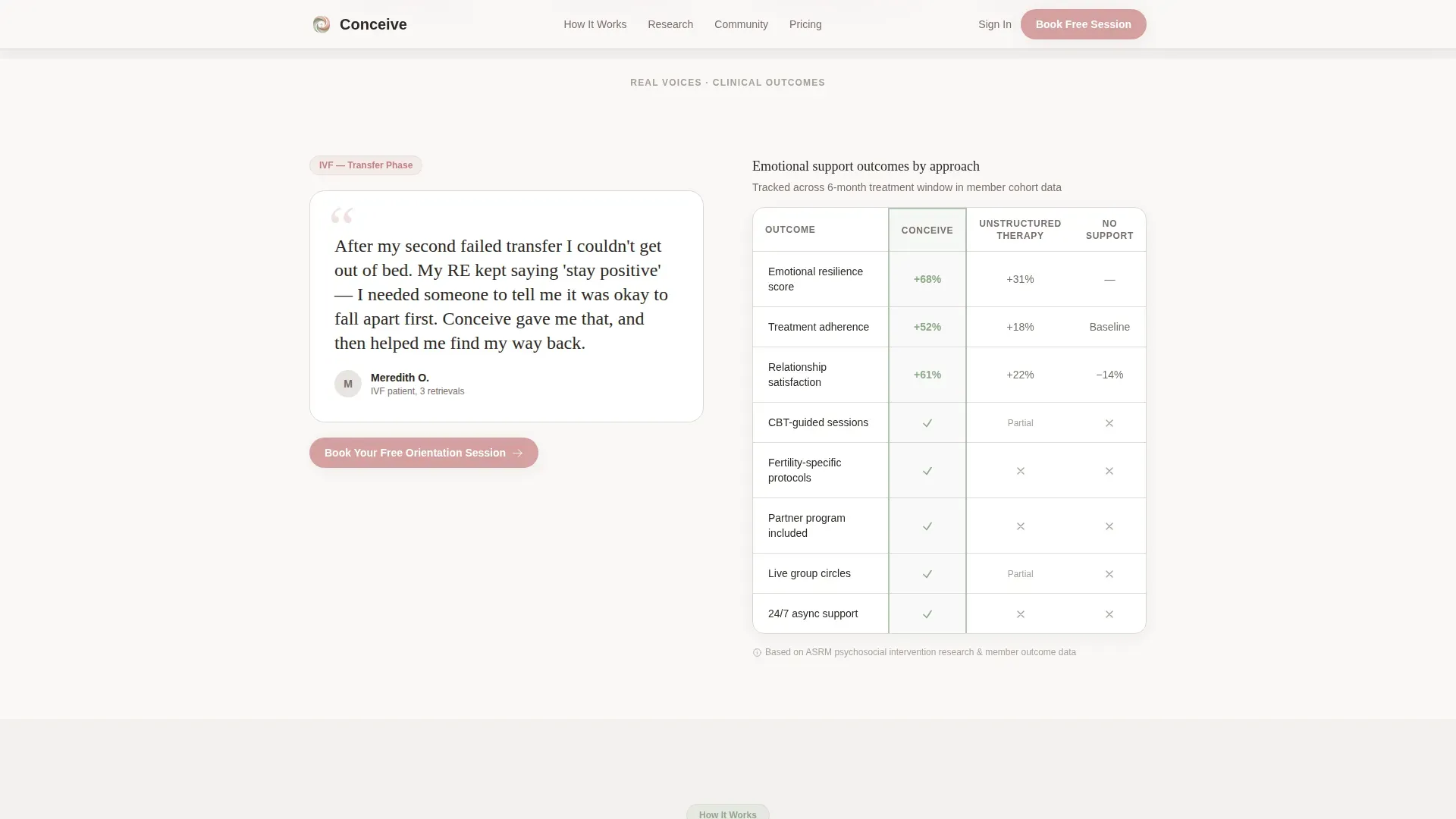
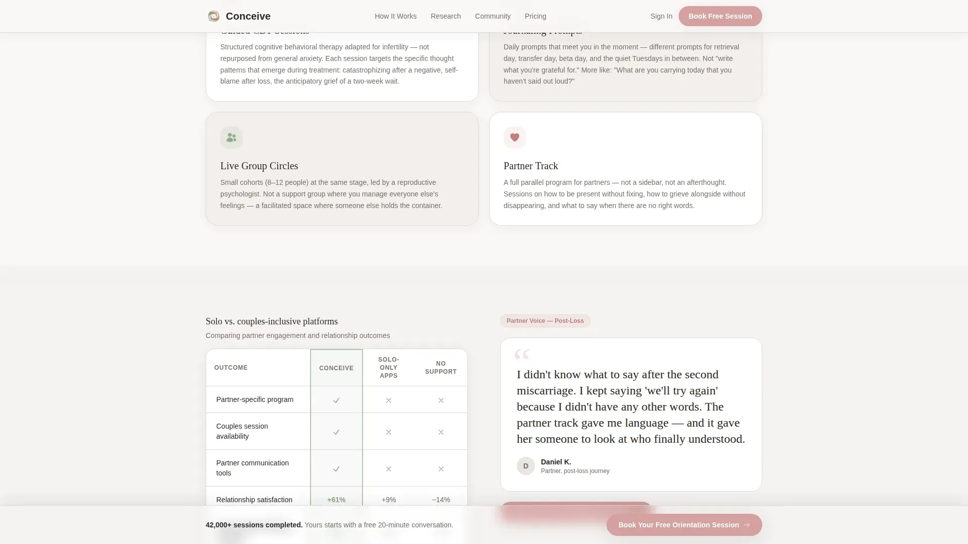
Patient and partner quotes are arranged in a mosaic grid that alternates between raw emotional testimony and structured evidence. Each testimonial tile is paired with a corresponding comparison table so visitors feel both understood and informed within the same visual unit.
Tabbed Comparison Tables
Two interactive comparison tables sit inside the mosaic. The first compares the app's guided CBT protocol against unstructured therapy and no support, tracking emotional resilience, treatment adherence, and relationship satisfaction. The second compares solo therapy apps against couple-inclusive platforms, directly addressing the partner audience.
Three-Step Booking Modal
The primary call to action opens a focused modal with three sequential steps: select your treatment stage (trying naturally, intrauterine insemination, IVF, or post-loss), choose solo or couples format, then pick a 20-minute video slot with a reproductive therapist. No payment details are collected at this stage.
Sticky Booking Bar
After the page midpoint, a warm blush-accented sticky bar remains visible at the bottom of the screen. It repeats the primary call to action so visitors can book at any scroll depth without needing to return to the top of the page.
Scroll-Triggered Fade Animations
Section transitions use medium-intensity scroll-triggered fade-ins throughout. Badge reveals are staggered. Session counter numbers animate upward on entry. The animation pace is calm and intentional, matching the soft emotional tone of the overall design.
Page sections overview
| Section | Purpose |
|---|---|
| Hero Badge Field | Establish credibility with award symbols and a fade-in headline |
| Testimonial Comparison Mosaic | Pair patient voices with outcome evidence in alternating tiles |
| How It Works | Walk visitors through the three-stage onboarding flow |
| Partner Comparison Section | Address partners with solo-versus-couples support data |
| Booking call to action + Sticky Bar | Drive free orientation session bookings with no friction |
Design & branding system
The visual identity uses a Soft Mist palette that feels like early morning light through sheer curtains. Typography pairs Fraunces, a serif display face, with DM Sans for body copy. The overall style is described in the brief as an Educational Guide theme: structured enough to feel credible, warm enough to feel human.
- Color tokens: morning fog gray (#E8E4E1), washed linen white (#FAF8F6), quiet sage (#B5C4B1), and warm blush (#D4A0A0) reserved for calls to action and emotional highlights only
- No imagery of babies, nurseries, or stock couples; the restrained visual field communicates respect for where the visitor is emotionally
- Fraunces handles display headlines for warmth and personality; DM Sans handles all body text for legibility at small sizes on mobile screens
Mobile & speed optimization
The template is built mobile-first to match real usage patterns. IVF patients check beta results on their phones at 6 a.m., and the layout prioritizes that context from the first viewport down to the booking modal.
- The three-step booking modal is touch-optimized for single-handed use on small screens
- Static sections use Server Components to keep JavaScript payload minimal and initial load fast
- Scroll animations are calibrated for mobile viewports so fade-ins trigger at the right scroll depth on smaller screens
How this template helps you convert
Every section in this template is sequenced to reduce resistance and build confidence before the visitor reaches the scheduler. The strategy is to let patients speak first, then let data confirm what they said.
- The award badge header answers the credibility question before the visitor has even read a headline, removing the first objection without asking anything in return.
- The testimonial-comparison mosaic pairs emotional recognition with structured outcome evidence, so by the time visitors reach the booking call to action, they are asking "which slot fits my calendar" rather than "does this actually work."
- The sticky booking bar ensures the call to action is always one tap away, removing the friction of scrolling back to convert after a decision moment anywhere on the page.
Other information about this template
This template is categorized under Health and Medical, specifically within the Infertility Care subcategory, and is designed for the Infertility Digital Therapy App niche. It uses the Comparison Table template style alongside the Testimonial Mosaic creative direction, making it suited for any fertility mental health platform that needs to present both emotional proof and clinical differentiation on a single page.
- The footer uses a Linear Single-Row pattern for clean, uncluttered page closure
- Localization defaults are set for English (US) with USD currency and MM/DD/YYYY date formatting
- The Intersection Match Score for this template's niche alignment is 13, reflecting a highly specific fit for the Infertility Digital Therapy App use case
- Social proof figures referenced in the template include 42,000+ completed sessions, a reported 61% pregnancy rate among users, and a 76% increase in feelings of partner support
Theme
Educational Guide
Creative direction
Testimonial Mosaic
Color system
Soft Mist
Style
Comparison Table
Direction
Booking/Scheduling
Page Sections
Award Badge Hero with Animated Credentials
Testimonial Mosaic with Comparison Tables
Three-step Booking Modal
Sticky Bottom Booking Bar
Soft Mist Visual Identity System
Scroll-triggered Fade and Counter Animations
Related questions
Who is this landing page template designed for?
What do the comparison tables in this template show?
Does the booking flow ask for a credit card?
What visual style does this template use?
Can this template support a small fertility wellness practice?



