Concierge Medicine Practice Website Template for Direct-Pay Patients
A sidebar companion landing page built for concierge medicine practices. It follows a Problem-to-Solution scroll arc that moves skeptical visitors from frustration to confidence, ending at a complimentary meet-and-greet booking. The fixed sidebar evolves through three progressive scheduling steps, reducing friction at every stage. Designed in a Medical Clarity style with a Slate and Sky color system.
by Rocket studio
Quick summary
This template is a single-page, sidebar companion layout built specifically for concierge and boutique medicine practices. It guides visitors through a clear Problem-to-Solution arc, contrasting the frustrations of conventional care with the calm certainty of direct-access medicine. A persistent scheduling sidebar evolves contextually as the visitor scrolls, walking them toward a complimentary meet-and-greet appointment with minimal friction.
Who this template is for
This template is designed for private physicians and boutique medical practices that compete on personal access, continuity, and unhurried care rather than volume. It speaks directly to the patients those practices want to reach.
- Concierge and direct primary care physicians launching or refreshing their practice presence
- Boutique medicine groups targeting executives, professionals, and families who want a dedicated physician
- Private practice owners who need a conversion-focused page without a complex multi-page build
What problem this template solves
Most medical practice pages look like insurance-company portals. They lead with credentials and stock photography, then bury the booking process three clicks deep. That design works against concierge medicine, where the entire value proposition is ease of access and personal trust.
- Visitors arrive skeptical after years of rushed appointments and unanswered calls, and generic practice pages do nothing to address that skepticism
- No fixed sidebar means booking intent disappears the moment a visitor gets distracted mid-scroll
- Without a clear contrast between conventional and concierge care, visitors cannot quickly understand what makes the practice worth a membership fee
What you get with this template
You get a fully structured, single-page layout that does the selling before the visitor even reaches a form. Every section is purposeful, and the sidebar companion stays present throughout without interrupting the reading flow.
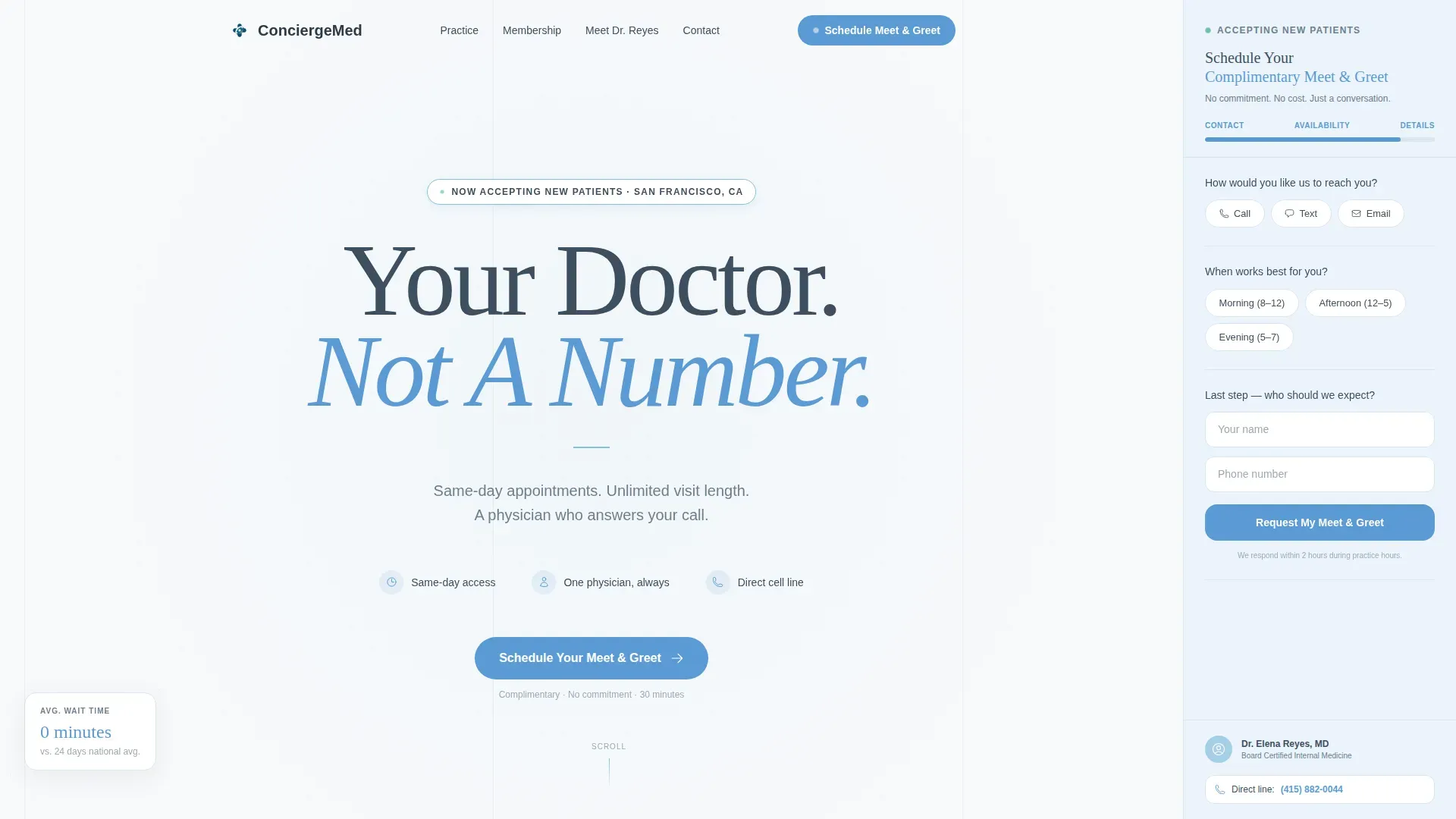
- A hero section with a bold serif headline, a grounding subline, and the persistent sidebar scheduling widget already visible on load
- A Problem-to-Solution contrast section, a three-portrait audience section, a testimonial section with quote cards, and a secondary practice guide call-to-action section
- A sidebar that moves progressively through appointment types, open time slots, and a short intake form as the visitor scrolls
Feature list
This template's features come directly from its brief and are grounded in what the layout actually delivers.
Progressive Sidebar Scheduling Widget
The fixed sidebar is not a static form. It opens showing available appointment types, shifts to open time slots as the visitor continues reading, and closes on a brief intake form. Contact preference comes first, followed by availability preference, then name and phone number last. This sequence earns personal information gradually rather than demanding it upfront.
Problem-to-Solution Scroll Arc
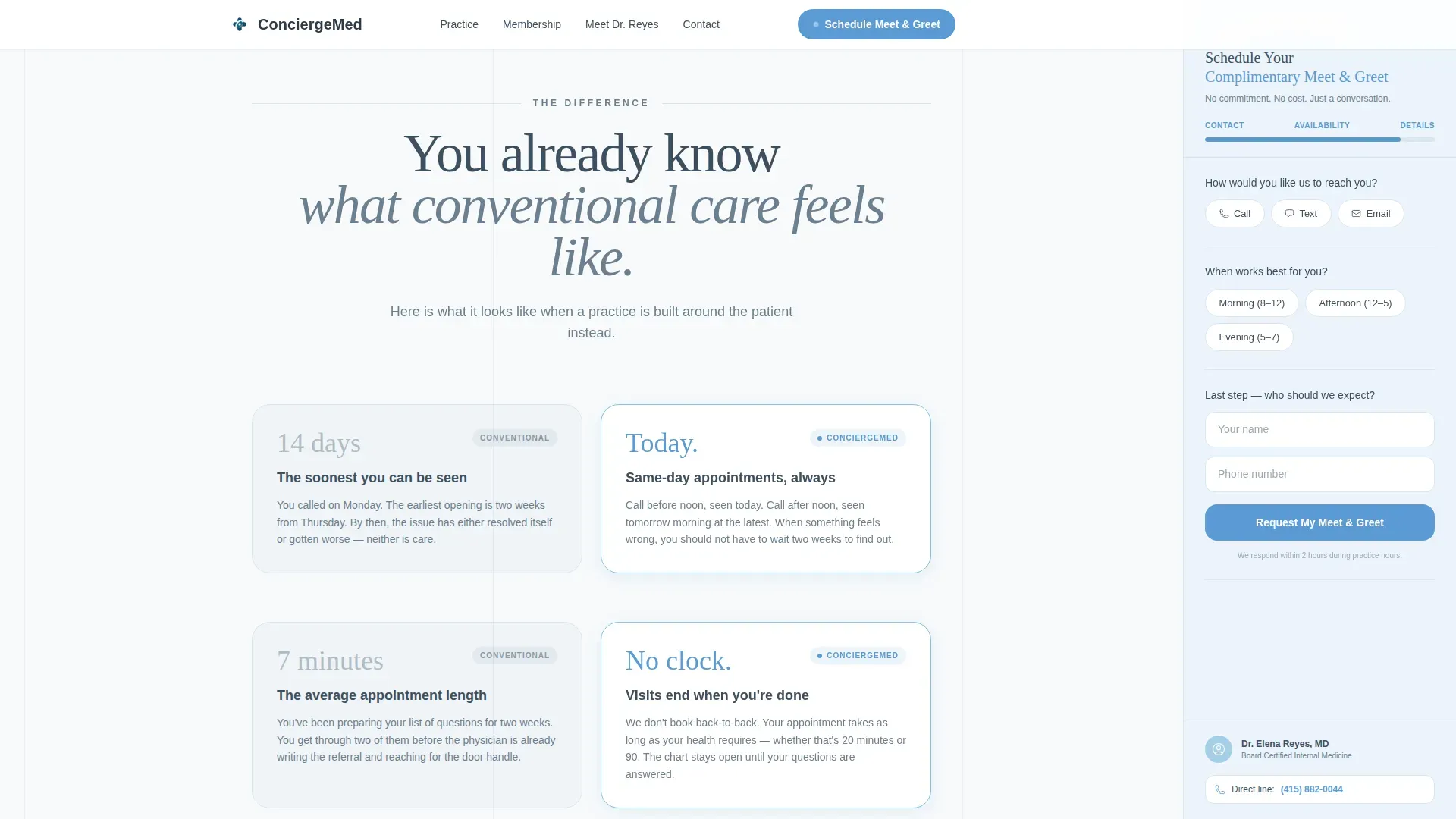
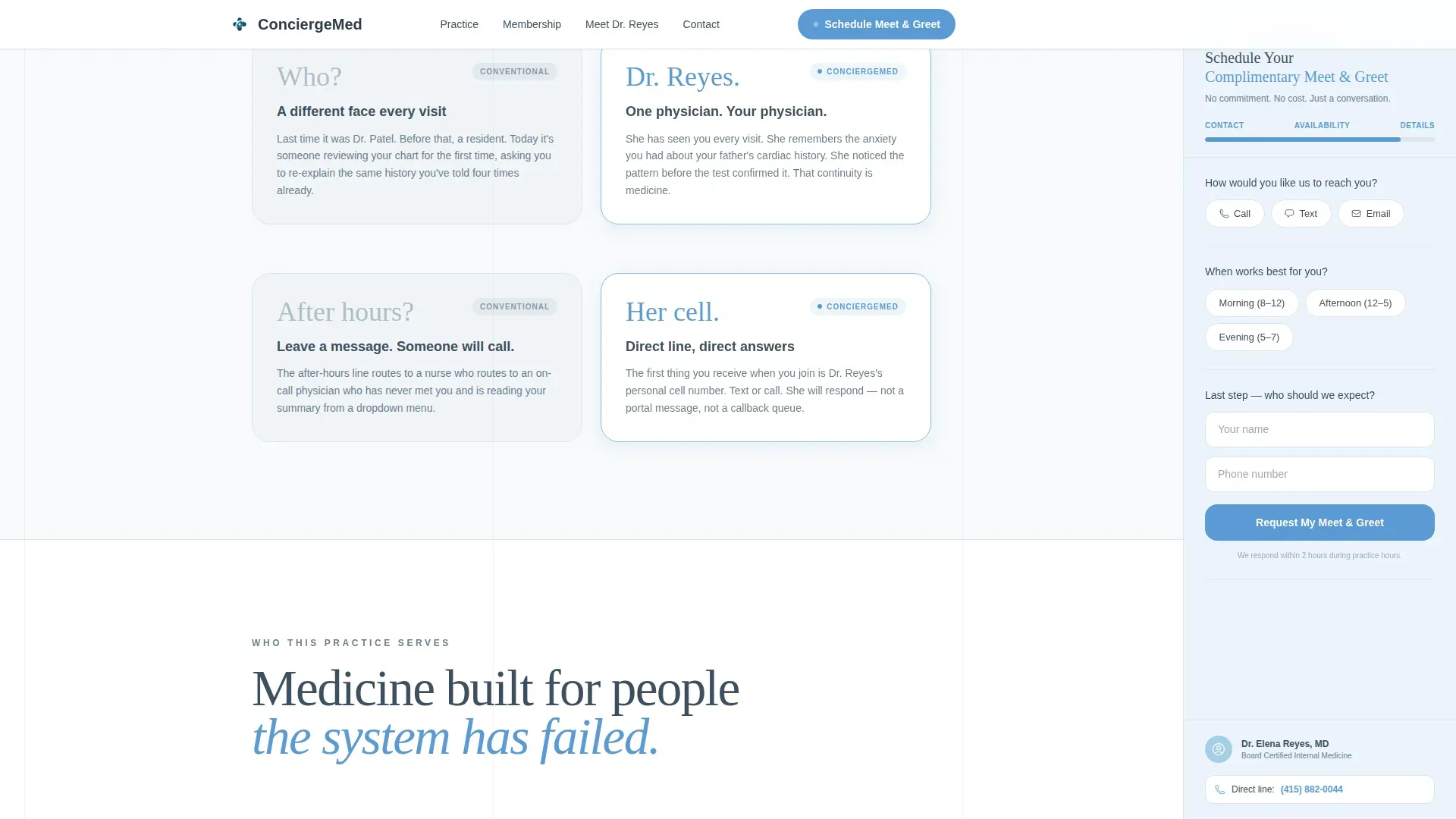
The page opens in familiar frustration: fourteen-day waits, rotating residents, seven-minute appointments, unanswered after-hours calls. Each problem is answered, in the next scroll beat, with its concierge counterpart. The structure meets the visitor where they already are emotionally, then resolves that tension with specific, credible answers.
Giant Serif Hero Headline
The header is a single centered headline, "Your Doctor. Not A Number.", set in Fraunces serif at large scale on a cloud-white field. No photography, no stethoscope imagery, no competing visual elements. The restraint itself communicates the practice's unhurried character before a single word of body copy is read.
Three Audience Portrait Sections
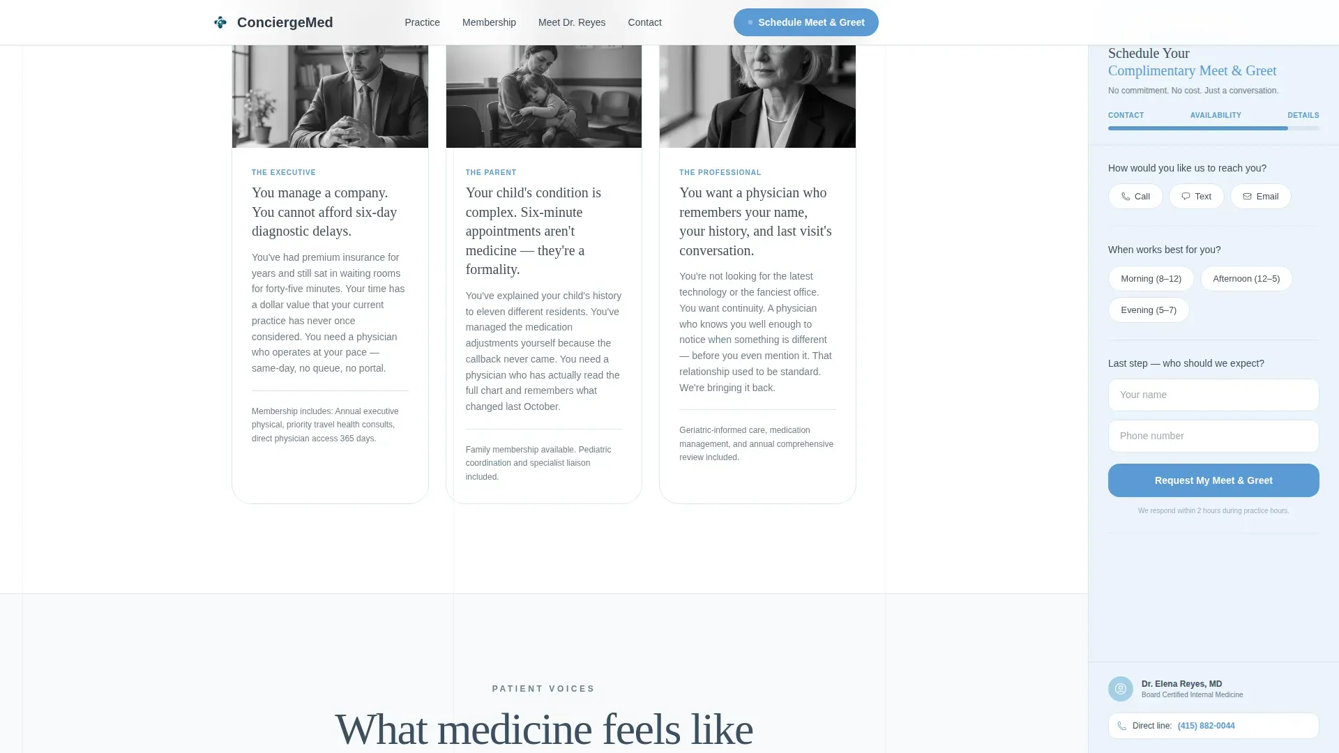
A dedicated section presents three specific ideal-patient profiles with authentic language: the executive tired of waiting-room delays, the parent of a chronically ill child exhausted by brief appointments, and the aging professional who wants genuine continuity of care. Each portrait is specific enough to feel like recognition rather than marketing.
Secondary Practice Guide Download
Visitors who are not yet ready to book are offered a secondary path. A "Download Our Practice Guide" call to action captures an email and delivers a document covering membership tiers, physician bios, and the enrollment process. This keeps warm leads inside the funnel without pushing them toward a commitment they are not ready to make.
Named Testimonials with Portrait Treatment
Social proof is presented as overlapping rotated photos paired with a centered quote card. Testimonials use named sources with roles and describe specific outcomes, making the claims feel earned rather than generic.
Page sections overview
| Section | Purpose |
|---|---|
| Hero Headline | Anchors brand promise and surfaces the sidebar scheduling widget on load |
| Problem versus. Solution | Contrasts conventional-care frustrations with concierge-care answers side by side |
| Who This Is For | Presents three specific patient portraits to prompt recognition and trust |
| Testimonials | Delivers named social proof with overlapping portrait treatment and a center quote card |
| Practice Guide Download | Offers a secondary email-capture path for visitors not yet ready to book |
| Footer | Closes with horizontal flow layout and practice contact details |
Design & branding system
The Medical Clarity theme uses a Slate and Sky color system built to feel clinical without feeling cold. Every color decision reinforces the emotional promise of the practice: clean air, open space, and unhurried attention.
- Cloud white (#F7F9FB) across all backgrounds, clinical slate (#3D4F5F) for headings, and soft charcoal (#2C3A47) for body text keep the page readable and calm
- The persistent sidebar carries the softest blue tint, and all clickable elements use cerulean (#5B9BD5) to signal interactivity with a sense of trust
- Fraunces serif handles all display headlines for warmth and authority; DM Sans handles body text for clean, open readability
Mobile & speed optimization
The layout is designed desktop-first because the sidebar companion format depends on a two-column arrangement. On smaller screens, the layout collapses gracefully so mobile visitors still move through the full content arc.
- The sidebar scheduling widget repositions below the hero on mobile, keeping the booking path accessible without the fixed-column format
- Scroll-reveal entrance animations and cinematic transitions are built for medium intensity, so they add presence without slowing the reading experience
- Server Components handle the static layout sections, while the sidebar scheduling widget runs as a Client Component to keep interactivity responsive
How this template helps you convert
Every design and copy decision in this template is aimed at one outcome: a booked meet-and-greet appointment. The path from arrival to booking is shorter than it looks because the sidebar is already moving through steps while the visitor is still reading.
- The hero section removes ambiguity immediately. The headline, subline, and visible sidebar tell the visitor exactly what this practice offers and how to take the next step, all above the fold.
- The Problem-to-Solution arc does the persuasion work before the visitor reaches any form. By the time they get to the intake step, their main objections have already been addressed in the scroll.
- The complimentary meet-and-greet removes the final financial barrier. The primary call to action, "Schedule Your Meet and Greet", frames the first visit as exploratory and free, making the decision feel low-risk.
Other information about this template
This template is built for practices that rely on direct primary care or membership medicine models, where the relationship between physician and patient is the product. A few additional details worth knowing before you build with it.
- The template uses English copy, United States date format, and United States dollar currency references throughout
- Animation intensity is set to medium: cinematic entrance effects and scroll-triggered reveals are included, but the page does not feel like a motion-heavy portfolio site
- Interactivity is high by design: the sidebar tab-switching and multi-step progressive disclosure require Client Component rendering, which is already accounted for in the build structure
- The footer follows a horizontal flow pattern suited to a single-page layout with minimal navigation needs
- This template is well suited to practices in the direct primary care, retainer medicine, or concierge family medicine space where personal access and membership enrollment are the central conversion goals
Theme
Medical Clarity
Creative direction
Problem→Solution Arc
Color system
Slate & Sky
Style
Sidebar Companion
Direction
Booking/Scheduling
Page Sections
Progressive Sidebar Scheduling Widget
Problem-to-solution Scroll Arc
Giant Serif Hero Section
Three Specific Audience Portraits
Complimentary Meet-and-greet Call to Action
Secondary Practice Guide Download
Related questions
Who is this template built for?
Can I use this template before I am ready to accept bookings?
Does the sidebar form handle patient data securely?
Can I edit the three audience portrait sections?
How does the sidebar behave on mobile screens?



