Mid-Century Modern Architecture Professional Website Template
Concrete is an asymmetric 60/40 landing page template built for a mid-century modern architecture practice. It pairs an animated ink-draw hero illustration with a brutalist Ink and Paper color system, an origin-story scroll structure, and a low-friction lead capture form. The result is a page that feels like a design monograph and converts like a focused pitch.
by Rocket studio
Quick summary
Concrete is a single-page landing page template designed for architecture practices that work at the intersection of raw materials and refined living. The asymmetric grid, muted monograph palette, and animated hero illustration create an immediate sense of authorship. The scroll guides visitors from founding philosophy through to a direct, low-friction conversation prompt.
Who this template is for
This template is built for design-forward architecture practices that need a lead generation presence as considered as the buildings they produce. It speaks directly to studios whose clients arrive with vision rather than a simple brief.
- Mid-century modern and brutalist architecture firms seeking qualified residential and commercial leads
- Practices whose clients include hillside lot owners, heritage-adjacent developers, and planners reviewing infill proposals
- Studios that want a desktop-first portfolio presence with high visual credibility
What problem this template solves
Most architecture practice pages present a portfolio grid and a contact form. That approach asks visitors to project their own story onto disconnected images. Concrete solves a more specific problem: it earns trust before a visitor ever reaches the form.
- Generic portfolio pages fail to communicate the thinking behind the work, leaving prospects uncertain whether the practice truly understands their site
- Visitors in the research phase need a reason to give their contact details before they are ready to commit
- Practices working on complex projects need a lead form that feels like the start of a design conversation, not a sales funnel
What you get with this template
This template delivers a complete, single-section-led landing page structured around an origin-story scroll. Every section is purpose-built to deepen visitor commitment progressively.
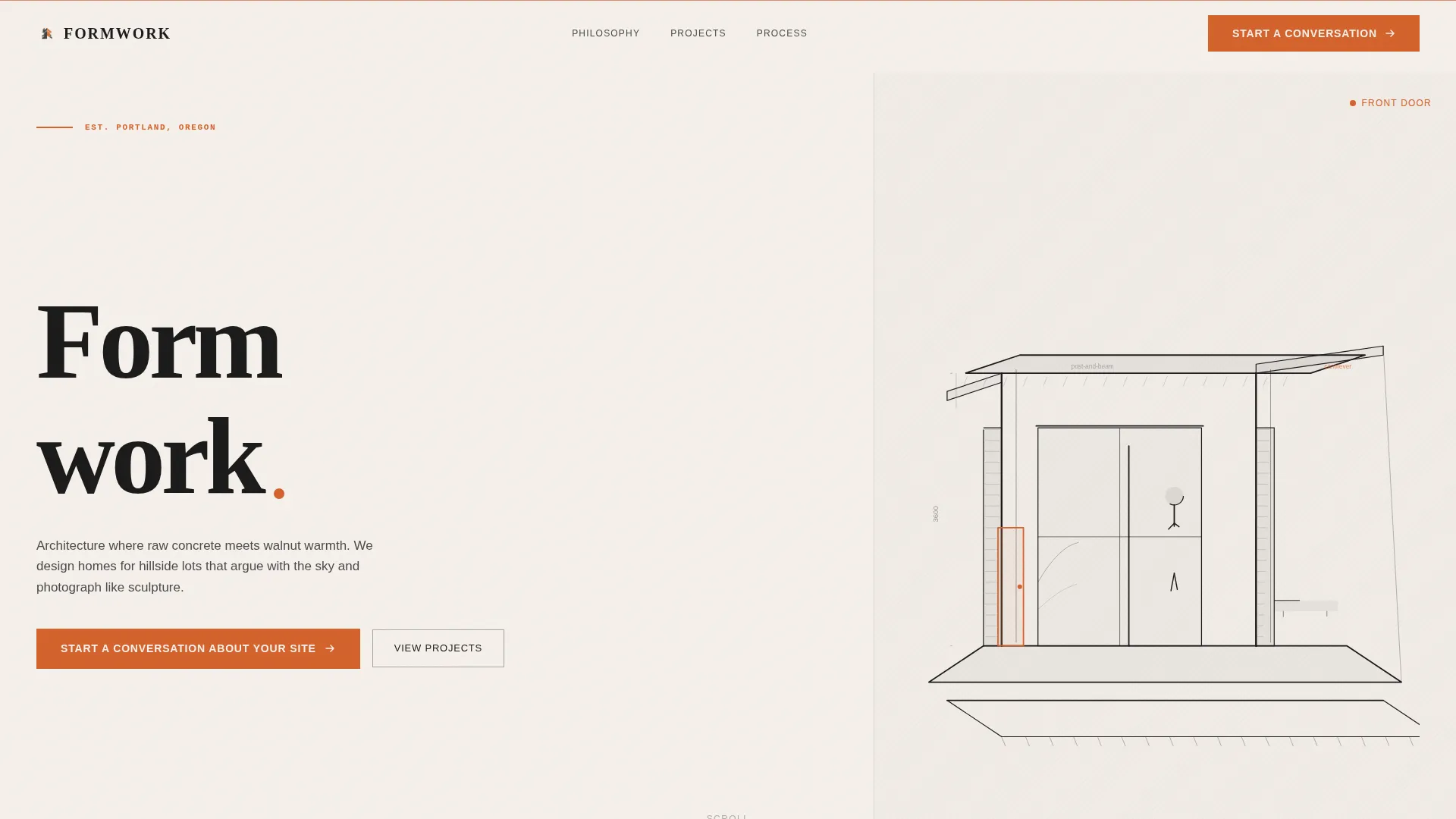
- An animated SVG axonometric ink drawing that loads stroke by stroke over the hero area, creating an immediate sense of craft
- A slide-out lead capture panel with three sequenced questions, plus a secondary monograph download path for earlier-stage visitors
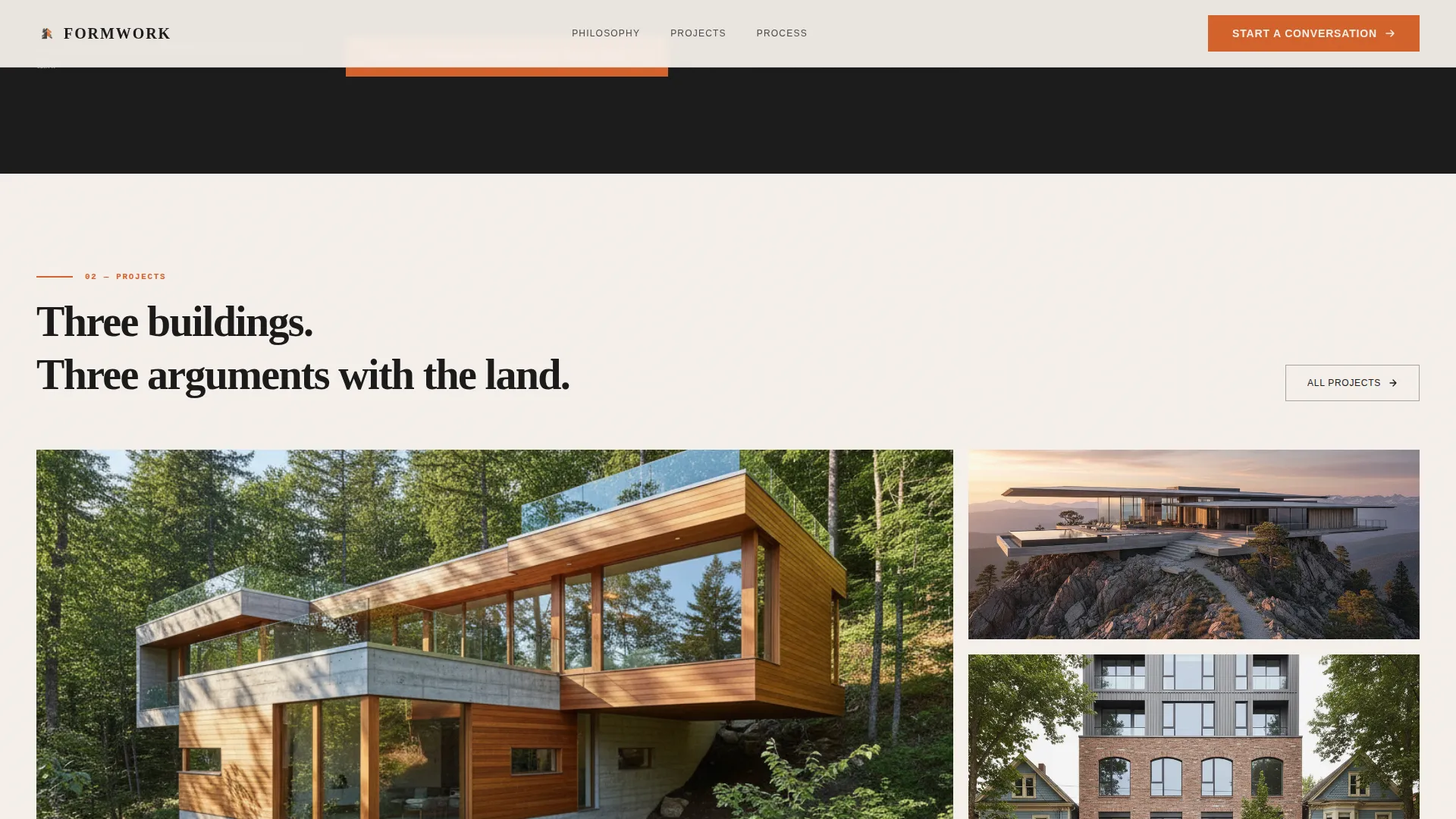
- An asymmetric bento image grid for project case studies, with scroll-linked parallax and image hover reveal interactions
Feature list
A paragraph overview of the feature set: each component below was specified directly from the brief and reflects a distinct, functional part of the template.
Animated SVG Hero Illustration
The header uses a hand-drawn axonometric section cut rendered as an animated SVG. Lines appear stroke by stroke over two seconds, mimicking an architect drawing in real time. The only color in the drawing is a single construction-orange accent marking the front door.
Asymmetric 60/40 Grid Layout
The page uses a deliberate 60/40 column split throughout. This asymmetry creates visual tension that feels designed rather than default, and it gives the practice's narrative copy and imagery unequal but balanced weight.
Origin Story Scroll Structure
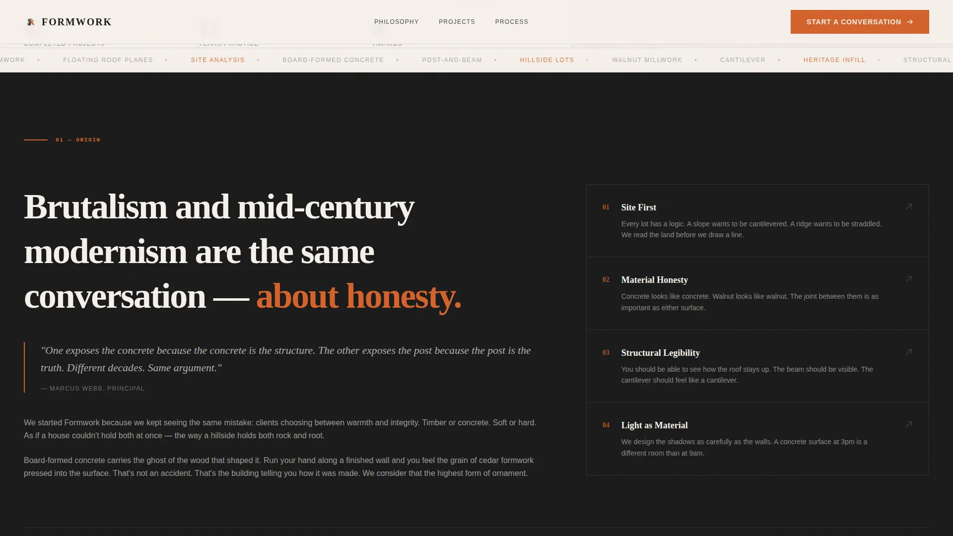
The scroll arc moves from founding philosophy through site analysis sketches, structural diagrams, and material studies before arriving at finished photography. Each section is ordered to deepen visitor understanding rather than simply display completed work.
Slide-Out Lead Capture Panel
The primary call to action opens a slide-out panel with three sequential questions: project type, site location with a map pin drop, and a free-text field asking the visitor to describe the land. No budget or timeline fields are included, keeping friction intentionally low.
Secondary Monograph Download Path
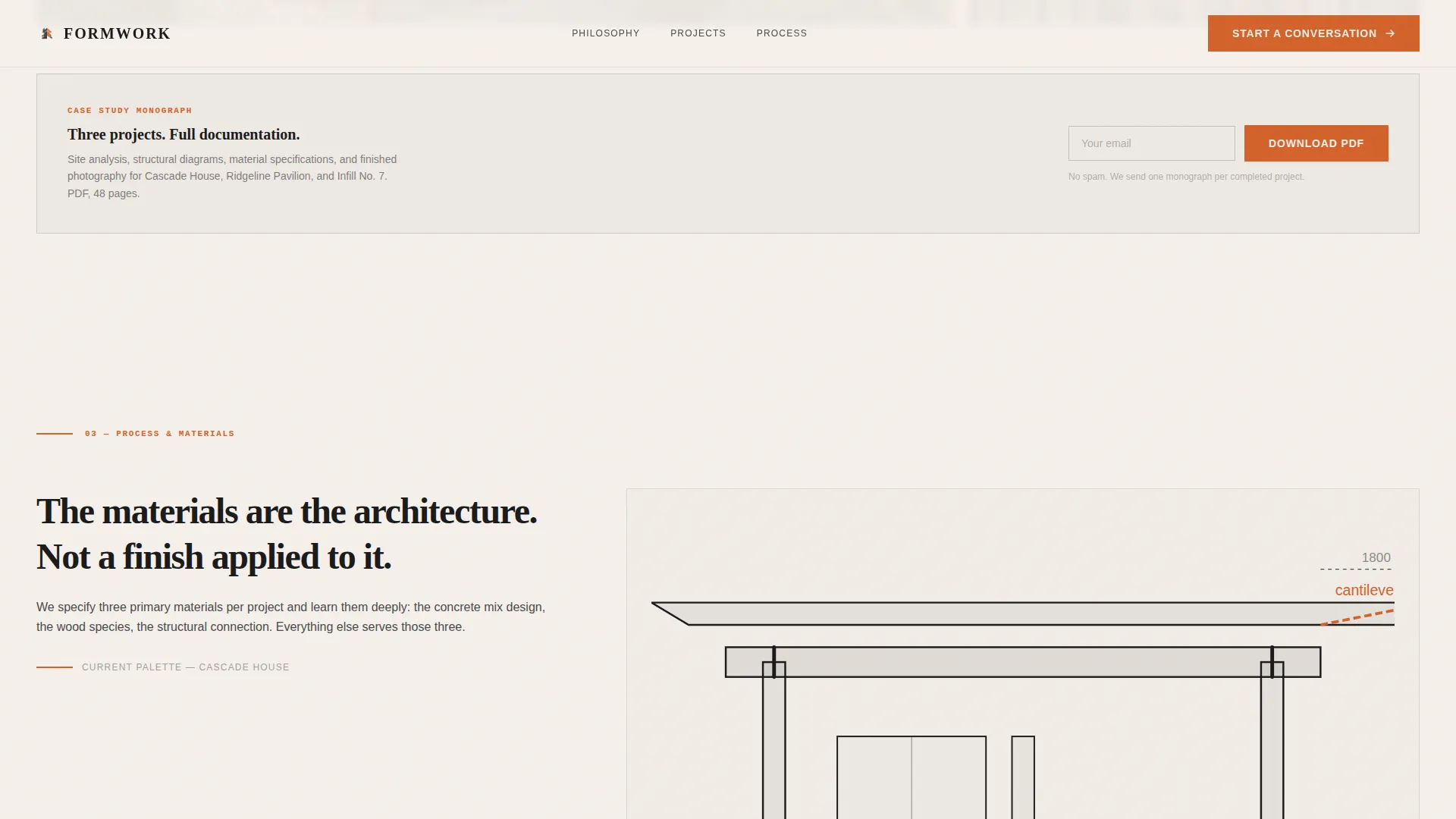
Visitors still in the research phase can exchange their email for a downloadable PDF case study monograph covering three projects. This secondary conversion path captures leads who are not yet ready to start a direct conversation.
Scroll-Linked Parallax and Staggered Reveals
Project images lazy-load and animate on scroll with parallax movement and staggered entry effects. Hover states on project images reveal additional detail, rewarding engaged visitors without cluttering the base layout.
Page sections overview
| Section | Purpose |
|---|---|
| Hero with illustration | Establish brand voice and animate the axonometric SVG drawing |
| Philosophy origin story | Explain the founding position on brutalism and mid-century modernism |
| Project case studies | Display three projects in an asymmetric bento image grid |
| Process and materials | Show structural diagrams, cedar formwork texture, and material studies |
| Primary call to action | Prompt site conversation via slide-out form panel |
| Monograph download offer | Capture research-phase visitors with a PDF case study exchange |
| Footer arc split | Close the page with structured navigation and practice identity |
Design & branding system
The visual identity follows a Bold Brutalist direction expressed through an Ink and Paper color system. The palette is drawn from print monograph references: matte stock, heavy ink, and a single warm accent that appears only where it must.
- Color system: deep sumi ink black (#1A1A1A) for type and dividers, uncoated warm white (#F5F0EB) for generous background breathing room, graphite pencil gray (#4A4A4A) for secondary text, and construction orange (#D4622B) reserved for calls to action and structural accent lines
- Typography: Fraunces serif display for headings and editorial moments, paired with DM Sans for body copy and interface elements
- All section dividers, illustration lines, and typographic weight lean toward the brutalist end of the spectrum, while walnut-warm white margins and serif display type keep the mid-century warmth present throughout
Mobile & speed optimization
The template is specified as desktop-first, reflecting the real browsing behavior of the target audience: clients reviewing architecture portfolios on larger screens. The layout still adapts for smaller viewports.
- Project images use lazy loading so the heavy visual content does not block the initial page experience
- The SVG hero illustration is optimized as a vector asset, keeping the animated draw-on effect lightweight relative to a comparable video or raster image
- Scroll-linked animations and staggered reveals are designed to function progressively, so the page remains readable even when motion is reduced
How this template helps you convert
The page is structured to move visitors through three distinct states: curious, convinced, and ready to act. Each section advances that arc deliberately.
- The animated hero and philosophy section establish the practice's point of view immediately, giving visitors a reason to keep scrolling rather than bouncing to a competitor's portfolio
- The project sequence and process sections build credibility through visible thinking, so that by the time a visitor reaches the call to action they already feel like an insider
- The dual-path conversion structure captures both ready leads through the slide-out conversation form and research-phase visitors through the monograph download, maximizing the range of visitor intent the page can serve
Other information about this template
This template was built for the architecture and design category, specifically for the mid-century modern architecture subcategory and niche. The following points cover practical details for anyone evaluating the template for their practice.
- The template style is Asymmetric Grid (60/40), theme is Bold Brutalist, and the creative direction is Origin Story
- The header concept is a Custom Illustration rather than a photograph, which means the hero retains its full visual impact without requiring a professional photo shoot at setup
- The color system is labeled Ink and Paper and uses only four defined values, making brand customization straightforward
- The landing page direction is Lead Generation, and both conversion paths (the slide-out form and the monograph download) are included in the template structure
- The footer uses a Pattern 7 Arc Browser Split layout, which separates navigation and identity elements into two visually distinct halves
- Social proof is handled through project photography placement, award mention slots, and the case study monograph rather than testimonial blocks or review badges
Theme
Bold Brutalist
Creative direction
Origin Story
Color system
Ink & Paper
Style
Asymmetric Grid (60/40)
Direction
Lead Generation
Page Sections
Animated SVG Hero Illustration
Asymmetric 60/40 Grid Layout
Origin Story Scroll Structure
Slide-out Lead Capture Panel
Secondary Monograph Download Path
Scroll-linked Parallax and Hover Reveals
Related questions
Who is this landing page template designed for?
Does this template include a lead capture form?
Can I use this template without the custom illustration?
What typography does this template use?
Is this template suitable for a practice handling both residential and commercial projects?



