Curated Party Subscription Box Landing Page Template
Confetti is a gallery and detail landing page template built for a curated party supplies subscription box. It guides existing subscribers through a tactile unboxing experience, showcasing box tiers side by side and offering one-tap add-ons through a sticky footer. The design uses a warm, minimal palette that feels editorial and intentional from the first scroll.
by Rocket studio
Quick summary
Confetti is a single-page subscription upgrade template for a curated party supplies and decorations box. It opens with a masonry photo wall, walks visitors through a layered unboxing scroll, and closes with a frictionless one-tap upgrade to the Grand tier. The design is warm, minimal, and built for an audience that cares deeply about how a party looks and feels.
Who this template is for
This template is designed for subscription box brands in the party supplies and decorations space that already have an active subscriber base. It works especially well when the goal is upgrading existing customers rather than acquiring new ones from scratch.
- Design-conscious parents planning first birthdays and milestone celebrations
- Couples hosting intimate dinner parties and editorial-style gatherings
- Creative directors and prop stylists sourcing curated decorations for shoots
What problem this template solves
Subscription box pages often feel transactional. They list contents, show a price, and ask for a click. For a brand built on surprise, curation, and tactile delight, that approach falls flat. This template solves the gap between what the box actually feels like and what a typical product page communicates.
- Visitors leave before understanding the full value of upgrading their subscription tier
- Add-on products are buried or presented without context, reducing impulse purchases
- The emotional tone of a beautifully curated box is lost in standard grid layouts
What you get with this template
You get a fully structured single-page layout that takes a subscriber from curiosity to commitment without friction. Every section is purposeful, visually distinct, and tied to a specific moment in the unboxing journey.
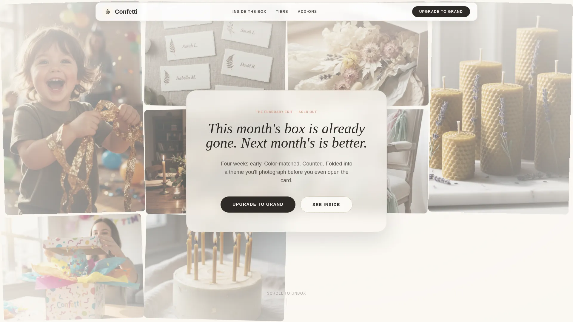
- A viewport-filling UGC Photo Wall header with staggered image loading and a frosted-glass headline overlay
- An animated tier comparison showing the Grand box stacking visibly higher than the base tier
- Toggle add-on cards for items like the Candle Set and Linen Upgrade, with a live-updating sticky footer total
Feature list
This template includes a focused set of interactive and visual features, each one grounded in the unboxing metaphor that runs through the entire page design.
UGC Photo Wall Header
The header fills the viewport edge to edge with a masonry grid of real subscriber photos. Images load with a gentle stagger, each tile appearing like a Polaroid being placed on a table. A frosted-glass overlay carries the centered headline as it types itself into view.
Layered Unboxing Scroll
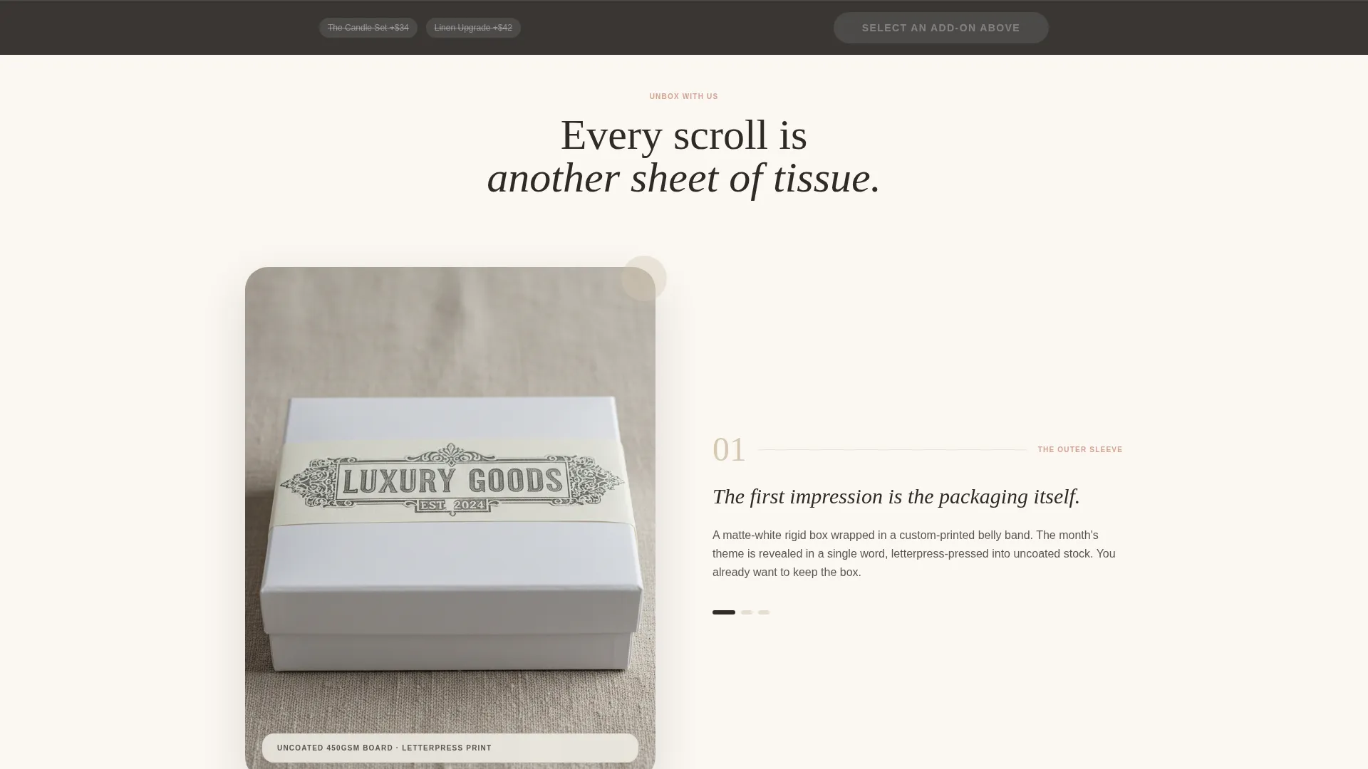
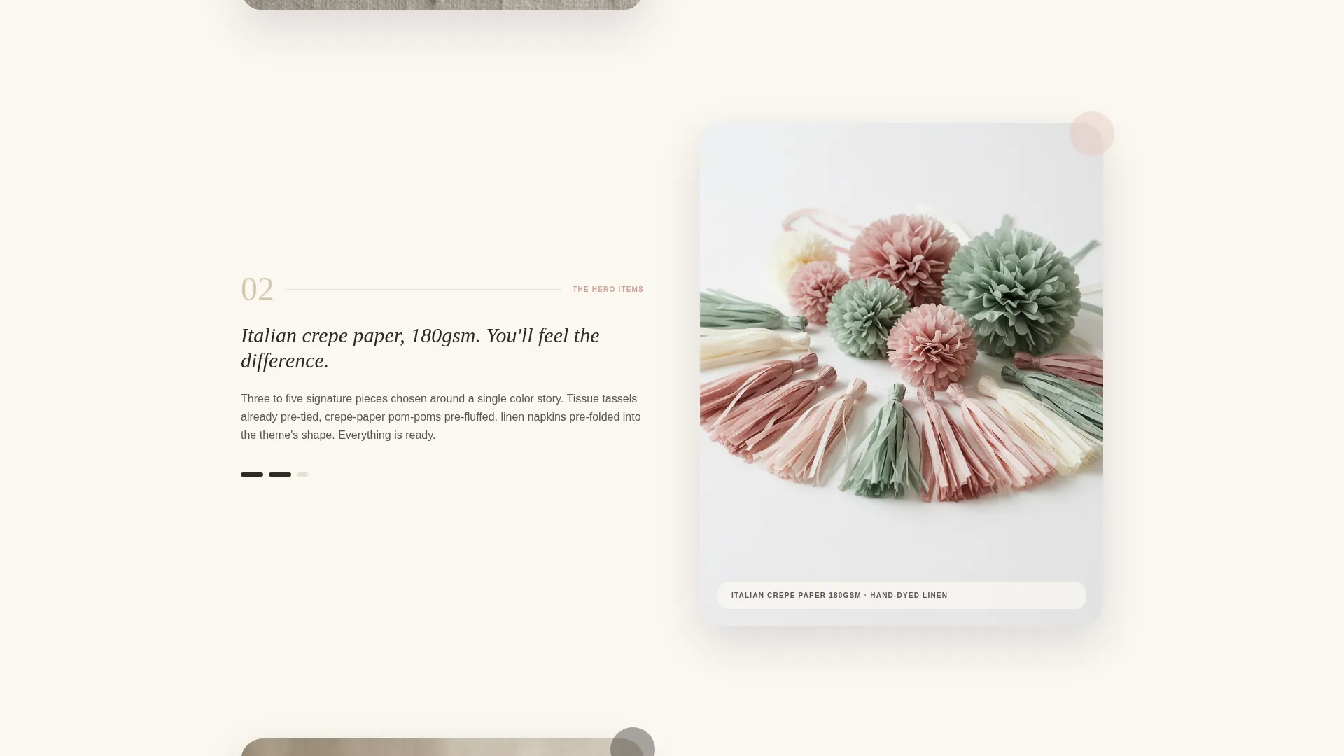
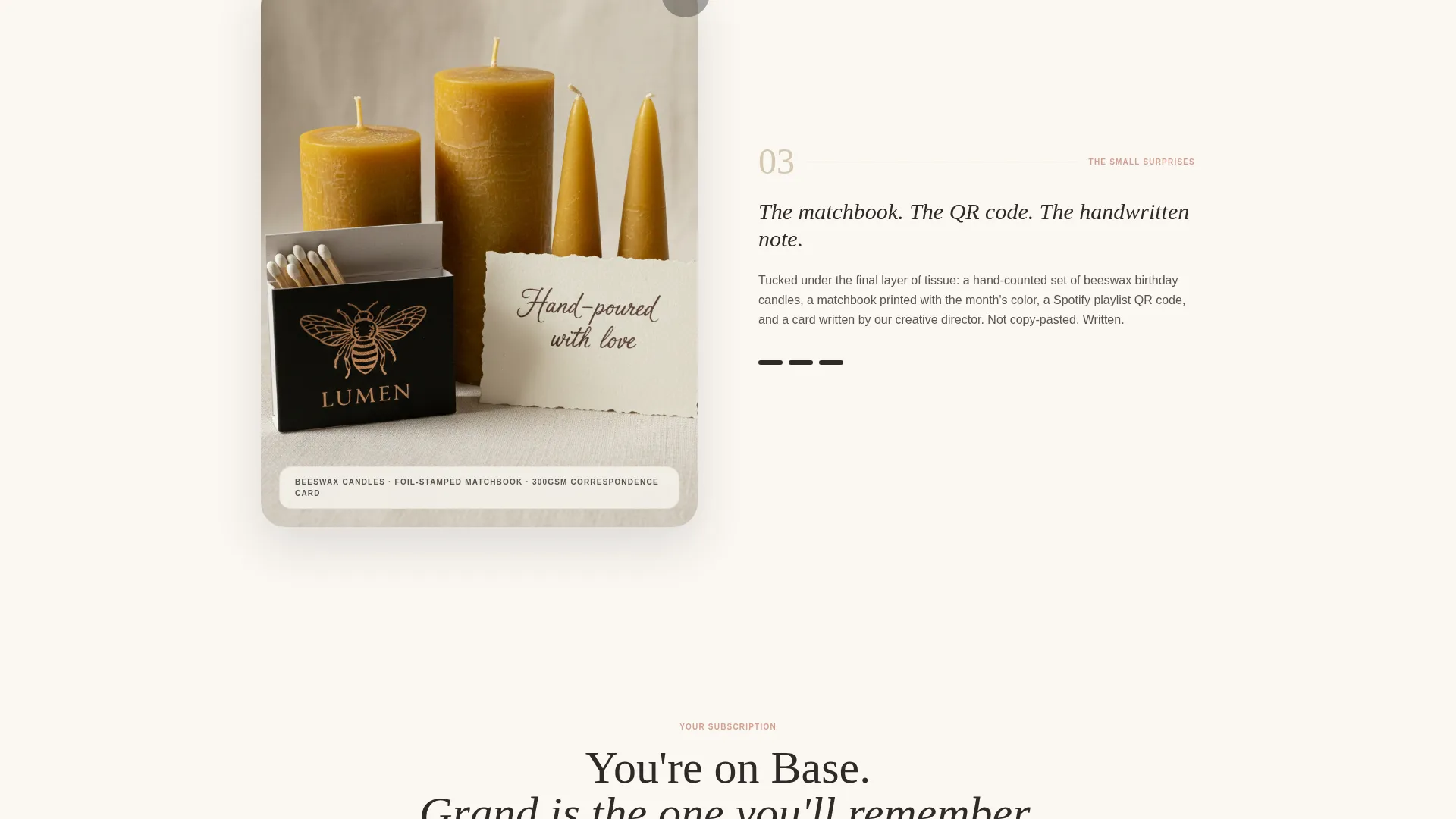
Each page section reveals one layer of the box deeper, mimicking the physical experience of lifting tissue paper. The sequence moves from the outer sleeve and printed card through hero items with material callouts, down to the small surprises like a matchbook, a playlist QR code, and a handwritten note.
Animated Tier Comparison
The upgrade path uses a visual box cross-section animation. The Grand tier items stack physically higher than the base tier inside the animated illustration, making the value difference immediately visible without a single word of comparison copy.
Micro-Interaction Product Reveals
Hovering over a product rotates it slightly. Clicking a color swatch recolors the entire scene. These small interactions reward curiosity and keep visitors engaged longer as they explore box contents.
Sticky Footer Add-On Bar
A persistent footer bar tracks the running total as visitors toggle add-on cards. Adding the Candle Set or the Linen Upgrade updates the price instantly. The bar stays visible throughout the scroll so the purchase decision is always one tap away.
Friction-Free Upgrade Form
The form pulls existing subscriber information automatically. Completing the upgrade requires only a single confirming tap. No new data entry, no multi-step checkout flow.
Page sections overview
| Section | Purpose |
|---|---|
| UGC Photo Wall | Opens with subscriber photos and a typed headline to set the brand tone |
| Outer Box Reveal | Introduces the box sleeve and printed card as the first unboxing layer |
| Hero Items Display | Showcases main box items large with material callouts and hover interactions |
| Small Surprises Layer | Highlights the matchbook, playlist QR code, and handwritten note details |
| Tier Comparison Block | Presents base versus Grand tier using an animated stacking box cross-section |
| Add-On Toggle Cards | Lets visitors add the Candle Set or Linen Upgrade with real-time price updates |
| Sticky Footer Bar | Persists the running total and upgrade call to action across the full scroll |
| One-Tap Upgrade Form | Confirms the upgrade using pre-filled subscriber info with a single tap |
Design & branding system
The visual identity follows a Luxe Minimal approach built around the Cloud Canvas color system. The palette feels like a golden-hour flat-lay on a linen tablecloth. Nothing competes for attention; every element earns its place on the page.
- Warm white (#FAF7F2) for backgrounds, soft putty (#D5C9B1) for dividers and secondary text, muted blush (#E8C4B8) for buttons and accent tags, and charcoal (#2E2B28) for headlines
- Slightly desaturated UGC photography so subscriber images sit naturally inside the Cloud Canvas tone without clashing
- Frosted-glass overlays, gentle stagger animations, and swatch-driven scene recoloring keep interactivity soft and tactile
Mobile & speed optimization
The layout is structured to work across screen sizes without losing the unboxing narrative. Staggered animations and toggle interactions are designed to feel deliberate rather than heavy.
- The masonry photo wall adapts to narrower viewports while preserving the edge-to-edge header impact
- Sticky footer add-on bar remains accessible on mobile so the upgrade path is never hidden below a fold
- Toggle card interactions and the animated tier comparison translate cleanly to touch-based navigation
How this template helps you convert
This template is engineered specifically for upgrading existing subscribers, not for cold acquisition. Every design decision reduces hesitation and shortens the path from "I'm curious" to "I tapped confirm."
- The animated tier comparison makes the Grand box feel visibly more valuable without relying on bullet-point feature lists, which removes a common objection before it forms.
- The sticky footer add-on bar keeps the running total visible at all times, so visitors feel in control of what they are spending rather than surprised at checkout.
- The one-tap upgrade form removes all data entry friction since subscriber information is already present, making the final confirmation feel effortless.
Other information about this template
This template sits inside the Retail and E-Commerce category, specifically within the Party Supplies and Decorations Store subcategory. It is built for subscription box brands operating in a design-forward niche where visual presentation is part of the product value.
- The template style follows a Bento Grid layout approach, organizing content into distinct, visually weighted blocks that guide the eye without feeling cluttered
- The creative direction is rooted in a Comparison Journey, moving the visitor from their current subscription state toward the Grand tier through progressive visual evidence
- The header concept centers on a UGC Photo Wall rather than a static hero, grounding the brand in real customer moments from the start
- The Luxe Minimal theme and Cloud Canvas color palette work together to position the brand above mass-market party supply competitors without requiring premium photography in every section
Theme
Luxe Minimal
Creative direction
Comparison Journey
Color system
Obsidian & Gold
Style
Bento Grid
Direction
Marketplace/Multi
Page Sections
UGC Photo Wall Header
Layered Unboxing Scroll
Animated Tier Comparison
Micro-interaction Product Reveals
Sticky Footer Add-on Bar
Friction-free Upgrade Form
Related questions
Who is this landing page template designed for?
Can I customize the color palette and box contents shown?
How does the one-tap upgrade form work?
Does the sticky footer add-on bar work on mobile devices?
Can I use this template for a one-time party supplies shop instead of a subscription box?



