Authentic Advisory Networks Landing Page Template
Circle is a single-column landing page template for a private peer advisory board built exclusively for active discretionary traders. It drives event registration through a manifesto-style scroll flow, a full-screen video hero, a curated registration form, and a nature-inspired botanical design system that signals depth over noise. This template helps serious traders find and connect with the right people.
by Rocket studio
Quick summary
Circle is a single-column flow landing page template designed for a private peer advisory board serving active discretionary traders. It combines a full-screen video hero, a manifesto-style editorial scroll, and a friction-forward registration form to attract serious members. The botanical design system and measured pacing create a space that feels grounded, honest, and deliberately unhurried.
Who this template is for
This template is built for founders and organizers who want to create a curated, invite-only community for serious traders. It speaks directly to people who are building exclusive peer experiences rather than open social groups. The audience for this template understands that the right community platform is not built on volume but on fit.
- Mid-career discretionary traders managing six- or seven-figure personal books who are organizing or joining a peer circle
- Community leaders and facilitators who serve professional traders and want to communicate depth, structure, and credibility
- Business leaders in the financial services or trading education space who want a landing page that filters tourists and attracts committed members
What problem this template solves
Most people who have traded seriously for five or more years already know that the noise problem is real. Discord channels move too fast. Reddit threads reward hot takes over honest analysis. The isolation compounds: traders make decisions in silence, repeat common mistakes, and never get the kind of direct peer feedback that actually changes behavior. This template addresses that gap head-on.
- It gives community organizers a voice that feels earned, not marketed, reflecting the emotional connection serious traders need before they trust a new community
- It replaces generic sign-up flows with a curated registration experience that signals this community is built for the right people, not everyone
- It lays out the problem, the vision, and the structure in a sequential scroll that builds conviction before the call to action ever appears
What you get with this template
You get a complete single-page layout built around five clearly defined content sections. Each section serves a specific role in moving a prospective member from skepticism to genuine interest. The template is designed so that every element earns its place on the page and nothing competes for attention unnecessarily.
- A full-screen video hero with a four-second delayed headline reveal, a manifesto-style problem and vision flow, a structured cohort detail section, and a curated event registration form
- A botanical color system using deep canopy green, sun-through-leaves gold, birch bark off-white, and rich loam brown, paired with Fraunces serif display and DM Sans body typography
- A persistent mobile bottom call-to-action bar that keeps the primary registration prompt accessible without interrupting the desktop reading experience
Feature list
This template includes a focused set of built-in capabilities drawn directly from the design brief. Each feature contributes to the overall goal: moving a qualified, thoughtful person toward reserving a seat in the introductory session.
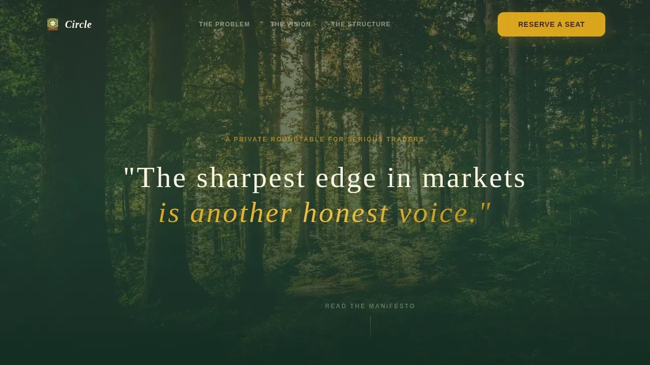
Full-Screen Video Hero with Delayed Text Reveal
The hero opens on slow aerial footage drifting above a forest canopy at golden hour. No charts, no tickers, no screens. After four seconds of visual silence, a single line fades in. That deliberate pause creates an emotional trigger unlike any standard trading community page. The contrast between what traders expect and what they actually see is the first moment of real differentiation.
Manifesto-Style Editorial Scroll
The page unfolds in a clear narrative order: the problem, the vision, and the structure. Each section deepens conviction by narrowing scope. Leaders who design community content this way earn trust progressively rather than demanding it upfront. The editorial voice stays honest and specific, avoiding hype and generic language throughout.
Cohort Structure Section
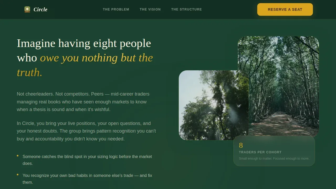
This section communicates the exact shape of the peer circle: eight traders per cohort, biweekly video meetings, and one annual in-person retreat. Peer-led facilitation with no gurus. Displaying these specifics is one of the most effective ways to build credibility for an exclusive peer advisory experience. It tells prospective members exactly what to expect and signals that the organizers have thought carefully about how this community will serve them.
Curated Event Registration Form
The registration form asks for first name, trading style via dropdown, years actively trading, and one sentence on what the applicant would bring to the group. The friction is intentional. Effective peer advisory groups depend on commitment from all members, and a form that requires genuine thought signals that admission is curated, not transactional. This filters for the right people before any session begins.
Persistent Mobile Bottom Call-to-Action Bar
On mobile, a sticky bottom bar keeps the "Reserve Your Seat at the Table" call to action visible throughout the scroll. This maintains a clear path to registration without repeating the prompt aggressively. It supports a 1:1 attention ratio on mobile, preventing decision fatigue while keeping access to the registration moment always within reach.
Botanical Color and Typography System
The design system pairs canopy green section backgrounds with birch bark body text areas, gold call-to-action highlights, and loam brown footer typography. Fraunces, a serif display typeface, carries the editorial headers. DM Sans handles body copy at high readability. Together they create a visual identity that feels grounded, alive, and distinctly different from standard financial industry design.
Page sections overview
| Section | Purpose |
|---|---|
| Video Hero | Establish emotional contrast and brand voice with a four-second delayed headline |
| The Problem | Frame isolation, echo chambers, and revenge trading as the shared challenge |
| The Vision | Show what honest peer-level conversations look like in practice |
| The Structure | Detail cohort size, meeting cadence, and peer-led facilitation model |
| Registration Form | Capture qualified applicants with intentional, friction-forward fields |
| Footer | Provide minimal navigation and contact anchors using a horizontal flow layout |
Design & branding system
The visual identity is nature-inspired and botanical, designed to feel like a deliberate departure from standard trading dashboards. The palette and typography choices work together to communicate a specific brand voice: grounded, unhurried, and deeply honest. A carefully developed visual voice like this builds emotional bonds with the audience before a single word is read. Consistency across all elements builds recognition and trust.
- Color system: deep canopy green (#1B4332) for backgrounds and section dividers, sun-through-leaves gold (#DAA520) for calls to action and pull quotes, birch bark off-white (#FAF3E0) for body text areas, and rich loam brown (#3E2723) for footer and secondary type
- Typography: Fraunces serif display for editorial headers and pull quotes, DM Sans for body paragraphs, creating a leather journal aesthetic that feels personal and considered
- Animation and interactivity: high-motion scroll reveals, staggered text entrance animations, parallax depth layers, and frequently asked question-style section reveals that reward readers who move through the full page
Mobile & speed optimization
The template is designed desktop-first but maintains full readability and interaction on smaller screens. Mobile users get the same narrative experience with one additional affordance: the persistent bottom call-to-action bar that stays anchored as they scroll. This keeps access to the registration form immediate without cluttering the mobile reading experience.
- The video hero uses lazy autoplay with muted playback, reducing load impact while keeping the cinematic opening intact on capable connections
- CSS smooth scroll behavior is applied throughout, making the single-column flow feel cohesive on both desktop and mobile
How this template helps you convert
The conversion journey for joining a private community is more layered than purchasing a product. This template accounts for that. Every design decision, from the four-second silence in the hero to the effort required by the registration form, is built to attract serious members and politely discourage everyone else. That selectivity is itself a conversion tool.
- The hero creates an immediate emotional connection by showing something traders do not expect, which earns attention before any claim is made. The manifesto sections then build a case for the community with honest, specific language that respects the intelligence of the audience.
- The registration form's intentional friction acts as a pre-qualification step. Prospective members who complete it have already demonstrated the kind of commitment and focus that effective peer advisory groups require. That self-selection improves cohort quality and long-term community success.
Other information about this template
This template is a strong fit for organizers who take community building seriously and want a landing page that reflects that seriousness. It applies best practices from peer advisory group design: showing structural specifics that enhance credibility, using pull-quote-style social proof formatted as campfire wisdom, and providing a clear post-sign-up path that reduces anxiety about what happens after registration.
- The registration form follows a low-friction contact model while still filtering for quality. It collects just enough information to serve as a meaningful pre-screening tool without overwhelming the applicant.
- Business leaders and senior leaders in the trading and financial communities will recognize the manifesto format as a statement of strategic direction rather than a sales pitch, which is appropriate for the audience.
- Organizers looking to explore similar community platform tools for hosting sessions, managing members, or delivering community content can pair this landing page with tools like Circle, the community platform, which is purpose-built for ongoing maintenance of private membership communities.
- The template's voice stays consistent across all communication channels on the page: hero, body, form, and footer. That consistency builds the emotional connection that makes prospective members feel they have already found their peers before they register.
- Business outcomes for peer advisory groups are well-documented. Peer advisory groups foster each other's growth and can lead to increased revenue and profits for businesses, particularly when members bring diversity of perspective and a willingness to be honest.
- The circle honest voices peer advisory landing page template is built for organizers who want their community's voice to feel lived-in and specific, not templated. That specificity is what creates the emotional triggers that move the right reader toward registering.
- Months ahead of launch, organizers can use the registration form data to build a waitlist and assess cohort composition before the first session takes place.
- Business growth in peer communities correlates directly with how well the landing page communicates the value of belonging. This template is designed to communicate that value clearly and without overpromising.

Theme
Nature-Inspired
Creative direction
Vision & Mission
Color system
Botanical
Style
Single Column Flow
Direction
Event Registration
Page Sections
Full-screen Video Hero with Delayed Reveal
Manifesto-style Editorial Scroll
Cohort Structure and Cadence Section
Friction-forward Registration Form
Persistent Mobile Call-to-action Bar
Botanical Color and Typography System
Related questions
Who is this landing page template designed for?
What sections are included in the template?
Can I customize the registration form fields?
How does this template support mobile users?
Why does the registration form intentionally include friction?


