Certified Broadband Landing Page Template
Signal is a single-page comparison table landing page built for telecommunications technicians. It targets property managers and general contractors with editorial-style FAQ sections, structured data tables comparing cable and infrastructure options, and two clear calls to action. The layout earns trust by teaching before asking, guiding visitors toward booking a site walk.
by Rocket studio
Quick summary
Signal is a telecommunications technician landing page built around editorial credibility and structured comparison data. It uses a magazine-style FAQ format to answer the real questions property managers and general contractors search for at night. Each scroll section builds technical fluency and trust until the visitor is ready to act.
Who this template is for
This template is designed for independent telecommunications technicians and small crews who work on commercial and multi-tenant properties. It speaks directly to clients who need structured cabling, fiber splicing, antenna mounting, and low-voltage rough-in work completed on tight schedules.
- Telecommunications technicians offering structured cabling, fiber splicing, and wireless infrastructure services
- Small internet service providers expanding coverage into underserved or rural areas
- Independent low-voltage contractors who work with property managers and general contractors
What problem this template solves
Most service pages in this trade either overwhelm visitors with jargon or undersell the crew's actual expertise. Potential clients arrive with half-formed questions and leave without acting. Signal solves that by restructuring the page around the real questions buyers type into search at 11 PM.
- Property managers need to understand cable category differences before approving a job budget
- General contractors need to confirm a crew is available and qualified before drywall closes on Friday
- Visitors leave generic service pages without enough information to make a confident decision
What you get with this template
You get a fully structured single-page layout that delivers technical authority through comparison tables and editorial-style content blocks. Every section is designed to answer a specific buyer question before the call to action ever appears.
- A manifesto-style header with credentials displayed like a publication masthead
- Multiple structured comparison tables covering cable categories, fiber versus copper, distance limits, and install timelines
- Two call-to-action placements: a primary button after the second comparison table and a sticky bottom bar repeating throughout the scroll
Feature list
This template delivers a focused set of components built specifically for a telecommunications technician landing page. Each feature serves the editorial credibility strategy that makes this layout distinct.
Quote and Manifesto Header
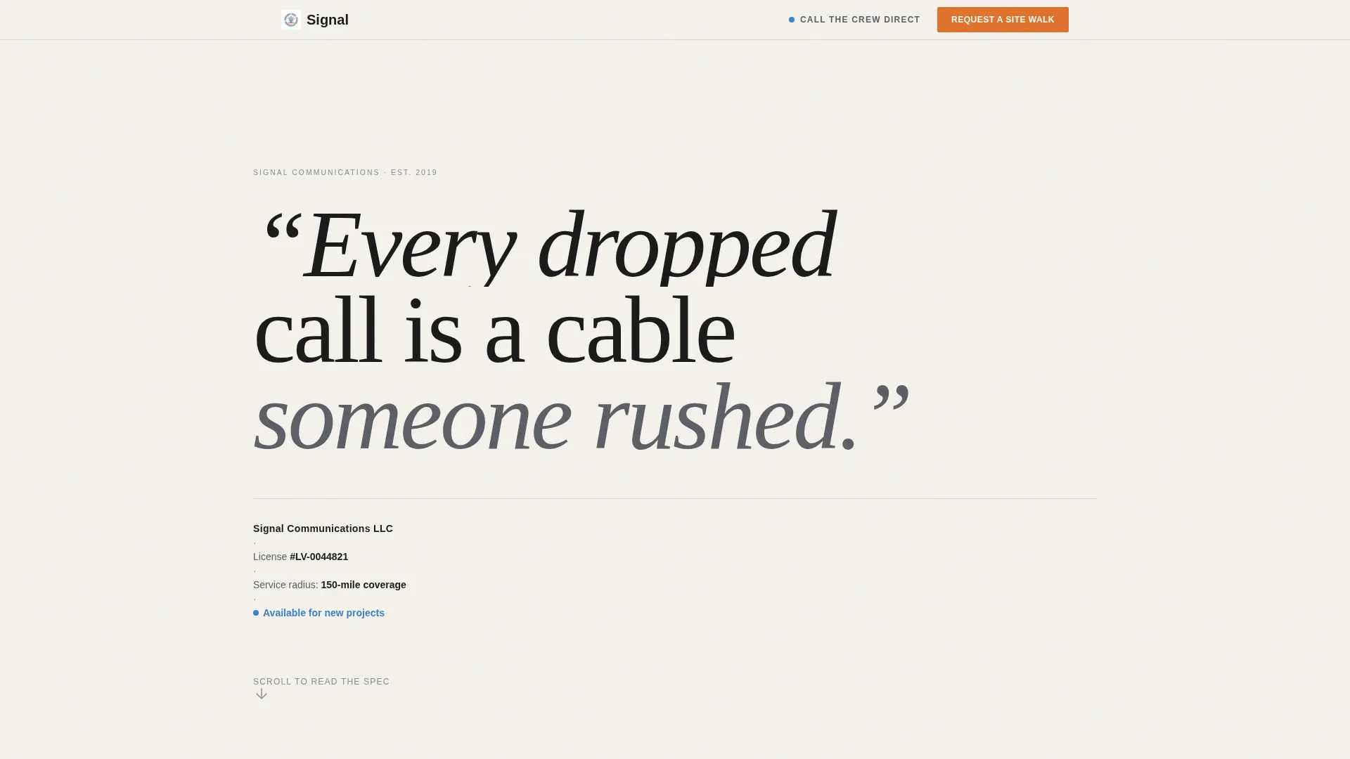
The page opens with an oversized serif statement on a clean white background. No hero image. Just a bold editorial line that sets the tone immediately, followed by a thin rule and a credential line displaying the company name, license number, and service radius.
FAQ-Driven Scroll Sections
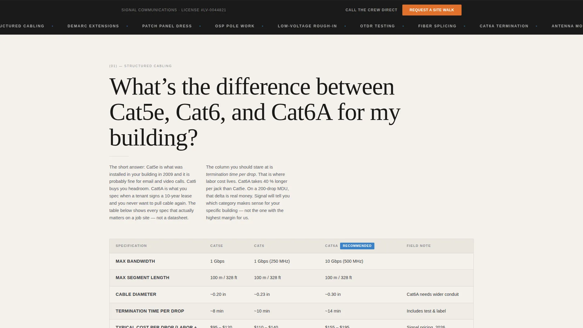
Each major scroll section opens with a real question a property manager or general contractor might search online. The question frames a structured comparison table and a short editorial paragraph, so every section teaches while it sells.
Structured Comparison Tables
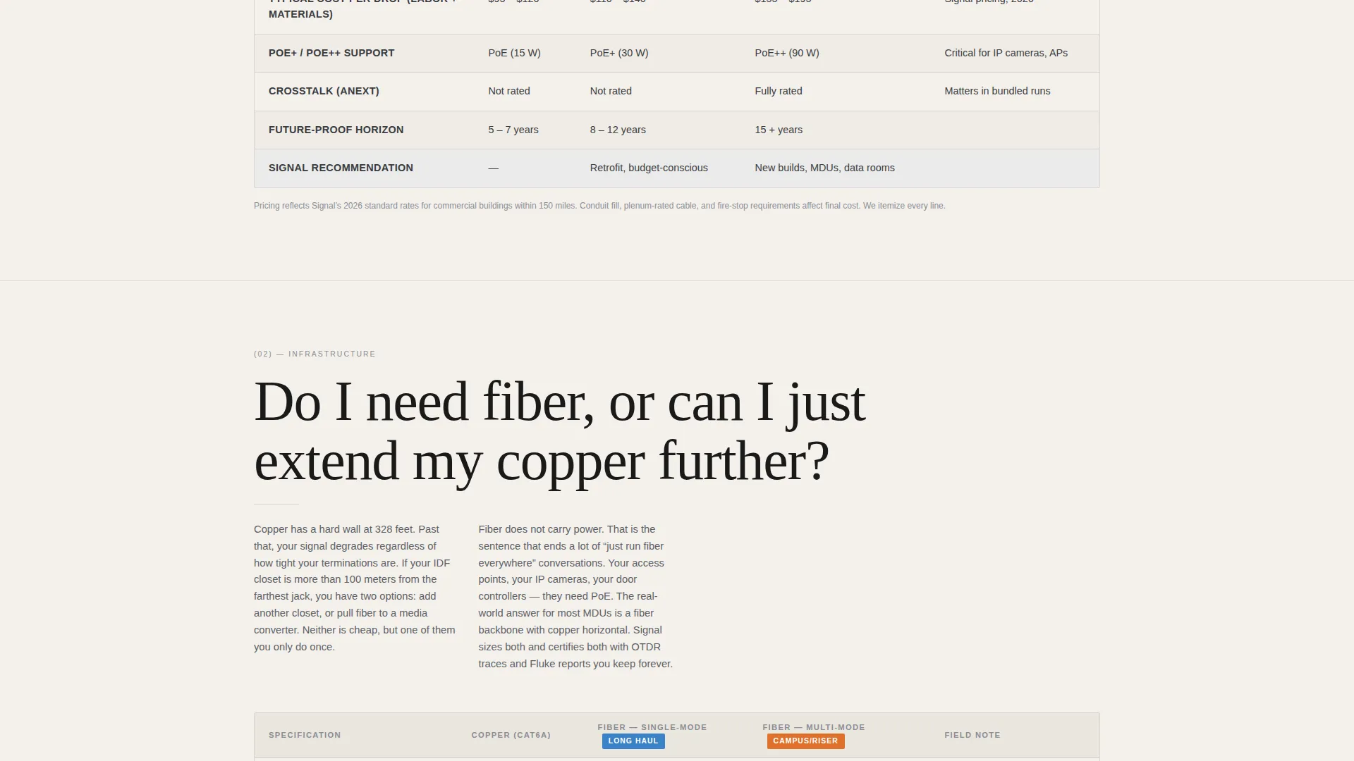
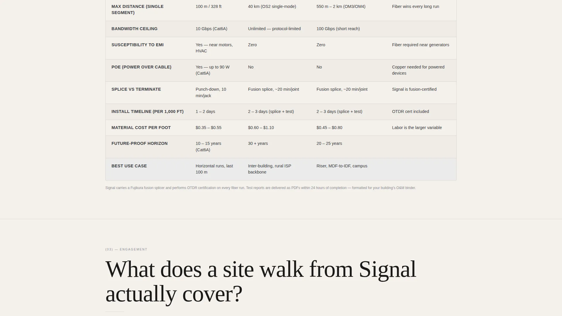
The template includes multiple data tables with clearly labeled columns. Visitors can compare cable categories by termination specs, maximum bandwidth, and estimated cost per drop. A second table compares fiber and copper runs by distance limits, future-proofing potential, and typical install timelines.
Dual Call-to-Action System
The primary call to action, labeled "Request a Site Walk," appears after the second comparison table and again in a sticky bottom bar. A secondary text link, "Call the Crew Direct," sits beside the primary button for buyers who need a same-day response.
Editorial Color and Typography System
The layout uses a restrained four-color palette and oversized serif typography inspired by printed technical journals. The visual system reinforces the authority of the content without relying on decorative imagery or visual noise.
Credential Masthead Display
License number, service radius, and company identity are displayed in a structured masthead format directly beneath the header statement. This gives first-time visitors immediate verification of who they are dealing with before they read a single line of service copy.
Page sections overview
| Section | Purpose |
|---|---|
| Manifesto Header | Opens with a bold editorial statement and credential masthead |
| Cable Category Table | Compares Cat5e and Cat6A by termination specs, bandwidth, and cost per drop |
| Fiber versus. Copper Table | Compares distance limits, future-proofing, and install timelines |
| Primary call to action Block | Introduces "Request a Site Walk" button and "Call the Crew Direct" link |
| Sticky Bottom Bar | Repeats the primary call to action throughout the full scroll |
Design & branding system
The visual identity follows an Editorial Magazine theme using a restrained four-color system. The palette reads like a freshly printed technical journal left on a job-site toolbox: matte, readable, and authoritative.
- Background in soft cumulus white (#F4F1EC), body text and structural lines in cable-jacket gray (#5C5F66), interactive elements and table highlights in signal blue (#3B82C8), and calls to action in termination orange (#E0712B)
- Oversized serif typography with wide editorial spacing creates authority without decorative imagery
- Thin horizontal rules and clean column structures mirror the precision expected in low-voltage work
Mobile & speed optimization
The layout is built with a mobile-first reading flow in mind. Comparison tables reformat for narrow screens so data stays readable without horizontal scrolling. The sticky bottom bar ensures the call to action is never more than a thumb-reach away.
- Comparison tables scale cleanly to single-column or compact layouts on smaller viewports
- The sticky call to action bar keeps "Request a Site Walk" visible throughout the full scroll on any device
- Typography sizing and line spacing are set to remain comfortable on phone-sized screens
How this template helps you convert
Signal converts by doing the selling before the visitor reaches the button. The editorial structure removes hesitation by answering the questions buyers bring with them.
- The manifesto header and credential masthead establish authority in the first few seconds, so the visitor knows they are reading from a qualified source before evaluating a single service.
- Each FAQ-driven comparison table answers a progressively more specific question, building the visitor's technical confidence until they feel consulted rather than pitched, and then presents the call to action at exactly the right moment.
Other information about this template
Signal fits naturally within the broader landscape of professional services landing pages that prioritize educational content over aggressive promotional copy. It is particularly well suited for telecommunications technician businesses that operate in competitive local markets where trust and demonstrated expertise are the primary differentiators.
- The template supports a click-through flow: no contact form appears on this page, keeping it lean and reducing friction before the visitor commits to a scheduling interaction
- The scheduling page linked from the call to action allows visitors to select service type (structured cabling, fiber splicing, wireless survey, or troubleshooting), building type, and preferred walk date
- The layout can represent a two-person crew or a larger low-voltage contractor without requiring structural changes
- The Editorial Magazine template style and Service Utility theme make this a strong fit for telecommunications technician businesses that want to stand apart from generic contractor websites
Theme
Service Utility
Creative direction
Case Study Narrative
Color system
Charcoal & Amber
Style
Editorial/Magazine
Direction
Lead Generation
Page Sections
Quote and Manifesto Header
Faq-driven Scroll Sections
Structured Comparison Tables
Dual Call-to-action System
Editorial Color and Typography System
Credential Masthead Display
Related questions
Does this template include a contact form?
Can I use this template if I offer more than just cabling?
What makes the comparison table format effective for this audience?
Is this layout suitable for a small crew or solo technician?
What happens after a visitor clicks 'Request a Site Walk'?



